An e-commerce website is an online shopping platform through which customers can purchase any item from their home. These online shopping websites let you select clothing 24/7, from electronics to food items; all things can be delivered to their homes.
The online shopping platform provides ease of access for the customer to try out different items from their home, and if they don’t like them, they can simply return their product. These features attract users to do online shopping, which benefits large companies like Amazon, Flipkart, Myntra, etc. Creating large e-commerce websites requires more complex knowledge of tools and technologies so that we can provide responsive and user-interactive websites that attract users to do online shopping on their websites.
Read Also:- Restaurant Website Using HTML and CSS
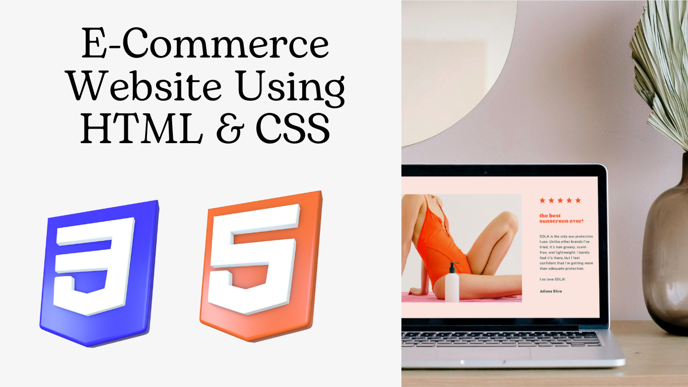
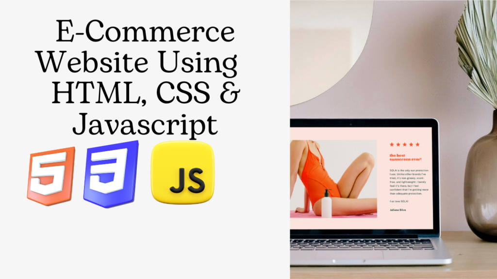
In this article, we will be using HTML, CSS, and JavaScript to create a user-interactive, modern, and responsive e-commerce website.
I hope you get some basic idea of what we are going to do in this article. We will be using HTML, CSS, and Javascript to create a responsive and user-interactive e-commerce website using HTML and CSS.
Let’s start with a simple example of creating a basic structure for our restaurant using HTML and CSS. But before that, let’s take a look at the live demo of the project.
Live Demo:
Before diving into the code, let’s discuss some general concepts of the e-commerce website using HTML, CSS, and Javascript.
What is an e-commerce website?
An e-commerce website is an online shopping platform through which customers can purchase any item from their home. Online shopping websites let you easily buy the products you like in different varieties and colors. If you don’t like the product, you can get it replaced or simply return it. E-commerce websites provide ease of access to buying and selling things, and one of the major advantages of e-commerce websites is that they provide 24/7 support to their customers.
What are the benefits of an e-commerce website?
The benefits of an e-commerce website are:
24×7 customer support
Different payment methods.
Fully return policy.
Delivery all over the world.
Adding Structure (HTML):
Header: We will be creating a header for our e-commerce website. Using the <section> tag, we will create a header section with class top-txt and then use the block-level element called the div tag with class “head and container.” Then, using the paragraph tag, we will add a small section to the header section of our website, and then use the div tag with class sign_in_up. We will create two hyperlinks, one for sign-in and the other for sign-up.
<body>
    <section class=" top-txt ">
        <div class="head container ">
            <div class="head-txt ">
                <p>Free shipping, 30-day return or refund guarantee.</p>
            </div>
            <div class="sing_in_up ">
                <a href="# ">SIGN IN</a>
                <a href="# ">SIGN UP</a>
            </div>
        </div>
    </section>
Style header :
Using the class selector (.top-txt), we will set the background color from the predefined color variable. We will use that variable and inherit the background color as “black,” and the font color is set to white.
Using the. head class selector, we will set the display of the header as flex for a responsive header, and then using the justify-content property, we will justify the content to the center, and using the font-size property, we will set the font size to 14px for the header text.
.top-txt {
    background-color: var(--black);
}
.head {
    display: flex;
    justify-content: space-between;
    color: rgba(255, 255, 255, 0.945);
    padding: 10px 0;
    font-size: 14px;
}

.head a {
    text-decoration: none;
    color: rgba(255, 255, 255, 0.945);
    margin: 0 10px;
}
Navbar:
A navbar is a horizontal bar that is present on the top of a website and provides ease of access for the user to move around to different sections of the website. Using the <nav> tag, we will create the navbar for our website, and then, using the div tag with the class “navbar-container,” we will create the container for our navbar elements.
Inside our navbar container, we will use an unordered list for creating the navbar item links, such as home, shop, blog, and contact. Also, we will be adding a logo to our website. For that, we will use the image tag to add the logo to our website.
<nav class="navbar">
        <div class="navbar-container">
            <input type="checkbox" name="" id="checkbox">
            <div class="hamburger-lines">
                <span class="line line1"></span>
                <span class="line line2"></span>
                <span class="line line3"></span>
            </div>
            <ul class="menu-items">
                <li><a href="#home">Home</a></li>
                <li><a href="#sellers">Shop</a></li>
                <li><a href="#news">Blog</a></li>
                <li><a href="#contact">Contact</a></li>
            </ul>
            <div class="logo">
                <img src="https://i.postimg.cc/TP6JjSTt/logo.webp" alt="">
            </div>
        </div>
    </nav>
Styling Navbar:
We will first use the checkbox condition. If the input type of the navbar is checkbox, the Humberger line display will be set to none, and if the input type is not checkbox, then the display will be set to block.
Now using the class selector (.navbar), we will create a box shadow, in which we will set the box shadow of the navbar to 0px and 5px, and using the position property, we will set the position to “sticky,” and using the background color property, we will set the background to “white” of our navbar.
We will be adding the image inside our navbar, so for that, using the child element selector, we will add a margin of left 3rem, and now we will style our navbar menu item. We will add a right margin of 3rem to the navbar, and using the color property, we will set the font color to black, and using the background color property, we will inherit the background color from the predefined variables.
Also, using the media query property, we will use the maximum width property so that we can add responsiveness to our website. We will set the maximum width of 500px, and if the screen size goes below the defined width, the hamburger menu display is set to none.
/* //........ Navbar ........// */

.navbar input[type="checkbox"],
.navbar .hamburger-lines {
    display: none;
}

.navbar {
    box-shadow: 0 5px 4px rgb(146 161 176 / 15%);
    position: sticky;
    top: 0;
    background: var(--white);
    color: var(--black);
    z-index: 100;
}

.navbar-container {
    display: flex;
    justify-content: space-between;
    align-items: center;
    height: 64px;
}

.navbar img {
    margin-left: 3rem;
}

.menu-items {
    order: 2;
    display: flex;
    margin-right: 3rem;
}

.menu-items li {
    list-style: none;
    margin-left: 1.5rem;
    font-size: 1.2rem;
}

.navbar-container ul a {
    text-decoration: none;
    color: var(--black);
    font-size: 18px;
    position: relative;
}

.navbar-container ul a:after {
    content: "";
    position: absolute;
    background: var(--primary-color);
    height: 3px;
    width: 0;
    left: 0;
    bottom: -10px;
    transition: 0.3s;
}

.navbar-container ul a:hover:after {
    width: 100%;
}

@media (max-width: 768px) {
    .navbar {
        opacity: 0.95;
    }
    .navbar-container input[type="checkbox"],
    .navbar-container .hamburger-lines {
        display: block;
    }
    .navbar-container {
        display: block;
        position: relative;
        height: 64px;
    }
    .navbar-container input[type="checkbox"] {
        position: absolute;
        display: block;
        height: 32px;
        width: 30px;
        top: 20px;
        left: 20px;
        z-index: 5;
        opacity: 0;
        cursor: pointer;
    }
    .navbar-container .hamburger-lines {
        display: block;
        height: 28px;
        width: 35px;
        position: absolute;
        top: 20px;
        left: 20px;
        z-index: 2;
        display: flex;
        flex-direction: column;
        justify-content: space-between;
    }
    .navbar-container .hamburger-lines .line {
        display: block;
        height: 4px;
        width: 100%;
        border-radius: 10px;
        background: #333;
    }
    .navbar-container .hamburger-lines .line1 {
        transform-origin: 0% 0%;
        transition: transform 0.3s ease-in-out;
    }
    .navbar-container .hamburger-lines .line2 {
        transition: transform 0.2s ease-in-out;
    }
    .navbar-container .hamburger-lines .line3 {
        transform-origin: 0% 100%;
        transition: transform 0.3s ease-in-out;
    }
    .navbar .menu-items {
        padding-top: 100px;
        background: #fff;
        height: 100vh;
        max-width: 100%;
        transform: translate(-150%);
        display: flex;
        flex-direction: column;
        /* margin-left: -40px;
        padding-left: 40px; */
        text-align: center;
        transition: transform 0.5s ease-in-out;
        /* box-shadow: 5px 0px 10px 0px #aaa; */
        overflow: scroll;
    }
    .navbar .menu-items li {
        margin-bottom: 2rem;
        font-size: 1.1rem;
        font-weight: 500;
    }
    .menu-items li,
    .navbar img {
        margin: 0;
    }
    .navbar .menu-items li:nth-child(1) {
        margin-top: 1.5rem;
    }
    .navbar-container .logo img {
        position: absolute;
        top: 10px;
        right: 15px;
        margin-top: 8px;
    }
    .navbar-container input[type="checkbox"]:checked~.menu-items {
        transform: translateX(0);
    }
    .navbar-container input[type="checkbox"]:checked~.hamburger-lines .line1 {
        transform: rotate(45deg);
    }
    .navbar-container input[type="checkbox"]:checked~.hamburger-lines .line2 {
        transform: scaleY(0);
    }
    .navbar-container input[type="checkbox"]:checked~.hamburger-lines .line3 {
        transform: rotate(-45deg);
    }
    .navbar-container input[type="checkbox"]:checked~.home_page img {
        display: none;
        background: #fff;
    }
}

@media (max-width: 500px) {
    .navbar-container input[type="checkbox"]:checked~.navbar-container img {
        display: none;
    }
}

Main or Product Section:
We will now create the home section, where we will add the banner for our webpage. It is the first section that appears when our website loads up, so we will make it more user-interactive. Using the div tag with class “home_img,” we will add a banner image using the image tag, and now we will be adding text using the paragraph tag. We will add a small heading for the summer collection, and using the h2 tag selector, we will add the heading for the winter fall collection.
Now we will add the social media links, such as Facebook, Instagram, and Twitter, using the Fontawesome classes.
<section id="home">
        <div class="home_page ">
            <div class="home_img ">
                <img src="https://i.postimg.cc/t403yfn9/home2.jpg" alt="img ">
            </div>
            <div class="home_txt ">
                <p class="collectio ">SUMMER COLLECTION</p>
                <h2>FALL - WINTER<br>Collection 2023</h2>
                <div class="home_label ">
                    <p>A specialist label creating luxury essentials. Ethically crafted<br>with an unwavering commitment to exceptional quality.</p>
                </div>
                <button><a href="#sellers">SHOP NOW</a><i class='bx bx-right-arrow-alt'></i></button>
                <div class="home_social_icons">
                    <a href="#"><i class='bx bxl-facebook'></i></a>
                    <a href="#"><i class='bx bxl-twitter'></i></a>
                    <a href="#"><i class='bx bxl-pinterest'></i></a>
                    <a href="#"><i class='bx bxl-instagram'></i></a>
                </div>
            </div>
        </div>
    </section>
Styling Home section:
Using the class selector (.home_page) with the child selector image, we will set the height to “Auto,” use the width property to set the width to 100%, and use the background-position property to set the background position to the center. Now, using the background-size property, we will set the background-size to “center.”.
Now we will style each element of the home section separately to add a unique style to our home section of the e-commerce website. We will set the font size of 2.5 rem for our heading in the home section, and using the color property, we will set the font color of our heading to light black from the predefined colors.
Similarly, we will add some font size and color, as well as the position of our other home section element. Just go through the below code for a deeper understanding.
.home_page img {
    height: auto;
    width: 100%;
    background-position: center;
    position: relative;
    background-size: center;
    -webkit-background-size: cover;
    -moz-background-size: cover;
    -o-background-size: cover;
}

.home_txt {
    position: absolute;
    top: 37%;
    left: 5%;
}

.home_txt p {
    color: var(--primary-color);
    font-weight: 600;
    padding-bottom: 20px;
    letter-spacing: 1.5px;
}

.home_txt h2 {
    font-size: 2.6rem;
    font-weight: 500;
    line-height: 53px;
    letter-spacing: 3px;
    font-weight: 600;
    color: var(--light-black);
}

.home_txt .home_label p {
    color: grey;
    font-size: 14px;
    padding-top: 10px;
}

.home_txt a {
    text-decoration: none;
    color: var(--white);
}

.home_txt button {
    background-color: var(--black);
    color: var(--white);
    border: none;
    padding: 15px 30px;
    font-size: 14px;
    letter-spacing: 2px;
    display: flex;
    justify-content: center;
    align-items: center;
    margin-bottom: 30px;
    cursor: pointer;
}

.home_txt .bx-right-arrow-alt {
    font-size: 25px;
    padding-left: 5px;
}

.home_txt .home_social_icons a {
    text-decoration: none;
    color: var(--light-black);
    margin-right: 15px;
    font-size: 18px;
}
Collection Section:
Now, using the section tag with the ID “collection,” we will create a section collection that will contain different types of products listed on our e-commerce website. Using the div tag with the class container and the <img> tag, we will add the image to our image collection. Also, using the <p> tag, we will add a small text for clothing collections, and using the button tag, we will create a shop now button.
Similarly, we will create a container for other product image content using the image tag. We will add an image, and using the <p> tag, we will add the details about shoes and spring, and similarly, we will create a shop now button.
<section id="collection">
        <div class="collections container">
            <div class="content">
                <img src="https://i.postimg.cc/Xqmwr12c/clothing.webp" alt="img" />
                <div class="img-content">
                    <p>Clothing Collections</p>
                    <button><a href="#sellers">SHOP NOW</a></button>
                </div>
            </div>
            <div class="content2">
                <img src="https://i.postimg.cc/8CmBZH5N/shoes.webp" alt="img" />
                <div class="img-content2">
                    <p>Shoes Spring</p>
                    <button><a href="#sellers">SHOP NOW</a></button>
                </div>
            </div>
            <div class="content3">
                <img src="https://i.postimg.cc/MHv7KJYp/access.webp" alt="img" />
                <div class="img-content3">
                    <p>Accessories</p>
                    <button><a href="#sellers">SHOP NOW</a></button>
                </div>
            </div>
        </div>
    </section>
Styling Collection:
Using the class selector (.collections), we will set the display as “flex,” and using the justify content property, we will set the justify content to the center. Using the margin top property, we will set the top margin to 65px, and using the class selector (.content), we will set the width to 330px. Using the margin property, we will add a margin of 20px, and using the position property, we will set the position to relative.
Now, using the content selector property, we will set the content width to 330px, and using the margin property, we will set the margin to 20px. Using the position property, we will set the position to “relative,” and we will also add the hover property to our collection. We will change the font color as the user hovers over the element. In a similar manner, we will add styling to other collection items.
.collections {
    display: flex;
    justify-content: center;
    flex-wrap: wrap;
    margin-top: 65px;
}

.content {
    width: 330px;
    margin: 20px;
    position: relative;
}

.content::after {
    content: "";
    position: absolute;
    top: 0;
    left: 0%;
    width: 100%;
    height: 100%;
    background: rgba(0, 0, 0, 0.871);
    z-index: 2;
    opacity: 0;
}

.content:hover::after {
    opacity: 1;
}

.content img {
    width: 100%;
    height: 300px;
    box-shadow: 0 14px 28px rgba(0, 0, 0, 0.25), 0 10px 10px rgba(0, 0, 0, 0.22);
}

.img-content {
    position: absolute;
    top: 70%;
    left: 50%;
    transform: translate(-50%, -50%);
    transition: all 0.3s ease-in-out;
    color: var(--white);
    text-align: center;
    font-size: 2.2rem;
    font-weight: bolder;
    z-index: 5;
    opacity: 0;
}

.img-content p {
    font-size: 1.6rem;
}

.img-content button {
    border: none;
    background-color: var(--primary-color);
    color: var(--white);
    border-radius: 10px;
    padding: 10px;
}

.img-content a {
    text-decoration: none;
    font-size: 1.1rem;
    color: #fff;
    transition: 0.3s;
}

.img-content button:hover {
    background: var(--white);
    color: var(--primary-color);
}

.img-content button:hover~.img-content a {
    color: var(--primary-color);
}

.img-content a:hover {
    color: var(--primary-color);
}

.content:hover .img-content {
    opacity: 1;
    top: 50%;
}


/* //........ Content 2 ........// */

.content2 {
    width: 330px;
    margin: 20px;
    position: relative;
}

.content2::after {
    content: "";
    position: absolute;
    top: 0;
    left: 0%;
    width: 100%;
    height: 100%;
    background: rgba(0, 0, 0, 0.871);
    z-index: 2;
    opacity: 0;
}

.content2:hover::after {
    opacity: 1;
}

.content2 img {
    width: 100%;
    height: 300px;
    box-shadow: 0 14px 28px rgba(0, 0, 0, 0.25), 0 10px 10px rgba(0, 0, 0, 0.22);
}

.img-content2 {
    position: absolute;
    top: 70%;
    left: 50%;
    transform: translate(-50%, -50%);
    transition: all 0.3s ease-in-out;
    color: var(--white);
    text-align: center;
    font-size: 2.2rem;
    font-weight: bolder;
    z-index: 5;
    opacity: 0;
}

.img-content2 p {
    font-size: 1.6rem;
}

.img-content2 a {
    text-decoration: none;
    font-size: 1.1rem;
    color: #fff;
    transition: 0.3s;
}

.img-content2 button {
    border: none;
    background-color: var(--primary-color);
    color: var(--white);
    border-radius: 10px;
    padding: 10px;
}

.img-content2 button:hover {
    background: var(--white);
    color: var(--primary-color);
}

.img-content2 button:hover~.img-content2 a {
    color: var(--primary-color);
}

.img-content2 a:hover {
    color: var(--primary-color);
}

.content2:hover .img-content2 {
    opacity: 1;
    top: 50%;
}


/* //........ Content 3 ........// */

.content3 {
    width: 330px;
    margin: 20px;
    position: relative;
}

.content3::after {
    content: "";
    position: absolute;
    top: 0;
    left: 0%;
    width: 100%;
    height: 100%;
    background: rgba(0, 0, 0, 0.871);
    z-index: 2;
    opacity: 0;
}

.content3:hover::after {
    opacity: 1;
}

.content3 img {
    width: 100%;
    height: 300px;
    box-shadow: 0 14px 28px rgba(0, 0, 0, 0.25), 0 10px 10px rgba(0, 0, 0, 0.22);
}

.img-content3 {
    position: absolute;
    top: 70%;
    left: 50%;
    transform: translate(-50%, -50%);
    transition: all 0.3s ease-in-out;
    color: var(--white);
    text-align: center;
    font-size: 2.2rem;
    font-weight: bolder;
    z-index: 5;
    opacity: 0;
}

.img-content3 p {
    font-size: 1.6rem;
}

.img-content3 a {
    text-decoration: none;
    font-size: 1.2rem;
    color: #fff;
    transition: 0.3s;
}

.img-content3 button {
    border: none;
    background-color: var(--primary-color);
    color: var(--white);
    border-radius: 10px;
    padding: 10px;
}

.img-content3 button:hover {
    background: var(--white);
    color: var(--primary-color);
}

.img-content3 button:hover~.img-content3 a {
    color: var(--primary-color);
}

.img-content3 a:hover {
    color: var(--primary-color);
}

.content3:hover .img-content3 {
    opacity: 1;
    top: 50%;
}

.content3:hover .img-content3 {
    opacity: 1;
    top: 50%;
}
Sales Section:
Using the section tag with the id “sellers,” we will create a seller section inside, where we will list all the products along with their names, images, and ratings. Using the <div> tag with class seller container, we will create the container for product items, and then using the <h2> tag selector, we will set the heading of top sales for items, and then we will add in the products that are most sold. Using the <p> tag, we will add the name of the product, and using the fontawesome classes, we will add the rating along with each product.
In a similar manner, we will add more products to our seller section. We will use the same format of adding products using the paragraph tag, using the div tag, and then adding the fontawesome classes.
<section id="sellers">
<div class="seller container">
<h2>Top Sales</h2>
<div class="best-seller">
<div class="best-p1">
<img src="https://i.postimg.cc/8CmBZH5N/shoes.webp" alt="img">
<div class="best-p1-txt">
<div class="name-of-p">
<p>PS England Shoes</p>
</div>
<div class="rating">
<i class='bx bxs-star'></i>
<i class='bx bxs-star'></i>
<i class='bx bxs-star'></i>
<i class='bx bx-star'></i>
<i class='bx bx-star'></i>
</div>
<div class="price">
$37.24
<div class="colors">
<i class='bx bxs-circle red'></i>
<i class='bx bxs-circle blue'></i>
<i class='bx bxs-circle white'></i>
</div>
</div>
<div class="buy-now">
<button><a href="https://codepen.io/sanketbodke/full/mdprZOq">Buy Now</a></button>
</div>
<!-- <div class="add-cart">
<button>Add To Cart</button>
</div> -->
</div>
</div>
<div class="best-p1">
<img src="https://i.postimg.cc/76X9ZV8m/Screenshot_from_2022-06-03_18-45-12.png" alt="img">
<div class="best-p1-txt">
<div class="name-of-p">
<p>PS England Jacket</p>
</div>
<div class="rating">
<i class='bx bxs-star'></i>
<i class='bx bxs-star'></i>
<i class='bx bx-star'></i>
<i class='bx bx-star'></i>
<i class='bx bx-star'></i>
</div>
<div class="price">
$17.24
<div class="colors">
<i class='bx bxs-circle green'></i>
<i class='bx bxs-circle grey'></i>
<i class='bx bxs-circle brown'></i>
</div>
</div>
<div class="buy-now">
<button><a href="https://codepen.io/sanketbodke/full/mdprZOq">Buy Now</a></button>
</div>
</div>
</div>
<div class="best-p1">
<img src="https://i.postimg.cc/j2FhzSjf/bs2.png" alt="img">
<div class="best-p1-txt">
<div class="name-of-p">
<p>PS England Shirt</p>
</div>
<div class="rating">
<i class='bx bxs-star'></i>
<i class='bx bxs-star'></i>
<i class='bx bxs-star'></i>
<i class='bx bxs-star'></i>
<i class='bx bx-star'></i>
</div>
<div class="price">
$27.24
<div class="colors">
<i class='bx bxs-circle brown'></i>
<i class='bx bxs-circle green'></i>
<i class='bx bxs-circle blue'></i>
</div>
</div>
<div class="buy-now">
<button><a href="https://codepen.io/sanketbodke/full/mdprZOq">Buy Now</a></button>
</div>
</div>
</div>
<div class="best-p1">
<img src="https://i.postimg.cc/QtjSDzPF/bs3.png" alt="img">
<div class="best-p1-txt">
<div class="name-of-p">
<p>PS England Shoes</p>
</div>
<div class="rating">
<i class='bx bxs-star'></i>
<i class='bx bxs-star'></i>
<i class='bx bxs-star'></i>
<i class='bx bxs-star'></i>
<i class='bx bxs-star'></i>
</div>
<div class="price">
$43.67
<div class="colors">
<i class='bx bxs-circle red'></i>
<i class='bx bxs-circle grey'></i>
<i class='bx bxs-circle blue'></i>
</div>
</div>
<div class="buy-now">
<button><a href="https://codepen.io/sanketbodke/full/mdprZOq">Buy Now</a></button>
</div>
</div>
</div>
</div>
</div>
<div class="seller container">
<h2>New Arrivals</h2>
<div class="best-seller">
<div class="best-p1">
<img src="https://i.postimg.cc/fbnB2yfj/na1.png" alt="img">
<div class="best-p1-txt">
<div class="name-of-p">
<p>PS England T-Shirt</p>
</div>
<div class="rating">
<i class='bx bxs-star'></i>
<i class='bx bxs-star'></i>
<i class='bx bxs-star'></i>
<i class='bx bxs-star'></i>
<i class='bx bxs-star'></i>
</div>
<div class="price">
$10.23
<div class="colors">
<i class='bx bxs-circle blank'></i>
<i class='bx bxs-circle blue'></i>
<i class='bx bxs-circle brown'></i>
</div>
</div>
<div class="buy-now">
<button><a href="https://codepen.io/sanketbodke/full/mdprZOq">Buy Now</a></button>
</div>
</div>
</div>
<div class="best-p1">
<img src="https://i.postimg.cc/zD02zJq8/na2.png" alt="img">
<div class="best-p1-txt">
<div class="name-of-p">
<p>PS England Bag</p>
</div>
<div class="rating">
<i class='bx bxs-star'></i>
<i class='bx bx-star'></i>
<i class='bx bx-star'></i>
<i class='bx bx-star'></i>
<i class='bx bx-star'></i>
</div>
<div class="price">
$09.28
<div class="colors">
<i class='bx bxs-circle brown'></i>
<i class='bx bxs-circle red'></i>
<i class='bx bxs-circle green'></i>
</div>
</div>
<div class="buy-now">
<button><a href="https://codepen.io/sanketbodke/full/mdprZOq">Buy Now</a></button>
</div>
</div>
</div>
<div class="best-p1">
<img src="https://i.postimg.cc/Dfj5VBcz/sunglasses1.jpg" alt="img">
<div class="best-p1-txt">
<div class="name-of-p">
<p>PS England Sunglass</p>
</div>
<div class="rating">
<i class='bx bxs-star'></i>
<i class='bx bxs-star'></i>
<i class='bx bxs-star'></i>
<i class='bx bxs-star'></i>
<i class='bx bxs-star'></i>
</div>
<div class="price">
$06.24
<div class="colors">
<i class='bx bxs-circle grey'></i>
<i class='bx bxs-circle blank'></i>
<i class='bx bxs-circle blank'></i>
</div>
</div>
<div class="buy-now">
<button><a href="https://codepen.io/sanketbodke/full/mdprZOq">Buy Now</a></button>
</div>
</div>
</div>
<div class="best-p1">
<img src="https://i.postimg.cc/FszW12Kc/na4.png" alt="img">
<div class="best-p1-txt">
<div class="name-of-p">
<p>PS England Shoes</p>
</div>
<div class="rating">
<i class='bx bxs-star'></i>
<i class='bx bxs-star'></i>
<i class='bx bxs-star'></i>
<i class='bx bxs-star'></i>
<i class='bx bxs-star'></i>
</div>
<div class="price">
$43.67
<div class="colors">
<i class='bx bxs-circle grey'></i>
<i class='bx bxs-circle red'></i>
<i class='bx bxs-circle blue'></i>
</div>
</div>
<div class="buy-now">
<button><a href="https://codepen.io/sanketbodke/full/mdprZOq">Buy Now</a></button>
</div>
</div>
</div>
</div>
</div>
<div class="seller container">
<h2>Hot Sales</h2>
<div class="best-seller">
<div class="best-p1">
<img src="https://i.postimg.cc/jS7pSQLf/na4.png" alt="img">
<div class="best-p1-txt">
<div class="name-of-p">
<p>PS England Shoes</p>
</div>
<div class="rating">
<i class='bx bxs-star'></i>
<i class='bx bxs-star'></i>
<i class='bx bxs-star'></i>
<i class='bx bxs-star'></i>
<i class='bx bxs-star'></i>
</div>
<div class="price">
$37.24
<div class="colors">
<i class='bx bxs-circle grey'></i>
<i class='bx bxs-circle black'></i>
<i class='bx bxs-circle blue'></i>
</div>
</div>
<div class="buy-now">
<button><a href="https://codepen.io/sanketbodke/full/mdprZOq">Buy Now</a></button>
</div>
</div>
</div>
<div class="best-p1">
<img src="https://i.postimg.cc/fbnB2yfj/na1.png" alt="img">
<div class="best-p1-txt">
<div class="name-of-p">
<p>PS England T-Shirt</p>
</div>
<div class="rating">
<i class='bx bxs-star'></i>
<i class='bx bxs-star'></i>
<i class='bx bxs-star'></i>
<i class='bx bxs-star'></i>
<i class='bx bxs-star'></i>
</div>
<div class="price">
$10.23
<div class="colors">
<i class='bx bxs-circle blank'></i>
<i class='bx bxs-circle blue'></i>
<i class='bx bxs-circle brown'></i>
</div>
</div>
<div class="buy-now">
<button><a href="https://codepen.io/sanketbodke/full/mdprZOq">Buy Now</a></button>
</div>
</div>
</div>
<div class="best-p1">
<img src="https://i.postimg.cc/RhVP7YQk/hs1.png" alt="img">
<div class="best-p1-txt">
<div class="name-of-p">
<p>PS England T-Shirt</p>
</div>
<div class="rating">
<i class='bx bxs-star'></i>
<i class='bx bxs-star'></i>
<i class='bx bxs-star'></i>
<i class='bx bxs-star'></i>
<i class='bx bxs-star'></i>
</div>
<div class="price">
$15.24
<div class="colors">
<i class='bx bxs-circle blank'></i>
<i class='bx bxs-circle red'></i>
<i class='bx bxs-circle blue'></i>
</div>
</div>
<div class="buy-now">
<button><a href="https://codepen.io/sanketbodke/full/mdprZOq">Buy Now</a></button>
</div>
</div>
</div>
<div class="best-p1">
<img src="https://i.postimg.cc/zD02zJq8/na2.png" alt="img">
<div class="best-p1-txt">
<div class="name-of-p">
<p>PS England Bag</p>
</div>
<div class="rating">
<i class='bx bxs-star'></i>
<i class='bx bx-star'></i>
<i class='bx bx-star'></i>
<i class='bx bx-star'></i>
<i class='bx bx-star'></i>
</div>
<div class="price">
$09.28
<div class="colors">
<i class='bx bxs-circle blank'></i>
<i class='bx bxs-circle grey'></i>
<i class='bx bxs-circle brown'></i>
</div>
</div>
<div class="buy-now">
<button><a href="https://codepen.io/sanketbodke/full/mdprZOq">Buy Now</a></button>
</div>
</div>
</div>
</div>
</div>
</section>Styling:
Using the class selector property, we will be selecting different elements and adding styling to our seller section of the website. Using the class selecto (.best-seller), we will set the display as “Flex,” and using the align item property, we will align the items to the center of the webpage.
Using the child selector, we will select the child element using the class (.red). We will set the font color to “primary color,” and using the cursor property, we will set the cursor to pointer. Similar to the red, we will be adding styling to the blue, gray,brown, orange, green, and many more classes. We will add the same styling to create greater contrast on our e-commerce website.
I will personally suggest that you go through the code once for better understanding and to take ideas from the project so that you can create your own projects.
.best-seller {
    display: flex;
    justify-content: space-between;
    align-items: center;
}

.best-seller .red {
    color: var(--primary-color);
    cursor: pointer;
}

.best-seller .blue {
    color: #8989ce;
    cursor: pointer;
}

.best-seller .white {
    color: var(--light-black);
    cursor: pointer;
}

.best-seller .grey {
    color: grey;
    cursor: pointer;
}

.best-seller .brown {
    color: rgb(175, 53, 53);
    cursor: pointer;
}

.best-seller .yellow {
    color: #ffff00;
    cursor: pointer;
}

.best-seller .orange {
    color: #ffa500;
    cursor: pointer;
}

.best-seller .green {
    color: #008000;
    cursor: pointer;
}

.seller h2 {
    margin-top: 65px;
    margin-bottom: 20px;
}

.seller .best-p1 {
    width: 250px;
    height: 370px;
    /* border: 2px solid black; */
}

.seller .best-p1 img {
    height: 250px;
    width: 250px;
}

.seller .best-p1 .price {
    display: flex;
    justify-content: space-between;
}

.seller .best-p1 .price .colors input[type="radio"] {
    color: #000;
    background-color: #000;
}

.best-seller .buy-now a {
    text-decoration: none;
    color: var(--white);
}

.seller a:hover {
    color: #f05e8a;
}

.best-seller .buy-now button,
.best-seller .add-cart button {
    padding: 10px 15px;
    margin-top: 5px;
    font-size: 14px;
    cursor: pointer;
    text-transform: uppercase;
    background-color: #f05e8a;
    color: var(--white);
    border: none;
    border-radius: 15px;
    font-weight: 500;
    border: 1px solid #f05e8a;
    transition: 0.5s;
}

.best-seller .buy-now button:hover,
.best-seller .add-cart button:hover {
    background-color: var(--white);
    font-weight: 600;
}

.best-seller .buy-now button:hover a,
.best-seller .add-cart button:hover a {
    color: #f05e8a;
}


/* .best-seller .add-cart button {
    padding: 5px 5px;
    margin-top: 5px;
    font-size: 14px;
    cursor: pointer;
} */


/* //........ deal of week ........// */

.deal_of_week {
    display: flex;
    justify-content: center;
    align-items: center;
}

.deal_of_week .names_of_brand p,
.deal_of_week .names_of_brand h3 {
    font-size: 1.8rem;
    margin-bottom: 1rem;
}

.deal_of_week .names_of_brand p {
    color: var(--grey);
}

.deal_of_week .countdown span {
    color: var(--primary-color);
    font-weight: 600;
    letter-spacing: 2px;
    margin: 0.8rem 0 0 3rem;
}

.deal_of_week .countdown h3 {
    font-size: 2rem;
    font-weight: 600;
    color: var(--light-black);
    line-height: 40px;
    margin: 0.8rem 0 0 3rem;
}

.deal_of_week .countdown p {
    margin: 0.8rem 0 0 3rem;
}

.deal_of_week .countdown a {
    text-decoration: none;
    color: var(--white);
    font-weight: 800;
}

.deal_of_week .countdown button {
    margin: 0.8rem 3rem;
    border: 2px solid var(--primary-color);
    background-color: var(--primary-color);
    color: var(--white);
    border-radius: 10px;
    padding: 12px;
    transition: 0.4s;
}

.deal_of_week .countdown button:hover {
    background: var(--white);
    color: var(--primary-color);
}

.deal_of_week .countdown button:hover~.countdown a {
    background: var(--white);
    color: var(--primary-color);
}

.countdown a:hover {
    color: var(--primary-color);
}


News Section:
Using the section tag with id news, we will create a particular section for the news related to the product items. Using the div tag, we will create a new heading container, and inside it, using the paragraph tag, we will add the latest news and Fashion New Trends heading and paragraph.
We will be adding columns of different news using the div tag with class 1-news. We will create the news for the container, and we will add the image source link for the news card on our e-commerce website. In a similar manner, we will be adding the news card for other news.
<section id="news">
        <div class="news-heading">
            <p>LATEST NEWS</p>
            <h2>Fashion New Trends</h2>
        </div>
        <div class="l-news container">
            <div class="l-news1">
                <div class="news1-img">
                    <img src="https://i.postimg.cc/2y6wbZCm/news1.jpg" alt="img">
                </div>
                <div class="news1-conte">
                    <div class="date-news1">
                        <p><i class='bx bxs-calendar'></i> 12 February 2022</p>
                        <h4>What Curling Irons Are The Best Ones</h4>
                        <a href="https://www.vogue.com/article/best-curling-irons" target="_blank">read more</a>
                    </div>
                </div>
            </div>
            <div class="l-news2">
                <div class="news2-img">
                    <img src="https://i.postimg.cc/9MXPK7RT/news2.jpg" alt="img">
                </div>
                <div class="news2-conte">
                    <div class="date-news2">
                        <p><i class='bx bxs-calendar'></i> 17 February 2022</p>
                        <h4>The Health Benefits Of Sunglasses</h4>
                        <a href="https://www.rivieraopticare.com/blog/314864-the-health-benefits-of-wearing-sunglasses_2/" target="_blank">read more</a>
                    </div>
                </div>
            </div>
            <div class="l-news3">
                <div class="news3-img">
                    <img src="https://i.postimg.cc/x1KKdRLM/news3.jpg" alt="img">
                </div>
                <div class="news3-conte">
                    <div class="date-news3">
                        <p><i class='bx bxs-calendar'></i> 26 February 202</p>
                        <h4>Eternity Bands Do Last Forever</h4>
                        <a href="https://www.briangavindiamonds.com/news/eternity-bands-symbolize-love-that-lasts-forever/" target="_blank">read more</a>
                    </div>
                </div>
            </div>
        </div>
    </section>
Styling News Section:
Now using the id selector (#news), we will set a margin bottom of 250px, and using the class selector property, we will set the align to be equal to the center, and then using font size preferences, we will set the font color.
Similary, we will be styling each element of the news section along with defined classes. We will basically arrange the deck chai for creating a talesnort.
/* //........ NEWS ........// */

#news {
    margin-bottom: 250px;
}

.news-heading p {
    text-align: center;
    font-size: 18px;
    color: var(--primary-color);
    letter-spacing: 2px;
    font-weight: 500;
    margin-bottom: 15px;
    margin-top: 70px;
}

.news-heading h2 {
    text-align: center;
    font-size: 32px;
    font-weight: 600;
    color: var(--light-black);
}

.l-news {
    padding-top: 45px;
    display: flex;
    justify-content: space-evenly;
    align-items: center;
    position: relative;
}

.l-news img {
    height: 200px;
    width: 300px;
}

.l-news1 {
    position: relative;
    width: 280px;
    height: 230px;
}

.l-news1 .news1-conte {
    position: absolute;
    bottom: -60%;
    left: 7%;
    background: var(--white);
    padding: 25px;
}

.l-news2 {
    position: relative;
    width: 280px;
    height: 230px;
}

.l-news2 .news2-conte {
    position: absolute;
    bottom: -60%;
    left: 7%;
    background: var(--white);
    padding: 25px;
}

.l-news3 {
    position: relative;
    width: 280px;
    height: 230px;
}

.l-news3 .news3-conte {
    position: absolute;
    bottom: -60%;
    left: 7%;
    background: var(--white);
    padding: 25px;
}

.l-news1 .news1-conte .date-news1 p {
    color: var(--light-black);
    text-align: center;
    padding: 15px 0;
}

.l-news1 .news1-conte .date-news1 h4 {
    font-size: 18px;
    text-align: center;
    font-weight: 600;
    padding-bottom: 15px;
}

.l-news1 .news1-conte .date-news1 a {
    text-decoration: none;
    text-align: center;
    padding: 0 50px;
    color: var(--primary-color);
    position: relative;
    font-weight: 600;
}

.l-news1 .news1-conte .date-news1 a::after {
    content: "";
    position: absolute;
    background: #ff3c78;
    height: 3px;
    width: 100%;
    left: 0;
    bottom: -10px;
    transition: 0.3s;
}

.l-news1 .news1-conte .date-news1 a:hover:after {
    width: 0%;
}

.l-news1 .news1-conte .date-news1 a:hover {
    color: var(--black);
}

.l-news2 .news2-conte .date-news2 p {
    color: var(--light-black);
    text-align: center;
    padding: 15px 0;
}

.l-news2 .news2-conte .date-news2 h4 {
    font-size: 18px;
    text-align: center;
    font-weight: 600;
    padding-bottom: 15px;
}

.l-news2 .news2-conte .date-news2 a {
    text-decoration: none;
    text-align: center;
    padding: 0 60px;
    color: var(--primary-color);
    position: relative;
    font-weight: 600;
}

.l-news2 .news2-conte .date-news2 a::after {
    content: "";
    position: absolute;
    background: #ff3c78;
    height: 3px;
    width: 100%;
    left: 0;
    bottom: -10px;
    transition: 0.3s;
}

.l-news2 .news2-conte .date-news2 a:hover:after {
    width: 0%;
}

.l-news2 .news2-conte .date-news2 a:hover {
    color: var(--black);
}

.l-news3 .news3-conte .date-news3 p {
    color: var(--light-black);
    text-align: center;
    padding: 15px 0;
}

.l-news3 .news3-conte .date-news3 h4 {
    font-size: 18px;
    text-align: center;
    font-weight: 600;
    padding-bottom: 15px;
}

.l-news3 .news3-conte .date-news3 a {
    text-decoration: none;
    text-align: center;
    padding: 0 60px;
    color: var(--primary-color);
    position: relative;
    font-weight: 600;
}

.l-news3 .news3-conte .date-news3 a::after {
    content: "";
    position: absolute;
    background: #ff3c78;
    height: 3px;
    width: 100%;
    left: 0;
    bottom: -10px;
    transition: 0.3s;
}

.l-news3 .news3-conte .date-news3 a:hover:after {
    width: 0%;
}

.l-news3 .news3-conte .date-news3 a:hover {
    color: var(--black);
}

Footer:
Using the div tag with class “form-details,” we fill up the form some time in a hurry if we are unable to find the data inside the form. Using the input tag, we will create a customer feedback form so that the user can contact us and provide their valuable feedback.
Now we will create a footer container using the image provider. We will add the image of the footer section, and then we will add all the necessary details inside our footer section of the website.
div class="form-details">
                    <input type="text" name="name" id="name" placeholder="Name" required>
                    <input type="email" name="email" id="email" placeholder="Email" required>
                    <textarea name="message" id="message" cols="52" rows="7" placeholder="Message" required></textarea>
                    <button>SEND MESSAGE</button>
                </div>
            </div>
        </form>
    </div>
    </section>
    <footer>
        <div class="footer-container container">
            <div class="content_1">
                <img src="https://i.postimg.cc/htGyQ4JB/footer-logo.png" alt="logo">
                <p>The customer is at the heart of our<br>unique business model, which includes<br>design.</p>
                <img src="https://i.postimg.cc/Nj9dgJ98/cards.png" alt="cards">
            </div>
            <div class="content_2">
                <h4>SHOPPING</h4>
                <a href="#sellers">Clothing Store</a>
                <a href="#sellers">Trending Shoes</a>
                <a href="#sellers">Accessories</a>
                <a href="#sellers">Sale</a>
            </div>
            <div class="content_3">
                <h4>SHOPPING</h4>
                <a href="./contact.html">Contact Us</a>
                <a href="https://payment-method-sb.netlify.app/" target="_blank">Payment Method</a>
                <a href="https://delivery-status-sb.netlify.app/" target="_blank">Delivery</a>
                <a href="https://codepen.io/sandeshbodake/full/Jexxrv" target="_blank">Return and Exchange</a>
            </div>
            <div class="content_4">
                <h4>NEWLETTER</h4>
                <p>Be the first to know about new<br>arrivals, look books, sales & promos!</p>
                <div class="f-mail">
                    <input type="email" placeholder="Your Email">
                    <i class='bx bx-envelope'></i>
                </div>
                <hr>
            </div>
        </div>
        <div class="f-design">
            <div class="f-design-txt container">
                <p>Design and Code by code.sanket</p>
            </div>
        </div>
    </footer>
</body>
Styling and Responsiveness :
We will first add the styling to our footer section. Using the footer tag sector, we will set the width of the footer to 100%, and using the content_1 img property, we will set the height to 25 pixels and the width to 180 pixels.
Now using the class selector property, we will set the footer-container as flex, and using the justify content property, we will justify the content to the center of the webpage, and then we will add the styling to the different elements of the footer.
Now, using the media query property, we will add more responsiveness to our website. Using the media query property, we will set the maximum width property as the screen size goes below, and then the elements can be arranged according to the screen size for a better user experience.
footer {
    width: 100%;
    background: var(--black);
}

.footer-container .content_1 img {
    height: 25px;
    width: 180px;
}

.footer-container {
    display: flex;
    justify-content: space-between;
    padding: 60px 0;
}

.footer-container h4 {
    color: var(--white);
    font-weight: 500;
    letter-spacing: 1px;
    margin-bottom: 25px;
    font-size: 18px;
}

.footer-container a {
    display: block;
    text-decoration: none;
    color: var(--grey);
    margin-bottom: 15px;
    font-size: 14px;
}

.footer-container .content_1 p,
.footer-container .content_4 p {
    color: var(--grey);
    margin: 25px 0;
    font-size: 14px;
}

.footer-container .content_4 input[type="email"] {
    background-color: var(--black);
    border: none;
    color: var(--white);
    outline: none;
    padding: 15px 0;
}

.footer-container .content_4 .f-mail {
    display: flex;
    justify-content: space-between;
    align-items: center;
}

.footer-container .content_4 .bx {
    color: var(--white);
}

.f-design {
    width: 100%;
    color: var(--white);
    text-align: center;
}

.f-design .f-design-txt {
    border-top: 1px solid var(--grey);
    padding: 25px 0;
    font-size: 14px;
    color: var(--grey);
}


/* //........ contact ...... // */

.contact {
    margin-top: 45px;
}

iframe {
    height: 72vh;
    width: 100%;
}

.form {
    display: flex;
    justify-content: space-between;
    margin: 80px 0;
}

.form .form-txt {
    flex-basis: 48%;
}

.form .form-txt h4 {
    font-weight: 600;
    color: var(--primary-color);
    letter-spacing: 1.5px;
    font-size: 15px;
    margin-bottom: 15px;
}

.form .form-txt h1 {
    font-weight: 600;
    color: var(--black);
    font-size: 40px;
    letter-spacing: 1.5px;
    margin-bottom: 10px;
    color: var(--light-black);
}

.form .form-txt span {
    color: var(--light-black);
    font-size: 14px;
}

.form .form-txt h3 {
    font-size: 22px;
    font-weight: 600;
    margin: 15px 0;
    color: var(--light-black);
}

.form .form-txt p {
    color: var(--light-black);
    font-size: 14px;
}

.form .form-details {
    flex-basis: 48%;
}

.form .form-details input[type="text"],
.form .form-details input[type="email"] {
    padding: 15px 20px;
    color: var(--grey);
    outline: none;
    border: 1px solid var(--grey);
    margin: 35px 15px;
    font-size: 14px;
}

.form .form-details textarea {
    padding: 15px 20px;
    margin: 0 15px;
    color: var(--grey);
    outline: none;
    border: 1px solid var(--grey);
    font-size: 14px;
    resize: none;
}

.form .form-details button {
    padding: 15px 25px;
    color: var(--white);
    font-weight: 500;
    background: var(--black);
    outline: none;
    border: none;
    margin: 15px;
    font-size: 14px;
    letter-spacing: 2px;
    cursor: pointer;
}


/* //....... Media Queries .......// */

@media (max-width: 500px) {
    .head {
        display: none;
    }
    .top-txt .head p,
    .top-txt .head a {
        font-size: 10px;
    }
    .home_txt h2,
    .home_txt .home_label p {
        display: none;
    }
    .home_txt {
        position: absolute;
        top: 20%;
        left: 5%;
        font-size: 12px;
    }
    .home_txt button {
        padding: 7px 7px;
        font-size: 10px;
    }
    .home_txt i {
        display: none;
    }
    .home_txt .home_social_icons {
        /* display: flex; */
        display: none;
    }
    .menu-items {
        margin-right: 0;
    }
    .best-seller {
        display: flex;
        flex-direction: column;
        align-items: center;
    }
    .l-news {
        display: flex;
        flex-direction: column;
        margin-right: 30px;
    }
    .l-news .l-news1,
    .l-news .l-news2 {
        margin-bottom: 200px;
    }
    .footer-container {
        display: flex;
        flex-direction: column;
    }
    .footer-container .content_1 {
        margin-bottom: 30px;
    }
    .best-seller img {
        padding-top: 40px;
    }
}

@media(min-width: 501px) and (max-width: 768px) {
    .head {
        display: none;
    }
    .top-txt .head p,
    .top-txt .head a {
        font-size: 10px;
    }
    .home_txt h2,
    .home_txt .home_label p {
        display: none;
    }
    .home_txt {
        position: absolute;
        top: 20%;
        left: 5%;
        font-size: 12px;
    }
    .home_txt button {
        padding: 7px 7px;
        font-size: 10px;
    }
    .home_txt i {
        display: none;
    }
    .home_txt .home_social_icons {
        /* display: flex; */
        display: none;
    }
    .menu-items {
        margin-right: 0;
    }
    .best-seller {
        display: flex;
        flex-direction: column;
    }
    .l-news {
        display: flex;
        flex-direction: column;
        margin-right: 30px;
    }
    .l-news .l-news1,
    .l-news .l-news2 {
        margin-bottom: 200px;
    }
    .footer-container {
        display: flex;
        flex-direction: column;
    }
    .footer-container .content_1 {
        margin-bottom: 30px;
    }
    .best-seller img {
        padding-top: 40px;
    }
}

@media(orientation: landscape) and (max-height: 500px) {
    .header {
        height: 90vmax;
    }
}


/* //....... Media Queries For Contact .......// */

@media (max-width: 500px) {
    .form {
        display: flex;
        flex-direction: column;
    }
    .form .form-details button {
        margin-left: 0;
    }
    .form .form-details input[type="text"],
    .form .form-details input[type="email"],
    .form .form-details textarea {
        width: 100%;
        margin-left: 0;
    }
    .form .form-details input[type="text"] {
        margin-bottom: 0px;
    }
}

@media(min-width: 501px) and (max-width: 768px) {
    .form {
        display: flex;
        flex-direction: column;
    }
    .form .form-details button {
        margin-left: 0;
    }
    .form .form-details input[type="text"],
    .form .form-details input[type="email"],
    .form .form-details textarea {
        width: 100%;
        margin-left: 0;
    }
    .form .form-details input[type="text"] {
        margin-bottom: 0px;
    }
}
Javascript for adding functions:
First, all document.ready functions ensure that the code runs after the document is fully uploaded, and then we will select all the anchor elements and add an on-click event to the hyper link, and then using the if condition, we will check if the hash has a null value or not, and if the anchor has a hash value, this will stop the default behavior of the anchor link.
Now, using the HTML and body elements, we will create a smooth scrolling function for our website with a duration of 800 ms. elements within elements with the class “menu-items.” When such an anchor is clicked, it unchecks a checkbox element with the ID “checkbox.” This suggests that the checkbox might be related to a navigation menu toggle, and clicking a menu item should close the menu.
$(document).ready(function () {
  $("a").on("click", function (event) {
    if (this.hash !== "") {
      event.preventDefault();

      var hash = this.hash;
      $("html, body").animate(
        {
          scrollTop: $(hash).offset().top,
        },
        800,
        function () {
          window.location.hash = hash;
        }
      );
    }
  });
});

$(".menu-items a").click(function () {
  $("#checkbox").prop("checked", false);
});
Final Video output:
Conclusion
Hopefully, the above tutorial has helped you to know how this E-commerce website using HTML CSS and Javascript works.
Here we have learned how to use the E-Commerce Website Using HTML and CSS. Next time, I am going to write an article on how Car Racing game using HTML and CSS. Please give us your valuable feedback on how you like this E-commerce Website Using HTML and CSS.
If you like the project, don’t forget to follow our website, foolishdeveloper.com.
Author: Arun