A restaurant website is a cloud-based or web-based form of an offline restaurant. Most big restaurants create a restaurant website to grow their businesses. They create a website and upload the menu of their restaurant, and customers can go to their website and easily order the food from the comfort of their homes.
30+ HTML CSS and Javascript Projects
Digital marketing has grown very fast in the past 2–3 years, due to which most businesses are switching to online business as it helps them grow their business at a faster rate and also allows them to reach a wider audience of customers. In this article, we will be creating an online restaurant website using HTML and CSS, which will help other developers get ideas on how to create a restaurant website.
I hope you get some basic idea of what we are going to do in this article. We will be using basic HTML and CSS properties to create a responsive restaurant website using HTML and CSS.
Let’s start with a simple example of creating a basic structure for our restaurant using HTML and CSS. But before that, let’s take a look at the live demo of the project.
Live Demo:
Before diving into the code, let’s discuss some general concepts of the Restaurant Website Using HTML and CSS.
What is an online Restaurant Website?
An online restaurant website is an online version of any restaurant that allows customers to order food directly from the restaurant while sitting at home. The purpose of creating a restaurant website is to reduce the curiosity inside the restaurant and also to grow the business by providing the restaurant food with the comfort of home.
What are the benefits of Online Restaurant Websites?
- Wide Reach to the Customer
- Easy to order
- Hassle-free payments
- increase in profit.
Adding Structure for Restaurant Website (HTML)
Basic Structure:
<!DOCTYPE html>
<html lang="en">
<head>
    <meta charset="UTF-8">
    <meta name="viewport" content="width=device-width, initial-scale=1.0">
    <title>Resturant</title>
    <link rel="stylesheet" href="main.css">
</head>
<body>
</body>
</html>
Basic HTML structure includes the major tags which tell the browser that the file contains the HTML code. HTML tag contains tags such as:
<!Doctype HTML>: This tag is used to tell the browser that the file we are using is HTML 5 which is the latest version of HTML.
<HTML lang=” en”>: The HTML is the root tag, which contains all the HTML tags, and lang is the attribute used to tell the browser that the supporting language is English.
<head>: The head contains the meta information of the HTML, such as the title,links to external files, and some common meta tags.
Inside the head tag, using the <link> tag with the href attribute, we have provided the link for the external CSS, which helps in adding styling to the structure of the Magic Card.
<body>: The body tag contains all the content that is displayed to the user.
Header Section:
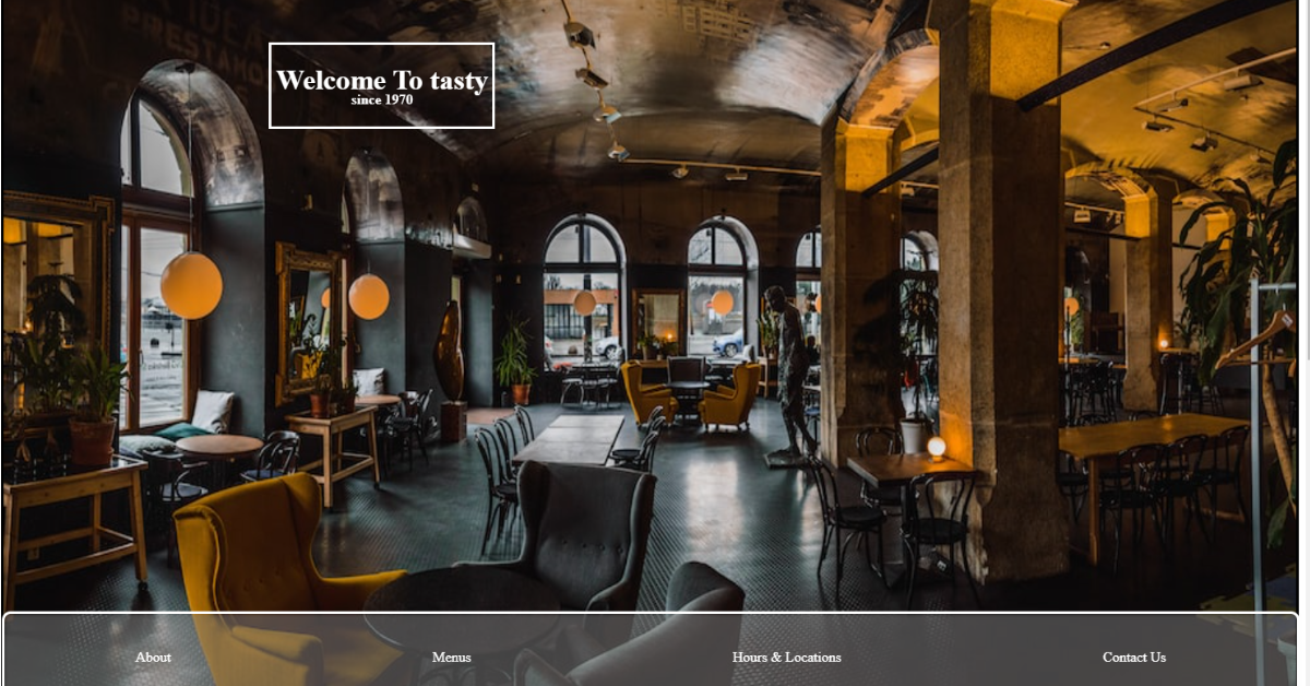
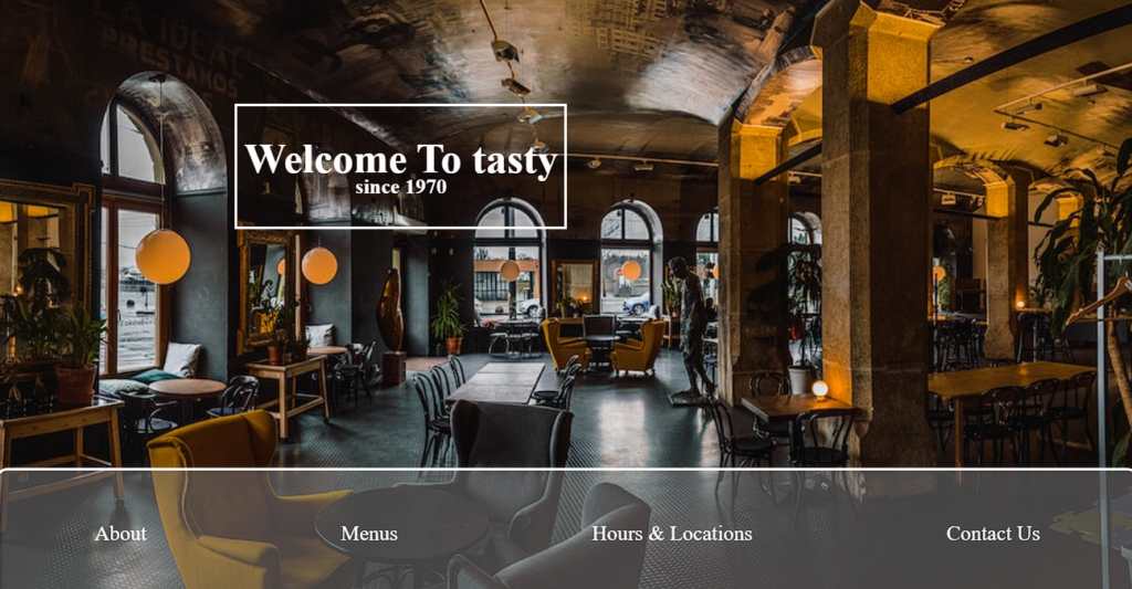
We will first create a header section of our restaurant website. Using the block-level element called the <header> tag will create a header section on the top of the website, and then inside the header tag, we will be using the div tag to create the container for the header, and we will add a heading using the <h1> tag, and using the <h4> tag, we will add the subheading of our restaurant.
Then, using the div tag, we will create a navbar, which will contain the navigation links for different sections of the website, such as About, Menus, Hours, and Locations. Contact Us.
           <header>
        <div class="headert">
            <h1>Welcome To tasty</h1>
            <h4>since 1970 </h4>
        </div>

        <div id="navbar">
        </div>
        <div id="navbar2">
            <div id=>
                <a href="#about">About</a>
            </div>
            <div>
                <a href="#Menus">Menus</a>
            </div>
            <div>
                <a href="#Hours ">Hours & Locations </a>
            </div>

            <div>
                <a href="#footer">Contact Us</a>
            </div>


        </div>

            </header>
Styling header and Navbar:
Using the header tag selector, we will add the styling to our header section. Using the position property, we will set the position to “relative,” and using the border-style property, we will set the border to “solid.”. The height of the header is set to 100 vh. We will be adding an image to the background of our restaurant website using the background-image property, and we will add the link to the image for the header background.
Using the child selector, we will add the styling to the elements inside the header section. We will set the font color to “white,” and using the text-decoration property, we will set the text-decoration to “none.”.
Now using the id selector (#Navbar), we will set the position to absolute, and using the color property, we will set the font color to “white.” Using the width and height properties, we will set the width of the navbar to 100% and the height of the navbar to 100%. Also, we will add a solid white border around the navbar, and using the hover property, we will add some styling to provide more interactiveness to the user.
  header {
          position: relative;
            border-style: solid;
           height: 100vh;
            background-repeat: no-repeat;
            background-size: 100% 100%;
            background-image: url("https://images.unsplash.com/photo-1521917441209-e886f0404a7b?ixid=MnwxMjA3fDB8MHxzZWFyY2h8MTV8fGNhZmV8ZW58MHx8MHx8&ixlib=rb-1.2.1&w=1000&q=80");
        }

        .headert {

            position: absolute;
            height: auto;
            width: fit-content;
            border-style: solid;
            color: white;
            text-align: center;
            top: 80px;
            left: 20vw;
            padding-left: 5px;
            padding-right: 5px;

        }

        header a {
            color: white;
            text-decoration: none;
        }

        .headert h4 {
            margin-top: 20px;
        }

        .headert h1 {

            margin-bottom: -0.8em;
        }

        #navbar {
           position: absolute;
            color: white;
            width: 100%;
            height: 100px;
            bottom: 0px;
            left: 0px;
            margin-left: -3px;
            margin-bottom: -3px;
            background-color: grey;
            opacity: 0.5;
            filter: blur(2px);
            margin-left: 1px;
            padding-top: 1px;
        }

        #navbar2 {
            display: flex;
            position: absolute;
            color: white;
            width: 100%;
            height: 97px;
            bottom: 0px;
            left: 0px;
            margin-left: -2px;
            margin-bottom: -2px;
            margin-right: -5px;
            border-style: solid;
            border-color: white;
            border-radius: 10px;
            flex-wrap: wrap;
            justify-content: space-around;
            align-items: center;
        }

        #navbar2 div {
            padding: 5px;
        }

        #navbar2 div:hover {
            cursor: pointer;

            background-color: black;
            border-radius: 5px;
        }
Main Menu Section :
Using the main tag, we will create a main section of our restaurant website, which will be highlighted as the main core component of the restaurant website. Then, using the section tag with the ID “photosab,” we will create a section that will include photos of different food items, and then, using the div tag, we will create an “About” section. Using the <h2> tag selector, we will set the heading “About Us,” and then we will write some paragraphs about our restaurant website, its qualities, and the food items for which our restaurant is famous.
Now we will create a div section with the class “About Photo,” inside which we will create different div tags for multiple photos for our food menu.
 <main>
                <section id="photosab">
                        <div id="about">
                        <div>
                            <h2>About Us </h2>
                            tasty has one of the delicioust foods you can ever taste.Our goal is to better the days of everyone
                            who walks in.A local favorite for +50 years.Featuring our famous pizzas, sandwiches and others for
                            you to discover.Full menu offered all day and late night.You can enjoy our menu with your family or
                            with your friends.You're our honoroable guests .
                        </div>

                         </div>
                         <div id="aboutpho">
                           <div id="im1">
                            </div>
                         <div id="im2">

                            </div>
                        <div id="im3">

                            </div>
                        <div id="im4">
                             </div>
                        <div id="im5">

                           </div>
                        <div id="im6">

                            </div>

                        <div id="im7">

                            </div>
                        <div id="im8">
                        </div>
                        <div id="im9">
                        </div>
                         </div>
                </section>
Styling About Section:
Using the ID selector (#photosab), we will add the styling to our main section. We will set the width to 100% of the main section, and using the height property, we will set the height so that all the content fits easily.
Then, using the id selector (#about), we will set the display to “flex,” and using the justify content property, we will set the content to the center. Using the background image property, we will set the background image using the URL.
#photosab {
            width: 100%;
            height: fit-content;
            position: relative;
            display: flex;
flex-wrap: wrap;

        }


        #about {display: flex;
            justify-content: center;
            align-items: center;
            width: 30%;
            background-image: url('https://previews.123rf.com/images/yphotoland/yphotoland1707/yphotoland170700134/85249062-black-lamps-is-shining-orange-light-on-red-brick-wall-for-background-texture-.jpg');
            background-size: 100% 100%;
            background-repeat: no-repeat;
             flex-basis: 200px;
            flex-grow: 1;

        }
Styling About Section
Using the id selector (#About), we will set the height as “fit-content, and using the border-style property, we will set the border style around us as solid, and using the border-radius property, we will set the border radius as 10 pixel.
Backdrop-filter property: we will set the background of our about section as blur 2px. Using the color property, we will set the font color of the about section as “white.”
Now we will be adding different images inside our child div tag using the id tag selector (#img1). We will be adding images in the grid form so that we can add multiple images inside a row. We will set the background image using the URL of the image, and the background size is set to 100% according to the grid size. In a similar way, we will be adding nine more images inside the about section to give our website a beautiful and interactive look.
#about div {
            height: fit-content;
            padding-bottom: 30px;
            width: 70%;
            border-style: solid;
            border-radius: 10px;
            box-shadow: 10px 10px 20px rgba(102, 74, 15, 0.699);
            backdrop-filter: blur(2px);
            background-color: rgba(221, 216, 216, 0.397);
            text-align: center;
        }

        #about div h2 {
            color: white;
        }

        #aboutpho {
            display: grid;

            width: 70%;
            height: 80vh;
            flex-shrink: 1;
            flex-grow: 1;
            grid-template-rows: repeat(4, 25%);
            grid-template-columns: repeat(6, auto);
        }

        #aboutpho div {
           border-style: solid;
            border-width: 1px;


        }

        #im1 {
            background-size: 100% 100%;
            background-image: url("https://images.unsplash.com/photo-1579027989536-b7b1f875659b?ixid=MnwxMjA3fDB8MHxwaG90by1wYWdlfHx8fGVufDB8fHx8&ixlib=rb-1.2.1&auto=format&fit=crop&w=750&q=80");
            grid-row: 1/3;
            grid-column: 1/3;
            background-repeat: no-repeat;
        }

        #im2 {
            background-size: 100% 100%;
            background-image: url("https://images.unsplash.com/photo-1482049016688-2d3e1b311543?ixid=MnwxMjA3fDB8MHxwaG90by1wYWdlfHx8fGVufDB8fHx8&ixlib=rb-1.2.1&auto=format&fit=crop&w=353&q=80");
            grid-row: 3/5;
            grid-column: 1/2;
            background-repeat: no-repeat;
        }

        #im3 {
            background-size: 100% 100%;
            background-image: url("https://images.unsplash.com/photo-1574936145840-28808d77a0b6?ixid=MnwxMjA3fDB8MHxzZWFyY2h8MjJ8fHJlc3RhdXJhbnR8ZW58MHx8MHx8&ixlib=rb-1.2.1&auto=format&fit=crop&w=500&q=60");
            grid-row: 1/3;
            grid-column: 6/7;
            background-repeat: no-repeat;
        }

        #im4 {
            background-size: 100% 100%;
            background-image: url("https://images.unsplash.com/photo-1491960693564-421771d727d6?ixid=MnwxMjA3fDB8MHxwaG90by1wYWdlfHx8fGVufDB8fHx8&ixlib=rb-1.2.1&auto=format&fit=crop&w=399&q=80");
            grid-row: 3/5;
            grid-column: 2/3;
            background-repeat: no-repeat;
        }

        #im5 {
            background-size: 100% 100%;
            background-image: url("https://images.unsplash.com/photo-1584365685547-9a5fb6f3a70c?ixlib=rb-1.2.1&ixid=MnwxMjA3fDB8MHxwaG90by1wYWdlfHx8fGVufDB8fHx8&auto=format&fit=crop&w=1534&q=80");
            grid-row: 1/3;
            grid-column: 5/6;
            background-repeat: no-repeat;
        }

        #im6 {
            background-size: 100% 100%;
            background-image: url("https://images.unsplash.com/photo-1551024709-8f23befc6f87?ixlib=rb-1.2.1&ixid=MnwxMjA3fDB8MHxwaG90by1wYWdlfHx8fGVufDB8fHx8&auto=format&fit=crop&w=825&q=80");
            grid-row: 3/5;
            grid-column: 5/7;
            background-repeat: no-repeat;
        }

        #im7 {
            background-size: 100% 100%;
            background-image: url("https://images.unsplash.com/photo-1504718855392-c0f33b372e72?ixid=MnwxMjA3fDB8MHxwaG90by1wYWdlfHx8fGVufDB8fHx8&ixlib=rb-1.2.1&auto=format&fit=crop&w=334&q=80");
            grid-row: 1/4;
            grid-column: 3/5;
            background-repeat: no-repeat;
        }

        #im8 {
            background-size: 100% 100%;
            background-image: url("https://images.unsplash.com/photo-1565958011703-44f9829ba187?ixlib=rb-1.2.1&ixid=MnwxMjA3fDB8MHxwaG90by1wYWdlfHx8fGVufDB8fHx8&auto=format&fit=crop&w=401&q=80");
            grid-row: 4/5;
            grid-column: 4/5;
            background-repeat: no-repeat;
        }

        #im9 {
            background-size: 100% 100%;
            background-image: url("https://images.unsplash.com/photo-1527224538127-2104bb71c51b?ixid=MnwxMjA3fDB8MHxwaG90by1wYWdlfHx8fGVufDB8fHx8&ixlib=rb-1.2.1&auto=format&fit=crop&w=751&q=80");
            grid-row: 4/5;
            grid-column: 3/4;
            background-repeat: no-repeat;
        }
Source Code link:
Conclusion
Hopefully, the above tutorial has helped you to know how this Portfolio website using HTML and CSS works.
Here we have learned how to use the Restaurant Website Using HTML and CSS. Next time, I am going to write an article on how Car Racing games using HTML and CSS. Please give us your valuable feedback on how you like this Restaurant Website Using HTML and CSS.
If you like the project, don’t forget to follow our website, foolishdeveloper.com.
Author: Arun
What is an online Restaurant Website?
An online restaurant website is an online version of any restaurant that allows customers to order food directly from the restaurant while sitting at home. The purpose of creating a restaurant website is to reduce the curiosity inside the restaurant and also to grow the business by providing the restaurant food in the comfort of home.
What are the benefits of Online Restaurant Websites?
1. Wide Reach to the Customer
2. Easy to order
3. Hassle-free payments
4. Increase in profit.