A portfolio website is a digital resume that most modern developers use to showcase their project work, experiences, and achievements all in one place. The portfolio website provides ease of access for developers to share their data with multiple companies at the same time. A portfolio not only helps students achieve their dream jobs but also helps companies by analyzing whether the candidates meet all the skills that are required for their company.
Responsive Personal Portfolio Website Using HTML, CSS, javascript
While creating a personal portfolio website, you need to focus on some of the most important factors: how you design the website and what elements and framework you should use while creating a personal portfolio website. We need to design the portfolio so that companies can easily understand your skills and experiences. A portfolio website is a website where you will showcase your educational qualifications and your experience to multiple users, and based on your skill set, they will hire your services for their projects. So keeping in mind all these factors, I created a personal portfolio using basic HTML and CSS for the structure and design of the portfolio website.

I hope you got some basic idea of what we are going to do in this article. We will be using advanced CSS properties for creating unique visuals and designs for creating our portfolio.
Let’s start with a simple example of creating a basic structure for our portfolio using HTML and CSS. But before that, let’s take a look at the live demo of the project.
Portfolio Website Live Demo:
In this article, we will be explaining the step-by-step process of creating a modern and responsive portfolio using HTML and CSS.
Before diving into the code, let’s discuss some general concepts of the Portfolio Website Using HTML and CSS.
What is a personal portfolio website?
A portfolio website is a digital resume that most modern developers use to showcase their project work, experiences, and achievements all in one place. The portfolio website provides easy access for developers to share their data with multiple companies simultaneously. A portfolio not only helps students achieve their dream jobs but also helps companies by analyzing whether the candidates meet all the skills that are required for their company.
What are the benefits of a personal portfolio website?
The advantages of using a personal portfolio website are:
1. Improves design skills.
2. Increase in social networking.
3. allows you to showcase your skills.
Adding Structure for the portfolio Website (HTML)
1. Creating Navbar: A navbar is a horizontal bar that is present on the top of a website and provides ease of access for the user to move around to different sections of the website. Now using the nav tag, we will create a container for our navbar with the id “navbar,” and then using the anchor tag, we will add the hyper link for different sections of the portfolio website, such as “About,” “Projects,” and “Social.”.
<nav id="navbar">
  <a href="#welcome-section">About</a>
  <a href="#projects">Projects</a>
  <a href="#social">Social</a>
</nav>
Styling Navbar:
Now using the tag selector (nav), we will add a background color of charcoal gray, and using the color property, we will set the font color to “white,” and using the display property, we will set the display to flex.
Then, using the child tag selector, we will set the font color to “white,” and using the margin left property, we will add a left margin of 20 pixels. We will also be using the hover property on the navbar item. Using the hover property, we will add hover styling, and as the user hovers over the navbar link, the opacity is set to 1, and an underline will appear at the bottom of the navbar links.
nav {
  background-color: #9F9FAD;
  color: #fff;
  display: flex;
  justify-content: flex-end;
  padding: 15px;
  position: fixed;
  top: 0;
  right:0;
  left: 0;
  z-index:100;
}

nav a {
  color: #fff;
  position: relative;
  margin-left: 20px;
  text-decoration: none;
}

nav a::after{
  content: '';
  border-bottom: 3px solid #fff;
  position: absolute;
  top: 0;
  left: 0;
  transform: translateY(10px);
  transition: transform 0.3s ease;
  opacity: 0;
  height: 100%;
  width: 100%;
}

nav a:hover::after {
  opacity:1;
  transform: translateY(0);
}

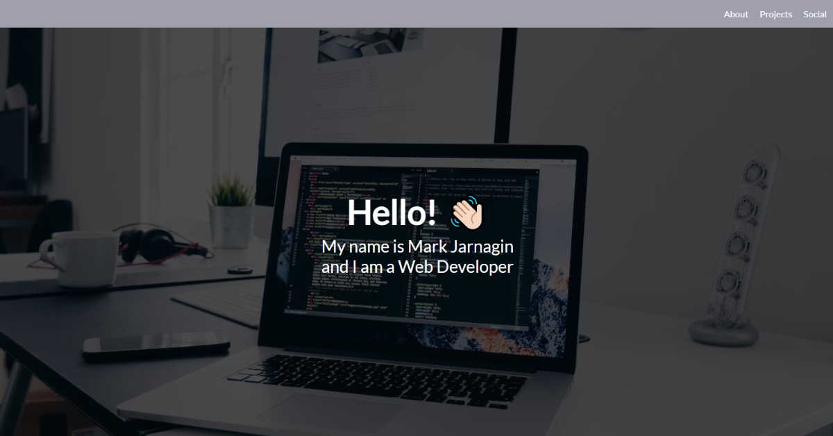
2. Creating Header:
Using the block-level element “Header” tag, we will create a header section for our personal portfolio website, and inside our header section, using the <h1> tag selector, we will add the introduction of the user, such as “Name,” and the kind of work it does, such as “Web Developer,” using the <p> tag.
<header id="welcome-section">
    <h1>Hello! 👋🏻</h1>
    <p>My name is Mark Jarnagin</p>
    <p>and I am a Web Developer</p>
</header>Styling Header Section:
Using the header tag selector, we will style our header section of the portfolio website. Using the background-image property, we will use an image as the background of our header section, and using the background-size property, we will set the property to cover, which will stretch the image according to the size of the header section. Using the color property, we will set the font color of the header section to white.
Now, using the child tag selector, we will add styling to the heading and paragraph tags of the header section. Using the h1 tag selector, we will set the font size to 60px, and using the bottom margin property, we will add a margin of 5px at the bottom of the heading tag.
Also, using the p tag selector, we will set the paragraph font size to 30 pixels.
header {
  background-image: url('https://images.unsplash.com/photo-1498050108023-c5249f4df085?ixid=MXwxMjA3fDB8MHxwaG90by1wYWdlfHx8fGVufDB8fHw%3D&ixlib=rb-1.2.1&auto=format&fit=crop&w=1352&q=80');
  background-size: cover;
  background-position: center center;
  color: #fff;
  display: flex;
  align-items: center;
  flex-direction: column;
  justify-content: center;
  height: 100vh;
  position: relative;
}

header::after {
  content: '';
  background-color: #000;
  position: absolute;
  top: 0;
  left: 0;
  right: 0;
  bottom: 0;
  opacity: 0.7;
}

header * {
  position: relative;
  z-index: 1;
}

header h1 {
  font-size: 60px;
  margin-bottom: 5px;
  margin-top: 0;
}

header p {
  font-size: 30px;
  margin: 0;
}

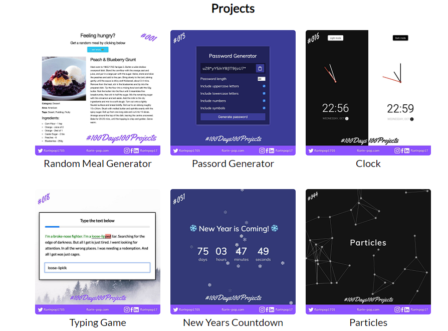
3. Creating Project Section:
Using the section tag, we will create a new section for the project section of the website. Using the h2 tag selector, we will set the heading of our portfolio project section as h2, and using the div tag with class project-container, we will create multiple sub-sections for the multiple projects.
Using the <a>tag for different links for different projects, we will add some new projects that we have created using the hyper link.
Then, using the section tag again, we will create a section for social media links. Here, we have used some social media icons using the class of Fontawesome icons, from which you can embed different social media icons and many more icons. We have added the social media links of Facebook, LinkedIn, Instagram, and Mail to our social media section.
<section id="projects">
  <h2>Projects</h2>
  <div class="projects-container">
   <a href="https://codepen.io/FlorinPop17/pen/VwYWMOa" targer="_blank" class="project-tile">
    <img src="https://www.florin-pop.com/images/100Days100PRojects/Day%20001.jpg" alt="random meal" />
    <p>Random Meal Generator</p>
  </a>

  <a href="https://codepen.io/FlorinPop17/pen/VwYWMOa" targer="_blank" class="project-tile">
    <img src="https://www.florin-pop.com/images/100Days100PRojects/Day%20013.jpg" alt="password generator" />
    <p>Passord Generator</p>
  </a>

  <a href="https://codepen.io/FlorinPop17/pen/VwYWMOa" targer="_blank" class="project-tile">
    <img src="https://www.florin-pop.com/images/100Days100PRojects/Day%20016.jpg" alt="clock" />
    <p>Clock</p>
  </a>

  <a href="https://codepen.io/FlorinPop17/pen/VwYWMOa" targer="_blank" class="project-tile">
    <img src="https://www.florin-pop.com/images/100Days100PRojects/Day%20018.jpg" alt="typing game" />
    <p>Typing Game</p>
  </a>

  <a href="https://codepen.io/FlorinPop17/pen/VwYWMOa" targer="_blank" class="project-tile">
    <img src="https://www.florin-pop.com/images/100Days100PRojects/Day%20031.jpg" alt="new years countdown" />
    <p>New Years Countdown</p>
  </a>

  <a href="https://codepen.io/FlorinPop17/pen/VwYWMOa" targer="_blank" class="project-tile">
    <img src="https://www.florin-pop.com/images/100Days100PRojects/Day%20044.jpg" alt="particles" />
    <p>Particles</p>
    </a>
  </div>
</section>

<section id="social" class="bg-social">
  <h2>Social Media</h2>
  <p>You can find me on</p>
  <ul class="social-ul">
    <li><a href="https://github.com/markjarnagin" id="profile-link" target="_blank"><i class="fab fa-github"></i></a></li>

    <li><a href="https://www.youtube.com/channel/UC9nXUkCNI3PDHi0V6kFPoWA" target="_blank"><i class="fab fa-youtube"></i></a></li>

    <li><a href="#" target="https://www.linkedin.com/in/mark-jarnagin-bb801358/" target="_blank"><i class="fab fa-linkedin"></i></a></li>

    <li><a href="https://www.instagram.com/MarkJarnagin88/" target="_blank"><i class="fab fa-instagram" target="_blank"></i></a></li>

    <li><a href="https://www.facebook.com/mark.jarnagin/" target="_blank"><i class="fab fa-facebook"></i></a></li>
  </ul>
</section>
Styling Project Section:
Using the section tag selector, we will set the width of our project section as “100%,” and using the text-align property, we will align the text to the center. Also, using the h2 tag selector, we will add a margin of 20 pixels to our project section heading.
Now using the class selector (.projects-container), we will set the display to “flex,” and using the align items property, we will align the items to the center. Using the maximum width property, we will set the maximum width of our projection section to 810 pixels.
Now, using the hover property, we will add a hover property to the tiles of our projects. As the user hovers over the projects using the transform property scale, we will increase the size of the projects.
Now using the class selector for our social media icons, we will set the background color to orange, and using the color property, we will set the font color to white. Using the border property, we will add a border of 1px solid white along the project tile and align them to the content using the align items property.
section {
  width: 100%;
  padding: 0 0;
  text-align: center;
}

section h2 {
  margin: 20px;
}

section p {
  margin-top: 0;
}

.projects-container {
  display: flex;
  flex-wrap: wrap;
  align-items: center;
  justify-content: center;
  max-width: 810px;
  margin: 20px auto 0;
}

.project-tile {
  margin: 10px;
  max-width: 250px;
  text-decoration: none;
  transition: transform 0.3s ease;
}

.project-tile:hover {
  transform: scale(1.05);
}

.project-tile p {
  color: #000;
  font-size: 20px;
  margintop: 10px;
}

.project-tile img {
  max-width: 100%;
  border-radius: 5px;
}

.bg-social {
  background-color: #9999C3; /*#FFFFFF*/
  color: #fff;
  padding: 10px;
}

.social-ul {
  display: flex;
  flex-wrap: wrap;
  justify-content: center;
  list-style-type: none;
  padding: 0;
  margin: 0;
}

.social-ul a {
  background-color: orange;
  border: 1px solid #fff;
  border-radius: 50%;
  color: #fff;
  display: inline-flex;
  align-items: center;
  justify-content: center;
  font-size: 25px;
  margin: 5px 18px;
  text-decoration: none;
  height:38px;
  width: 38px;
}

4. Creating Footer:
A footer is the bottom section of a website where we add the details of the website owner. Here we will add the copyright icon and name of the user. Using the footer tag, we will add the name of the portfolio user along with a heart icon from Fontawesome.
<footer>Made with <i class="fas fa-heart"></i> by Mark Jarnagin</footer>
Styling Footer:
Using the child selector property, we will set the font icon color to red. Using the color property, we will change the color of the heart to red.
Also, using the media query property, we will add responsiveness to our portfolio website. We will set the max-width property, and if the screen size goes below the defined max width, the section of project padding is set to 20px.
footer .fa-heart {
  color: red;
}

@media (max-width: 440px) {
  section {
    padding: 20px;
  }
}
Source Code link:
Conclusion
Hopefully, the above tutorial has helped you to know how this Portfolio website using HTML and css works.
Here we have learned how to use the Portfolio Website Using HTML and CSS. Next time, I am going to write an article on how Car Racing game using HTML and CSS. Please give us your valuable feedback on how you like this Portfolio Website Using HTML and CSS.
If you like the project, don’t forget to follow our website, foolishdeveloper.com.
Author: Arun