A personal website is a user-specific website. We can create personal websites for different purposes; we can create personal websites for writing up our personal blogs and personal memos; and we can also use personal websites for creating personal portfolios that show our skill set, projects, and work experience.
Creating this type of website helps in upskilling our frontend skills and also helps in boosting confidence. We will be creating a personal portfolio website in this article using HTML and CSS, where we will be using different elements and properties to create a unique and user-interactive website.

We will create a multiple-section personal website where each section shows different data about a particular user. Different users can make different types of personal websites based on their choices.
In a step-by-step method, we will be creating every element of the personal website and then using the CSS properties for styling our website. But before that, we need to understand some important concepts about the personal website.
30+ HTML CSS and Javascript Projects
What is the need for creating a personal website?
A personal website stores the information of a particular user and can be accessed by a particular user, where users can add their personal data and other resources in one place. We can also use personal websites as a portfolio, where we can add our skills along with past experience about the particular work.
Now let’s take a look at the live demo of our Personal Website Using HTML and CSS:
Adding the structure (HTML):
Adding Important Links:
Using the link tag, we will be adding some important links for our personal portfolio website. Using the link tag with font awesome link, we will be adding it for using different types of icons inside our personal website. Using the Google Fonts links, we will be adding two different fonts inside our personal website, “Poppins” and “Raleway,” which we will be using inside our personal website using CSS.
  <link rel="stylesheet" href="https://use.fontawesome.com/releases/v5.8.2/css/all.css"
    integrity="sha384-oS3vJWv+0UjzBfQzYUhtDYW+Pj2yciDJxpsK1OYPAYjqT085Qq/1cq5FLXAZQ7Ay" crossorigin="anonymous" />
  <link href="https://fonts.googleapis.com/css?family=Poppins:200i,300,400&display=swap" rel="stylesheet" />
  <link href="https://fonts.googleapis.com/css?family=Raleway:700&display=swap" rel="stylesheet" />
</head>
Adding Structure to the body:
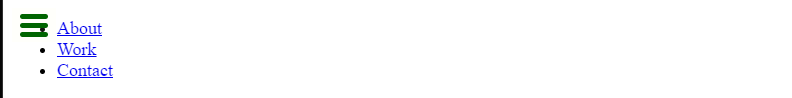
1. Creating a Navbar: The Navbar is a top section of the website where different navigation links are added in one place so that users can easily go to different sections just by clicking on different menu items. Now, using the unordered list tag with different list items, we will create a list of items such as “About,” “Work, “and””Contact.” We will add a hyperlink to all the navigation menus using the <a> tag.
<!-- START NAV -->

  <nav id="navbar" class="nav">
    <ul class="nav-list">
      <li>
        <a href="#welcome-section">About</a>
      </li>
      <li>
        <a href="#projects">Work</a>
      </li>
      <li>
        <a href="#contact">Contact</a>
      </li>
    </ul>
  </nav>

  <!-- END NAV -->
2. Welcome and Project Section:
Section tag is a block-level element tag that helps in creating a particular section for each project tiles. We will set the heading of our personal website as I am Mimic, and using the
tag, we will add some text about our personal welcome section.
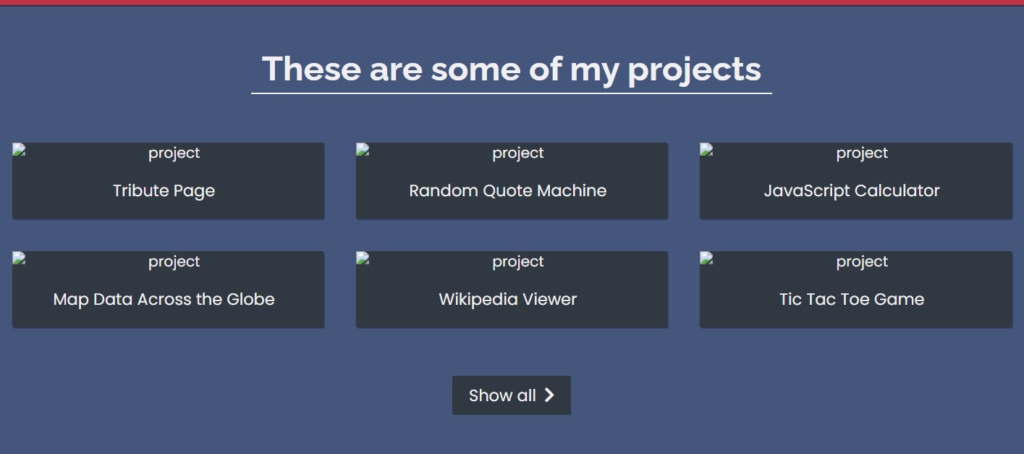
Project section: We will create a grid section for our project where we will be adding images, resources, and other related materials that can be shared with the regulators if they want to run background changes.
<!-- START WELCOME SECTION -->
<section id="welcome-section" class="welcome-section">
<h1>Hey I am Mimic</h1>
<p>a web developer</p>
</section>
<!-- END WELCOME SECTION -->
<!-- START PROJECTS SECTION -->
<section id="projects" class="projects-section">
<h2 class="projects-section-header">These are some of my projects</h2>
<div class="projects-grid">
<a href="https://codepen.io/freeCodeCamp/full/zNqgVx" target="_blank" class="project project-tile">
<img class="project-image" src="https://raw.githubusercontent.com/freeCodeCamp/cdn/master/build/testable-projects-fcc/images/tribute.jpg"
alt="project" />
<p class="project-title">
<span class="code"><</span>
Tribute Page
<span class="code">/></span>
</p>
</a>
<a href="https://codepen.io/freeCodeCamp/full/qRZeGZ" target="_blank" class="project project-tile">
<img class="project-image" src="https://raw.githubusercontent.com/freeCodeCamp/cdn/master/build/testable-projects-fcc/images/random-quote-machine.png"
alt="project" />
<p class="project-title">
<span class="code"><</span>
Random Quote Machine
<span class="code">/></span>
</p>
</a>
<a href="https://codepen.io/freeCodeCamp/full/wgGVVX" target="_blank" class="project project-tile">
<img class="project-image" src="https://raw.githubusercontent.com/freeCodeCamp/cdn/master/build/testable-projects-fcc/images/calc.png" alt="project" />
<p class="project-title">
<span class="code"><</span>
JavaScript Calculator
<span class="code">/></span>
</p>
</a>
<a href="https://codepen.io/freeCodeCamp/full/mVEJag" target="_blank" class="project project-tile">
<img class="project-image" src="https://raw.githubusercontent.com/freeCodeCamp/cdn/master/build/testable-projects-fcc/images/map.jpg" alt="project" />
<p class="project-title">
<span class="code"><</span>
Map Data Across the Globe
<span class="code">/></span>
</p>
</a>
<a href="https://codepen.io/freeCodeCamp/full/wGqEga" target="_blank" class="project project-tile">
<img class="project-image" src="https://raw.githubusercontent.com/freeCodeCamp/cdn/master/build/testable-projects-fcc/images/wiki.png" alt="project" />
<p class="project-title">
<span class="code"><</span>
Wikipedia Viewer
<span class="code">/></span>
</p>
</a>
<a href="https://codepen.io/freeCodeCamp/full/KzXQgy" target="_blank" class="project project-tile">
<img class="project-image" src="https://raw.githubusercontent.com/freeCodeCamp/cdn/master/build/testable-projects-fcc/images/tic-tac-toe.png"
alt="project" />
<p class="project-title">
<span class="code"><</span>
Tic Tac Toe Game
<span class="code">/></span>
</p>
</a>
</div>
<a href="https://codepen.io/FreeCodeCamp/" class="btn btn-show-all" target="_blank">Show all<i class="fas fa-chevron-right"></i></a>
</section>
<!-- END PROJECTS SECTION -->Contact Section and Footer Section:
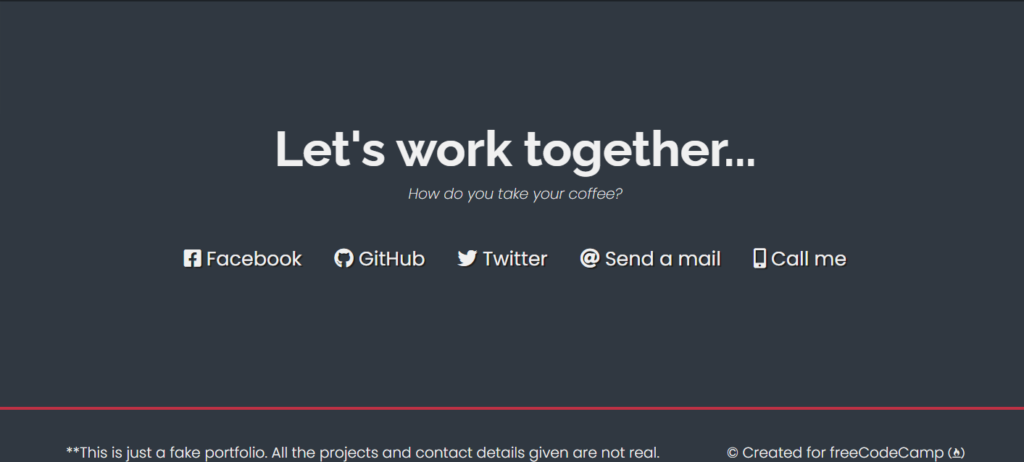
It’s important to build a network and connect with new people for better growth and reach. We will create a contact section using the section tag with the ID “Contact,” and inside our section tag we will create a div tag, a block-level element. Then, inside our contact section container, we will create a heading for our contact section using the <h2> tag selector.
Also, using the div tag with class contact links, we will add some social media contact links, and using the fontawesome classes, we will add the fontawesome icon.
Now we will be creating a footer section, and using the <p> tag, we will add the copyright information of the paragraph, and using the <a> tag, we will add the link for our different social media accounts.
<!-- START CONTACT SECTION -->
<section id="contact" class="contact-section">
<div class="contact-section-header">
<h2>Let's work together...</h2>
<p>How do you take your coffee?</p>
</div>
<div class="contact-links">
<a href="https://facebook.com/freecodecamp" target="_blank" class="btn contact-details"><i class="fab fa-facebook-square"></i> Facebook</a>
<a id="profile-link" href="https://github.com/freecodecamp" target="_blank" class="btn contact-details"><i class="fab fa-github"></i> GitHub</a>
<a href="https://twitter.com/freecodecamp" target="_blank" class="btn contact-details"><i class="fab fa-twitter"></i> Twitter</a>
<a href="mailto:example@example.com" class="btn contact-details"><i class="fas fa-at"></i> Send a mail</a>
<a href="tel:555-555-5555" class="btn contact-details"><i class="fas fa-mobile-alt"></i> Call me</a>
</div>
</section>
<!-- END CONTACT SECTION -->
<!-- START FOOTER SECTION -->
<footer>
<p>
**This is just a fake portfolio. All the projects and contact details given
are not real.
</p>
<p>
© Created for
<a href="https://www.freecodecamp.com/" target="_blank">freeCodeCamp <i class="fab fa-free-code-camp"></i></a>
</p>
</footer>
<!-- END FOOTER SECTION -->
</body>
</html>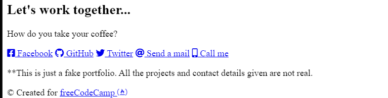
Styling Personal Webpage:
Basic and Responsive Styling:
Using the root selector, we will predefine some variables for different CSS properties that are common in most parts of the website, so we will declare some common variables, and then we will just use the variables for those properties. We will create variables for different color schemes, such as white,red,blue,and gray.
Then we will reset all the padding and margin from the default browser’s padding and margin.
Now using the HTML tag selector, we will be adding some basic styling to our personal webpage, and also using the different media query properties, we will make our personal webpage responsive for different screen sizes. Using the multiple media query property, we have made our personal page responsive for different screen sizes.
* Custom properties/variables  */
:root {
  --main-white: #f0f0f0;
  --main-red: #be3144;
  --main-blue: #45567d;
  --main-gray: #303841;
}

/* Base reset */
* {
  margin: 0;
  padding: 0;
}

/* box-sizing and font sizing */
*,
*::before,
*::after {
  box-sizing: inherit;
}

html {
  box-sizing: border-box;

  /* Set font size for easy rem calculations
   * default document font size = 16px, 1rem = 16px, 100% = 16px
   * (100% / 16px) * 10 = 62.5%, 1rem = 10px, 62.5% = 10px
  */
  font-size: 62.5%;
  scroll-behavior: smooth;
}

/* A few media query to set some font sizes at different screen sizes.
 * This helps automate a bit of responsiveness.
 * The trick is to use the rem unit for size values, margin and padding.
 * Because rem is relative to the document font size
 * when we scale up or down the font size on the document
 * it will affect all properties using rem units for the values.
*/

/* I am using the em unit for breakpoints
 * The calculation is the following
 * screen size divided by browser base font size
 * As an example: a breakpoint at 980px
 * 980px / 16px = 61.25em
*/

/* 1200px / 16px = 75em */
@media (max-width: 75em) {
  html {
    font-size: 60%;
  }
}

/* 980px / 16px = 61.25em */
@media (max-width: 61.25em) {
  html {
    font-size: 58%;
  }
}

/* 460px / 16px = 28.75em */
@media (max-width: 28.75em) {
  html {
    font-size: 55%;
  }
}

/* Base styles */

body {
  font-family: 'Poppins', sans-serif;
  font-size: 1.8rem; /* 18px */
  font-weight: 400;
  line-height: 1.4;
  color: var(--main-white);
}
Styling Common Elements:
Using the multiple tag selector, we will select the different headings and set the font family to “Raleway,” which was imported from Google. Using the link tag in the head section of the HTML file, and using the font-weight property, we will set the width of the font.
Also, we will set the height of the h1 and h2 tags to 6 rem and 4 rem.
Using the anchor tag selector, we will add a font color from the predefined variable, and using the img tag selector, we will set the image’s display type to “block.”.
h1,
h2 {
  font-family: 'Raleway', sans-serif;
  font-weight: 700;
  text-align: center;
}

h1 {
  font-size: 6rem;
}

h2 {
  font-size: 4.2rem;
}

ul {
  list-style: none;
}

a {
  text-decoration: none;
  color: var(--main-white);
}

img {
  display: block;
  width: 100%;
}
Styling Navbar:
Using the class selector (.navbar), we will set the display as “flex,” and using the justify-content property, we will set the justify-content as “flex-end.” Also, using the width property, we will set the width to 100%, and using the background property, we will set the background to a red background, and using the justify-content property, we will align the elements to the center of the webpage.
/* nav */

.nav {
  display: flex;
  justify-content: flex-end;
  position: fixed;
  top: 0;
  left: 0;
  width: 100%;
  background: var(--main-red);
  box-shadow: 0 2px 0 rgba(0, 0, 0, 0.4);
  z-index: 10;
}

.nav-list {
  display: flex;
  margin-right: 2rem;
}

@media (max-width: 28.75em) {
  .nav {
    justify-content: center;
  }

  .nav-list {
    margin: 0 1rem;
  }
}

.nav-list a {
  display: block;
  font-size: 2.2rem;
  padding: 2rem;
}

.nav-list a:hover {
  background: var(--main-blue);
}

Styling Welcome and Project Section:
Using the class selector (.welcome-section), we will set the display to “Flex,” and using the justify content property, we will justify the content to the center. Also, using the width property, we will set the width to 100%, and using the height property, we will set the height of the welcome section to 100 vh. Also, using the background-image property, we will set the background image to a linear gradient.
30+ Javascript Projects with Source Code
We will also style the elements of the welcome section using the child selector. We will set the font size of the paragraph to 3 rem, and using the font-weight property, we will set the font weight to 200.
styling project section:
We will style our project in grid form, where every project is created in the form of a card with an image of the project on top of the card, and along with the image, we will add a small description below about the project. Also, using the media query property, we will set the responsiveness of our project section for better user interaction.
/* Welcome section */

.welcome-section {
  display: flex;
  flex-direction: column;
  justify-content: center;
  align-items: center;
  width: 100%;
  height: 100vh;
  background-color: #000;
  background-image: linear-gradient(62deg, #3a3d40 0%, #181719 100%);
}

.welcome-section > p {
  font-size: 3rem;
  font-weight: 200;
  font-style: italic;
  color: var(--main-red);
}

/* Projects section */

.projects-section {
  text-align: center;
  padding: 10rem 2rem;
  background: var(--main-blue);
}

.projects-section-header {
  max-width: 640px;
  margin: 0 auto 6rem auto;
  border-bottom: 0.2rem solid var(--main-white);
}

@media (max-width: 28.75em) {
  .projects-section-header {
    font-size: 4rem;
  }
}

/* "Automagic" image grid using no media queries */
.projects-grid {
  display: grid;
  grid-template-columns: repeat(auto-fit, minmax(320px, 1fr));
  grid-gap: 4rem;
  width: 100%;
  max-width: 1280px;
  margin: 0 auto;
  margin-bottom: 6rem;
}

@media (max-width: 30.625em) {
  .projects-section {
    padding: 6rem 1rem;
  }

  .projects-grid {
    grid-template-columns: 1fr;
  }
}

.project {
  background: var(--main-gray);
  box-shadow: 1px 1px 2px rgba(0, 0, 0, 0.5);
  border-radius: 2px;
}

.code {
  color: var(--main-gray);
  transition: color 0.3s ease-out;
}

.project:hover .code {
  color: #ff7f50;
}

.project-image {
  height: calc(100% - 6.8rem);
  width: 100%;
  object-fit: cover;
}

.project-title {
  font-size: 2rem;
  padding: 2rem 0.5rem;
}

.btn {
  display: inline-block;
  padding: 1rem 2rem;
  border-radius: 2px;
}

.btn-show-all {
  font-size: 2rem;
  background: var(--main-gray);
  transition: background 0.3s ease-out;
}

.btn-show-all:hover {
  background: var(--main-red);
}

.btn-show-all:hover > i {
  transform: translateX(2px);
}

.btn-show-all > i {
  margin-left: 10px;
  transform: translateX(0);
  transition: transform 0.3s ease-out;
}
Styling Contact and Footer :
(.contact-section) class selector, we will add the style to the container of our contact section. We will set the display of the container as “flex,” and using the flex-direction property, we will set the flex direction as “column-wise.” Now, using the align items property, we will align the items to the center of the webpage.
Now, using the child element selector, we will set the font size of our contact section heading to 6 rem. We will add some padding and margin to different social media links, and using the align item property, we will align the items to the center of the webpage.
Styling footer section:
Using the footer tag selector, we will set the font weight to 300, and using the background property, we will set the background of the footer section to grey, and the display type is set to flex for the responsive footer section.
Also, using the media query property, we will add responsiveness to our footer section. Using the maximum width property, we will set the screen width condition. If the screen of the device is below the defined screen size, the content of the footer section will automatically adjust according to the screen size.
/* Contact section */

.contact-section {
  display: flex;
  flex-direction: column;
  justify-content: center;
  align-items: center;
  text-align: center;
  width: 100%;
  height: 80vh;
  padding: 0 2rem;
  background: var(--main-gray);
}

.contact-section-header > h2 {
  font-size: 6rem;
}

@media (max-width: 28.75em) {
  .contact-section-header > h2 {
    font-size: 4rem;
  }
}

.contact-section-header > p {
  font-style: italic;
}

.contact-links {
  display: flex;
  justify-content: center;
  width: 100%;
  max-width: 980px;
  margin-top: 4rem;
  flex-wrap: wrap;
}

.contact-details {
  font-size: 2.4rem;
  text-shadow: 2px 2px 1px #1f1f1f;
  transition: transform 0.3s ease-out;
}

.contact-details:hover {
  transform: translateY(8px);
}

/* Footer */

footer {
  font-weight: 300;
  display: flex;
  justify-content: space-evenly;
  padding: 2rem;
  background: var(--main-gray);
  border-top: 4px solid var(--main-red);
}

footer > p {
  margin: 2rem;
}

footer i {
  vertical-align: middle;
}

@media (max-width: 28.75em) {
  footer {
    flex-direction: column;
    text-align: center;
  }
}
final Video Output:
Conclusion:
Hopefully, the above tutorial has helped you to know how to create this personal website using HTML and CSS source code.
Here we have learned how to use a personal website using HTML and CSS. Next time, I am going to write an article on how online bookstores use HTML and CSS. Please give us your valuable feedback on how you like this personal website using HTML and CSS.
If you like the project, don’t forget to follow our website, foolishdeveloper.com.
Codepen by: Subo
Author: Arun
