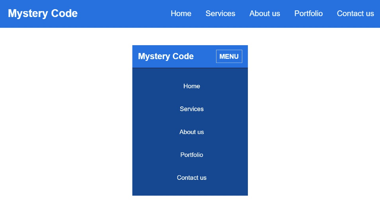
In this article, you will learn how Responsive Top Navigation Menu Bar is created using HTML and CSS. Earlier I designed many more types of menubars.
The beauty and quality of a website depend a lot on the navigation bar. All types of site content can be nicely stored in this navbar. As a result, the user will be able to find the information he needs very easily and quickly.
Responsive Top Navigation Menu Bar using HTML CSS
Every website uses a menu bar. However, some sites now use the sidebar menu. Earlier I showed you how to create a sidebar menu. I used HTML and CSS to create this design. @media of CSS has helped to make it fully responsive.
This is a very simple project. First I created this basic structure. Then I added a title. Then I added five menu items here. If you want to add a dropdown with these items. Then you can see another design made by me. We have made it responsive so that the design looks beautiful on all devices. Follow the step-by-step tutorial below to create this design.
Step 1: Basic structure of Navigation Menu
I have created the basic structure of this navigation using the HTML and CSS code below. Navbar height: 70px and background color blue. You can use any other color instead of this blue color.
Step 2: Create a logo in the navbar
Has now created a logo in the menu bar. I used text to create the logo here. I have added font-size: 26px to increase the text size a bit.
Step 3: Add menu item in Top Navigation
Now I have added the menu items to the menu bar. Added five menu items here. However, you can add menu items of your choice. Here the font size of the menu item: 26px and padding: 0 15px is used to maintain some distance between each item.
Step 4: Create menu button for Responsive device
Above we designed it for the desktop. Now you have to add some elements in it which will be useful for mobile or small devices.
Now I have created a menu button which can be seen mainly in the case of mobile. In the case of mobile, all the menu items will be hidden and this menu button will be available instead. When you click on this menu button, you will see all the menu items.
I have used the JavaScript below to execute that button.
Step 5: Make the Top Navigation Menu Bar Responsive
Now I have made this top navigation menu bar responsive using CSS. In the case of desktops, menu items can be seen side by side.
Hopefully from this tutorial, you have learned how to create responsive top navigation menus using HTML and CSS. You can check out this article if you want to add a dropdown to this design. You can definitely comment on how you like the article.
If you have any problems creating the Top Navigation Menu, you can ask directly on Instagram(@foolishdeveloper).


