A circular Progress Bar is an interesting web element that is used to show the progress of something.
This type of Progress Bar is used in different types of websites such as personal, business websites. Which helps to show qualifications, services, etc. nicely through animation.

Earlier I showed you how to make Circular Progress Bar with the help of Bootstrap and JQuery. However, there are many beginners who do not know jQuery or bootstrap. I have created an animated progress bar design for them using pure CSS.
As I have said before, this design is important enough to show the information of education, experience, product, etc. on different service websites or portfolio websites.
If you visit different types of personal sites then you can see this design. There the developers organize their knowledge about different programming languages using such Circular Progress Bar. Below is a live demo that will help you learn how this Circular Progress Bar works.
See the Pen
Pure CSS Percentage Circle by Foolish Developer (@fghty)
on CodePen.
Hopefully, the above design has completely satisfied you. It requires basic knowledge of HTML and CSS to make it.
Circular Progress Bar using HTML and CSS
Below I have shared a complete step-by-step tutorial that will undoubtedly make any beginner an expert in making this type of design.
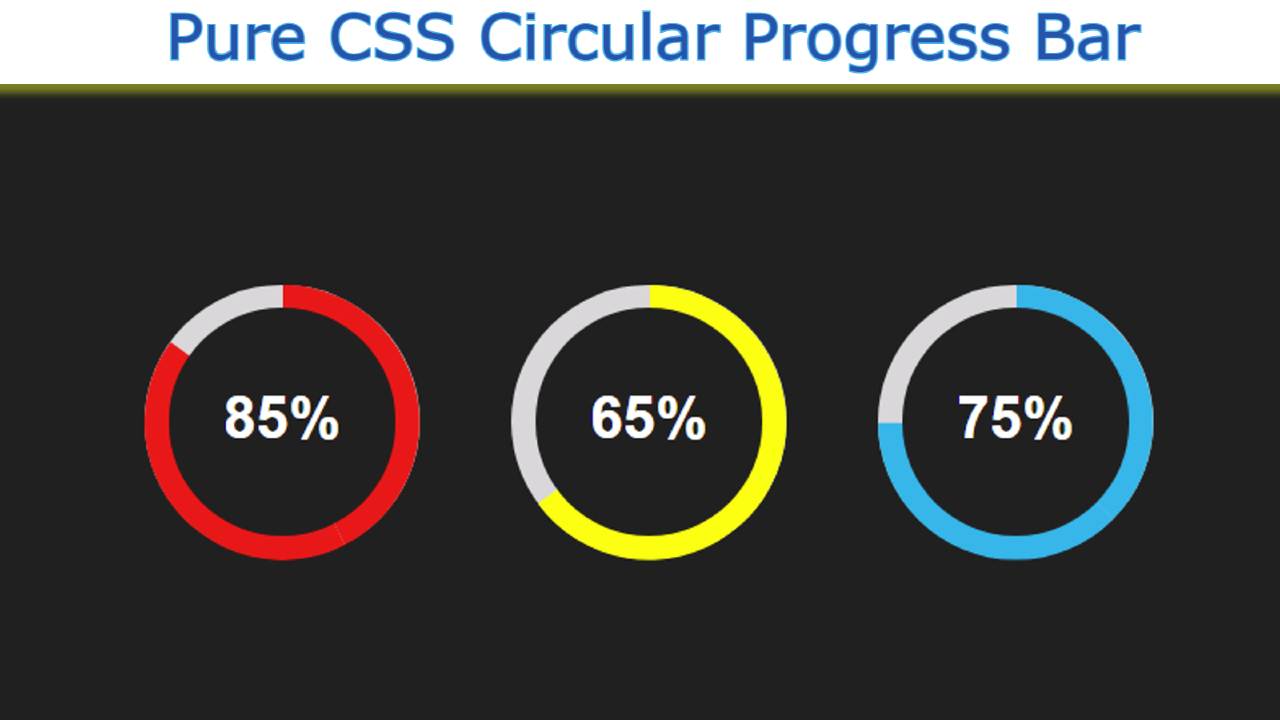
Before sharing the tutorial, let me give you some information about this design. Here I have created three Circular Bars. We have created different percentages and different colors for everyone. You can easily change the percentage and color to your liking.
Progress will be completely zero when you open the webpage. Then slowly pre-scheduling means the animation will arrive. Let’s learn how to make it with the help of the tutorial below.
Step 1: Design the web page
I designed that page using the following codes. Here I have used black as the background color of the webpage. You can use any color you want according to your need.

I have added all the bars in the dev below.
Step 2: Create the basic structure of the progress bar
Using these codes, I have created the basic structure of this Circular Progress Bar. Here the length and height of this circle is 150 px. Here the background color is white and border-radius: 50% has been used to make it completely round.

Step 3: Add all the information using HTML
I have added complete information using this CSS and HTML code.
Let me say here that this circle has been divided into two parts. The following code has been used to create the first part.
I have used the following code to create the other half.
I have designed some basics using the CSS code below.
Now I will add animation to it for which the following CSS codes have been used. Here background-color I have used red and instructed to animate it from zero to 153-degree angle. For this I have given the required degree using transform: rotate ().
In the case of the first Circular Progress Bar, I am using 85%, so here I have used 306/2 = 153 degrees.I used 306 here because a circle is formed by 360 degrees. 85% of 360 is 306.I divided the 306 into two because I divided this progress bar animation into two parts. So if you use 153 degree animation in each part, 85% of the circle will be filled with color.
Step 4: Add animation to the Circular Progress Bar
Using the animation tag here, I have set a time of three seconds, which means that the whole animation will take three seconds to take effect. I used @keyframes to make this animation work nicely. Here we have used transform: rotate (0deg) for 0%.
This means that when the web page is loaded, it will be completely 0. Then here in the case of 100% transform: rotate (153deg) will be reached.

Step 5: Add text to show percentages
Now in the middle of its design, I have added a text which has been used for the work of percentage. The width and height of the background of this text are 124 px. Border-radius: 50% helped to make it completely round.
I have set the background color to be equal to the background color of the web page and have placed it in the very center of the circle. As a result, the middle part of this CSS Circular Progress Bar is covered. This makes it look like a progress bar.

Step 6: Create more animated Circular progress bars
Hopefully, in the above tutorial, I have fully explained how I created this element. Now I will design two more Circular Progress Bar HTML CSS following the same procedure.


Hopefully from this tutorial you have learned how I designed this Circular Progress Bar using HTML and CSS code.
In the meantime, I have shown you how to create a Circular Progress Bar using Bootstrap. Be sure to comment on how you like this article. You can use the download button below to download the source code required to create it.