Love is a long-lasting, original, and valuable emotion for a particular person. Everyone loves someone so much that they can do anything for their love to last forever. The base or the root of life is started by love itself. Love is not all about love for one partner. Love is for all; you can love friends, family, partners, or animals in this world; the pure relation with whom your vibes match up is love only.
The one thing that matters in love is respect and care for each other. Standing together through the ups and downs of life. Most people find it difficult to express their love for them. We have used technology to create an animated and unique way to express their feelings and their love for their loved ones.
We have used HTML and CSS to create a love message that you can share with your family members, partners, and friends. Whoever you love, you can share it with them. Expressing love technically and uniquely is the specialty of the developer, so we will teach you the step-by-step method of creating a unique love message using HTML and CSS.
I hope you get some basic idea of what we are going to do in this article. We will be using HTML and CSS to create our I Love You message with a unique design and animation that will be more attractive and unique.
Let’s start with a simple example of creating a basic structure for our I Love You Code using HTML and CSS. But before that, let’s take a look at the live demo of the project.
Live Demo:
See the Pen I love you by Benjamin Zanatta (@benjaminzanatta) on CodePen.
Now we will add a unique touch and animation to our I love you code using HTML and CSS. But before that, we need to understand some of the basic CSS concepts that we will be using in our project.
What is CSS Animation?
An animation is a CSS property that changes the dimension, color, position, background, and movement from one state to another state. Animation is formed by creating keyframes at different proportions. This property helps in creating a unique and dynamic design inside the website for greater user experiences.
What is the Syntax of Animation Property?
div {
  width: 200px;
  height: 200px;
  background-color: red;
  animation-name: example;
  animation-duration:zoom-in 4s;
}
Adding Structure Using HTML
We have used the basic HTML tags for creating the structure of our I love you code. Using the <div> tag with the class wrapper, we will create a container that will contain all the animation and structure of our I love you code.
Then, inside our container, using the input tag with type checkbox, we will create a checkbox for creating an animation, and then, using the label property, we will add the text for the checkbox. In a similar manner, we will create two more checkboxes with labels for creating the different elements of the I love you code.
<div class="wrapper">
  <input type="checkbox" id="ck1"/>
  <label for="ck1">I</label>
  <input type="checkbox" id="ck2"/>
  <label for="ck2">love</label>
  <input type="checkbox" id="ck3"/>
  <label for="ck3">you</label>
</div>

<span>(Click on words)</span>
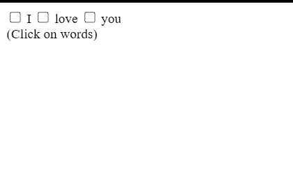
HTML Output:
Styling I love you code (CSS)
First of all, using the Google Imports link, we will import new font faces for our I love you code, and then, using the HTML tag selector, we will add some basic styling to the webpage. We will set the width and height of the website to 100%, and using the table-layput property, we will fix the table layout.
Now, using the body tag selector, we will set the font family to “Shadow Into Light” to change the fontfaces of our I love you code.
@import url(https://fonts.googleapis.com/css?family=Shadows+Into+Light);

html {
  display: table;
  width: 100%; height: 100%;
  table-layout: fixed;
}

body {
  display: table-cell;
  width: 100%; height: 100%;
  vertical-align: middle;
  font-family: 'Shadows Into Light';
  color: #111;
}
Styling container and Element:
Now using the class selector property (.wrapper) we will set the width as 500px and using the height property we will set the height of the container as 500px , also using the margin property we will set the margin to zero .
now using the input tag selector with type checkbox we will set their display to none and we will hide the checkbox.Now selecting checkbox and label together we will set the width as 100px and using the line-height property we will set the line height as 100px of the input text and using the transition property we will set the transition as ease with 1 second duration
.wrapper {
  width: 500px; height: 500px;
  position: relative;
  margin: 0 auto;
}

input[type="checkbox"] {
  display: none;
}

input[type="checkbox"] + label {
  width: 100px; height: 100px;
  line-height: 100px;
  display: inline-block;
  position: absolute;
  text-align: center;
  font-size: 100px;
  transition: all 1s ease;
}

label {
  text-shadow: 8px 8px 30px rgba(0,0,0,0.5);
}
  label:hover {
    color: #c32a2a;
    cursor: pointer;
  }
Now we will be adding the checked list property to our element. We will set the border radius to 50px, and using the top property, we will set the top position to 0px. We will be adding the background to our checked label and setting the background color to red with a smooth transition. Now again, using the class selector property, we will select the element and transform it to 45 degrees with different widths and heights of the element. We will be creating a heart shape using the transform, height, and width properties.
#ck1 + label,
#ck2 + label {
  border-radius: 50px;
  top: 0;
}

#ck1:checked + label,
#ck2:checked + label,
#ck3:checked + label {
  background: #c32a2a;
  font-size: 0;
  transition: all 1s ease;
}

#ck1:checked + label,
#ck2:checked + label {
  width: 300px; height: 300px;
  border-radius: 150px;
  line-height: 300px;
}

#ck1 + label {
  left: 0;
}

#ck2 + label {
  right: 0;
}

#ck3 + label {
  bottom: 0; left: 50%;
  margin: 0 -50px;
}
  #ck3:checked + label {
    width: 275px; height: 275px;
    bottom: 96px; left: 162px;
    transform: rotate(45deg);
    line-height: 27px;
  }

span {
  display: inline-block;
  text-align: center;
  position: absolute;
  bottom: 10px; left: 50%;
  margin-left: -100px;
  width: 200px;
  font-size: 24px;
  color: #999;
}
final output:

Final Video Output:
Conclusion
I hope you get the idea of the project. We just attempted to make the entire thing more beginner-friendly by breaking it down step by step. We advise beginners to read and understand this article first, and then Try creating a unique and customizable I love you, Code. Using CSS, we have finished our I love you code using CSS project. Please feel free to leave a comment below if you have any doubts.
If you like the project, don’t forget to follow our website, foolishdeveloper.com.
Author: Arun

![Read more about the article Number Guessing Game in React JS [Step By Step]](https://foolishdeveloper.com/wp-content/uploads/2023/05/maxresdefault-300x169.webp)
