
A modern website contains multiple sections and multiple pages. They are collections of large websites, and finding the specific information on these types of websites is a bit tough, so to overcome that problem and provide a great user experience for the website so that more and more users visit the website, We create navbars that provide ease of access to visit different parts of the website easily.
Modern websites are also equipped with responsive navbars so that users can easily navigate forth and back to different sections. We will be using HTML and CSS to create responsive navbars that will make our website more helpful and user-friendly.
Before we start with our navigation bar using HTML and CSS, we need to understand some of the important topics about navigation bars.
What is a Navigation Bar?
A navigation bar is a website element that is present mainly on the top of the website and that remains fixed throughout the website so that if the user scrolls down below and wants to access some other section or pages, they can easily go to the particular section using the navigation bar, which contains different navigation links for different sections.
30+ Projects Using HTML and CSS
What are the different types of Navigation bars?
- Top Bar (Navbar).
- Side Bar.
- Hamburger Menu.
- bottom Navigation bar.
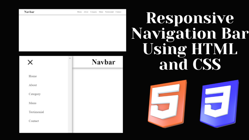
In this article, we will be creating a top navigation bar using HTML and CSS, which is a responsive navbar that adjusts according to the screen size of the device for a better user experience.
let’s take a look at the live demo of the website.
Adding the Structure:
First of all, we will add a basic HTML structure for our navbar using the <HTML> tag, then use the head tag and its child title tag to add the title of the webpage, and then inside the body tag, we will use the predefined tag in HTML for the navbar. Using the tag <nav> with the class navbar. We will create a section for our navigation bar and then inside our navbar a block-level element <div>, which helps in creating the container for our different navigation links. First of all, we will create a checkbox using the input tag with type checkbox, which we will be using in CSS for the checked property of the responsive navbar.
Now we will create a section for ham burger lines, which we will be using for small devices, and then we will be using the list property to create different navigation links such as home, services,about , menu, testimonial, and contact.
Also, we will be using the <h1> tag to create the heading of our navigation bar.
<html lang="en">
<head>
<meta charset="UTF-8">
<meta http-equiv="X-UA-Compatible" content="IE=edge">
<meta name="viewport" content="width=device-width, initial-scale=1.0">
<title>Navbar</title>
</head>
<body>
<nav class="navbar">
<div class="navbar-container container">
<input type="checkbox" name="" id="">
<div class="hamburger-lines">
<span class="line line1"></span>
<span class="line line2"></span>
<span class="line line3"></span>
</div>
<ul class="menu-items">
<li><a href="#">Home</a></li>
<li><a href="#">About</a></li>
<li><a href="#">Category</a></li>
<li><a href="#">Menu</a></li>
<li><a href="#">Testimonial</a></li>
<li><a href="#">Contact</a></li>
</ul>
<h1 class="logo">Navbar</h1>
</div>
</nav>
</body>
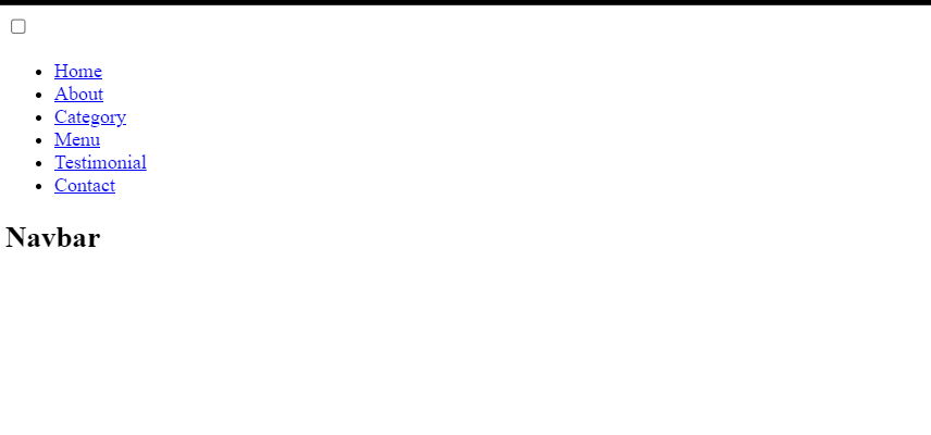
</html>HTML output:
Styling Navbar (CSS):
1. Basic Styling: Using the universal selector with the before and after properties, we will set the box-sizing of the website’s border box so that our navigation bar covers the complete space, and we will also set the padding and margin to zero from the browser default padding.
*,
*::after,
*::before{
    box-sizing: border-box;
    padding: 0;
    margin: 0;
}

.html{
    font-size: 62.5%;
}
2. Styling Navbar Section & Container:
We will set the checkbox’s display to none by using the class selector (.navbar) with child element input. The container will now automatically have a margin applied to it when we set the maximum width to 1200 pixels using the class selector (.container) and the width value to 90%.
Now, using the class (.navbar), we will set up the website’s box shadow. We will also set the background color to white, the position property to “fixed,” and the z-index value to 100 to make it appear at the top of the page.
.navbar input[type="checkbox"],
.navbar .hamburger-lines{
    display: none;
}

.container{
    max-width: 1200px;
    width: 90%;
    margin: auto;
}

.navbar{
    box-shadow: 0px 5px 10px 0px #aaa;
    position: fixed;
    width: 100%;
    background: #fff;
    color: #000;
    opacity: 0.85;
    z-index: 100;
}

.navbar-container{
    display: flex;
    justify-content: space-between;
    height: 64px;
    align-items: center;
}

3. Styling logo and Navigation Menu :
We’ll set the order to two using the class selector property (.menu-items), and we’ll set the display to “flex” using the display property. We’ll set the logo’s font size to 2.3 rem and its order to 1 so that it appears first using the logo class selector.
We will now update the navigation link’s list style to its current state, add a 1.5 rem margin left, and set the unordered list’s font size to 2.3 rem using the font size property.
Create Portfolio Website Using HTML and CSS
Now, using the media query property, we will add responsiveness to the website, and as the screen size goes below the defined screen size, the opacity of the navbar decreases to 0.75. Also, we will be styling our hamburger line; we will design the width, height, and position of the navigation bar.
.menu-items{
    order: 2;
    display: flex;
}
.logo{
    order: 1;
    font-size: 2.3rem;
}

.menu-items li{
    list-style: none;
    margin-left: 1.5rem;
    font-size: 1.3rem;
}

.navbar a{
    color: #444;
    text-decoration: none;
    font-weight: 500;
    transition: color 0.3s ease-in-out;
}

.navbar a:hover{
    color: #117964;
}

@media (max-width: 768px){
    .navbar{
        opacity: 0.95;
    }

    .navbar-container input[type="checkbox"],
    .navbar-container .hamburger-lines{
        display: block;
    }

    .navbar-container{
        display: block;
        position: relative;
        height: 64px;
    }

    .navbar-container input[type="checkbox"]{
        position: absolute;
        display: block;
        height: 32px;
        width: 30px;
        top: 20px;
        left: 20px;
        z-index: 5;
        opacity: 0;
        cursor: pointer;
    }

    .navbar-container .hamburger-lines{
        display: block;
        height: 28px;
        width: 35px;
        position: absolute;
        top: 20px;
        left: 20px;
        z-index: 2;
        display: flex;
        flex-direction: column;
        justify-content: space-between;
    }

Class selector (.navbar) and child element selector (.menu-items): we’ll set a 100px padding top and use the background attribute to change the background to “white.” We will change the display to flex and add a 40px margin and 40px left padding by using the display property.
Now that the position is set to “Absolute,” we will add a 10px top property and a 10px right property using the logo class selector.
We will now set the checked property using the checked CSS property. The navigation menu grows and shows down if the checked property is set, and the hamburger hides when the navbar is unchecked.
 .navbar .menu-items{
        padding-top: 100px;
        background: #fff;
        height: 100vh;
        max-width: 300px;
        transform: translate(-150%);
        display: flex;
        flex-direction: column;
        margin-left: -40px;
        padding-left: 40px;
        transition: transform 0.5s ease-in-out;
        box-shadow:  5px 0px 10px 0px #aaa;
        overflow: scroll;
    }

    .navbar .menu-items li{
        margin-bottom: 1.8rem;
        font-size: 1.1rem;
        font-weight: 500;
    }

    .logo{
        position: absolute;
        top: 10px;
        right: 15px;
        font-size: 2.5rem;
    }

    .navbar-container input[type="checkbox"]:checked ~ .menu-items{
        transform: translateX(0);
    }

    .navbar-container input[type="checkbox"]:checked ~ .hamburger-lines .line1{
        transform: rotate(45deg);
    }

    .navbar-container input[type="checkbox"]:checked ~ .hamburger-lines .line2{
        transform: scaleY(0);
    }

    .navbar-container input[type="checkbox"]:checked ~ .hamburger-lines .line3{
        transform: rotate(-45deg);
    }

}

@media (max-width: 500px){
    .navbar-container input[type="checkbox"]:checked ~ .logo{
        display: none;
    }
}
final Output:
Conclusion
Hopefully, the above tutorial has helped you to know how this Responsive Navigation Bar using HTML and CSS works.
Here we have learned how to use the Navigation Bar Using HTML and CSS. Next time, I am going to write an article on how personal website using HTML and CSS. Please give us your valuable feedback on how you like this Navigation Bar Using HTML and CSS.
If you like the project, don’t forget to follow our website, foolishdeveloper.com
Author: Arun