Login forms and registration forms are important sections of a website that help provide security to the website and provide a private interface for every user so that their data can remain private and not be misused by any third party.
A registration form is used for entering the user details on the website for the first time when creating an account for the user, so that a unique username and password are generated for the user to use the services of the website privately.
Login forms are used by the user when he or she visits the same website again. To access the user’s personal space, the user needs to enter a unique username and password to log on to the website.

In this article, you will learn how to create a login and registration forms using HTML, CSS, and JavaScript programming code. We all know that a login form is a design that is used in every website. The user can access his account using the login form.
Different types of login forms are used on different websites. I have already shown you many types of designs. In this design, we can do both login and registration in one form. Basically, we create separate forms for login and registration.
12+ CSS Rain Effect | Simple Rain Animation Effect
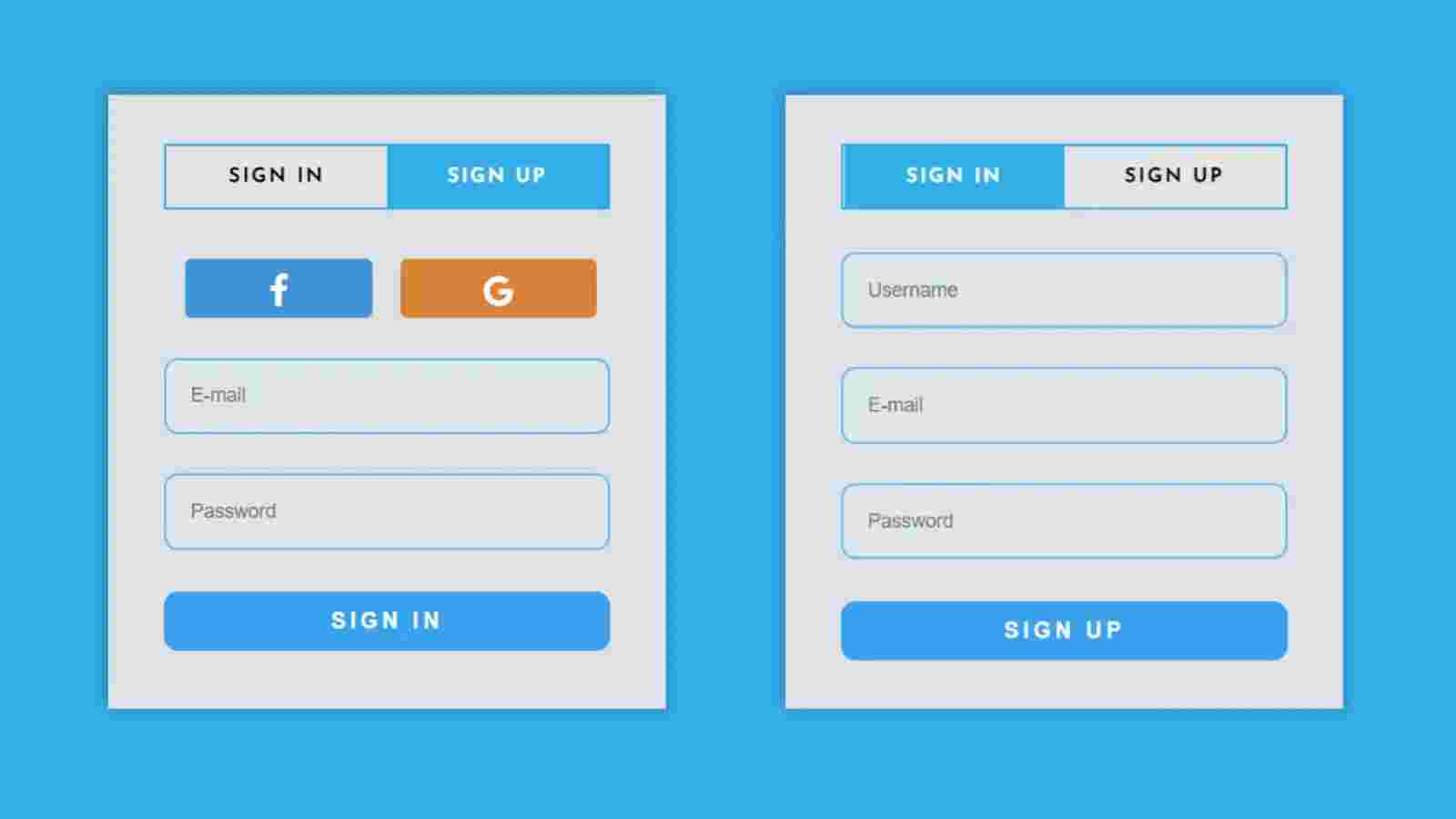
But in this case, you can do two types of work in one form. First of all, when you open this login form, there will be a complete interface for login.
Login and Registration Form [Live Demo]
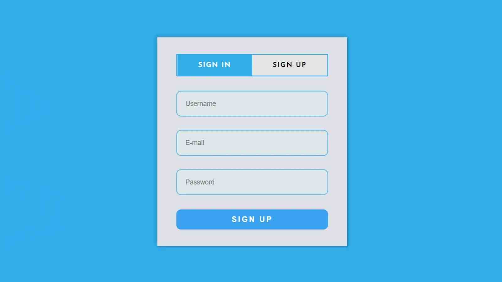
When you want to register, clicking on the registration button at the top will open the registration page. You can register here with your username, e-mail id, password. This is a simple and beautiful design.
In this case, I have used Jquery programming code. To activate the menu bar in this login form. If you want to know how this design works then you must check out the demo below.
live Demo:
As you can see above, first of all, I used the background blue of the home page and created a nice login form on it. First of all, I created two buttons in the login form. Clicking on which will open the login and registration form. In general, the login form can be seen by clicking on it.
Login and Registration Form in HTML CSS
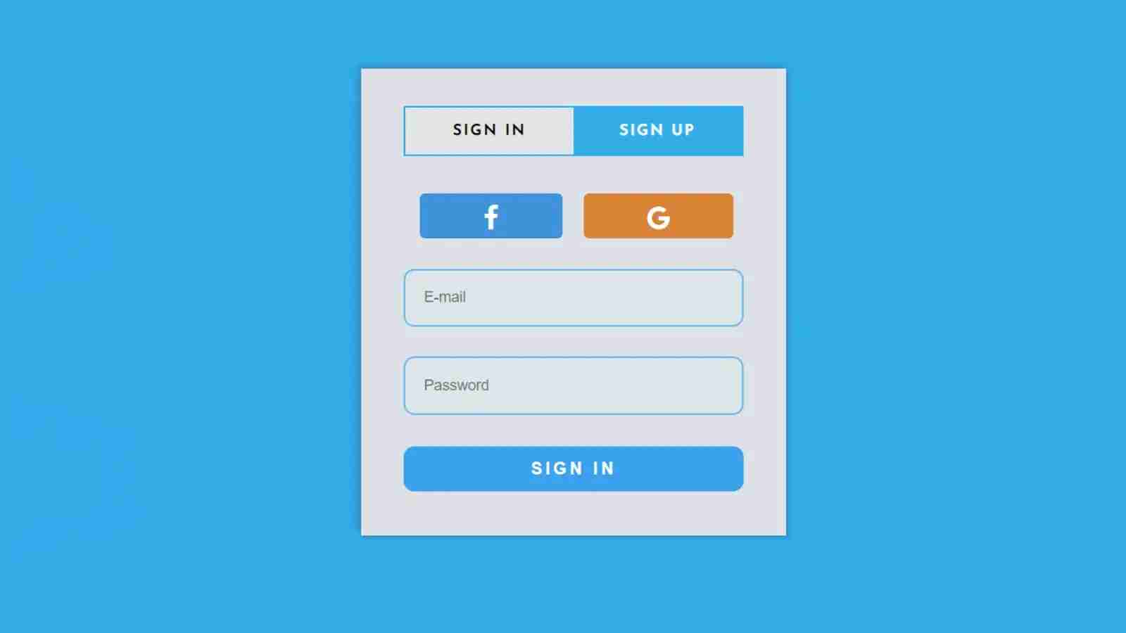
In the first login form, I have made two buttons of Facebook and Google so that you can also log in with the help of social media. Below is the space to input the email ID and password.
Below I have created a login button. To register, click on the registration button on the top. If you click on that button, you will see the registration form. First of all in this form I have made a place to input username e-mail, ID, and password. Then I added a nice button in the same way. I used the Jquery programming code to execute the menu bar.
If you want the source code to create it, use the download button below. If you want to know how I made it then you must follow the tutorial below step by step. In the following tutorial, I have shown step by step how this login form has been created based on any programming code.
Step 1: Create the structure of the login form
First of all, copy the HTML structure below and add it to your Html file. In this case, you will see that I have added the query and font awesome CDN link in the head section of the HTML structure.
Of course, you have to put the link between these two in the HTML file. The font awesome link will help to highlight the icons and the jQuery link will help to execute the jQuery script.
The CSS code below has helped to design the background and add color to the background. In this case, I have used blue color as the background but you can change the color of your choice here. I have used the height of the login form 420px and absolute position.

Step 2: Create a menu bar
As you can see in the demo above, first of all, I used two buttons to open the login and registration page. The HTML and CSS code below helped to create those buttons. You need JavaScript enabled to view it. I have used a 2px border around this menu bar.
35+ Free JavaScript Games(Code+ Demo)
I kept the background white and used the background blue of the activated menu item. In the case of active items having different colors, you can easily understand which form is active.

Step 3: Add social media button
I used the following HTML and CSS programming code to add the two social media buttons in everyone’s first login form. I used 45 px from top to bottom using margin-top 45px.
I used different colors in the background for two social icons. I used blue for Facebook and purple for Google. As you can see I have used the icon in this case so you must add the CDN link.

Step 4: Create a place to input email and passwords
The following HTML and CSS codes have helped to make room for inputting email IDs and passwords. I made a nice login button with the background I used blue and 2 px blue color borders. I used the size of the text in the input space as 14px and the color black.
In this case, I took the background of the button I made and used white color in the text. It has a hove attached to it that will change the background of the button when you move or click the mouse on that button.
40+ Tailwind Login Form page (Free code + demo)
In this case, let me say that these buttons and input spaces will be valid in all cases, that is, the same will be valid in both the registration form and the login form. This means you don’t have to add CSS code for buttons and input space separately.
Step 5: Add the information of Registration Form
The username, e-mail ID, and password input in the registration form and the following code helped to create the registration button. As I said earlier, there is no need to add any CSS code separately.
Step 6: Activate menu bar by adding Jquery code
So far we have only designed it. Now we will implement the two menu buttons at the top. As you saw in the demo above, when you want to open the login form, click on the login button at the top of this form.
When you want the registration form, you can see the registration form by clicking the registration button. I used the jQuery code to make this thing work.

Final Video Output:
Conclusion:
Hope you learned from this tutorial how I created this login and registration form using HTML CSS and JQuery programming code. I have already made many more such designs and you can follow the designs if you want.
Forms are an important part of the websites because they help in collecting data from multiple users at the same time, which helps in analyzing the user’s needs. The forms are also used for the security purposes of the user’s data.
Source Code:
FAQ:
What is a Registration form?
A registration form is a user form data where user needs to create an account on the website for accessing the services by entering a unique username , email address and password for creating a personal space on the website.
What is the use of forms?
The uses of forms are:
1. Collecting data.
2. Enhancing Security.
3. Analysis data.
4. Improving Services.
