
In this article, I am going to show you how to create an Accordion Menu menu using HTML, CSS, and JavaScript code. Earlier I showed the design of many more types of Animated CSS accordion menus. Now it’s time to recreate it with JavaScript.
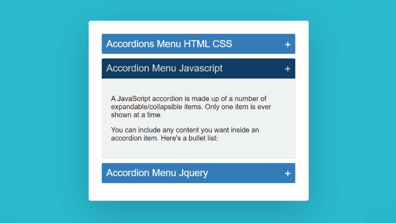
The responsive accordion menu has an original heading. When you click on that heading, all the information related to that heading can be seen below.
Accordion Menu is a modern content structure where a large amount of information can be neatly arranged in one place. This type of structure is used on different types of websites. This type of design is mainly used in the FAQ section or question-answer section.
This type of Accordion Menu is very important for arranging related questions and answers for different types of services. In addition, a large amount of text is arranged on different types of websites depending on the different headings.
Video Tutorial of Animated Accordion Menu
If you do not understand what I am saying then you can watch the video tutorial below. This video tutorial will help you to know how I made this simple javascript accordion.
We hope you have learned how to make this design from the video tutorial above.
I made a small box on a web page as you can see above. I used three headings in that box. I have given the background color to highlight those headings and made it a bit bigger in size. Then I added some amount of content under that heading.
Here you can add any type of content. Under normal circumstances, information is hidden. When you click on that heading, the information under that heading can be seen below.
You can use the demo section below to get a live experience of this design. Here you will find the required source code which you can copy and use in your own work.
See the Pen
Accordions Menu HTML CSS by Foolish Developer (@fghty)
on CodePen.
Hopefully, the demo above has helped you to know how this javascript accordion works.
How to Create Simple CSS Accordion Menu
Now I have shared with you how to make it in full detail below. If you are a beginner then you must follow the tutorial below to complete it perfectly. You can download the source code using the download button below the article.
Step 1: Create a box on the webpage
I designed that page using the HTML and CSS code below and created a box on the web page. As I said before, I have created a box on the web page here and I have added all the headings and information on it. Accordingly, I have created a box on the web page using the following HTML and CSS code. I have used the width of the box 500px and the background color is white.
I have used box-shadow to make it look brighter. I used border-radius: 5px to make the four of these boxes somewhat round.

Step 2: Add all the information in the Accordion Menu
Now I have added all kinds of headings and information using the following HTML codes. Below I have added three headings and their information in three steps. In place of this information, you can use images or something else. I have added 3 information sections here, you can increase or decrease the amount if you want.

Step 3: Design the information added above
I have now designed the information that I added using the HTML code above. First I designed the headings. I have used the heading font-size: 22px and background: # 2980b9. I used a plus sign (+) with each heading.

Step 4: Design this menu while it is closed
Now I have decided what this CSS accordion menu will look like when it is open and closed. First I designed the close condition using the following codes. Here I have used height: 0px of the content, which means that its content cannot be seen while it is close.

Step 5: Design this menu while it is open
Now I have designed the open state using the following CSS codes. This code determines how the content will appear when you click on these headings. No specific height of content is given here. This height will depend on the amount of content. Here background color I used white and used a light border around the content.

Step 6: Activate the Simple Accordion Menu Using JavaScript
Now I have activated this menu bar using JavaScript below. This means that when you click on a text, its related information will be seen. I used JavaScript code to activate this work.
First I set the constants of acordionItem and accordionItemHeading one by one. Because we know that no ID or class function can be used directly in JavaScript. So here I have determined a constant.
Now I have activated this Animated Accordion Menu menu bar using the JavaScript code below. Hope you know the basic javascript if you don’t know then you can watch the video tutorial above.

Hopefully from the above tutorial, you have learned how to create Accordion Menu using HTML, CSS, and JavaScript.
I have already made this kind of design through Bootstrap and JQuery. You can see them if you want.