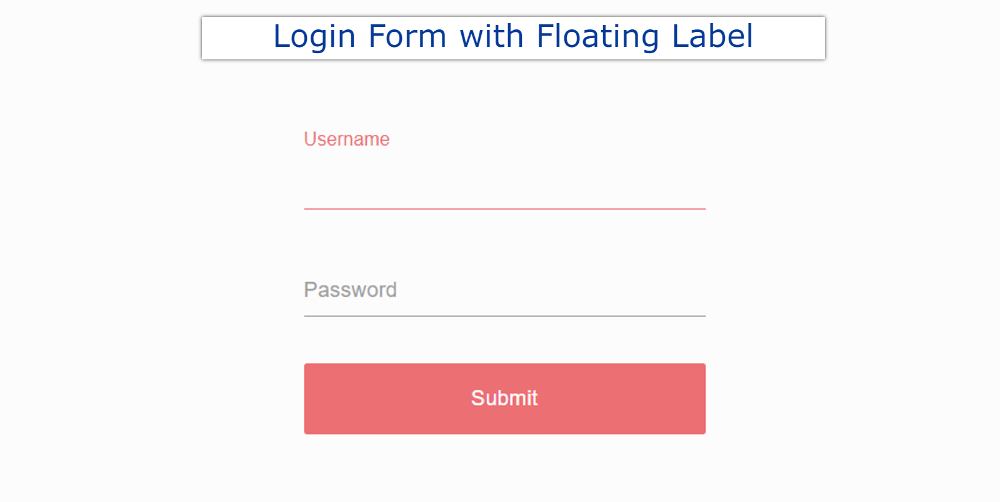
In this article, you will learn how to create a Login Form with Floating Label using HTML and CSS. Earlier I shared with you the design of different types of login forms. However, Floating Label animation has been added to this login form.
I used HTML and CSS to create this project (Login Form with Floating Label Animation). In normal forms, the label is fixed above the input box.
This label is in the input box. As you click on the input box, the label will move upwards. Usually, we use a placeholder in the input box. However, in many cases, the label is used.
Login Form with Floating Label
It is much more modern and beautiful than the ordinary input box. I used only HTML and CSS to create this modal login form with floating labels. No JavaScript is used here.
Below I have given a demo that will help you to know how it works. Here you will find the required source code and preview.
See the Pen
Login Form With Floating label by Foolish Developer (@foolishdevweb)
on CodePen.
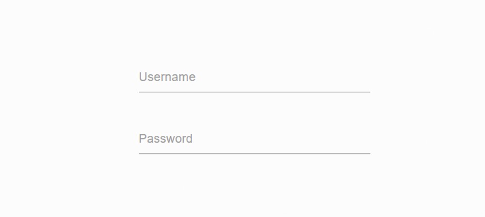
As you can see above, two input boxes have been created here. One label at a time has been used for the input box. Which is in that input box.
When you click on that input box, the label will go up a bit. This will change the color of the input box and label.
How to Create Animated Form Label in CSS
This Login Form with Floating Label is not very nice. But it will help you to understand how to create a Floating Label in the input box.
Step 1: Basic structure of login form
The following HTML code is the basic structure of this login form. Then the webpage is designed by CSS.
Step 2: Add input boxes and labels
I created the input boxes using the following HTML and CSS codes. One level at a time has been used in these input boxes.
I designed the input spaces using the following CSS codes. The width of the input space here is 300px and there is no border around the space.
Instead of a border around, only a 1-pixel border has been used at the bottom.
Step 3: Design the labels
These CSS Floating Labels have been designed using the following CSS. Here font-size: 16px is used to increase the size of the Floating Label.
Transform: translateY (30px) is used to keep the labels slightly down. As a result, the labels will be down 30px.
Step 4: Floating Label has been activated
This login Form with Floating Label has been implemented using the following CSS. These labels will move up when you click on the input box. Under normal circumstances, the transform is used to keep the labels down.
Labels are placed below 30px using transform. The instructions here are that when you click on the input box, the value of that transform will become zero. As a result, those levels will go up again.
Step 5: Create a login button
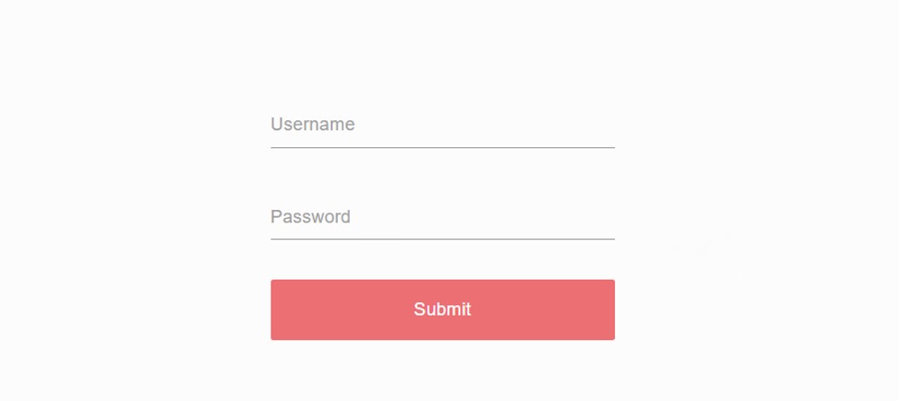
The buttons were created using the following HTML and CSS codes. The background color of the button is red and it is accompanied by a border of 2 pixels.
Different types of hover and color effects have been added to the login button using the following CSS. The background color of the buttons will change when the mouse is moved or clicked on the buttons.
Hopefully from the above tutorial, you have learned how I created this Login Form Card With a Floating label using HTML and CSS.
Earlier I shared with you many more types of label animation tutorials. If you like this article, you can follow those tutorials. You can use the download button below to download the required source code of this Login Form with Floating Label.

