In this tutorial, you will learn how to create a CSS Gradient Border using HTML and CSS. We use different types of borders in different places.
However, if different types of color animations are used on that border, its beauty increases a lot. Here I will show you how to create a gradient border CSS using some simple HTML CSS.
If you follow this tutorial, you can use this design in any of your elements. This type of colorful gradient border can be easily added to different types of buttons, login forms, profile cards, etc.
Gradient Border CSS
Here I have given complete source code and a step-by-step tutorial. If you want to know how to make it then follow the tutorial below. If you want the source code, use the download button at the bottom of the article.
See the Pen
Animated Gradient Border CSS by Shantanu Jana (@shantanu-jana)
on CodePen.
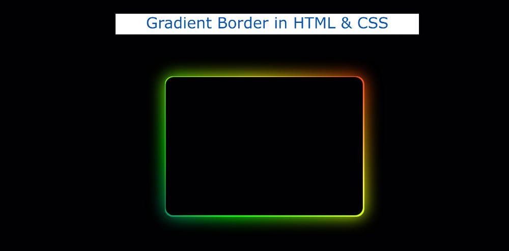
Here I have created a gradient background using different colors on the box. A border and color shadow has been used around the box.
Although this type of CSS border gradient I have implemented in many projects. Earlier I shared designs of different types of buttons, profile cards, and login forms using gradient borders.
How to make gradient border in CSS
I used black background color on the webpage. I made a rectangular box on it. The box has a color border all around. For this, I first created a box using HTML. Then I designed the box and added the animation.
Step 1: Make a border viewing box
A box has been created at the top of the web page using the following HTML and CSS codes. I have used the width of this box: 500px, height: 350px, background color black.
Although after this step we will not see any result. Because the background color of the box and the background color of the webpage are kept the same.
Step 2: Add Gradient Border to the box
Now using before and after, I have made linear-gradient background colors in that box. Here I have added many colors and each color can be seen at a 45-degree angle.
A shadow can be seen around the box so the length of the color background created by this trial and after is kept 6px longer than the total box.
If you watch the demo, you will see that this shadow has been blurred a bit. For this filter: blur (20px) has been used.
Step 3: Activate Color Border
Now the background color in the box above is not animated. Above we have added animation. But now we need to use @keyframes to make it work.
I have implemented background animation using my own @keyframes. As a result, the color of the border and shadow is changing every second.
CSS Border Gradient
Hopefully from the simple tutorial above you have learned how to create gradient border CSS. If you have difficulty connecting the above codes then use the code section below.
See the Pen
Animated Gradient Border CSS by Shantanu Jana (@shantanu-jana)
on CodePen.
From this section, you can directly copy the codes. If you can’t add these codes to your file, you can use the download button below. Be sure to comment on how you like this Pure CSS Gradient Border.


