
A gym is a fitness business where the user creates a fitness environment where customers can do different kinds of workouts. Gyms consist of modern equipment and machines that help customers get fit at a faster rate in comparison to normal sports activities.
Business only grows after expansion, and the best way to expand our businesses is to make them digital to reach different customers. Digital expansion of the business means we can create a website for our business where we can add all the services and benefits of our business to the user.

Today we will be creating a complete responsive gym website using HTML, CSS, and Javascript. We will be adding different types of animation to our project to make it more unique and user-interactive.
Live Demo:
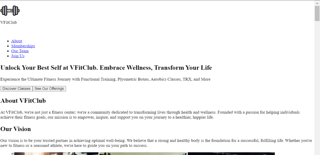
What is a Gym website?
A gym website is the digital form of all the services provided by a fitness expert in offline mode. A gym website usually helps in making the customer fit by giving advice or making diet charts or workout plans as per the user. These kinds of services, when sold online using a website, can be referred to as gym websites.
Create a Netflix Landing Page Clone in Using Html and CSS
Adding the Structure (HTML):
Creating the Header section:
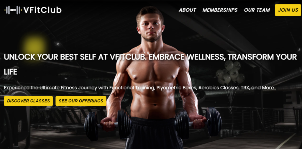
The header section, commonly referred to as the navigation bar, is the first section of our website. It contains the name and logo of the website as well as links to the different sections.
The header section can be easily created inside the website by using the HTML header tag for creating the particular section and block-level elements to create the container for the header components. We will use the element within the div to create a navbar, and then add our logo and website name using the image tag.
Then, using the list item tag, we will create a list of hyperlinks for different sections of the website.
<body>
  <!-- HEADER -->
  <header class="header">
    <div class="container">
      <nav class="header-nav" aria-label="navigation">
        <div class="logo-content">
          <img src="https://vfitclub.netlify.app/image/logo.png" alt="Logo" class="nav-icon" width="70" height=60" />
          <div class="logo">VFitClub</div>
        </div>
        <img src="https://vfitclub.netlify.app/image/nav-icon.svg" alt="navigation icon" class="nav-hamburger" width="30" height="30" />
        <ul>
          <li>
            <a href="#aboutus">About</a>
          </li>
          <li>
            <a href="#memberships">Memberships</a>
          </li>
          <li>
            <a href="#ourteam">Our Team</a>
          </li>
          <li>
            <a href="#contact">Join Us</a>
          </li>
        </ul>
      </nav>
    </div>
  </header>
Creating the main Section:
The main section of any website is the heart and soul of the website, where users add all the necessary information, links, and other material that is important for our website. Using the main tag, we will create the main section of our website.
Here inside our main section, we will create multiple sub-sections, such as the hero section, where we will add the heading of the website with a unique text and also some offer buttons for attracting the user.
Then we will create an about us section where we will add the details of the user, generally a small description of our gym along with its features. Then we will add the services section, where we will list all the gym membership details along with the prices for different durations.
<main>
    <!-- MAIN SECTION -->
    <section class="section-hero" id="section-hero">
      <div class="container hero-box">
        <div class="hero-image-content">
          <h1 class="heading">Unlock Your Best Self at VFitClub. Embrace Wellness, Transform Your Life</h1>
          <p class="description">Experience the Ultimate Fitness Journey with Functional Training, Plyometric Boxes, Aerobics Classes, TRX, and More</p>
          <div class="hero-box-buttons"><button>Discover Classes</button><button>See Our Offerings</button></div>
        </div>
      </div>
    </section>
    <section class="section-aboutus" id="aboutus">
      <div class="container aboutus">
        <div class="section-aboutus-info" data-aos="fade-down">
          <h2>About VFitClub</h2>
          <p>
            At VFitClub, we're not just a fitness center; we're a community dedicated to transforming lives through health and wellness. Founded with a passion for helping individuals
            achieve their fitness goals, our mission is to empower, inspire, and support you on your journey to a healthier, happier life.
          </p>
          <h2>Our Vision</h2>
          <p>
            Our vision is to be your trusted partner in achieving optimal well-being. We believe that a strong and healthy body is the foundation for a successful, fulfilling life.
            Whether you're new to fitness or a seasoned athlete, we're here to guide you on your path to success.
          </p>
        </div>
        <div class="section-aboutus-images">
          <figure class="about-box__image">
            <img src="https://vfitclub.netlify.app/image/about-image1.jpg" alt="navigation icon" class="nav-hamburger" width=320" height="190" style="--i: 0" data-aos="fade-down-right" />
            <img src="https://vfitclub.netlify.app/image/about-image2.jpg" alt="navigation icon" class="nav-hamburger" width="320" height="190" style="--i: 1" data-aos="fade-down" />
            <img src="https://vfitclub.netlify.app/image/about-image3.jpg" alt="navigation icon" class="nav-hamburger" width="320" height="190" style="--i: 2" data-aos="fade-down-left" />
          </figure>
        </div>
      </div>
    </section>

    <section class="section-ourteam" id="ourteam">
      <div class="container ourteam" data-aos="fade-down">
        <h2 class="title">Our Team</h2>
        <div class="team-members">
          <div class="team-member">
            <img src="https://vfitclub.netlify.app/image/JoeBloggs.jpg" alt="Logo" class="member-logo" />
            <div class="team-memmber-info">
              <div class="member-name">Joe Bloggs</div>
              <div class="member-desg">Weight Lifting Coach</div>
              <div class="member-desc">Specializes in sculpting strength and muscle with precision</div>
            </div>
          </div>
          <div class="team-member">
            <img src="https://vfitclub.netlify.app/image/CharlieWatson.jpg" alt="Logo" class="nav-icon" />
            <div class="team-memmber-info">
              <div class="member-name">Charlie Watson</div>
              <div class="member-desg">MMA Coach</div>
              <div class="member-desc">Hones combat skills and self-defense with expertise</div>
            </div>
          </div>
          <div class="team-member">
            <img src="https://vfitclub.netlify.app/image/RachelDanielle.jpg" alt="Logo" class="nav-icon" />
            <div class="team-memmber-info">
              <div class="member-name">Rachel Danielle</div>
              <div class="member-desg">Yoga Instructor</div>
              <div class="member-desc">Guides you to inner peace and flexibility through mindful yoga practice</div>
            </div>
          </div>
          <div class="team-member">
            <img src="https://vfitclub.netlify.app/image/TaylorMelé.jpg" alt="Logo" class="nav-icon" />
            <div class="team-memmber-info">
              <div class="member-name">Taylor Melé</div>
              <div class="member-desg">Personal Trainer</div>
              <div class="member-desc">Your path to achieving fitness goals, one personalized session at a time</div>
            </div>
          </div>
        </div>
      </div>
    </section>
    <section class="section-memberships" id="memberships">
      <div class="container memberships">
        <h2 class="title">Memberships</h2>
        <div class="classes">
          <div class="class" data-aos="flip-left">
            <h2 class="class-name">3 Months</h2>
            <div class="class-price">$100/MON USD</div>
            <hr />
            <div class="class-name">
              <ul>
                <li>5 Classes</li>
                <li>5 In Personal Training Sessions</li>
                <li>Full Gym & Facilities Access</li>
                <li>Gym Tour & Training Instruction</li>
              </ul>
            </div>
            <a>Get Started</a>
          </div>
          <div class="class" data-aos="flip-up">
            <h2 class="class-name">6 Months</h2>
            <div class="class-price">$75/MON USD</div>
            <hr />
            <div class="class-name">
              <ul>
                <li>10 Classes</li>
                <li>10 In Personal Training Sessions</li>
                <li>Full Gym & Facilities Access</li>
                <li>Boxing Ring, Free Events</li>
                <li>Gym Tour & Training Instruction</li>
              </ul>
            </div>
            <a>Get Started</a>
          </div>
          <div class="class" data-aos="flip-right">
            <h2 class="class-name">1 Whole Year</h2>
            <div class="class-price">$50/MON USD</div>
            <hr />
            <div class="class-name">
              <ul>
                <li>10 Classes</li>
                <li>15 In Personal Training Sessions</li>
                <li>Full Gym & Facilities Access</li>
                <li>Boxing Ring, Free Events</li>
                <li>Gym Tour & Training Instruction</li>
              </ul>
            </div>
            <a>Get Started</a>
          </div>
        </div>
      </div>
    </section>
    <section class="section-reviews" id="reviews">
      <div class="container reviews">
        <h2 class="title">Customer Reviews</h2>
        <div class="review">
          <div class="review-info">
            <div class="review-image" data-aos="image-rotateIn"><img src="https://vfitclub.netlify.app/image/review1.jpeg" alt="Logo" class="review-icon" width="130" height="130" /></div>
            <div class="review-details" data-aos="fade-down">
              <div>Samantha R</div>
              <div>
                I can't say enough good things about VFitClub. The trainers are exceptional, and the community is so welcoming. I've made incredible progress in my fitness journey
                here
              </div>
            </div>
          </div>
          <div class="review-info">
            <div class="review-image" data-aos="image-rotateIn"><img src="https://vfitclub.netlify.app/image/review2.jpeg" alt="Logo" class="review-icon" width="130" height="130" /></div>
            <div class="review-details" data-aos="fade-down">
              <div>Vinay U</div>
              <div>Charlie, the MMA coach, is a true expert. He pushes you to your limits while ensuring safety. I've learned so much and gained newfound confidence</div>
            </div>
          </div>
          <div class="review-info">
            <div class="review-image" data-aos="image-rotateIn"><img src="https://vfitclub.netlify.app/image/review3.jpeg" alt="Logo" class="review-icon" width="130" height="130" /></div>
            <div class="review-details" data-aos="fade-down">
              <div>Michael S</div>
              <div>
                VFitClub is not just a gym; it's a lifestyle. The facility is top-notch, and the trainers are top-level. I've never felt more motivated and supported in my fitness
                journey
              </div>
            </div>
          </div>
        </div>
      </div>
    </section>
    <section class="section-contact" id="contact">
      <div class="container contact">
        <div class="contactus">
          <form>
            <h2 class="title">GET IN TOUCH</h2>
            <div class="class-input"><input type="text" placeholder="Name" /></div>
            <div class="class-input"><input type="email" placeholder="Email" /></div>

            <div class="class-input"><input type="number" placeholder="Number" /></div>
            <div class="class-input"><textarea placeholder="Message"></textarea></div>
            <button>SEND</button>
          </form>
        </div>
        <div class="map">
          <iframe src="https://www.google.com/maps/embed?pb=!1m18!1m12!1m3!1d6208.882633670527!2d-77.03822868422614!3d38.914011108427125!2m3!1f0!2f0!3f0!3m2!1i1024!2i768!4f13.1!3m3!1m2!1s0x89b7b7e5bf2241b3%3A0xeee16e72747760aa!2sU%20Street%2FAfrican-Amer%20Civil%20War%20Memorial%2FCardozo!5e0!3m2!1sen!2sin!4v1699174834310!5m2!1sen!2sin" allowfullscreen="" loading="lazy" style="border: 0" referrerpolicy="no-referrer-when-downgrade"></iframe>
        </div>
      </div>
    </section>
  </main>
Creating the footer section:
Inside the footer section, we will add the copyright information, contact details, and also the location of our gym. Using the block level element, we will create the section for our footer, and then, using the <h2> tag selector, we will add the details for contact inside the footer section along with the company address.
<footer class="section-footer" id="footer">
<div class="footer-box container">
<div class="contact-details">
<h2>VFitClub</h2>
<div class="contact-company-address">
123 Wellness Way Activeville,<br />
Fitnessland 56789<br />United States
</div>
<div class="contact-social-links">
<img src="https://vfitclub.netlify.app/image/whatsapp.svg" alt="navigation icon" class="nav-hamburger" width=35" height="35" /> <img src="https://vfitclub.netlify.app/image/facebook.svg" alt="navigation icon" class="nav-hamburger" width=35" height="35" /> <img src="https://vfitclub.netlify.app/image/instagram.svg" alt="navigation icon" class="nav-hamburger" width=35" height="35" /> <img src="https://vfitclub.netlify.app/image/twitter.svg" alt="navigation icon" class="nav-hamburger" width=35" height="35" />
</div>
</div>
<nav class="footer-nav" aria-label="navigation">
<h3>Quick Links</h3>
<ul>
<li>
<a href="#aboutus">About</a>
</li>
<li>
<a href="#memberships">Memberships</a>
</li>
<li>
<a href="#ourteam">Our Team</a>
</li>
<li>
<a href="#contact">Contact </a>
</li>
<li>
<a href="#reviews">Reviews</a>
</li>
</ul>
</nav>
<div class="newsletter">
<h3>News Letter</h3>
<input type="email" placeholder="email@domain.com" /><button>✓</button>
</div>
</div>
<hr />
<div class="container copyrights">
<div>Copyright © by Vinay</div>
<a href="https://github.com/uvinay5/responsive-gym-web/" target="_blank"><img src="https://vfitclub.netlify.app/image/github.svg" alt="navigation icon" class="nav-hamburger" width="50" height="50" /></a>
</div>
</footer>
<script src="./index.js"></script>
<script src="https://cdn.rawgit.com/michalsnik/aos/2.1.1/dist/aos.js"></script>
<script>
AOS.init({
offset: 120,
delay: 50,
duration: 400,
once: true,
});
</script>
</body>HTML Output:
Adding Styling (CSS)
Adding responsiveness and basic Styling:
Using the Google Imports link, we will import some of the new fonts for our website, and using the root selector, we will pre-define all the colors that we will be using inside our website.
Personal PortfolioWebsite Using HTML and CSS Source Code
The media query property is a CSS property that helps in making our website responsive. We will use the media query property with the maximum screen width property, using which we will set the maximum width of the screen. If the screen size of the devices goes below the defined screen size, the website will automatically adjust the number of columns inside our website.
@charset "UTF-8";
@import url("https://fonts.googleapis.com/css2?family=Inter:wght@100;200;400;500;900&family=Poppins&display=swap");
:root {
  --color-yellow: #f4ce14;
  --color-yellow-dark: hsl(56, 100%, 33%);
  --color-yellow-light: hsl(55, 67%, 78%);
  --color-black: hsl(0, 0%, 13%);
  --color-black-light: hsl(0, 0%, 18%);
  --color-black-light-text: hsl(0, 0%, 27%);
  --two-col-layout: 2;
  --four-col-layout: 4;
  --three-col-layout: 3;
  --total-stack-size: 10;
}

@media only screen and (max-width: 56.25em) {
  :root {
    --two-col-layout: 1;
    --four-col-layout: 1;
    --three-col-layout: 1;
  }
}
@media only screen and (max-width: 59em) {
  :root {
    --two-col-layout: 1;
    --four-col-layout: 1;
    --three-col-layout: 1;
  }
}
*,
*::before,
*::after {
  margin: 0;
  padding: 0;
  box-sizing: inherit;
}

html {
  box-sizing: border-box;
  font-size: 62.5%;
  scroll-behavior: smooth;
}
Styling body elements
We will be adding styling to each of the elements of our website using the heading tag selector. We will set the size of the heading to 3.5 rem, and using the <a> tag property, we will set the text decoration of our hyperlink to none. Using the font color property, we will inherit from the parent elements.
Now using the body tag selector, we will add a common styling to all the elements of the body. We will set the font family to Poppins, and using the font-weight property, we will set the font weight to 400, and using the color property, we will set the font color to “white.”.
Now we will add the styling to the elements, and we will add the hover property to the buttons on our website. Similarly, we will add the styling to each and every element of the header section of the body. We will inherit the background color from the root property, and using the list styling property to set it to none,we will define the position of all the navigation links.
h1 {
  font-size: 3.5rem;
}

a {
  text-decoration: none;
  color: inherit;
}

hr {
  border: 0;
  margin: 0;
  width: 100%;
  height: 2px;
  background: rgb(96, 96, 96);
  margin-bottom: 10px;
}

body {
  font-family: "Poppins", sans-serif;
  font-weight: 400;
  font-size: 1.6rem;
  line-height: 1.9;
  color: #ffffff;
}
body .container {
  max-width: 1440px;
  padding: 0 1.4rem;
  margin: 0 auto;
}
body button {
  padding: 8px 10px;
  font-style: italic;
  text-transform: uppercase;
  background-color: var(--color-yellow);
  border: 2px solid var(--color-yellow);
  font-weight: 600;
  border-radius: 5px;
  margin-bottom: 5px;
  cursor: pointer;
  -webkit-backdrop-filter: blur(5px);
  backdrop-filter: blur(5px);
  transition: all 0.2s;
}
body button:hover {
  background-color: transparent;
  color: #fff;
}
body section:nth-child(odd) {
  background-color: var(--color-black);
}
body section:nth-child(even) {
  background-color: var(--color-black-light);
}
body .header {
  position: absolute;
  top: 0;
  z-index: 10;
  width: 100%;
  background-image: linear-gradient(rgb(0, 0, 0), rgba(0, 0, 0, 0));
}
body .header .header-nav {
  display: flex;
  padding: 10px 0px;
  justify-content: space-between;
  align-items: center;
}
body .header .header-nav .nav-hamburger {
  display: none;
}
@media only screen and (max-width: 50em) {
  body .header .header-nav .nav-hamburger {
    display: block;
  }
}
body .header .header-nav .logo-content {
  display: flex;
  align-items: center;
  gap: 5px;
}
body .header .header-nav .logo {
  font-size: 3rem;
  font-weight: 600;
  letter-spacing: 3px;
}
@media only screen and (max-width: 50em) {
  body .header .header-nav .logo {
    font-size: 2.5rem;
  }
}
body .header .header-nav .nav-icon {
  transition: all 0.5s;
}
@media only screen and (max-width: 50em) {
  body .header .header-nav .nav-icon {
    height: 40px;
    width: 40px;
  }
}
body .header .header-nav:hover > .nav-icon {
  transform: rotate(180deg);
}
body .header ul {
  display: flex;
  gap: 15px;
  list-style: none;
  text-transform: uppercase;
}
@media only screen and (max-width: 50em) {
  body .header ul {
    display: none;
  }
}
body .header ul li {
  position: relative;
  padding: 5px;
  overflow: hidden;
  font-size: 1.8rem;
  font-style: italic;
  font-weight: 600;
  letter-spacing: 1.2px;
  cursor: pointer;
}
body .header ul li:hover {
  color: var(--color-yellow);
}
body .header ul li a:after {
  background-color: var(--color-yellow);
  content: "";
  position: absolute;
  width: 90%;
  left: -100%;
  height: 3px;
  border-radius: 30px;
  bottom: 0px;
  transition: all 0.5s;
}
body .header ul li a:hover:after {
  left: 5%;
}
body .header ul li:last-child {
  background-color: var(--color-yellow);
  border: 2px solid var(--color-yellow);
  border-radius: 5px;
  transition: all 0.2s;
  color: #000;
  cursor: pointer;
  padding: 3px 10px;
}
body .header ul li:last-child:hover {
  background-color: inherit;
  color: #fff;
}
body .header ul li:last-child a:after {
  content: none;
}
Styling main and footer section:
Class selector: section hero We will be adding styling to the hero section of our website. Using the height property, we will set the maximum height of 100 vh, and using the display property, we will set the display as flex. Using the align-items property, we will align the items to the center, and using the background property, we will add an image background using the URL.
Then, using the media query property, we will add responsiveness to the hero section of the website. Similarly, we will add the styling to other sections of the website our main section we will make the card design for our gym members main different section for user feedback, and many other sections where we will add different stylings.
We will add the animation to the hero, and in the loading section, we will use javascript to capture the moment of the cursor, and using the keyframes property, we will add the animation of the color property to the cursor of the website.
body .section-hero {
  height: max(100vh, 60rem);
  display: flex;
  align-items: center;
  justify-content: center;
  background-image: url("https://vfitclub.netlify.app/image/hero-background.webp");
  -webkit-backdrop-filter: blur(10px);
  backdrop-filter: blur(10px);
  background-size: cover;
}
body .section-hero .hero-box {
  height: 100%;
  width: 100%;
  display: flex;
  align-items: center;
  justify-content: flex-start;
  background-image: url("https://vfitclub.netlify.app/image/hero-image.png");
  background-repeat: no-repeat;
  background-position: bottom;
  background-size: contain;
}
@media only screen and (max-width: 50em) {
  body .section-hero .hero-box {
    background-size: 175%;
  }
}
body .section-hero .hero-box .hero-image-content {
  display: flex;
  flex-direction: column;
  justify-content: flex-start;
  align-items: start;
  gap: 15px;
}
body .section-hero .hero-box h1 {
  text-transform: uppercase;
  font-size: clamp(2.5rem, 3vw, 3rem);
  text-shadow: 2px 5px 5px rgba(0, 0, 0, 0.7), 0px -4px 12px rgba(0, 0, 0, 0.5);
  animation: moveInLeft 0.5s ease-out;
}
body .section-hero .hero-box p {
  font-size: 1.8rem;
  text-shadow: 2px 7px 5px rgba(0, 0, 0, 0.4), 0px -4px 10px rgba(0, 0, 0, 0.5);
  animation: moveInRight 0.5s ease-out;
}
body .section-hero .hero-box .hero-box-buttons {
  display: flex;
  gap: 10px;
}
body .section-hero .hero-box .hero-box-buttons button {
  font-size: 1.6rem;
}
body .section-hero .hero-section-mouseClick {
  position: absolute;
  animation: onclick 0.1s;
  z-index: -1;
  box-shadow: rgba(195, 184, 34, 0.15) 0px 0px 30px 30px;
}
body .section-aboutus {
  padding-top: clamp(4rem, 10vw, 10rem);
}
body .section-aboutus .aboutus {
  overflow: hidden;
  padding: 3rem 3rem;
  display: grid;
  grid-template-columns: repeat(
    var(--two-col-layout),
    minmax(min-content, 1fr)
  );
  grid-row-gap: 0rem;
  grid-column-gap: 5rem;
  justify-content: center;
  text-align: justify;
}
body .section-aboutus .aboutus .section-aboutus-images {
  align-items: baseline;
  justify-content: baseline;
}
body .section-aboutus .aboutus .section-aboutus-images figure {
  display: grid;
  grid-template-rows: 150px 150px 150px;
}
@media only screen and (max-width: 50em) {
  body .section-aboutus .aboutus .section-aboutus-images figure {
    grid-template-rows: 190px 190px 190px;
    grid-row-gap: 3rem;
  }
}
body .section-aboutus .aboutus .section-aboutus-images figure img {
  position: relative;
  top: calc(var(--i) * -55px);
  left: calc(var(--i) * 90px);
  outline: 5px solid #fff;
  transition: all 0.3s;
  cursor: pointer;
}
@media only screen and (max-width: 50em) {
  body .section-aboutus .aboutus .section-aboutus-images figure img {
    top: 0px;
    left: 0px;
  }
}
body .section-aboutus .aboutus .section-aboutus-images figure img:hover {
  z-index: calc(var(--total-stack-size) - var(--i));
  transform: scale(1.1);
}
@media only screen and (max-width: 50em) {
  body .section-aboutus .aboutus .section-aboutus-images figure img:hover {
    transform: none;
  }
}
body .section-aboutus .aboutus .section-aboutus-info {
  display: flex;
  flex-direction: column;
}
body .section-aboutus .aboutus .section-aboutus-info h2 {
  margin-bottom: 1rem;
  text-transform: uppercase;
}
body .section-aboutus .aboutus .section-aboutus-info p {
  margin-bottom: 2rem;
}
body .section-ourteam {
  padding: clamp(4rem, 10vw, 12rem) 0;
}
body .section-ourteam .ourteam {
  padding: 2rem 3rem;
}
body .section-ourteam .ourteam .title {
  text-align: center;
  text-transform: uppercase;
  margin-bottom: 40px;
}
body .section-ourteam .ourteam .team-members {
  display: grid;
  grid-template-columns: repeat(
    var(--four-col-layout),
    minmax(min-content, 1fr)
  );
  grid-column-gap: 5rem;
  grid-row-gap: 5rem;
  justify-content: stretch;
  margin-top: 10px;
}
body .section-ourteam .ourteam .team-members .team-member {
  cursor: pointer;
  height: 300px;
  position: relative;
  overflow: hidden;
}
body .section-ourteam .ourteam .team-members .team-member img {
  width: 100%;
  height: 100%;
  -o-object-fit: cover;
  object-fit: cover;
  position: absolute;
}
body
  .section-ourteam
  .ourteam
  .team-members
  .team-member
  .team-memmber-info
  .member-name {
  padding: 1rem 0.8rem;
  background-color: var(--color-yellow);
  font-size: 1.5rem;
  position: absolute;
  padding-right: 40px;
  bottom: 0px;
  left: 0px;
  z-index: 4;
  -webkit-clip-path: polygon(0 0, 100% 0, 70% 100%, 0% 100%);
  clip-path: polygon(0 0, 100% 0, 70% 100%, 0% 100%);
  color: #000;
  font-weight: 600;
}
body
  .section-ourteam
  .ourteam
  .team-members
  .team-member
  .team-memmber-info
  .member-desg {
  font-style: italic;
  position: absolute;
  padding: 1rem 0.8rem;
  font-size: 1.5rem;
  background-color: var(--color-black-light-text);
  width: 100%;
  bottom: 0px;
  text-align: end;
  z-index: 3;
  right: 0px;
}
body .section-ourteam .ourteam .team-members .team-member:hover .member-desc {
  position: absolute;
  z-index: 2;
  left: 0%;
  top: 0px;
}
body .section-ourteam .ourteam .team-members .team-member .member-desc {
  width: 100%;
  height: 100%;
  position: absolute;
  z-index: 2;
  left: 100%;
  -webkit-backdrop-filter: blur(8px);
  backdrop-filter: blur(8px);
  background-color: rgba(20, 20, 20, 0.58);
  display: flex;
  align-items: center;
  padding: 3rem;
  font-size: 1.8rem;
  top: 0px;
  transition: all 0.5s ease;
}
body .section-memberships {
  padding: clamp(4rem, 10vw, 8rem) 0;
}
body .section-memberships .memberships {
  padding: 3rem 3rem;
  position: relative;
}
body .section-memberships .memberships .title {
  text-align: center;
  text-transform: uppercase;
  margin-bottom: 40px;
}
body .section-memberships .memberships .classes {
  display: grid;
  grid-template-columns: repeat(
    var(--three-col-layout),
    minmax(min-content, 1fr)
  );
  grid-column-gap: 10rem;
  grid-row-gap: 5rem;
  justify-content: space-around;
  margin-top: 20px;
  margin: 20px 70px;
}
@media only screen and (max-width: 50em) {
  body .section-memberships .memberships .classes {
    margin: 0px;
  }
}
body .section-memberships .memberships .classes .class {
  cursor: pointer;
  background-color: #414141;
  z-index: 10;
  box-shadow: rgba(0, 0, 0, 0.16) 0px 10px 36px 0px,
    rgba(0, 0, 0, 0.06) 0px 0px 0px 1px;
  display: flex;
  align-items: center;
  flex-direction: column;
  justify-content: space-between;
  transition: all 0.5s;
}
body .section-memberships .memberships .classes .class .class-name {
  padding: 1.5rem;
  margin-top: 10px;
  text-transform: uppercase;
}
body .section-memberships .memberships .classes .class .class-price {
  font-size: 1.8rem;
  margin-bottom: 20px;
}
body .section-memberships .memberships .classes .class ul {
  padding: 2rem;
  list-style: none;
}
body .section-memberships .memberships .classes .class ul li {
  margin: 15px 0px;
}
body .section-memberships .memberships .classes .class a {
  width: 100%;
  padding: 15px;
  color: #000;
  font-weight: 600;
  text-align: center;
  font-size: 1.8rem;
  background-color: var(--color-yellow);
}
body .section-memberships .memberships .classes .class a:hover {
  background-color: var(--color-yellow-dark);
}
body .section-memberships .memberships .classes .class:hover {
  transform: scale(1.05);
  box-shadow: rgba(0, 0, 0, 0.29) 0px 10px 36px 0px,
    rgba(0, 0, 0, 0.218) 0px 0px 0px 1px;
}
body .section-reviews {
  padding: clamp(4rem, 10vw, 8rem) 0;
}
body .section-reviews .reviews {
  padding: 2rem 3rem;
  position: relative;
}
body .section-reviews .reviews .title {
  text-align: center;
  text-transform: uppercase;
  margin-bottom: 40px;
}
body .section-reviews .reviews .review {
  display: grid;
  grid-template-columns: repeat(
    var(--three-col-layout),
    minmax(min-content, 1fr)
  );
  grid-column-gap: 10rem;
  grid-row-gap: 5rem;
  justify-content: space-around;
  margin: 20px 0px;
}
body .section-reviews .reviews .review .review-info {
  display: flex;
  flex-direction: column;
  justify-content: center;
  align-items: center;
}
body .section-reviews .reviews .review .review-info .review-image {
  width: 145px;
  height: 145px;
  justify-content: center;
  position: relative;
  border-radius: 100%;
  overflow: hidden;
  display: flex;
  align-items: center;
  cursor: pointer;
}
body .section-reviews .reviews .review .review-info .review-image img {
  transform: rotate(-90deg);
  border-radius: 100%;
  z-index: 15;
  border: 2px solid var(--color-black);
}
body .section-reviews .reviews .review .review-info .review-image:before {
  content: "";
  width: 100%;
  height: 50%;
  z-index: 11;
  position: absolute;
  background-color: hsl(55, 100%, 49%);
  transition: 0.3s;
  bottom: 0px;
}
body .section-reviews .reviews .review .review-info .review-image:after {
  content: "";
  width: 100%;
  height: 100%;
  position: absolute;
  border-radius: 100%;
  background-image: linear-gradient(
    90deg,
    hsl(0, 0%, 13%),
    hsla(48, 100%, 35%, 0.174),
    hsl(55, 100%, 49%) 100%
  );
}
body .section-reviews .reviews .review .review-info .review-image:hover:before {
  width: 100%;
  height: 100%;
}
body .section-reviews .reviews .review .review-info .review-details {
  display: flex;
  flex-direction: column;
  align-items: center;
}
body
  .section-reviews
  .reviews
  .review
  .review-info
  .review-details
  div:first-child {
  font-size: 1.8rem;
  padding: 1rem;
}
body
  .section-reviews
  .reviews
  .review
  .review-info
  .review-details
  div:last-child {
  text-align: justify;
  position: relative;
  font-style: italic;
}
body
  .section-reviews
  .reviews
  .review
  .review-info
  .review-details
  div:last-child:before {
  top: -20px;
  left: -25px;
  position: absolute;
  content: "‟";
  font-size: 5rem;
}
body .section-contact {
  position: relative;
}
body .section-contact .contact {
  overflow: hidden;
  display: grid;
  grid-template-columns: repeat(
    var(--two-col-layout),
    minmax(min-content, 1fr)
  );
  grid-column-gap: 1rem;
  grid-row-gap: 1rem;
  justify-content: space-around;
}
body .section-contact .contact .contactus {
  display: flex;
  justify-content: stretch;
  align-items: center;
  padding: 2rem 1rem;
}
body .section-contact .contact .contactus form {
  width: 100%;
}
body .section-contact .contact .contactus form input::-webkit-outer-spin-button,
body
  .section-contact
  .contact
  .contactus
  form
  input::-webkit-inner-spin-button {
  -webkit-appearance: none;
  margin: 0;
}
body .section-contact .contact .contactus form input,
body .section-contact .contact .contactus form textarea {
  margin: 0;
  color: #fff;
  font-size: 1.8rem;
  padding: 10px 5px;
  width: 100%;
  background-color: transparent;
  border: 0px;
  outline: none;
  position: relative;
}
body .section-contact .contact .contactus form textarea {
  min-height: 50px;
}
body .section-contact .contact .contactus form .class-input {
  position: relative;
  margin: 20px 0px;
  overflow: hidden;
  border-bottom: 1px solid #6a6a6a;
  cursor: text;
}
body .section-contact .contact .contactus form .class-input:after {
  content: "";
  position: absolute;
  width: 100%;
  height: 0%;
  border-bottom: 2px solid yellow;
  left: 0px;
  bottom: 0px;
  transform: translateX(-100%);
  transition: all 0.5s;
}
body .section-contact .contact .contactus form .class-input:hover:after {
  transform: translateX(0%);
}
body .section-contact .contact .contactus form button {
  padding: 10px 30px;
  font-size: 1.5rem;
}
body .section-contact .contact .contactus form button:hover {
  background-color: var(--color-yellow);
  color: #464646;
}
body .section-contact .contact .map {
  width: 100%;
  height: 450px;
}
body .section-contact .contact .map iframe {
  width: 100%;
  height: 100%;
}
body .section-footer {
  padding: clamp(4rem, 10vw, 8rem) 0;
  background-color: #161616;
}
body .section-footer .footer-box {
  margin: auto;
  display: grid;
  grid-template-columns: repeat(
    var(--three-col-layout),
    minmax(min-content, 1fr)
  );
  grid-column-gap: 10rem;
  grid-row-gap: 5rem;
  justify-content: space-around;
  padding: 30px 30px;
}
body .section-footer .footer-box .contact-details .contact-company-address {
  font-size: 1.8rem;
  margin: 10px 0px;
}
body .section-footer .footer-box .contact-social-links {
  cursor: pointer;
  display: flex;
  width: 100%;
  gap: 4rem;
}
body .section-footer .footer-box .footer-nav h3 {
  margin: 10px 0px;
}
body .section-footer .footer-box .footer-nav li {
  font-size: 1.7rem;
  list-style: none;
}
body .section-footer .footer-box .newsletter h3 {
  margin: 10px 0px;
}
body .section-footer .footer-box .newsletter input {
  padding: 8px 10px;
  width: 60%;
  background-color: #414141;
  margin-right: 10px;
  border: none;
  border-radius: 5px;
  color: #fff;
  font-size: 1.7rem;
  outline: none;
}
body .section-footer .footer-box .newsletter button {
  font-weight: 900;
  padding: 8px 20px;
}
body .section-footer .copyrights {
  cursor: pointer;
  display: flex;
  justify-content: center;
  align-items: center;
  flex-direction: column;
}
body .section-footer .copyrights div {
  font-size: 1.8rem;
  margin: 20px;
}

[data-aos="image-rotateIn"] {
  transform: rotate(360deg) scale(0.5);
  transition-property: transform, opacity;
}
[data-aos="image-rotateIn"].aos-animate {
  transform: rotate(90deg) scale(1);
}

@keyframes onclick {
  0% {
    opacity: 0;
    transform: scale(0);
  }
  100% {
    opacity: 1;
    transform: scale(1);
  }
}
@keyframes moveInLeft {
  0% {
    opacity: 0;
    transform: translateX(-100px);
  }
  100% {
    opacity: 1;
    transform: translate(0);
  }
}
@keyframes moveInRight {
  0% {
    opacity: 0;
    transform: translateX(100px);
  }
  100% {
    opacity: 1;
    transform: translate(0);
  }
} /*# sourceMappingURL=main.css.map */

Adding functions (Javascript):
We will create some variables using the var keyword, such as movement strength, and we will set the value of the movement strength to 25. Using the height and width property, we will set the height and width of the movements based on the strength of the screen height and width.
Tourism Website Using HTML and CSS
We will create an event listener for our hero section of the webpage, and using the mouse move event listener, we will capture the movement of the mouse from the center of the screen along the x and y axes. Using the background property, we will add the parallax effect on the mouse move anywhere in the hero section. A parallax effect with a yellow background is created behind the move cursor, and we will use the setTimeout function to remove the parallax effect after 250 milliseconds.
var movementStrength = 25;
var height = movementStrength / window.screen.height;
var width = movementStrength / window.screen.width;
const hero = document.getElementById("section-hero");

hero.addEventListener("mousemove", (e) => {
  var pageX = e.clientX - window.screen.width / 2;
  var pageY = e.clientY - window.screen.height / 2;
  var newvalueX = width * pageX * -1 - 10;
  var newvalueY = height * pageY * -1 - 0;
  hero.style.backgroundPosition = newvalueX + "px     " + newvalueY + "px";

  const div = document.createElement("div");
  div.classList.add("hero-section-mouseClick");
  div.style.left = e.clientX + "px";
  div.style.top = e.clientY + "px";
  const box = document.getElementById("section-hero");
  box.appendChild(div);
  setTimeout(() => {
    box.removeChild(div);
    div.remove();
  }, 250);
});
final Video Output
Conclusion:
Hopefully, the above tutorial has helped you to know how to Responsive Gym Website using Javascript
Here we have learned how to use the Responsive Gym Website using Javascript. Next time, I am going to write an article on how to create to do list using javascript. Please give us your valuable feedback on how you like this Responsive Gym Website using Javascript.
If you like the project, don’t forget to follow our website, foolishdeveloper.com.
Code: Vinay
Author: Arun