
Introduction :
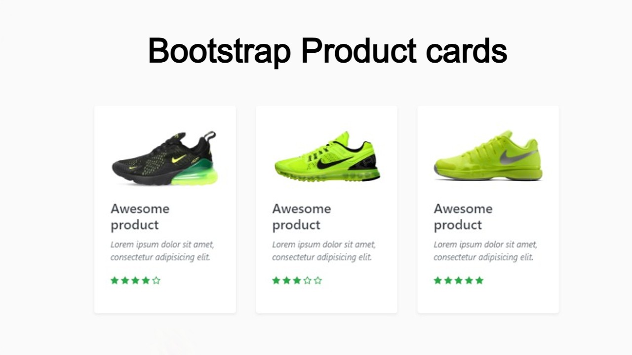
Hello friends, welcome to today’s new blog post. Today we have created Sneaker Product Cards Using HTML CSS beautiful project for you which is quite amazing and also very easy to create which you can create in no time. If you have a little good knowledge of CSS, then you can create it. In this we have made two product cards, in which we have used some hover effect and also used image. When the user hovers the card, the image slides and is visible, which looks quite amazing and also looks amazing to view.
Explanation :
First of all, we are going to create the structure of our product card with the help of HTML which is a very easy task.
- Head Section:
- <meta>: The first thing in the head section is the meta link which is very important and it also helps a lot in our project.
- <title>: After this, the title of the project is also added inside the head section.
- <link>: Whatever the link to the file is, we have to add it in the head section.
- Body Section:
- <main class=”container”>: First of all we have created a main container in which we are going to add images and text.
- <section class=”card”>: Then we have created a card in which our card will be created, in this we will add our image.
- <img>: We are using HTML image tag to add product images.
- <div class=”product-info”>: For product information, we have created a product information section.
- <div class=”btn”>: Then at last we have created a button section in which we will add our Buy Now button.
So in this way, another product card will be created whose process will also be the same in which we will add an image and some information.
CSS Styling:
Now we will style our product card with the help of CSS in which we are going to set the background color and fonts.
- body: First of all we have used white color in the background of the body, you can do something else also.
- button: In the button we have zeroed the border and outline and used a little border radius and used the cursor pointer.
- image: We have kept the width and height of the image full so that the image displays properly in the card.
- container: The height of the container is kept full but the width is kept 850px and the margin is kept auto and the text and all the items are kept centered.
- card: In the card, we have used relative position, the width is set to 350px and we have also used box shadow.
So friends, in this way we have designed our product card which is quite simple, in which we have set some width and height, also set the background and added some hover effects.
Index.html:
<main class="container">
      <section class="card">
        <div class="product-image">
          <img
            src="https://i.ibb.co/cNWqxGx/red.png"
            alt="OFF-white Red Edition"
            draggable="false"
          />
        </div>
        <div class="product-info">
          <h2>Nike X OFF-white</h2>
          <p>The 10: Air Jordan 1 off-white - Chicago</p>
          <div class="price">$999</div>
        </div>
        <div class="btn">
          <button class="buy-btn">Buy Now</button>
          <button class="fav">
            <svg
              class="svg"
              id="i-star"
              xmlns="http://www.w3.org/2000/svg"
              viewBox="0 0 32 32"
              stroke="#000"
              stroke-linecap="round"
              stroke-linejoin="round"
              stroke-width="2"
            >
              <path
                d="M16 2 L20 12 30 12 22 19 25 30 16 23 7 30 10 19 2 12 12 12 Z"
              />
            </svg>
          </button>
        </div>
      </section>
      <section class="card card-blue">
        <div class="product-image">
          <img
            src="https://i.ibb.co/0JKpmgd/blue.png"
            alt="OFF-white Blue Edition"
            draggable="false"
          />
        </div>
        <div class="product-info">
          <h2>Nike X OFF-white</h2>
          <p>Air Jordan 1 Retro High "Off-White - UNC" sneakers</p>
          <div class="price">$1599</div>
        </div>
        <div class="btn">
          <button class="buy-btn">Buy Now</button>
          <button class="fav">
            <svg
              class="svg"
              id="i-star"
              xmlns="http://www.w3.org/2000/svg"
              viewBox="0 0 32 32"
              stroke="#000"
              stroke-linecap="round"
              stroke-linejoin="round"
              stroke-width="2"
            >
              <path
                d="M16 2 L20 12 30 12 22 19 25 30 16 23 7 30 10 19 2 12 12 12 Z"
              />
            </svg>
          </button>
        </div>
      </section>
    </main>
Style.css:
/*===== GOOGLE FONTS =====*/
@import url("https://fonts.googleapis.com/css2?family=Montserrat:wght@400;500;600;700&display=swap");

/*===== VARIABLES CSS =====*/
:root {
  --dark-color-lighten: #f2f5ff;
  --red-card: #a62121;
  --blue-card: #4bb7e6;
  --btn: #141414;
  --btn-hover: #3a3a3a;
  --text: #fbf7f7;
}

/*===== RESET =====*/
*,
::before,
::after {
  margin: 0;
  padding: 0;
  box-sizing: border-box;
}

body {
  margin: 0;
  padding: 0;
  box-sizing: border-box;
  height: 100vh;
  width: 100vw;
  background-color: var(--dark-color-lighten);
  font-family: "Montserrat", sans-serif;
}
button {
  font-family: "Montserrat", sans-serif;
  display: inline-block;
  border: none;
  outline: none;
  border-radius: 0.2rem;
  color: var(--text);
  cursor: pointer;
}

a {
  text-decoration: none;
}

img {
  max-width: 100%;
  height: 100%;
  user-select: none;
}

/*===== CARD =====*/
.container {
  height: 100%;
  width: 850px;
  margin: auto;
  display: flex;
  align-items: center;
  justify-content: space-evenly;
}
.card {
  position: relative;
  padding: 1rem;
  width: 350px;
  height: 450px;
  box-shadow: -1px 15px 30px -12px rgb(32, 32, 32);
  border-radius: 0.9rem;
  background-color: var(--red-card);
  color: var(--text);
  cursor: pointer;
}

.card-blue {
  background: var(--blue-card);
}

.product-image {
  height: 230px;
  width: 100%;
  transform: translate(0, -1.5rem);
  transition: transform 500ms ease-in-out;
  filter: drop-shadow(5px 10px 15px rgba(8, 9, 13, 0.4));
}
.product-info {
  text-align: center;
}

.card:hover .product-image {
  transform: translate(-1.5rem, -7rem) rotate(-20deg);
}

.product-info h2 {
  font-size: 1.4rem;
  font-weight: 600;
}
.product-info p {
  margin: 0.4rem;
  font-size: 0.8rem;
  font-weight: 600;
}
.price {
  font-size: 1.2rem;
  font-weight: 500;
}
.btn {
  display: flex;
  justify-content: space-evenly;
  align-items: center;
  margin-top: 0.8rem;
}
.buy-btn {
  background-color: var(--btn);
  padding: 0.6rem 3.5rem;
  font-weight: 600;
  font-size: 1rem;
  transition: 300ms ease;
}
.buy-btn:hover {
  background-color: var(--btn-hover);
}
.fav {
  box-sizing: border-box;
  background: #fff;
  padding: 0.5rem 0.5rem;
  border: 1px solid#000;
  display: grid;
  place-items: center;
}

.svg {
  height: 25px;
  width: 25px;
  fill: #fff;
  transition: all 500ms ease;
}

.fav:hover .svg {
  fill: #000;
}

@media screen and (max-width: 800px) {
  body {
    height: auto;
  }
  .container {
    padding: 2rem 0;
    width: 100%;
    flex-direction: column;
    gap: 3rem;
  }
}