Introduction:
A Travel Website Using HTML CSS JavaScript is an online platform where users can explore different destinations, book tours, and discover new travel experiences. Travel websites provide detailed itineraries, stunning visuals, and interactive features that help customers plan their trips efficiently.
Businesses grow by expanding their reach, and one of the best ways to do that is through digital presence. A travel website allows companies to showcase their services, destinations, and offers to a global audience, making it easier for customers to book trips from anywhere. With a well-designed website, travel agencies can improve customer engagement and provide a seamless booking experience.
In this tutorial, we will build a fully responsive travel website using HTML, CSS, and JavaScript. We will implement interactive animations, create dynamic tour cards, and ensure an engaging user experience. Let’s get started!
Step 1: Html:
Creating the Header Section
The header section is the first visual element of a website, serving as a navigation bar where users can access different sections. It typically contains:
- Website logo to establish branding.
- Navigation links for easy access to important pages.
- A responsive design that adjusts across devices.
In our travel website, we’ll create this section using the HTML <header> tag, ensuring a well-structured and accessible layout.
Implementing the Navigation Bar:
- Use the tag to define the navigation structure.
- Add a menu icon to trigger the mobile-friendly menu.
- Include a list of navigation links that direct users to different sections.
Here’s how we structure it in HTML:
<!-- Header Section -->
<header class="header center">
<div class="header-text">
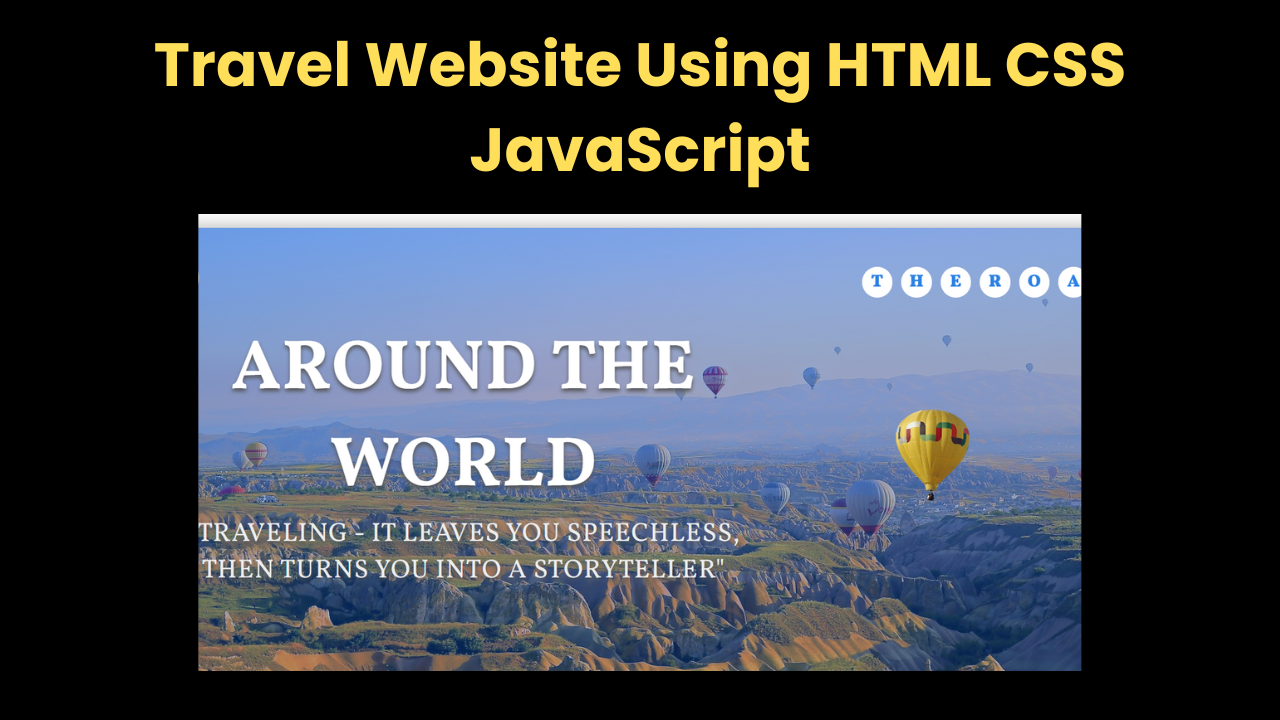
<h1 class="heading">Around the World</h1>
<p class="header-paragraph">
"Traveling - it leaves you speechless, then turns you into a storyteller"
</p>
</div>
<img src="images/air-balloon.png" alt="Header Image" class="header-image">
<div class="logo">
<h1>
<span class="center">t</span>
<span class="center">h</span>
<span class="center">e</span>
<span class="center">r</span>
<span class="center">o</span>
<span class="center">a</span>
<span class="center">d</span>
</h1>
</div>
</header>
<!-- Navbar -->
<div class="navbar-wrapper">
<nav class="navbar">
<div class="close-navbar-icon navbar-icon center">
<div class="line line-1"></div>
<div class="line line-2"></div>
</div>
<div class="nav-list">
<a href="#" class="nav-link center">Home</a>
<a href="#" class="nav-link center">Tours</a>
<a href="#" class="nav-link center">About Us</a>
<a href="#" class="nav-link center">Offer</a>
<a href="#" class="nav-link center">Contact</a>
</div>
</nav>
</div>Explanation of the Code:
- <header> section:
- Contains the title and tagline to set the theme of the site.
- Includes an image (hot air balloon) for aesthetics.
- Uses a styled logo animation for branding.
- Navigation Menu (<nav>)
- ⦁ The navbar includes five main links: Home, Tours, About Us, Offer, and Contact.
- ⦁ It features open/close icons to create an interactive sliding menu effect.
- ⦁ The menu icon uses
- which contains small bars (lines) to indicate a dropdown menu.
- Logo Design:
- The logo uses <h1> with animated letters appearing one by one for a unique effect.
- The <span> elements ensure individual styling for each letter.
This header setup makes the website engaging and user-friendly, ensuring visitors can navigate easily while enjoying an aesthetically pleasing design.
Creating the Main Section:
The main section is the core part of any website, where we add crucial information, visuals, and interactive elements to engage users. In this travel website, our main section consists of multiple sub-sections, including the hero section, an about us section, and a popular tours section that showcases travel packages. We will use the <main> tag to structure these sections properly, ensuring SEO-friendliness and enhanced accessibility.
Hero Section – Capturing Attention:
The hero section creates the first impression with a bold heading, travel quote, and an animated image.
<header class="header center">
  <div class="header-text">
    <h1 class="heading">Around the World</h1>
    <p class="header-paragraph">"Traveling - it leaves you speechless, then turns you into a storyteller"</p>
  </div>
  <img src="images/air-balloon.png" alt="Header Image" class="header-image">
</header>
Popular Tours Section – Showcasing Travel Packages:
The tour section highlights exciting travel experiences using interactive cards that flip to reveal pricing and booking options.
<section class="popular-tours">
  <h1 class="popular-tours-heading">The Most Popular Tours</h1>
  <div class="cards-wrapper">
    <div class="card">
      <div class="front-side">
        <img src="images/forest.jpg" alt="Forest" class="card-image">
        <h1 class="tour-name">The Wild Forest</h1>
      </div>
      <div class="back-side center">
        <h3 class="tour-price">$399</h3>
        <button class="card-button">Booking</button>
      </div>
    </div>
  </div>
</section>
Step 2: CSS:
Adding Responsiveness and Basic Styling To enhance our travel website’s design, we use Google Fonts for a modern typography style and define consistent color themes using CSS variables. The goal is to create a visually appealing, mobile-friendly, and interactive experience.
Importing Fonts and Defining Colors:
We import custom fonts using Google Fonts and pre-define colors using the :root selector:
@import url("https://fonts.googleapis.com/css2?family=Vollkorn:wght@400;600;700&display=swap");

:root {
  --primary-color: #2b81e4;
  --secondary-color: #eee;
  --white-color: #fff;
  --grey-color: #555;
  --light-grey-color: #777;
}
Using Media Queries for Responsiveness:
To make our website adapt to different screen sizes, we use media queries. This ensures an optimal layout on mobiles, tablets, and desktops.
@media (max-width: 800px) {
  .header-paragraph {
    display: none;
  }

  .popular-tours-heading {
    font-size: 5rem;
  }

  .contact-form {
    width: 90%;
  }

  .footer-list {
    flex-direction: column;
    align-items: center;
  }

  .footer-link {
    margin: 1rem 0;
  }
}
Background Animations and Styling Effects for the Hero Section:
The hero section is the most visually engaging part of a website—it sets the tone and creates a strong first impression. To enhance the travel theme, we use a background gradient, a high-quality image, and an animated floating effect for dynamic movement.
.header {
  width: 100%;
  height: calc(100vh - 7rem);
  background: linear-gradient(rgba(18, 113, 255, 0.5), rgba(18, 113, 255, 0.3)),
    url(images/header-bg.jpg) center no-repeat;
  background-size: cover;
  position: relative;
}
How It Works:
- Full-Screen Display:
- The width: 100% ensures the hero section stretches across the entire viewport.
- The height: calc(100vh – 7rem) makes sure it occupies most of the screen space while leaving room for the navigation bar.
- Gradient Overlay for Depth:
- ⦁ The linear-gradient(rgba(18, 113, 255, 0.5), rgba(18, 113, 255, 0.3)) applies a semi-transparent blue gradient over the background.
- ⦁ This helps make text more readable while creating a calm, atmospheric effect, perfect for a travel theme.
- Background Image Optimization:
- ⦁ url(images/header-bg.jpg) center no-repeat; ensures the image is centered and doesn’t repeat.
- ⦁ background-size: cover; makes sure it fills the entire section without being stretched or distorted.
Step 3 : JavaScript:
- To make the travel website more interactive, we will implement mouse-based movement effects in the hero section.
- This includes: Defining a movement strength variable to control responsiveness. Using event listeners to track mouse movements and apply a parallax effect.
Creating Movement Variables:
First, we define a movement strength variable that determines how much the background shifts as the user moves the mouse.
const movementStrength = 25;
const heroSection = document.querySelector(".header");

heroSection.addEventListener("mousemove", (event) => {
  const width = window.innerWidth;
  const height = window.innerHeight;

  // Get mouse position relative to the center of the screen
  const mouseX = event.clientX - width / 2;
  const mouseY = event.clientY - height / 2;

  // Apply parallax effect based on movement strength
  const translateX = (mouseX / width) * movementStrength;
  const translateY = (mouseY / height) * movementStrength;

  heroSection.style.backgroundPosition = `${50 + translateX}% ${50 + translateY}%`;

  // Remove the effect after 250 milliseconds
  setTimeout(() => {
    heroSection.style.backgroundPosition = "50% 50%";
  }, 250);
});
How It Works:
- Captures Mouse Movements: The mousemove event listener detects mouse motion within the hero section.
- Calculates Screen Position: The script determines the mouse’s position relative to the screen center using event.clientX and event.clientY.
- Applies Parallax Effect: The background shifts dynamically, creating a subtle motion effect.
- Resets Position: After 250 milliseconds, the background returns to its default position using setTimeout, ensuring smooth transitions.
Conclusion:
Hopefully, this tutorial has helped you understand how to create a responsive travel website using HTML, CSS, and JavaScript.
We have explored structuring the page, styling for a smooth user experience, and adding interactive elements to enhance engagement. This approach ensures a visually appealing, user-friendly, and mobile-responsive travel website.
Index.html:
<div class="container">
<!-- Navbar -->
<div class="open-navbar-icon navbar-icon center">
<div class="line"></div>
<div class="line"></div>
<div class="line"></div>
</div>
<div class="navbar-wrapper">
<nav class="navbar">
<div class="close-navbar-icon navbar-icon center">
<div class="line line-1"></div>
<div class="line line-2"></div>
</div>
<div class="nav-list">
<a href="#" class="nav-link center">Home</a>
<a href="#" class="nav-link center">Tours</a>
<a href="#" class="nav-link center">About Us</a>
<a href="#" class="nav-link center">Offer</a>
<a href="#" class="nav-link center">Contact</a>
</div>
</nav>
</div>
<!-- End of Navbar -->
<!-- Header -->
<header class="header center">
<div class="header-text">
<h1 class="heading">Around the world</h1>
<p class="header-paragraph">
"Traveling - it leaves you speechless, then turns you into a
storyteller"
</p>
</div>
<img
src="images/air-balloon.png"
alt="Header Image"
class="header-image"
/>
<div class="logo">
<h1>
<span class="center">t</span>
<span class="center">h</span>
<span class="center">e</span>
<span class="center">r</span>
<span class="center">o</span>
<span class="center">a</span>
<span class="center">d</span>
</h1>
</div>
</header>
<!-- End of Header -->
<!-- Popular tours -->
<section class="popular-tours">
<h1 class="popular-tours-heading">The Most Popular Tours</h1>
<div class="cards-wrapper">
<div class="card">
<div class="front-side">
<img src="images/forest.jpg" alt="Forest" class="card-image" />
<h1 class="tour-name">The wild forest</h1>
<ul class="card-list">
<li class="card-list-item">7 days tour</li>
<li class="card-list-item">Up to 20 people</li>
<li class="card-list-item">4 tour guides</li>
<li class="card-list-item">Sleep in private tents</li>
<li class="card-list-item">Difficulty: medium</li>
</ul>
<button class="navigation-button">
price >>
</button>
</div>
<div class="back-side center">
<button class="navigation-button">
<< back
</button>
<h3 class="tour-price">$399</h3>
<button class="card-button">Booking</button>
</div>
</div>
<div class="card">
<div class="front-side">
<img src="images/river.jpg" alt="River" class="card-image" />
<h1 class="tour-name">Along the river</h1>
<ul class="card-list">
<li class="card-list-item">9 days tour</li>
<li class="card-list-item">Up to 30 people</li>
<li class="card-list-item">7 tour guides</li>
<li class="card-list-item">Sleep in private tents</li>
<li class="card-list-item">Difficulty: hard</li>
</ul>
<button class="navigation-button">
price >>
</button>
</div>
<div class="back-side center">
<button class="navigation-button">
<< back
</button>
<h3 class="tour-price">$499</h3>
<button class="card-button">Booking</button>
</div>
</div>
<div class="card">
<div class="front-side">
<img src="images/sea.jpg" alt="Sea" class="card-image" />
<h1 class="tour-name">The island beach</h1>
<ul class="card-list">
<li class="card-list-item">5 days tour</li>
<li class="card-list-item">Up to 40 people</li>
<li class="card-list-item">8 tour guides</li>
<li class="card-list-item">Sleep in hotel</li>
<li class="card-list-item">Difficulty: easy</li>
</ul>
<button class="navigation-button">
price >>
</button>
</div>
<div class="back-side center">
<button class="navigation-button">
<< back
</button>
<h3 class="tour-price">$599</h3>
<button class="card-button">Booking</button>
</div>
</div>
</div>
</section>
<!-- End of Popular tours -->
<!-- Stories -->
<section class="stories">
<div class="video-container">
<video class="bg-video" autoplay muted loop>
<source src="images/video.mp4" type="video/mp4" />
</video>
</div>
<div class="stories-wrapper">
<div class="story-bg">
<div class="story">
<img
src="images/story-img-1.jpg"
alt="Customer image"
class="story-image"
/>
<div class="story-text">
<h1 class="story-heading">
These were the best days of this year
</h1>
<p class="story-paragraph">
Lorem ipsum dolor sit amet consectetur adipisicing elit.
Architecto quas, repudiandae veritatis nam mollitia cumque
distinctio, quia aperiam aliquid at consequuntur libero
quisquam facilis laborum inventore repellat perspiciatis vel
fugiat molestias recusandae eum necessitatibus quo possimus
aspernatur? Nobis, architecto eaque.
</p>
</div>
</div>
</div>
<div class="story-bg">
<div class="story">
<img
src="images/story-img-2.jpg"
alt="Customer image"
class="story-image"
/>
<div class="story-text">
<h1 class="story-heading">
I enjoyed this great tour
</h1>
<p class="story-paragraph">
Lorem ipsum dolor sit amet consectetur adipisicing elit.
Architecto quas, repudiandae veritatis nam mollitia cumque
distinctio, quia aperiam aliquid at consequuntur libero
quisquam facilis laborum inventore repellat perspiciatis vel
fugiat molestias recusandae eum necessitatibus quo possimus
aspernatur? Nobis, architecto eaque.
</p>
</div>
</div>
</div>
</div>
</section>
<!-- End of Stories -->
<!-- Contact -->
<section class="contact">
<h1 class="contact-heading">Contact Us</h1>
<form class="contact-form center">
<div class="input-group">
<label>Full Name *</label>
<input
type="text"
class="contact-input"
placeholder="Enter Your Name"
/>
</div>
<div class="input-groups">
<div class="input-group">
<label>Email *</label>
<input
type="email"
class="contact-input"
placeholder="Enter Your Email"
/>
</div>
<div class="input-group">
<label>Phone</label>
<input
type="text"
class="contact-input"
placeholder="Enter Phone Number"
/>
</div>
</div>
<div class="input-group">
<label>Message</label>
<textarea
class="form-textarea"
placeholder="Your Message Here..."
></textarea>
</div>
<input type="submit" value="Submit" class="form-btn" />
</form>
</section>
<!-- End of Contact -->
<!-- Footer -->
<footer class="footer">
<div class="footer-list">
<a href="#" class="footer-link">Home</a>
<a href="#" class="footer-link">Tours</a>
<a href="#" class="footer-link">About Us</a>
<a href="#" class="footer-link">Offer</a>
<a href="#" class="footer-link">Contact</a>
</div>
<p class="footer-paragraph">
Copyright © CodeAndCreate All Rights Reserved
</p>
</footer>
<!-- End of Footer -->
</div>
<script src="script.js"></script>Style.css:
/* Common Styles */
* {
  margin: 0;
  padding: 0;
  font-family: "Vollkorn", serif;
  list-style-type: none;
  text-decoration: none;
  box-sizing: border-box;
  outline: none;
}

html {
  font-size: 62.5%;
}

:root {
  --primary-color: #2b81e4;
  --secondary-color: #eee;
  --white-color: #fff;
  --grey-color: #555;
  --light-grey-color: #777;
}

.center {
  display: flex;
  justify-content: center;
  align-items: center;
}

.container {
  background-color: var(--secondary-color);
  margin: 3.5rem;
  box-shadow: 0 1rem 3rem var(--grey-color);
  overflow: hidden;
}

/* End of Common styles */

/* Navbar */
.navbar-icon {
  width: 5.5rem;
  height: 5.5rem;
  background-color: var(--white-color);
  border-radius: 50%;
  cursor: pointer;
  flex-direction: column;
}

.open-navbar-icon {
  position: fixed;
  top: 6.5rem;
  left: 6.5rem;
  z-index: 200;
}

.navbar-icon .line {
  height: 0.2rem;
  width: 3.5rem;
  background-color: var(--light-grey-color);
}

.open-navbar-icon .line {
  margin: 0.3rem 0;
}

.navbar-wrapper {
  width: 100vw;
  height: 100vh;
  background-color: rgba(255, 255, 255, 0.7);
  position: fixed;
  left: 0;
  bottom: -100%;
  opacity: 0;
  z-index: 300;
  padding: 3.5rem 5.5rem 3.5rem 3.5rem;
  transition: bottom 0.5s, opacity 0.2s;
}

.change .navbar-wrapper {
  bottom: 0;
  opacity: 1;
  transition: bottom 0.5s, opacity 0.2s 0.25s;
}

.navbar {
  width: 100%;
  height: 100%;
  background: linear-gradient(rgba(0, 0, 0, 0.5), rgba(0, 0, 0, 0.3)),
    url(images/navbar-bg.jpg) center no-repeat;
  background-size: cover;
  position: relative;
  overflow-y: hidden;
}

.close-navbar-icon {
  position: absolute;
  top: 2.5rem;
  right: 3rem;
  z-index: 300;
}

.close-navbar-icon .line {
  position: absolute;
}

.line-1 {
  transform: rotate(40deg);
}

.line-2 {
  transform: rotate(-40deg);
}

.nav-list {
  height: 100%;
  display: flex;
}

.nav-link {
  font-size: 3rem;
  font-weight: 700;
  color: var(--white-color);
  text-transform: uppercase;
  width: 100%;
  opacity: 0.8;
  position: relative;
  top: -100%;
  transition: all 0.3s;
}

.change .nav-link {
  top: 0;
}

.nav-link:hover {
  opacity: 1;
  color: var(--primary-color);
}

.change .nav-link:nth-child(1) {
  transition: top 1s 0.4s, opacity 0.3s, color 0.3s;
}

.change .nav-link:nth-child(2) {
  transition: top 1s 0.6s, opacity 0.3s, color 0.3s;
}

.change .nav-link:nth-child(3) {
  transition: top 1s 0.8s, opacity 0.3s, color 0.3s;
}

.change .nav-link:nth-child(4) {
  transition: top 1s 1s, opacity 0.3s, color 0.3s;
}

.change .nav-link:nth-child(5) {
  transition: top 1s 1.2s, opacity 0.3s, color 0.3s;
}
/* End of Navbar */

/* Header */
.header {
  width: 100%;
  height: calc(100vh - 7rem);
  background: linear-gradient(rgba(18, 113, 255, 0.5), rgba(18, 113, 255, 0.3)),
    url(images/header-bg.jpg) center no-repeat;
  background-size: cover;
  position: relative;
  perspective: 100rem;
}

.header-text {
  text-align: center;
  text-transform: uppercase;
  letter-spacing: 0.1rem;
  text-shadow: 0 0.3rem 0.5rem var(--grey-color);
}

.heading {
  font-size: 8rem;
  color: var(--white-color);
}

.header-paragraph {
  font-size: 3rem;
  font-weight: 500;
  color: var(--secondary-color);
  max-width: 70rem;
  margin: auto;
}

.logo {
  position: absolute;
  top: 4rem;
  right: 4rem;
}

.logo h1 {
  display: flex;
}

.logo h1 span {
  font-size: 2rem;
  font-weight: 900;
  color: var(--primary-color);
  text-transform: uppercase;
  background-color: var(--white-color);
  width: 3.5rem;
  height: 3.5rem;
  margin: 0.5rem;
  border-radius: 50%;
}

.logo h1 span:nth-child(1) {
  animation: drop-letters 5s 0.1s infinite;
}

.logo h1 span:nth-child(2) {
  animation: drop-letters 5s 0.2s infinite;
}

.logo h1 span:nth-child(3) {
  animation: drop-letters 5s 0.3s infinite;
}

.logo h1 span:nth-child(4) {
  animation: drop-letters 5s 0.4s infinite;
}

.logo h1 span:nth-child(5) {
  animation: drop-letters 5s 0.5s infinite;
}

.logo h1 span:nth-child(6) {
  animation: drop-letters 5s 0.6s infinite;
}

.logo h1 span:nth-child(7) {
  animation: drop-letters 5s 0.7s infinite;
}

@keyframes drop-letters {
  0% {
    transform: translateY(0);
  }
  10% {
    transform: translateY(0);
  }
  15% {
    transform: translateY(-100%);
  }
  20% {
    transform: translateY(0);
  }
  100% {
    transform: translateY(0);
  }
}

.header-image {
  width: 35%;
  animation: image-float 150s infinite;
}

@keyframes image-float {
  0% {
    transform: translateZ(40rem);
    opacity: 1;
  }
  40% {
    transform: translateZ(-500rem) translateX(150rem);
    opacity: 0.8;
  }
  70% {
    transform: translateZ(-1500rem) translateX(800rem);
    opacity: 0.6;
  }
  80% {
    transform: translateZ(-50rem) translateX(100rem);
    opacity: 0.8;
  }
  100% {
    transform: translateZ(40rem);
    opacity: 1;
  }
}
/* End of Header */

/* Popular tours */
.popular-tours {
  padding: 5rem 0 10rem 0;
}

.popular-tours-heading {
  font-size: 8rem;
  text-align: center;
  margin-bottom: 8rem;
  color: var(--primary-color);
  text-shadow: 0 0.1rem 0.2rem var(--primary-color);
}

.cards-wrapper {
  display: flex;
  justify-content: space-evenly;
}

.card {
  width: 35rem;
  position: relative;
  perspective: 150rem;
}

.card-image {
  width: 100%;
  border-radius: 0.3rem 0.3rem 0 0;
}

.front-side {
  text-align: center;
  background-color: var(--white-color);
  border-radius: 0.3rem;
  position: relative;
  z-index: 10;
  opacity: 0.9;
  transition: opacity 0.4s, transform 0.4s, box-shadow 0.4s;
}

.change > .front-side {
  transform: translateZ(-5rem) translateX(3rem);
  box-shadow: 0 2rem 4rem #777;
  opacity: 0.5;
  z-index: 0;
}

.tour-name {
  font-size: 2.5rem;
  font-weight: 700;
  text-transform: uppercase;
  position: absolute;
  top: 30%;
  right: 1.5rem;
  color: var(--white-color);
  text-shadow: 0 0 1rem #000;
}

.card-list {
  width: 80%;
  margin: auto;
  padding: 2rem 0 3rem 0;
}

.card-list-item {
  font-size: 1.6rem;
  font-weight: 500;
  color: var(--light-grey-color);
  margin: 2rem 0;
  border-bottom: 0.1rem solid var(--primary-color);
  padding-bottom: 1.5rem;
}

.back-side {
  position: absolute;
  top: 0;
  background-color: var(--primary-color);
  width: 100%;
  height: 100%;
  border-radius: 0.3rem;
  box-shadow: 0 2rem 4rem #777;
  flex-direction: column;
  transform: translateZ(-5rem) translateX(3rem);
  opacity: 0.5;
  transition: opacity 0.4s, transform 0.4s, box-shadow 0.4s;
}

.change > .back-side {
  transform: translateZ(0) translateX(0);
  box-shadow: 0 0.5rem 2rem #aaa;
  opacity: 0.9;
}

.tour-price {
  font-size: 5rem;
  font-weight: 300;
  color: var(--white-color);
  margin-bottom: 3rem;
}

.card-button {
  color: var(--primary-color);
  background-color: var(--white-color);
  border: none;
  font-size: 2.5rem;
  padding: 1rem 2rem;
  letter-spacing: 0.2rem;
  border-radius: 5rem;
  cursor: pointer;
}

.navigation-button {
  position: absolute;
  top: 0.5rem;
  left: 0.5rem;
  padding: 0.5rem;
  background-color: rgba(255, 255, 255, 0.8);
  color: var(--light-grey-color);
  border-radius: 0.3rem;
  border: none;
  font-size: 1.5rem;
  font-weight: 600;
  text-transform: uppercase;
  letter-spacing: 0.2rem;
  cursor: pointer;
}
/* End of Popular tours */

/* Stories */
.stories {
  padding: 10rem 0;
  position: relative;
}

.video-container {
  position: absolute;
  top: 0;
  left: 0;
  width: 100%;
  height: 100%;
  opacity: 0.4;
}

.bg-video {
  width: 100%;
  height: 100%;
  object-fit: cover;
}

.stories-wrapper {
  display: flex;
  flex-direction: column;
  align-items: center;
}

.story-bg {
  background-color: rgba(238, 238, 238, 0.85);
  padding: 5rem;
  margin: 5rem;
  width: 70%;
  box-shadow: 0 2rem 5rem rgba(51, 51, 51, 0.4);
  transform: skewX(20deg);
}

.story {
  transform: skewX(-20deg);
  display: flex;
}

.story-image {
  width: 20rem;
  height: 20rem;
  border-radius: 50%;
  object-fit: cover;
  margin-right: 5rem;
}

.story-text {
  letter-spacing: 0.1rem;
}

.story-heading {
  font-size: 2.5rem;
  text-transform: uppercase;
  color: var(--grey-color);
  margin-bottom: 1rem;
}

.story-paragraph {
  font-size: 1.8rem;
  color: var(--light-grey-color);
}

.story-paragraph::first-letter {
  margin-left: 1rem;
}
/* End of Stories */

/* Contact */
.contact {
  padding: 15rem 0 20rem 0;
  text-align: center;
  background: url(images/contact-us-bg.png) center no-repeat;
  background-size: cover;
  animation: contact-bg 35s infinite;
}

.contact-heading {
  font-size: 7rem;
  font-weight: 700;
  text-transform: uppercase;
  letter-spacing: 0.5rem;
  color: var(--white-color);
  text-shadow: 0 1rem 2rem #000;
  margin-bottom: 8rem;
}

.contact-form {
  width: 70rem;
  height: 50rem;
  background-color: rgba(255, 255, 255, 0.95);
  margin: auto;
  flex-direction: column;
  border-radius: 0.5rem;
  box-shadow: 0 1rem 3rem #000;
  padding: 5rem;
}

.input-group {
  width: 100%;
  display: flex;
  flex-direction: column;
  margin: 1rem 0;
  position: relative;
}

.input-groups {
  width: 100%;
  display: flex;
  justify-content: space-between;
}

.input-groups .input-group {
  width: 48.5%;
}

.input-group input,
.input-group textarea {
  padding: 3rem 1rem 1rem 1rem;
  background-color: var(--secondary-color);
  border: 0.1rem solid var(--secondary-color);
  font-size: 1.4rem;
  color: var(--light-grey-color);
  letter-spacing: 0.1rem;
  border-radius: 0.5rem;
  transition: border 0.3s;
}

.input-group input:focus,
.input-group textarea:focus {
  border: 0.1rem solid #ccc;
}

.input-group label {
  font-size: 1.2rem;
  font-weight: 600;
  text-transform: uppercase;
  letter-spacing: 0.1rem;
  color: var(--grey-color);
  position: absolute;
  top: 1rem;
  left: 1rem;
}

.form-btn {
  width: 100%;
  padding: 1rem;
  font-size: 1.6rem;
  letter-spacing: 0.1rem;
  margin-top: 1rem;
  background-color: var(--light-grey-color);
  color: var(--white-color);
  border-radius: 0.5rem;
  border: none;
  cursor: pointer;
  transition: background-color 0.4s;
}

.form-btn:hover {
  background-color: var(--grey-color);
}

.input-group textarea {
  max-height: 15rem;
  max-width: 100%;
}

@keyframes contact-bg {
  0% {
    background-color: #3d3d3d;
  }
  25% {
    background-color: #ced8e4;
  }
  50% {
    background-color: #1e81f3;
  }
  75% {
    background-color: #ff7842;
  }
  100% {
    background-color: #3d3d3d;
  }
}
/* End of Contact */

/* Footer */
.footer {
  background-color: var(--grey-color);
  padding: 4rem 0 2rem 0;
}

.footer-list {
  display: flex;
  justify-content: center;
}

.footer-link {
  font-size: 2rem;
  color: var(--white-color);
  margin: 0 2rem;
  background-color: var(--grey-color);
  padding: 0.3rem 3rem;
  letter-spacing: 0.3rem;
  transition: all 0.2s;
}

.footer-link:hover {
  transform: rotate(-10deg);
  box-shadow: 0 2rem 3rem #000;
}

.footer-paragraph {
  text-align: center;
  font-size: 1.5rem;
  color: var(--secondary-color);
  letter-spacing: 0.2rem;
  margin-top: 5rem;
}
/* End of Footer */

@media (max-width: 1200px) {
  .cards-wrapper {
    flex-direction: column;
    align-items: center;
  }

  .card {
    margin: 3rem 0;
  }

  .story-bg {
    width: 85%;
  }
}

@media (max-width: 1000px) {
  .nav-list {
    flex-direction: column;
  }

  .nav-link {
    flex-grow: 1;
  }

  .header-text {
    position: absolute;
    top: 50%;
    left: 50%;
    transform: translate(-50%, -50%);
    z-index: 10;
  }

  .heading {
    font-size: 6rem;
  }

  .header-paragraph {
    font-size: 2.5rem;
  }

  .popular-tours-heading {
    font-size: 6rem;
  }

  .story-bg {
    transform: skewX(0);
  }

  .story {
    transform: skewX(0);
    flex-direction: column;
    align-items: center;
  }

  .story-image {
    margin-bottom: 3rem;
  }

  .footer-link {
    padding: 0.3rem 2rem;
    margin: 0 1rem;
  }
}

@media (max-width: 800px) {
  .header-paragraph {
    display: none;
  }

  .popular-tours-heading {
    font-size: 5rem;
  }

  .contact-form {
    width: 90%;
  }

  .footer-list {
    flex-direction: column;
    align-items: center;
  }

  .footer-link {
    margin: 1rem 0;
  }
}

@media (max-width: 650px) {
  .container {
    margin: 0;
  }

  .open-navbar-icon {
    top: 2.5rem;
    left: 2.5rem;
  }

  .navbar-wrapper {
    padding: 0;
  }

  .close-navbar-icon {
    right: 4rem;
  }

  .header {
    height: 100vh;
  }

  .contact-heading {
    font-size: 6rem;
  }

  .contact-form {
    padding: 2rem;
    height: 40rem;
  }
}

@media (max-width: 500px) {
  html {
    font-size: 45%;
  }
}
Script.js:
const container = document.querySelector(".container");

document.querySelector(".open-navbar-icon").addEventListener("click", () => {
  container.classList.add("change");
});

document.querySelector(".close-navbar-icon").addEventListener("click", () => {
  container.classList.remove("change");
});

const colors = ["#6495ed", "#7fffd4", "#ffa07a", "#f08080", "#afeeee"];

let i = 0;

Array.from(document.querySelectorAll(".nav-link")).forEach(item => {
  item.style.cssText = `background-color: ${colors[i++]}`;
});

Array.from(document.querySelectorAll(".navigation-button")).forEach(item => {
  item.onclick = () => {
    item.parentElement.parentElement.classList.toggle("change");
  };
});