
In this article, you will learn how to create Skeleton Loading Animation using HTML and CSS. Already shared a tutorial on creating a working skeleton loader using JavaScript. Now is the time to create Skeleton Loading Animation CSS.
The design I made earlier was completely functional, meaning the content could be seen after a short loading animation. However, in the case of this design, it will not be the only animation that will continue here. This will help beginners understand how skeleton CSS animation works.
If you want to make it work with JavaScript you can follow the previous tutorial. The CSS Skeleton Loading animation created here was originally created on a profile card.
Skeleton Loading Animation CSS
You must have seen different types of websites where such animations on elements or content can be seen during internet slowdown. For example, in the case of websites like YouTube, Facebook, etc., you will see this type of screen loading animation when the internet speed is low.
Which satisfies some of the users and enhances the beauty of the website. Below I have given a demo that will help you to know how this design works.
See the Pen
Skeleton Loading Animation CSS by Foolish Developer (@foolishdevweb)
on CodePen.
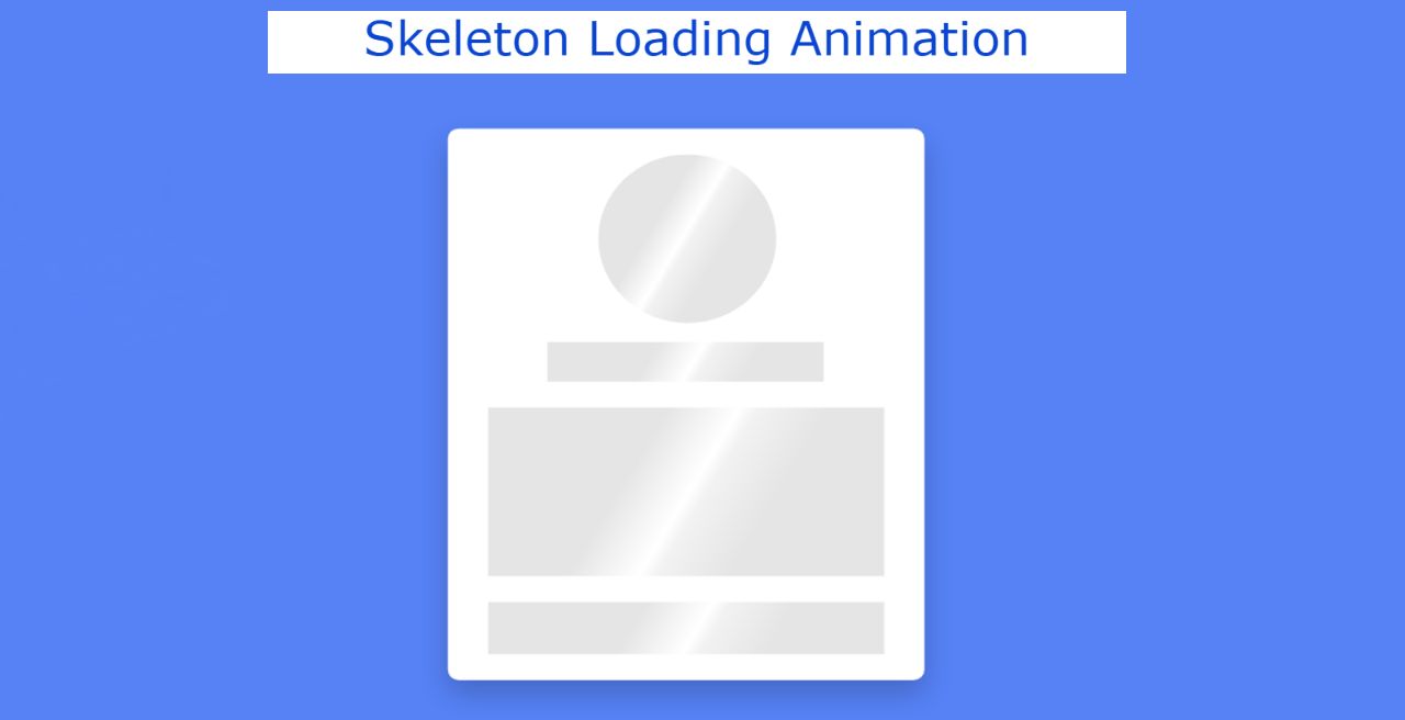
The demo above has helped you to know how this loading animation works. As you can see, a web page is painted blue. Then a box was made. HTML and CSS have been used to make it much easier.
We created its basic structure with the help of HTML and designed it with the help of CSS. Since it was not implemented, no JavaScript was used.
How to Create Skeleton Screen Loading Animation
This box is basically a profile card that first contains a small profile image space. Then there is the place to give the name and then some basic information. After all, there is a place to put icons on some social media. Skeleton Loading Animation CSS has been added to these places. This animation will continue for 2 seconds.
Now it’s time to use HTML and CSS to create it. This requires you to have a basic idea about HTML and CSS. If you only want the source code, you can use the download button below the article.
Step 1: The basic structure of this effect
The basic structure of this project has been created using the following HTML and CSS codes. First, the background color of the webpage is given. Then a small box was made.
The width of this box: 350px and height will depend on the amount of content. The background color of the box is white and box-shadow is added to enhance the beauty.

Step 2: Make space for the elements of the profile card
Now is the time to add different elements to the profile card. Here is a place for profile images, names, descriptions, social icons, etc. The following HTML and CSS are used to create that space.
Created from the place where the profile image is stored using the following HTML and CSS codes. The width and height of this space are 130px and border-radius: 50% has been used to make it round.

Now the place to input the name has been created. Its width: 70% and height: 30px.

An area with width: 100% and height: 130px has been created for further description.

Now a place has been created for storing social media icons at a height of 40px.

Step 3: Add skeleton animation to the elements
Above we have designed a place to keep the elements. However, Skeleton Loading Animation has not been added yet. The following CSS codes have been used to add this animation. You can see this animation in each of the elements in this card.
If you want to add more elements to this card, you need to add some animation separately. These animations will work in every element added to that card. The animation time used here is two seconds. You can change it if you want.

Hopefully from the tutorial above you have learned how to create this Skeleton Loading Animation CSS. If there is any problem then you can definitely let me know by commenting.
If you want to make this skeleton CSS animation work, you must use JavaScript. I have already shared another tutorial for that. Be sure to comment on how you like this Skeleton Loading Animation.