Websites use registration forms to verify user identities, whether they are verified or not.Users with corrected information in the registration forms are allowed to use particular services and information from the website.
The main purpose of using registration forms is when a new user visits any website and wants to use a particular service of the website. In order to protect against data leakage or hacking of the website, the user needs to create an account on the website using their unique email ID and mobile number.
We will create a responsive registration form using HTML and CSS step by step so that every user can understand it easily and help them create their own registration form using HTML and CSS.
Personal PortfolioWebsite Using HTML and CSS Source Code
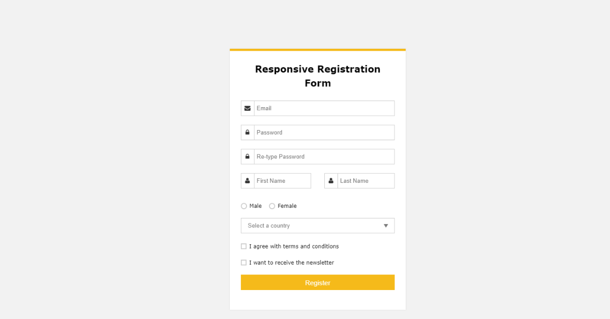
Let’s us take a look at the live demo of our responsive registration form project.
See the Pen Responsive Registration Form by Ananda Projapati (@anandaprojapati) on CodePen.
Before we start with our project, let’s understand some of the important concepts about the registration form using HTML and CSS.
What is a registration form?
A registration form is a type of form that is used for collecting the data of the new user on the website so that they can use their unique email IDs and passwords to access the website’s products and services.
Which HTML Element is used for creating Forms?
We use the <form> element inside HTML to create the structure of the form.
Creating the Structure (HTML):
Using the
block-level element, which covers a whole line, we will create a wrapper for our form container. Inside our form container, we will be adding the form elements for creating the complete registration form.
Using the <h2> tag, we will add the main registration form heading of our project, and then use the div tag with the class form. We will create the structure of our form.
Then, inside our form, using the div tag, we will use an inline element span, and inside it, using the font-awesome icon class, we will add the icons of the email, and using the input tag, we will create an input where the user will add their email ID. Similarly, we will add an icon for a password, and using the form input type “password,” we will create an input field for the password.
Similarly, we will create different input fields that are required for the registration form with awesome font icons.
<div class="form_wrapper">
  <div class="form_container">
    <div class="title_container">
      <h2>Responsive Registration Form</h2>
    </div>
    <div class="row clearfix">
      <div class="">
        <form>
          <div class="input_field"> <span><i aria-hidden="true" class="fa fa-envelope"></i></span>
            <input type="email" name="email" placeholder="Email" required />
          </div>
          <div class="input_field"> <span><i aria-hidden="true" class="fa fa-lock"></i></span>
            <input type="password" name="password" placeholder="Password" required />
          </div>
          <div class="input_field"> <span><i aria-hidden="true" class="fa fa-lock"></i></span>
            <input type="password" name="password" placeholder="Re-type Password" required />
          </div>
          <div class="row clearfix">
            <div class="col_half">
              <div class="input_field"> <span><i aria-hidden="true" class="fa fa-user"></i></span>
                <input type="text" name="name" placeholder="First Name" />
              </div>
            </div>
            <div class="col_half">
              <div class="input_field"> <span><i aria-hidden="true" class="fa fa-user"></i></span>
                <input type="text" name="name" placeholder="Last Name" required />
              </div>
            </div>
          </div>
            	<div class="input_field radio_option">
              <input type="radio" name="radiogroup1" id="rd1">
              <label for="rd1">Male</label>
              <input type="radio" name="radiogroup1" id="rd2">
              <label for="rd2">Female</label>
              </div>
              <div class="input_field select_option">
                <select>
                  <option>Select a country</option>
                  <option>Option 1</option>
                  <option>Option 2</option>
                </select>
                <div class="select_arrow"></div>
              </div>
            <div class="input_field checkbox_option">
            	<input type="checkbox" id="cb1">
    			<label for="cb1">I agree with terms and conditions</label>
            </div>
            <div class="input_field checkbox_option">
            	<input type="checkbox" id="cb2">
    			<label for="cb2">I want to receive the newsletter</label>
            </div>
          <input class="button" type="submit" value="Register" />
        </form>
      </div>
    </div>
  </div>
</div>
<p class="credit">Developed by <a href="http://www.designtheway.com" target="_blank">Design the way</a></p>
HTML output:

Styling the Structure:
Adding Basic Styling:
Using the body tag selector, we will set the font family to “Verdana,” and using the font-size property, we will set the font size to “14px.” Background color property: we will add a beige background to the body of our webpage.
body {
  font-family: Verdana, Geneva, sans-serif;
  font-size: 14px;
  background: #f2f2f2;
}
Styling Container:
class selector property (.clearfix), we will set the content property of our container as blank, and using the display property, we will set the display as “block,” and the visibility of the container is set as hidden.
Now, using the class selector (.form_wrapper), we will set the background to white and the width of the container to 400 pixels. Using the max-width property, we will set the maximum width to 100%, and using the box-sizing property, we will set the box size to border box. We will add a border to our form container, and we will also add a container shadow.
.clearfix:after {
  content: "";
  display: block;
  clear: both;
  visibility: hidden;
  height: 0;
}

.form_wrapper {
  background: #fff;
  width: 400px;
  max-width: 100%;
  box-sizing: border-box;
  padding: 25px;
  margin: 8% auto 0;
  position: relative;
  z-index: 1;
  border-top: 5px solid #f5ba1a;
  -webkit-box-shadow: 0 0 3px rgba(0, 0, 0, 0.1);
  -moz-box-shadow: 0 0 3px rgba(0, 0, 0, 0.1);
  box-shadow: 0 0 3px rgba(0, 0, 0, 0.1);
  -webkit-transform-origin: 50% 0%;
  transform-origin: 50% 0%;
  -webkit-transform: scale3d(1, 1, 1);
  transform: scale3d(1, 1, 1);
  -webkit-transition: none;
  transition: none;
  -webkit-animation: expand 0.8s 0.6s ease-out forwards;
  animation: expand 0.8s 0.6s ease-out forwards;
  opacity: 0;
}
Styling form elements:
We will now add styling to the heading of our registration form. Using the child element selector property, we will set the font size to 1.5 em, and using the line height property, we will set the line height to 1.5 em.
Now, using the class selector (.title_container), we will align the text to the center, and using the padding-bottom property, we will set the padding bottom to 15 pixels. We will add some basic styling to each of the form elements so that our registration form looks unique and user-interactive. We will add different animations and effects to our registration form elements.
.form_wrapper h2 {
  font-size: 1.5em;
  line-height: 1.5em;
  margin: 0;
}
.form_wrapper .title_container {
  text-align: center;
  padding-bottom: 15px;
}
.form_wrapper h3 {
  font-size: 1.1em;
  font-weight: normal;
  line-height: 1.5em;
  margin: 0;
}
.form_wrapper label {
  font-size: 12px;
}
.form_wrapper .row {
  margin: 10px -15px;
}
.form_wrapper .row > div {
  padding: 0 15px;
  box-sizing: border-box;
}
.form_wrapper .col_half {
  width: 50%;
  float: left;
}
.form_wrapper .input_field {
  position: relative;
  margin-bottom: 20px;
  -webkit-animation: bounce 0.6s ease-out;
  animation: bounce 0.6s ease-out;
}
.form_wrapper .input_field > span {
  position: absolute;
  left: 0;
  top: 0;
  color: #333;
  height: 100%;
  border-right: 1px solid #cccccc;
  text-align: center;
  width: 30px;
}
.form_wrapper .input_field > span > i {
  padding-top: 10px;
}
.form_wrapper .textarea_field > span > i {
  padding-top: 10px;
}
.form_wrapper input[type=text], .form_wrapper input[type=email], .form_wrapper input[type=password] {
  width: 100%;
  padding: 8px 10px 9px 35px;
  height: 35px;
  border: 1px solid #cccccc;
  box-sizing: border-box;
  outline: none;
  -webkit-transition: all 0.3s ease-in-out;
  -moz-transition: all 0.3s ease-in-out;
  -ms-transition: all 0.3s ease-in-out;
  transition: all 0.3s ease-in-out;
}
.form_wrapper input[type=text]:hover, .form_wrapper input[type=email]:hover, .form_wrapper input[type=password]:hover {
  background: #fafafa;
}
.form_wrapper input[type=text]:focus, .form_wrapper input[type=email]:focus, .form_wrapper input[type=password]:focus {
  -webkit-box-shadow: 0 0 2px 1px rgba(255, 169, 0, 0.5);
  -moz-box-shadow: 0 0 2px 1px rgba(255, 169, 0, 0.5);
  box-shadow: 0 0 2px 1px rgba(255, 169, 0, 0.5);
  border: 1px solid #f5ba1a;
  background: #fafafa;
}
Styling Remaining form element:
We will style the button of our registration form. We will set the background of the button to “yellow,” and using the height property, we will set the height of the registration form submit button to 35 pixels and the width of the button to 100% of the form. Also, using the color property, we will set the font color to “white.” We will use the hover property on our submit button. As the user hovers over the button, the background of the button changes to dark yellow with a black mask.
We will add some padding and margin to the form elements, like the radio button and drop-down menu option, and also increase the font size of the drop-down menu items.
.form_wrapper input[type=submit] {
  background: #f5ba1a;
  height: 35px;
  line-height: 35px;
  width: 100%;
  border: none;
  outline: none;
  cursor: pointer;
  color: #fff;
  font-size: 1.1em;
  margin-bottom: 10px;
  -webkit-transition: all 0.3s ease-in-out;
  -moz-transition: all 0.3s ease-in-out;
  -ms-transition: all 0.3s ease-in-out;
  transition: all 0.3s ease-in-out;
}
.form_wrapper input[type=submit]:hover {
  background: #e1a70a;
}
.form_wrapper input[type=submit]:focus {
  background: #e1a70a;
}
.form_wrapper input[type=checkbox], .form_wrapper input[type=radio] {
  border: 0;
  clip: rect(0 0 0 0);
  height: 1px;
  margin: -1px;
  overflow: hidden;
  padding: 0;
  position: absolute;
  width: 1px;
}

.form_container .row .col_half.last {
  border-left: 1px solid #cccccc;
}

.checkbox_option label {
  margin-right: 1em;
  position: relative;
}
.checkbox_option label:before {
  content: "";
  display: inline-block;
  width: 0.5em;
  height: 0.5em;
  margin-right: 0.5em;
  vertical-align: -2px;
  border: 2px solid #cccccc;
  padding: 0.12em;
  background-color: transparent;
  background-clip: content-box;
  transition: all 0.2s ease;
}
.checkbox_option label:after {
  border-right: 2px solid #000000;
  border-top: 2px solid #000000;
  content: "";
  height: 20px;
  left: 2px;
  position: absolute;
  top: 7px;
  transform: scaleX(-1) rotate(135deg);
  transform-origin: left top;
  width: 7px;
  display: none;
}
.checkbox_option input:hover + label:before {
  border-color: #000000;
}
.checkbox_option input:checked + label:before {
  border-color: #000000;
}
.checkbox_option input:checked + label:after {
  -moz-animation: check 0.8s ease 0s running;
  -webkit-animation: check 0.8s ease 0s running;
  animation: check 0.8s ease 0s running;
  display: block;
  width: 7px;
  height: 20px;
  border-color: #000000;
}

.radio_option label {
  margin-right: 1em;
}
.radio_option label:before {
  content: "";
  display: inline-block;
  width: 0.5em;
  height: 0.5em;
  margin-right: 0.5em;
  border-radius: 100%;
  vertical-align: -3px;
  border: 2px solid #cccccc;
  padding: 0.15em;
  background-color: transparent;
  background-clip: content-box;
  transition: all 0.2s ease;
}
.radio_option input:hover + label:before {
  border-color: #000000;
}
.radio_option input:checked + label:before {
  background-color: #000000;
  border-color: #000000;
}

.select_option {
  position: relative;
  width: 100%;
}
.select_option select {
  display: inline-block;
  width: 100%;
  height: 35px;
  padding: 0px 15px;
  cursor: pointer;
  color: #7b7b7b;
  border: 1px solid #cccccc;
  border-radius: 0;
  background: #fff;
  appearance: none;
  -webkit-appearance: none;
  -moz-appearance: none;
  transition: all 0.2s ease;
}
.select_option select::-ms-expand {
  display: none;
}
.select_option select:hover, .select_option select:focus {
  color: #000000;
  background: #fafafa;
  border-color: #000000;
  outline: none;
}

.select_arrow {
  position: absolute;
  top: calc(50% - 4px);
  right: 15px;
  width: 0;
  height: 0;
  pointer-events: none;
  border-width: 8px 5px 0 5px;
  border-style: solid;
  border-color: #7b7b7b transparent transparent transparent;
}

.select_option select:hover + .select_arrow, .select_option select:focus + .select_arrow {
  border-top-color: #000000;
}

.credit {
  position: relative;
  z-index: 1;
  text-align: center;
  padding: 15px;
  color: #f5ba1a;
}
.credit a {
  color: #e1a70a;
}
Adding Animation and Responsiveness:
Using the keyframe property, we will add a keyframe check. We will add the amination to our check element. We will add the animation in different keyframes. At 0%, we will set the height and width of the form to 0; at 25%, we will set the width to 7 pixels; and slowly, we will increase the height and width at different frames for creating smooth animation.
Similarly, we will create different types of animation for different elements, such as bounce animation, which will be displayed to the user as a bouncing ball, and expand animation, which will expand the form in a smooth animation.
Now, using the media query property, we will add responsiveness to our webpage. We will set the maximum width property, and if the screen size goes below the defined screen width, the form elements will automatically adjust their size according to the different devices with different screens.
@-webkit-keyframes check {
  0% {
    height: 0;
    width: 0;
  }
  25% {
    height: 0;
    width: 7px;
  }
  50% {
    height: 20px;
    width: 7px;
  }
}
@keyframes check {
  0% {
    height: 0;
    width: 0;
  }
  25% {
    height: 0;
    width: 7px;
  }
  50% {
    height: 20px;
    width: 7px;
  }
}
@-webkit-keyframes expand {
  0% {
    -webkit-transform: scale3d(1, 0, 1);
    opacity: 0;
  }
  25% {
    -webkit-transform: scale3d(1, 1.2, 1);
  }
  50% {
    -webkit-transform: scale3d(1, 0.85, 1);
  }
  75% {
    -webkit-transform: scale3d(1, 1.05, 1);
  }
  100% {
    -webkit-transform: scale3d(1, 1, 1);
    opacity: 1;
  }
}
@keyframes expand {
  0% {
    -webkit-transform: scale3d(1, 0, 1);
    transform: scale3d(1, 0, 1);
    opacity: 0;
  }
  25% {
    -webkit-transform: scale3d(1, 1.2, 1);
    transform: scale3d(1, 1.2, 1);
  }
  50% {
    -webkit-transform: scale3d(1, 0.85, 1);
    transform: scale3d(1, 0.85, 1);
  }
  75% {
    -webkit-transform: scale3d(1, 1.05, 1);
    transform: scale3d(1, 1.05, 1);
  }
  100% {
    -webkit-transform: scale3d(1, 1, 1);
    transform: scale3d(1, 1, 1);
    opacity: 1;
  }
}
@-webkit-keyframes bounce {
  0% {
    -webkit-transform: translate3d(0, -25px, 0);
    opacity: 0;
  }
  25% {
    -webkit-transform: translate3d(0, 10px, 0);
  }
  50% {
    -webkit-transform: translate3d(0, -6px, 0);
  }
  75% {
    -webkit-transform: translate3d(0, 2px, 0);
  }
  100% {
    -webkit-transform: translate3d(0, 0, 0);
    opacity: 1;
  }
}
@keyframes bounce {
  0% {
    -webkit-transform: translate3d(0, -25px, 0);
    transform: translate3d(0, -25px, 0);
    opacity: 0;
  }
  25% {
    -webkit-transform: translate3d(0, 10px, 0);
    transform: translate3d(0, 10px, 0);
  }
  50% {
    -webkit-transform: translate3d(0, -6px, 0);
    transform: translate3d(0, -6px, 0);
  }
  75% {
    -webkit-transform: translate3d(0, 2px, 0);
    transform: translate3d(0, 2px, 0);
  }
  100% {
    -webkit-transform: translate3d(0, 0, 0);
    transform: translate3d(0, 0, 0);
    opacity: 1;
  }
}
@media (max-width: 600px) {
  .form_wrapper .col_half {
    width: 100%;
    float: none;
  }

  .bottom_row .col_half {
    width: 50%;
    float: left;
  }

  .form_container .row .col_half.last {
    border-left: none;
  }

  .remember_me {
    padding-bottom: 20px;
  }
Final Video Output:
Conclusion:
Hopefully, the above tutorial has helped you to know how to create this Registration Form using HTML and CSS.
Here we have learned how to use a Registration Form using HTML and CSS. Next time, I am going to write an article on how to create a flappy bird using javascript. Please give us your valuable feedback on how you like this Registration Form using HTML and CSS.
If you like the project, don’t forget to follow our website, foolishdeveloper.com.
Codepen by: Ananda
Author: Arun