
A profile card is a kind of digital card that includes the person’s picture, a brief bio, and all of their social network connections. This allows anybody to contact the individual instantly by only clicking on the social media icon. This type of card increases networking and builds strong connections.
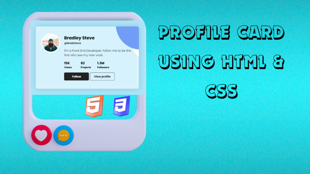
This digital profile card holds all the information about the particular user. These cards are very beneficial for increasing business as they give all the information to the customer about all the services provided by the card holder.
30+ HTML CSS and Javascript Projects
Live Project:
It is a beginner project where we will learn more about styling and all the concepts related to styling, like what color palette should be chosen for good contrast and all the other necessary styling concepts. But before starting with our project, let’s understand some of the basic concepts of a profile card.
What is a profile Card?
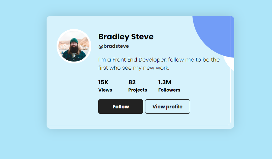
A profile card is a digital type of identity card that is created using basic HTML and CSS. A profile card contains the image of the user along with their name, work, and services provided by the individual, as well as all the social media links for contacting the person.
Adding the Structure:(HTML)
HTML is a hypertext markup language that helps in creating the body of the project. Here we will create a main container for our profile card using the <div>tag, and using the child div tag, we will create a container for the profile image, and we will add an image using the URL.
Then we will create a container for the user name and add the name of the user by using the <h2> tag and the user handle with the small heading <h4>.
We will add the user’s brief description using the <p>tag. Next, we will add the list items where we will display the user’s social media reach using the unordered list tag and for making connection with the user we will add the social button for the user.
<div class="card">
    <div class="img">
      <img src="https://images.unsplash.com/photo-1610216705422-caa3fcb6d158?ixid=MnwxMjA3fDB8MHxzZWFyY2h8NDB8fGZhY2V8ZW58MHwyfDB8fA%3D%3D&ixlib=rb-1.2.1&auto=format&fit=crop&w=500&q=60">
    </div>
    <div class="infos">
      <div class="name">
        <h2>Bradley Steve</h2>
        <h4>@bradsteve</h4>
      </div>
      <p class="text">
        I'm a Front End Developer, follow me to be the first
        who see my new work.
      </p>
      <ul class="stats">
        <li>
          <h3>15K</h3>
          <h4>Views</h4>
        </li>
        <li>
          <h3>82</h3>
          <h4>Projects</h4>
        </li>
        <li>
          <h3>1.3M</h3>
          <h4>Followers</h4>
        </li>
      </ul>
      <div class="links">
        <button class="follow">Follow</button>
        <button class="view">View profile</button>
      </div>
    </div>
  </div>
Adding the styling (CSS):
Basic Styling:
Using the Google import links, we will import the new fonts Poppins with font weights of 100, 300, and 700. Also, using the (*) universal tag selector, we will add the padding and margin as “zero,” and the box type is border-box.
Now using the body tag selector, we will change the font style to Poppins, which we imported using Google Fonts. Also, using the align-items property, we will align the items to the center, and using the background-color property, we will add a blue background.
@import url('https://fonts.googleapis.com/css2?family=Poppins:wght@100;300;700&display=swap');

* {
  margin: 0;
  padding: 0;
  box-sizing: border-box;
}

body {
  font-family: 'Poppins', sans-serif;
  align-items: center;
  justify-content: center;
  background-color: #ADE5F9;
  min-height: 100vh;
}
Styling Image :
Using the img tag selector, we will style the picture. The maximum width will be added to the picture using the max-width attribute, and the display will be set to “block” using the display tag. The text format will now be standard text as we’ve set the list style to none using the unordered list element.
img {
  max-width: 100%;
  display: block;
}
ul {
  list-style: none;
}
Styling Card:
Using the multiple tag selector, we will add the same styling to the multiple elements of the profile card. Using the child selector image, we will set the border radius to 50%, which makes the image circular.
Now using the class selector (.card), we will add a padding of 2.5 rem, and using the border radius property, we will add a border radius of 10 px, which will make the corner a little curved. Using the background color property, we will set the background color to blue using the RGB color combination.
We will add padding and margin and also change the font size and styling so that our product card looks more interactive and user-friendly. We will also add the hover property to the social media icons so if any user hovers over the button, the background of the button changes.
/* Utilities */
.card::after,
.card img {
  border-radius: 50%;
}
body,
.card,
.stats {
  display: flex;
}

.card {
  padding: 2.5rem 2rem;
  border-radius: 10px;
  background-color: rgba(255, 255, 255, .5);
  max-width: 500px;
  box-shadow: 0 0 30px rgba(0, 0, 0, .15);
  margin: 1rem;
  position: relative;
  transform-style: preserve-3d;
  overflow: hidden;
}
.card::before,
.card::after {
  content: '';
  position: absolute;
  z-index: -1;
}
.card::before {
  width: 100%;
  height: 100%;
  border: 1px solid #FFF;
  border-radius: 10px;
  top: -.7rem;
  left: -.7rem;
}
.card::after {
  height: 15rem;
  width: 15rem;
  background-color: #4172f5aa;
  top: -8rem;
  right: -8rem;
  box-shadow: 2rem 6rem 0 -3rem #FFF
}

.card img {
  width: 8rem;
  min-width: 80px;
  box-shadow: 0 0 0 5px #FFF;
}

.infos {
  margin-left: 1.5rem;
}

.name {
  margin-bottom: 1rem;
}
.name h2 {
  font-size: 1.3rem;
}
.name h4 {
  font-size: .8rem;
  color: #333
}

.text {
  font-size: .9rem;
  margin-bottom: 1rem;
}

.stats {
  margin-bottom: 1rem;
}
.stats li {
  min-width: 5rem;
}
.stats li h3 {
  font-size: .99rem;
}
.stats li h4 {
  font-size: .75rem;
}

.links button {
  font-family: 'Poppins', sans-serif;
  min-width: 120px;
  padding: .5rem;
  border: 1px solid #222;
  border-radius: 5px;
  font-weight: bold;
  cursor: pointer;
  transition: all .25s linear;
}
.links .follow,
.links .view:hover {
  background-color: #222;
  color: #FFF;
}
.links .view,
.links .follow:hover{
  background-color: transparent;
  color: #222;
}
Adding Responsiveness:
We will make our project responsive, so the profile card will adjust the size according to the different devices for a better user experience. Using the media query property, we will set the maximum width of the screen, and if the screen size goes below the defined screen size, the display is set to block, and the profile card will automatically adjust the size as per the device.
@media screen and (max-width: 450px) {
  .card {
    display: block;
  }
  .infos {
    margin-left: 0;
    margin-top: 1.5rem;
  }
  .links button {
    min-width: 100px;
  }
}
Final Output:
Conclusion:
So, you saw how we created the profile card using HTML and CSS in a step-by-step manner, explaining all the important concepts, starting from creating the structure for the profile card to styling the signup form to make it look more interactive.
For more such projects stay connected with Foolish Developer and become an expert in coding. If you have any queries feel free to ask in the comment section.
Thank you!!
Author: Arun
Codepen by: Ayoub