
In this tutorial, you will learn how to create a Simple Responsive Layout with CSS Grid. Currently, Responsive Word is very important for any website. Different websites have different types of structures. Some websites are made up of two-column websites. However, CSS Grid makes this task much easier.
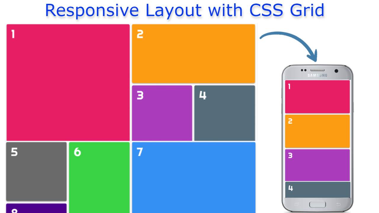
CSS Grid arranges the columns of the website according to the screen size of the device. Here I have created a Responsive Layout using CSS Grid. I have given here an example and the necessary source code. You can create a Responsive Layout using that source code using CSS Grid.
The most important point here is that the layouts I have used are of different sizes. Each is made of a different size. Here the contents are arranged using three columns. However, in the case of responsive devices, it can be seen in a column.
Simple Responsive Layout with CSS Grid
I have not shared any tutorial on this design. I have given only the source code here. I used HTML and CSS to make it. Using some amount of HTML, I have created the layouts in it and with the help of CSS, I have made them in design and response.
See the Pen
CSS Grid Template by Foolish Developer (@foolishdevweb)
on CodePen.
Hopefully by watching the demo above you understand how this Simple Responsive Layout works. Any website or element is very important because the number of mobile users is many times more than the number of desktop users.
Below I have provided HTML and CSS codes that you can copy and use for any purpose. Create an HTML and CSS file if you want to make it. Hope you know how to create HTML and CSS files.
Step 1: HTML code of Responsive Layout
10 boxes have been created using the following HTML codes. You copy these codes and paste them into your HTML file.
Step 2: Make the layouts responsive with CSS Grid
Now it’s time to design it with CSS code. Copy the following code and add it to your CSS file. Be sure to attach your CSS file to the HTML file.
Hopefully, with the help of the above code, you understand how this Responsive Layout with CSS Grid has been created. Copy the codes above and add them to your HTML and CSS files. If there is any difficulty in copying and assembling the codes, you can take the help of the download button below.
You can take the help of the demo section above to know how it works in the case of Responsive Devices. You can use the download button below to download the source code required to create this (Responsive Layout with CSS Grid).