Introduction :
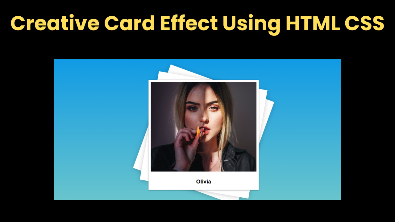
Hello developer friends, today we have created a beautiful, small and nice project for you which is quite amazing. This is a Creative Card Effect Using HTML CSS project in which when you hover over the image card box, it shows you an amazing animation in which the image transforms and different shapes are designed in the background of the image which are displayed with smooth animation and this animation looks quite amazing. We have created it with the help of CSS.
Explanation :
First of all, let’s create the structure of our project in which we use HTML and the most important thing for our project is the image which is very important for you to have, make sure you have the image.
- Head Section:
- <meta>: The head section contains the most important meta link which is very important for our project.
- <title>: If we want to add a title to our project, then we have to add it in the head section, for which we use the title tag.
- stylesheet: It is very important to have CSS code for any project, for which it is necessary to link the CSS file to HTML, for which we use the head section.
- Body Section:
- <body>: The most important thing in the body section is the body tag in which we write the code of our project.
- <section>: To create image animation we first created a main section named card section.
- img Box: After this we have created another section in which we have added the image, this is the image section.
- <img>: To add the image we have used HTML’s image element.
- <article>: We have added text at the bottom of the image for which we have used article element.
CSS Styling:
Now we have created the structure of our project with the help of HTML. Now we have to design our project with the help of CSS and also add the hover effect.
- background: We have first added the background to the body which you can do as per your choice.
- display: We flex the display so that our body content is centered and flexed.
- font-family: We used the css font element to add fonts to our project. We used the sans-serif font.
- card: For designing card box we have used position relative and also we have used shadow in it.
- hover: We used After Effects to add an effect to the image where the image transforms on hover.
In this way we have designed our project in which we have used hover effect and also added width and height. If you have good knowledge of CSS then you can make very good CSS projects.
Index.html:
<html lang="en">
  <head>
    <meta charset="UTF-8" />
    <meta http-equiv="X-UA-Compatible" content="IE=edge" />
    <meta name="viewport" content="width=device-width, initial-scale=1.0" />
    <title>Talha - Creative Card</title>
    <link rel="stylesheet" href="style.css" />
  </head>
  <body>
    <section class="card">
      <section class="imgBox">
        <img src="marian-oleksyn-Edv_EEWiB3E-unsplash.jpg" />
      </section>
      <article class="details">
        <h2>Olivia</h2>
      </article>
    </section>
  </body>
</html>
Style.css:
body {
  margin: 0;
  height: 100vh;
  background: linear-gradient(#0093e9, #80d0c7);
  display: flex;
  justify-content: center;
  align-items: center;
  font-family: sans-serif;
}

.card {
  position: relative;
  width: 30rem;
  height: 30rem;
  background: white;
  box-shadow: 0 1px 5px rgba(0, 0, 0, 0.5);
}

.card:before,
.card:after {
  content: "";
  position: absolute;
  top: 0;
  left: 0;
  width: 100%;
  height: 100%;
  background: white;
  transition: 1s;
  z-index: -1;
}

.card:hover:before {
  transform: rotate(20deg);
  box-shadow: 0 2px 20px rgba(0, 0, 0, 0.2);
}

.card:hover:after {
  transform: rotate(10deg);
  box-shadow: 0 2px 20px rgba(0, 0, 0, 0.2);
}

.imgBox {
  position: absolute;
  top: 10px;
  left: 10px;
  bottom: 10px;
  right: 10px;
  background: #222;
  transition: 1s;
  z-index: 2;
}

img {
  position: absolute;
  top: 0;
  left: 0;
  width: 100%;
  height: 100%;
  object-fit: cover;
}

.card:hover .imgBox {
  bottom: 80px;
}

.details {
  position: absolute;
  left: 10px;
  right: 10px;
  bottom: 10px;
  height: 60px;
  text-align: center;
}