Introduction:
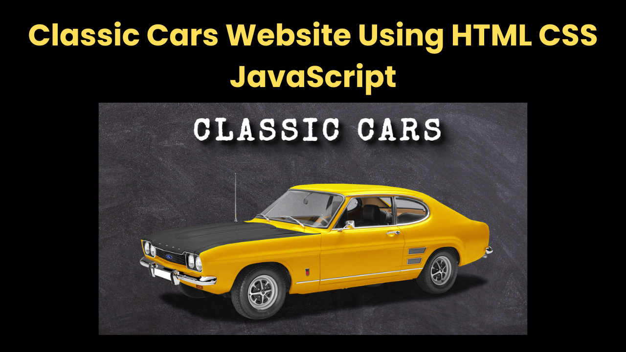
Welcome to this comprehensive tutorial where we will Classic Cars Website Using HTML CSS JavaScript. This project is perfect for beginners and intermediate web developers who want to practice building multi-section, responsive websites with clean code and interactive features.
The website we’ll create features multiple sections such as a hero banner, popular cars cards, video and image galleries, and a contact form — all styled with modern design principles.
- HTML (HyperText Markup Language) establishes the foundation by structuring headings, images, sections, and navigation menus.
- CSS (Cascading Style Sheets) transforms that foundation into an engaging design, managing colors, typography, layouts, responsiveness, and animations.
- JavaScript brings interactivity to life, allowing menu toggles, hover effects, dynamic transitions, and video playback controls.
By the end of this tutorial, you’ll have a well-optimized, SEO-friendly website that is fully responsive and interactive. Let’s dive in and build a stunning Classic Cars showcase website from scratch!
Why Build This Classic Cars Website?
Building this website is a great way to:
- Practice semantic and well-structured HTML markup
- Master responsive layouts using CSS Flexbox and Grid
- Apply custom Google Fonts and typography
- Create interactive UI elements like hamburger menus with JavaScript
- Handle multimedia content — images and videos — on your site
- Build a multi-section one-page website with smooth navigation
Plus, this website can serve as a portfolio piece, a car enthusiast blog, or a landing page for a car dealership or event.
Project Overview: What We’ll Build
- A Hamburger Menu icon for mobile-friendly navigation
- Navigation Bar with links that smoothly scroll to sections
- Hero Section with a large heading and a classic car banner image
- Popular Cars Section displaying car cards with images, names, prices, and “See More” buttons
- Video Gallery showing multiple looping, muted videos of classic cars
- Image Gallery displaying classic car photos arranged in a visually appealing layout with decorative “shelves”
- Contact Form with input fields for name, email, and message, plus a submit button
- Footer with copyright info
Step 1: Structuring Your HTML:
Your HTML is the backbone of the website. Here’s what you need to keep in mind.
- Wrap each major section inside a .wrapper container for consistent spacing and layout
- Include meaningful class names to target elements easily in CSS and JavaScript
- Include links to Google Fonts for custom typography
- Reference external CSS and JS files for modular code
HTML provides the essential layout of the website, ensuring proper sectioning, accessibility, and usability. Below is a breakdown of core components that help structure the site intuitively.
Navigation Bar Setup:
The navigation menu enables easy browsing between sections. Each link smoothly transitions to its corresponding section, improving user experience.
<nav class="navbar target">
  <a href="#home" class="navbar-link">Home</a>
  <a href="#popular-cars" class="navbar-link">Popular Cars</a>
  <a href="#video-gallery" class="navbar-link">Video Gallery</a>
  <a href="#image-gallery" class="navbar-link">Image Gallery</a>
  <a href="#contact" class="navbar-link">Contact</a>
</nav>
This navbar is designed to be sticky, meaning it remains fixed at the top while scrolling. The JavaScript toggle mechanism will ensure it appears dynamically when clicked.
Hero Section for Classic Car Showcase:
A visually striking hero section introduces the website with a bold heading and a featured car image.
<section class="section-1 target center" id="home">
  <h1 class="section-heading">Classic Cars</h1>
  <img src="images/car-section1.png" class="section-1-img" />
</section>
Including a high-resolution background image and well-spaced content ensures this section captures attention immediately.
Interactive Video Gallery:
To make the site engaging, the video gallery section dynamically plays videos on hover, creating an immersive browsing experience.
<section class="section-3 target" id="video-gallery">
  <h1 class="section-heading">Video Gallery</h1>
  <div class="videos-wrapper center">
    <video src="images/car-video.mp4" muted loop class="video"></video>
  </div>
</section>
Step 2: Styling with CSS — Design and Responsiveness:
The CSS makes the website look nice and work well on different devices. Here are some important parts with small code snippets:
1. Typography
We use Google Fonts for clean, readable text:
<link href="https://fonts.googleapis.com/css2?family=Josefin+Sans&display=swap" rel="stylesheet" />
2. Layout and Centring
The .wrapper class centers content and adds padding:
.wrapper {
  max-width: 1200px;
  margin: 0 auto;
  padding: 20px;
}
Step 3: Adding JavaScript for Interactivity
JavaScript enhances the user experience by:
- Toggling the hamburger menu: When the menu icon is clicked, it toggles between open and closed states and shows/hides the navbar on mobile devices.
- Smooth scrolling: Clicking navigation links smoothly scrolls the user to the respective section instead of a sudden jump (you can use native CSS scroll-behavior: smooth or JS).
How JavaScript Makes the Navigation Menu Interactive:
One of the key features of this car website is its responsive navigation menu. On smaller screens, the menu turns into a hamburger icon (the three lines), which users can tap to open or close the menu. This functionality is powered by a small but powerful JavaScript snippet.
What Does the JavaScript Do?:
The JavaScript listens for a click on the hamburger menu icon. When clicked, it toggles an active class on both the menu icon and the navigation bar. This triggers CSS animations and changes that show or hide the menu and animate the icon into a cross (X), letting users know the menu is open.
Here’s the JavaScript code that makes this happen:
const menu = document.querySelector('.menu');
const navbar = document.querySelector('.navbar');
menu.addEventListener('click', () => {
  menu.classList.toggle('active');
  navbar.classList.toggle('active');
});- document.querySelector grabs the HTML elements with the classes .menu and .navbar.
- addEventListener(‘click’, …) waits for a user to click the menu icon.
- classList.toggle(‘active’) adds the class active if it’s missing, or removes it if it’s already there.
Conclusion:
We have successfully built a responsive, SEO-friendly classic car website using HTML, CSS, and JavaScript. This project demonstrates effective structuring, engaging design, and interactive elements that enhance user experience. Building this Classic Cars website is a practical way to improve your frontend skills. You get to:
- Structure a multi-section HTML page professionally
- Style with modern CSS techniques and Google Fonts
- Use JavaScript for simple but effective UI interactivity
- Manage multimedia content efficiently
Index.html:
<div class="menu target center">
<div class="menu-line menu-line-1"></div>
<div class="menu-line menu-line-2"></div>
</div>
<!-- End of Menu -->
<!-- Navbar -->
<nav class="navbar target">
<a href="#home" class="navbar-link">Home</a>
<a href="#popular-cars" class="navbar-link">Popular Cars</a>
<a href="#video-gallery" class="navbar-link">Video Gallery</a>
<a href="#image-gallery" class="navbar-link">Image Gallery</a>
<a href="#contact" class="navbar-link">Contact</a>
</nav>
<!-- End of Navbar -->
<!-- Section 1 -->
<div class="wrapper">
<section class="section-1 target center" id="home">
<h1 class="section-heading section-1-heading">Classic Cars</h1>
<img src="images/car-section1.png" class="section-1-img" />
</section>
</div>
<!-- End of Section 1 -->
<!-- Section 2 -->
<div class="wrapper">
<section class="section-2 target" id="popular-cars">
<h1 class="section-heading">Popular Cars</h1>
<div class="cards-wrapper center">
<div class="card">
<h2 class="car-name">Car Name</h2>
<img src="images/car-1.jpg" class="card-img" />
<h3 class="car-price">$ 200,000</h3>
<button type="button" class="card-btn">See More</button>
</div>
<div class="card">
<h2 class="car-name">Car Name</h2>
<img src="images/car-2.jpg" class="card-img" />
<h3 class="car-price">$ 100,000</h3>
<button type="button" class="card-btn">See More</button>
</div>
<div class="card">
<h2 class="car-name">Car Name</h2>
<img src="images/car-3.jpg" class="card-img" />
<h3 class="car-price">$ 150,000</h3>
<button type="button" class="card-btn">See More</button>
</div>
</div>
</section>
</div>
<!-- End of Section 2 -->
<!-- Section 3 -->
<div class="wrapper">
<section class="section-3 target" id="video-gallery">
<h1 class="section-heading">Video Gallery</h1>
<div class="videos-wrapper center">
<video src="images/car-video-1.mp4" muted loop class="video"></video>
<video src="images/car-video-2.mp4" muted loop class="video"></video>
<video src="images/car-video-3.mp4" muted loop class="video"></video>
</div>
<div class="videos-wrapper center">
<video src="images/car-video-4.mp4" muted loop class="video"></video>
<video src="images/car-video-5.mp4" muted loop class="video"></video>
<video src="images/car-video-6.mp4" muted loop class="video"></video>
</div>
</section>
</div>
<!-- End of Section 3 -->
<!-- Section 4 -->
<div class="wrapper">
<section class="section-4 target" id="image-gallery">
<h1 class="section-heading">Image Gallery</h1>
<div class="gallery center">
<div class="gallery-shelf"></div>
<img src="images/gallery-car-1.jpg" class="gallery-img-1" />
<img src="images/gallery-car-2.jpg" class="gallery-img-2" />
<img src="images/gallery-car-3.jpg" class="gallery-img-3" />
</div>
<div class="gallery center">
<div class="gallery-shelf"></div>
<img src="images/gallery-car-4.jpg" class="gallery-img-1" />
<img src="images/gallery-car-5.jpg" class="gallery-img-2" />
<img src="images/gallery-car-6.jpg" class="gallery-img-3" />
</div>
</section>
</div>
<!-- End of Section 4 -->
<!-- Section 5 -->
<div class="wrapper">
<section class="section-5 target" id="contact">
<h1 class="section-heading">Contact Us</h1>
<form class="contact-form">
<input type="text" class="form-input" placeholder="Your Full Name" />
<input type="email" class="form-input" placeholder="Your Email" />
<textarea class="form-input" placeholder="Enter Message"></textarea>
<input class="form-btn" type="submit" value="Submit" />
</form>
<p class="copyright">
Copyright © CodeAndCreate All Rights Reserved
</p>
</section>
</div>
<!-- End of Section 5 -->
<script src="script.js"></script>Style.css:
/* Common Styles */
* {
  margin: 0;
  padding: 0;
  outline: none;
  box-sizing: border-box;
  text-decoration: none;
  list-style-type: none;
  font-family: "Special Elite", cursive;
  font-weight: 400;
}

html {
  font-size: 62.5%;
  scroll-behavior: smooth;
}

body {
  background-color: #ccc;
  padding-right: 3rem;
}

.center {
  display: flex;
  justify-content: center;
  align-items: center;
}
/* End of Common Styles */

/* Menu */
.menu {
  width: 4rem;
  height: 4rem;
  position: fixed;
  top: 2rem;
  left: 2rem;
  z-index: 10;
  flex-direction: column;
  cursor: pointer;
  transition: all 0.5s;
}

.menu.change {
  transform: rotate(45deg);
  left: 15vw;
}

.menu-line {
  width: 100%;
  height: 0.2rem;
  background-color: #fff;
  margin: 0.3rem 0;
  box-shadow: 0.1rem 0.1rem 0.3rem #222;
  transition: transform 0.5s;
}

.change .menu-line-1 {
  transform: rotate(270deg) translateX(-0.4rem);
}

.change .menu-line-2 {
  transform: rotate(360deg) translateY(-0.4rem);
}
/* End of Menu */

/* Navbar */
.navbar {
  width: 15vw;
  height: 100vh;
  background-color: #fff;
  position: fixed;
  top: 0;
  left: -15vw;
  display: flex;
  flex-direction: column;
  padding: 4rem 0 0 4rem;
  z-index: 10;
  transition: left 0.5s;
}

.navbar.change {
  left: 0;
}

.navbar-link {
  font-size: 1.5rem;
  font-weight: 600;
  margin: 2rem 0;
  color: #777;
  letter-spacing: 0.3rem;
  text-transform: uppercase;
  transition: color 0.3s;
}

.navbar-link:hover {
  color: #111;
}
/* End of Navbar */

/* Common Section Styles */
.wrapper {
  width: 100%;
  perspective: 50rem;
}

section {
  width: 100%;
  height: 100vh;
  background-color: #efefef;
  position: relative;
  left: 0;
  margin-bottom: 3rem;
  transform-origin: left;
  box-shadow: 0.5rem 0.5rem 1rem #aaa;
  padding: 5rem 0;
  transition: left 0.5s, transform 0.5s;
}

section.change {
  left: 15vw;
  transform: rotateY(10deg);
}

.section-heading {
  font-size: 10rem;
  font-weight: bolder;
  color: #fff;
  margin-bottom: 10rem;
  letter-spacing: 1rem;
  text-align: center;
  text-shadow: 0.3rem 0.3rem 0.5rem #555;
}
/* End of Common Section Styles */

/* Section-1 */
.section-1 {
  flex-direction: column;
  background: url(images/bg-section1.jpg) center no-repeat;
  background-size: cover;
}

.section-1 .section-1-heading {
  margin-bottom: 3rem;
  text-transform: uppercase;
  text-shadow: 1rem 1rem 1rem #000, 2rem 2rem 2rem #111, 3rem 3rem 3rem #222;
}

.section-1-img {
  width: 70%;
}
/* End of Section-1 */

/* Section 2 */
.section-2 {
  display: flex;
  flex-direction: column;
  justify-content: space-around;
}

.card {
  width: 50rem;
  margin: 0 3rem;
  background-color: #fff;
  padding: 1rem;
  box-shadow: 0.6rem 0.6rem 0.6rem #bbb;
  position: relative;
  transition: box-shadow 0.5s;
}

.card:hover {
  box-shadow: 0.8rem 0.8rem 0.8rem #bbb;
}

.car-name {
  font-size: 2rem;
  font-weight: 600;
  text-transform: uppercase;
  color: #fff;
  position: absolute;
  top: 2rem;
  left: 2rem;
  z-index: 10;
}

.card-img {
  width: 100%;
  opacity: 0.8;
  transition: opacity 0.5s;
}

.card:hover .card-img {
  opacity: 1;
}

.car-price {
  font-size: 1.8rem;
  color: #777;
  margin: 0.5rem 0;
}

.card-btn {
  width: 100%;
  background-color: #fff;
  font-size: 1.7rem;
  letter-spacing: 0.3rem;
  text-transform: uppercase;
  border: none;
  margin-top: 1rem;
  padding: 0.5rem;
  color: #fff;
  text-shadow: 0.1rem 0.1rem 0.3rem #000;
  box-shadow: 0.1rem 0.1rem 0.5rem #bbb;
  cursor: pointer;
}
/* End of Section 2 */

/* Section 3 */
.section-3 {
  display: flex;
  flex-direction: column;
  justify-content: space-around;
  background-color: #222;
}

.video {
  width: 25%;
  margin: 0 2rem;
  border-radius: 0.5rem;
  opacity: 0.8;
  box-shadow: 0.3rem 0.3rem 0.5rem #111;
  transition: all 0.5s;
}

.video:hover {
  opacity: 1;
  box-shadow: 0.5rem 0.5rem 1rem #111;
}
/* End of Section 3 */

/* Section 4 */
.section-4 {
  display: flex;
  flex-direction: column;
  justify-content: space-between;
}

.gallery {
  margin: 10rem 0;
  perspective: 10rem;
}

.gallery-shelf {
  width: 80%;
  height: 3rem;
  background-color: rgba(38, 126, 199, 0.8);
  margin: auto;
  position: relative;
  box-shadow: 1rem 1rem 5rem #444;
}

.gallery-shelf::before {
  content: "";
  position: absolute;
  width: 100%;
  height: 10rem;
  background-color: rgba(34, 152, 248, 0.7);
  top: -10rem;
  transform: rotateX(20deg);
  transform-origin: bottom;
}

.gallery img {
  width: 15%;
  position: absolute;
  bottom: 6rem;
  transform: translateX(-50%) rotateX(0.5deg);
  box-shadow: 0.2rem -0.2rem 0.5rem #888;
  border-radius: 0.5rem;
  transform-origin: bottom;
  transition: all 0.3s;
}

.gallery img:hover {
  transform: translateX(-50%) rotateX(0);
  box-shadow: 0 0.2rem 0.3rem #888;
}

.gallery-img-1 {
  left: 50%;
}

.gallery-img-2 {
  left: 30%;
}

.gallery-img-3 {
  left: 70%;
}
/* End of Section 4 */

/* Section 5 */
.section-5 {
  background: linear-gradient(rgba(0, 0, 0, 0.6), rgba(0, 0, 0, 0.8)),
    url(images/bg-section5.jpg) center no-repeat;
  background-size: cover;
  display: flex;
  flex-direction: column;
  justify-content: space-around;
  align-items: center;
  margin-bottom: 0;
}

.contact-form {
  width: 60rem;
  height: 45rem;
  background-color: rgba(255, 255, 255, 0.2);
  border: 2rem solid rgba(255, 255, 255, 0.8);
  display: flex;
  flex-direction: column;
  justify-content: center;
  padding: 5rem;
}

.contact-form input,
.contact-form textarea {
  width: 100%;
  height: 4rem;
  margin: 2rem 0;
  background-color: transparent;
  padding: 0.5rem;
  border: 0.1rem solid #fff;
  font-size: 1.5rem;
  letter-spacing: 0.1rem;
  color: #fff;
  flex-shrink: 0;
  transition: background-color 0.5s;
}

.contact-form textarea {
  max-width: 100%;
  min-height: 8rem;
}

.form-input:focus {
  background-color: rgba(255, 255, 255, 0.5);
}

.contact-form .form-btn {
  background-color: rgba(255, 255, 255, 0.8);
  font-weight: 600;
  letter-spacing: 0.3rem;
  color: #444;
  cursor: pointer;
}

.copyright {
  font-size: 2rem;
  font-weight: 300;
  color: #fff;
  text-align: center;
}
/* End of Section 5 */

/* Responsive */
@media (max-width: 1500px) {
  .navbar {
    width: 20vw;
    padding: 2rem 0 0 2rem;
    left: -20vw;
  }

  .menu.change {
    left: 20vw;
  }

  section.change {
    left: 20vw;
    transform: rotateY(15deg);
  }

  .section-heading {
    font-size: 7rem;
  }

  .section-1 {
    justify-content: space-evenly;
  }

  .section-2 {
    height: auto;
    padding: 5rem 0 10rem 0;
  }

  .cards-wrapper {
    flex-wrap: wrap;
  }

  .card {
    width: 40rem;
    margin: 3rem;
  }

  .section-3 {
    padding: 5rem 3rem;
  }

  .video {
    width: 30%;
    margin: 2rem;
  }

  .section-4 {
    height: auto;
  }

  .gallery {
    margin: 12rem 0;
  }

  .gallery-shelf {
    width: 90%;
  }

  .gallery img {
    width: 20%;
  }

  .gallery-img-2 {
    left: 25%;
  }

  .gallery-img-3 {
    left: 75%;
  }

  .section-5 {
    height: auto;
  }

  .contact-form {
    width: 55rem;
    height: 40rem;
    padding: 2rem;
  }

  .copyright {
    margin-top: 5rem;
  }
}

@media (max-width: 1000px) {
  body {
    padding-right: 0;
  }

  .navbar {
    width: 25vw;
    left: -25vw;
  }

  .menu.change {
    left: 25vw;
  }

  section.change {
    left: 25vw;
    transform: rotateY(20deg);
  }

  .section-1-img {
    width: 90%;
  }

  .section-3 {
    height: auto;
  }

  .videos-wrapper {
    flex-direction: column;
  }

  .video {
    width: 70%;
    margin: 3rem 0;
  }
}

@media (max-width: 750px) {
  .navbar {
    width: 30vw;
    left: -30vw;
  }

  .menu.change {
    left: 30vw;
  }

  section.change {
    left: 30vw;
    transform: rotateY(25deg);
  }

  .section-heading {
    font-size: 5.5rem;
  }

  .section-4 {
    padding: 6rem 0 1rem 0;
  }

  .gallery-shelf {
    height: 1.5rem;
    width: 95%;
  }

  .gallery-shelf::before {
    height: 5rem;
    top: -5rem;
  }

  .gallery img {
    width: 25%;
    bottom: 4rem;
  }

  .gallery-img-2 {
    left: 22%;
  }

  .gallery-img-3 {
    left: 78%;
  }
}

@media (max-width: 600px) {
  html {
    font-size: 55.5%;
  }

  .navbar {
    width: 40vw;
    left: -40vw;
  }

  .menu.change {
    left: 40vw;
  }

  section.change {
    left: 0;
    transform: rotateY(0);
  }

  .section-heading {
    font-size: 4.5rem;
  }

  .section-1-img {
    width: 100%;
  }

  .video {
    width: 100%;
    margin: 2rem 0;
  }

  .gallery {
    margin: 9rem 0;
  }

  .contact-form {
    width: 40rem;
    border: 1rem solid rgba(255, 255, 255, 0.8);
  }
}

@media (max-width: 400px) {
  html {
    font-size: 40%;
  }

  .copyright {
    width: 80%;
  }
}
/* End of Responsive */
Script.js:
document.querySelector(".menu").addEventListener("click", () => {
  document.querySelectorAll(".target").forEach((item) => {
    item.classList.toggle("change");
  });
});

document.querySelectorAll(".wrapper").forEach((item) => {
  item.addEventListener("click", () => {
    document.querySelectorAll(".target").forEach((item) => {
      item.classList.remove("change");
    });
  });
});

const videos = document.querySelectorAll(".video");

videos.forEach((video) => {
  video.addEventListener("mouseover", () => {
    video.play();
  });
  video.addEventListener("mouseout", () => {
    video.pause();
  });
});