Books are the real friends of humans that teach them everything about the world, whether our past histories, different geographical studies, different calculations, or various other types of knowledge.
However students usually find difficulty purchasing new books, and to solve this problem, we will design a UI for our bookstore website using HTML and CSS.

In this article, we will create a bookstore website project using HTML and CSS. We will create unique website designs where we will list all the different types of books with their details for easy selection of the books for the user.
30+ Projects Using HTML and CSS
I hope you got some idea about the project. We will be creating each section from scratch, so it is helpful for every developer to enhance their skill set.
Let’s take a look at the live demo:
See the Pen Online Book Store by yash falke (@yashfalke77) on CodePen.
Adding the Structure (HTML):
Adding New Fonts:
First of all, we will be adding new fonts to our book store app, and then we will be using new font faces to style our book store using the link. We will be creating links for the “Roboto” font face and the “Noto Sans” font face. We will be using all these font faces using CSS.
We will also be using some icons inside our bookstore website; for that, we will be using Google icon links.
<!-- Fonts...... -->
    <link rel="preconnect" href="https://fonts.gstatic.com">
    <link href="https://fonts.googleapis.com/css2?family=Roboto:wght@300&display=swap" rel="stylesheet">
    <link rel="preconnect" href="https://fonts.gstatic.com" crossorigin>
    <link href="https://fonts.googleapis.com/css2?family=Noto+Sans+JP:wght@300&display=swap" rel="stylesheet">

    <!-- Google icons  -->
    <link href="https://fonts.googleapis.com/icon?family=Material+Icons" rel="stylesheet">
Creating the Navbar:
Using the <nav> tag, we will be creating a navbar or navigation bar that provides ease of access for the user to move to different sections of the website. Also, using the <div> tag, we will create the container for our navbar, and inside it, we will create a hyperlink for browsing categories, where we can add different categories using the <select> tag for the drop-down menu.
Also, using the <h3> tag, we will create the heading for readbooks, and using the div tag, we will create an About Us link in the navigation bar so that users can easily move to the About Us section.
 <nav class="nav-bar">
        <div class="nav1">
            <a href="">Browse Categories</a>
            <input type="text" id="search_book" placeholder="Search Book">
        </div>
        <h3>readbooks</h3>
        <div class="icon-about">
            <i class="material-icons"><span class="material-icons-outlined">account_circle</span></i>
            <a href="">About-Us</a>
        </div>

    </nav>

Main Section:
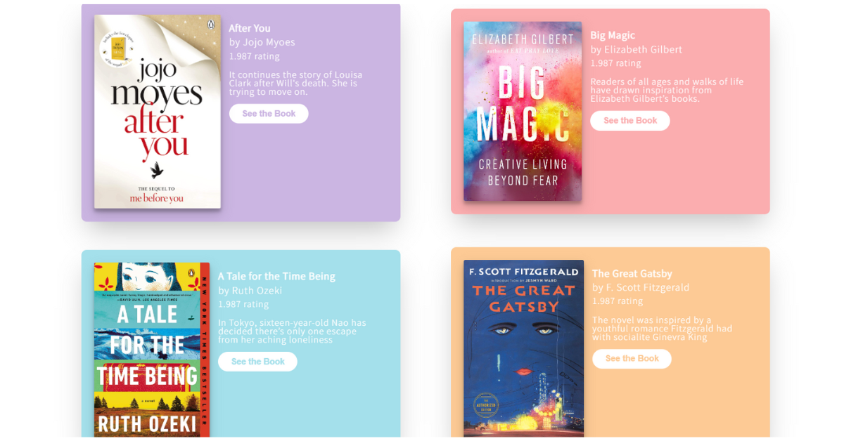
Using the main tag, we will create the main section of our book store website, where we will be adding all the book, novel, and other helpful guide data. Using the div tag, we will create the container for books, and using the <img> tag with src, we will be adding some images inside our bookstore.
We will create another section called description for writing the information about the book, such as the book name, author, rating, and a small description of the website, and we will also create a button to see the book.
In a similar manner, we will be adding more books with their images and information about the books. We will be adding all the details inside our book store.
 <main>
        <div class="books">
            <div>
                <img src="https://images-na.ssl-images-amazon.com/images/I/718ReYbwlFL.jpg" alt="" class="book-img">
            </div>
            <div class="descp">
                <h2 class="book-name">After You</h2>
                <h3 class="author">by Jojo Myoes</h3>
                <h3 class="rating">1.987 rating</h3>
                <p class="info">
                    It continues the story of Louisa Clark after Will's death. She is trying to move on.
                </p>
                <button type="submit">See the Book</button>
            </div>
        </div>

        <div class="books">
            <div>
                <img src="https://images-na.ssl-images-amazon.com/images/I/91JxVjINNsL.jpg" alt="" class="book-img">
            </div>
            <div class="descp">
                <h2 class="book-name">Big Magic</h2>
                <h3 class="author">by Elizabeth Gilbert</h3>
                <h3 class="rating">1.987 rating</h3>
                <p class="info">
                    Readers of all ages and walks of life have drawn inspiration from Elizabeth
                    Gilbert’s books.
                </p>
                <button type="submit" id="b1">See the Book</button>
            </div>
        </div>

        <div class="books">
            <div>
                <img src="https://images-na.ssl-images-amazon.com/images/I/9129dzchsGL.jpg" alt="" class="book-img">
            </div>
            <div class="descp">
                <h2 class="book-name">A Tale for the Time Being</h2>
                <h3 class="author">by Ruth Ozeki</h3>
                <h3 class="rating">1.987 rating</h3>
                <p class="info">
                    In Tokyo, sixteen-year-old Nao has decided there’s only one escape from her aching loneliness

                </p>
                <button type="submit" id="b2">See the Book</button>
            </div>
        </div>

        <div class="books">
            <div>
                <img src="https://images-na.ssl-images-amazon.com/images/I/81djg0KWthS.jpg"
                    alt="" class="book-img">
            </div>
            <div class="descp">
                <h2 class="book-name">The Great Gatsby</h2>
                <h3 class="author">by F. Scott Fitzgerald</h3>
                <h3 class="rating">1.987 rating</h3>
                <p class="info">
                    The novel was inspired by a youthful romance Fitzgerald had with socialite Ginevra King
                </p>
                <button type="submit" id="b3">See the Book</button>
            </div>
        </div>

    </main>
Styling (CSS):
Adding Basic Styling:
Using all the HTML tags, we will select a multiple tag selector and set their padding, margin, and border to zero. Also, using the display property, we will set the display to block, and using the font family property, we will set the font family of the book store app to “Roboto.” Also, using the min-height property, we will set the minimum height to 100 vh.
html, body, div, span, applet, object, iframe,
h1, h2, h3, h4, h5, h6, p, blockquote, pre,
a, abbr, acronym, address, big, cite, code,
del, dfn, em, img, ins, kbd, q, s, samp,
small, strike, strong, sub, sup, tt, var,
b, u, i, center,
dl, dt, dd, ol, ul, li,
fieldset, form, label, legend,
table, caption, tbody, tfoot, thead, tr, th, td,
article, aside, canvas, details, embed,
figure, figcaption, footer, header, hgroup,
menu, nav, output, ruby, section, summary,
time, mark, audio, video {
	margin: 0;
	padding: 0;
	border: 0;
	font-size: 100%;
	font: inherit;
	vertical-align: baseline;
}
/* HTML5 display-role reset for older browsers */
article, aside, details, figcaption, figure,
footer, header, hgroup, menu, nav, section {
	display: block;
}
body {
	line-height: 1;
}
ol, ul {
	list-style: none;
}
blockquote, q {
	quotes: none;
}
blockquote:before, blockquote:after,
q:before, q:after {
	content: '';
	content: none;
}
table {
	border-collapse: collapse;
	border-spacing: 0;
}

/* ---------------------------------------------------------- Main css -------------------------------------------------------------*/
body{
    font-family: 'Roboto', sans-serif;
    min-height: 100vh;
}
Navbar Styling:
Using the class selector property (.nav-bar), we will set the display of the website to flex for the responsiveness of the Book Store web app. The direction of the flex is column-wise. Also, using the align items property, we will align the items to the center of the webpage.
Now, using the class selector (.icon-about), we will set the display to “flex,” and using the align items property, we will align the items to the center. Now we will be adding the styling to each and every element of the website individually.
.nav-bar{
        display: flex;
        flex-direction: column;
        justify-content: center;
        align-items: center;
    }
    .nav1{
        display: flex;
        flex-direction: column;
        align-items: center;
    }
    .icon-about{
        display: flex;
        align-items: center;
        justify-content: center;
        margin-top: 0.5em;
        padding: 1em;
    }
    .nav1 a{
        margin-top: 0.5em;
        padding: 1em;
        border-bottom: 1px solid #adb5bd;
        color: #adb5bd;
        font-size: 1em;
        text-decoration: none;
        transform: translateY(103px);
    }
    .nav1 input{
        margin-top: 0.5em;
        border: none;
        border-bottom: 1px solid #adb5bd;
        padding: 0.8em 1em;
        font-size: 1em;
    }
    .nav1 input::placeholder{
        font-family: 'Roboto', sans-serif;
        color: #adb5bd;
        font-size: 1em;
    }
    input:focus, textarea:focus, select:focus{
        outline: none;
    }
    .nav-bar h3{
        margin-top: 0.5em;
        /* border-bottom: 1px solid #adb5bd; */
        padding: 0.8em 1em;
        font-size: 1em;
        font-weight: bold;
        transform: translateY(-103px);
    }
    .material-icons-outlined{
        color: #adb5bd;
        size: 2px;
        margin-right: 1em;

    }
    .icon-about a{
        text-decoration: none;
        color: #adb5bd;
        font-size: 1em;
        padding-left: 1em;
    }
Styling the Main Section:
Now, using the main tag property, we will add the top margin of 1 rem to add some gap between the navbar and main container for a better and more unique design. Also, using the class selector (.book), we have already set the display to “flex,” which helps in making responsive websites, and now using the child selector, we will add styling to the other book classes.
Now, using the image tag selector, we will set the width to 100%, and using the border-radius property, we will set the border radius to 3 pixels. We will be adding styling to each and every element of our book store UI app. We will set the different colors, and using the para tag selector, we will set the font size, font face, and colors for different headings.
 main{
        margin-top: 1em;
        font-family: 'Noto Sans JP', sans-serif;
    }
    .books{
        display: flex;
        flex-direction: row;
        background-color: #cbb5e2;
        border-radius: 10px;
        margin-bottom: 3em;
        box-shadow: rgba(0, 0, 0, 0.25) 0px 25px 50px -12px;
    }
    .books:nth-of-type(2){
        background-color: #fbadaf;
    }
    .books:nth-of-type(3){
        background-color: #a4e0eb;
    }
    .books:nth-of-type(4){
        background-color: #fdca95;
    }
    .book-img{
        width: 100%;
        max-width: 1000px;
        margin: 1.5em;
        border-radius: 3px;
        transition: transform 1s;
        box-shadow: rgba(0, 0, 0, 0.19) 0px 10px 20px, rgba(0, 0, 0, 0.23) 0px 6px 6px;
    }
    .book-img:hover{
        transform: scale(1.05);
    }
    .descp{
        margin: 1.5em;
        padding: 1em;

    }
    .book-name{
        font-weight: bold;
        padding-bottom: 0.5em;
        font-size: 1.1em;
        letter-spacing: 1px;
        color: white;
    }
    .author{
        padding-bottom: 0.5em;
        font-size: 1.1em;
        letter-spacing: 1px;
        color: white;
    }
    .rating{
        padding-bottom: 1.2em;
        font-size: 1em;
        letter-spacing: 1px;
        color: white;
    }
    .info{
        font-size: 1em;
        letter-spacing: 1px;
        color: white;
    }
    .descp button{
        margin-top: 1em;
        background: none;
        border: none;
        color: #cbb5e2;
        background-color: white;
        padding: 0.6em 1.5em;
        font-size: 1em;
        border-radius: 20px;
        font-weight: bolder;
    }
    .descp button:hover{
        color: #a790f2;
    }
    #b1{
        color: #fbadaf;
    }
    #b1:hover{
        color: #ff6e9f;
    }
    #b2{
        color: #a4e0eb;
    }
    #b2:hover{
        color: #62cdec;
    }
    #b3{
        color: #fdca95;
    }
    #b3:hover{
        color: #fb9124;
    }

}
Adding Responsiveness:
Using the media query property, we will set the defined maximum width or the screen size, and if the size of the document goes below the defined screen width, the background of the image.
@media(min-width: 900px){
    /* ----------------------------------------------------- Navbar ---------------------------------------------------------- */
    .nav-bar{
        display: flex;
        flex-direction: row;
        justify-content: space-between;
    }
    .nav1{
        display: flex;
        flex-direction: row;
        margin-left: 1em;
        margin-bottom: 1em;
        margin-top: 1em;
    }
    .nav1 a{
        padding: 1em;
        border: none;
        border-right: 1px solid #adb5bd;
        color: #adb5bd;
        font-size: 1em;
        text-decoration: none;
    }
    .nav1 input{
        border: none;
        margin-left: 0.5em;
        padding: 0.8em 1em;
        font-size: 1em;
    }
    .nav1 input::placeholder{
        font-family: 'Roboto', sans-serif;
        color: #adb5bd;
        font-size: 1em;
    }
    input:focus, textarea:focus, select:focus{
        outline: none;
    }
    .nav-bar h3{
        padding: 0.8em 1em;
        margin-left: 1em;
        margin-bottom: 1em;
        margin-top: 1em;
        font-size: 1em;
        font-weight: bold;
    }
    .icon-about{
        display: flex;
        align-items: center;
    }
    .material-icons-outlined{
        color: #adb5bd;
        size: 2px;
        margin-right: 1em;

    }
    .icon-about a{
        margin-right: 2em;
        text-decoration: none;
        color: #adb5bd;
        font-size: 1em;
        border-left: 1px solid #adb5bd;
        padding-left: 1em;
    }

    /* ------------------- MAIN BOOKS ---------------------------------- */
    main{
        margin-top: 1em;
        font-family: 'Noto Sans JP', sans-serif;
        display: flex;
        flex-direction: row;
        flex-wrap: wrap;
        justify-content: space-evenly;
        align-items: center;
    }
    .books{
        display: flex;
        flex-direction: row;
        width: 100%;
        max-width: 600px;
        justify-content: space-evenly;
        background-color: #cbb5e2;
        border-radius: 10px;
        margin-bottom: 3em;
        box-shadow: rgba(0, 0, 0, 0.25) 0px 25px 50px -12px;
    }
    .books:nth-of-type(2){
        background-color: #fbadaf;
    }
    .books:nth-of-type(3){
        background-color: #a4e0eb;
    }
    .books:nth-of-type(4){
        background-color: #fdca95;
    }
    .book-img{
        width: 100%;
        max-width: 500px;
        border-radius: 3px;
        transition: transform 1s;
        margin: 1.5em;
        box-shadow: rgba(0, 0, 0, 0.19) 0px 10px 20px, rgba(0, 0, 0, 0.23) 0px 6px 6px;
    }
    .book-img:hover{
        transform: scale(1.05);
    }
    .descp{
        margin: 1.5em;
        padding: 1em;

    }
    .book-name{
        font-weight: bold;
        padding-bottom: 0.5em;
        font-size: 1.1em;
        letter-spacing: 1px;
        color: white;
    }
    .author{
        padding-bottom: 0.5em;
        font-size: 1.1em;
        letter-spacing: 1px;
        color: white;
    }
    .rating{
        padding-bottom: 1.2em;
        font-size: 1em;
        letter-spacing: 1px;
        color: white;
    }
    .info{
        font-size: 1em;
        letter-spacing: 1px;
        color: white;
    }
    .descp button{
        margin-top: 1em;
        background: none;
        border: none;
        color: #cbb5e2;
        background-color: white;
        padding: 0.6em 1.5em;
        font-size: 1em;
        border-radius: 20px;
        font-weight: bolder;
    }
    .descp button:hover{
        color: #a790f2;
    }
    #b1{
        color: #fbadaf;
    }
    #b1:hover{
        color: #ff6e9f;
    }
    #b2{
        color: #a4e0eb;
    }
    #b2:hover{
        color: #62cdec;
    }
    #b3{
        color: #fdca95;
    }
    #b3:hover{
        color: #fb9124;
    }


}

Video final Output:
Conclusion:
Hopefully, the above tutorial has helped you to know how to create this Book Store app Using HTML, CSS.
Here we have learned how to use a Book store app Using HTML, and CSS. Next time, I am going to write an article on how personal page use HTML and CSS. Please give us your valuable feedback on how you like this bookstore app Using HTML and CSS.
If you like the project, don’t forget to follow our website, foolishdeveloper.com.
Codepen by: Yash
Author: Arun