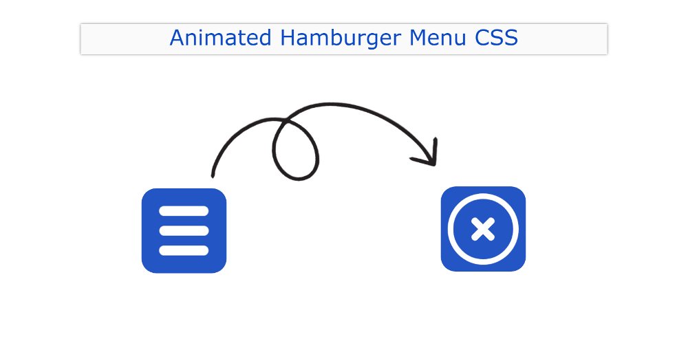
In this article, you will learn how to create Animated Hamburger Menu using HTML and CSS. Hamburger Menu CSS We use it in different places. Earlier I shared a tutorial on making more hamburger icons. However, I have added animation to this design.
In this article, you will learn how to create an Animated Hamburger Menu CSS. Here I have used a small amount (only two lines) of JavaScript. The most common type of hamburger icon is found in different types of site menubars, navigation menu bars.
Animated Hamburger Menu CSS
Here you will find the required source code, tutorials, and previews. Below I have given a preview of this project and you can see how it works.
See the Pen
Untitled by Foolish Developer (@foolishdevweb)
on CodePen.
As you can see, a small button has been created at the top of a web page. There are three lines on that button. When you click on that hamburger icon, you will see animation in it.
Those three lines will be transformed into a circular circle and a cross mark will be seen in the circle. When you click on that button again, the button will be converted to three lines again. The background of the hamburger menu icon has been made blue and the color of the lines has been made white.
How to make an animated hamburger menu
To make it, you must have a basic idea about HTML CSS. Here I have used only 2 lines of JavaScript. However, it is very easy if you do not know JavaScript can easily understand.
Step 1: Basic structure of the Hamburger Menu
Using your bellow HTML and CSS codes, add the necessary information to this menu. I have only used 2 line HTML code here.
I used blue color in the background of this button and the button is height: 172px, width: 172px.
Step 2: Add 3 lines to the hamburger menu
Now the white lines in this button have been designed. The height of each line: 20px, width: 100px and the background white color has been used.
Above we have added three lines but only one line can be seen. Because those three lines are in the same place. So we have a line I can see.
Separate spaces have been assigned for the three lines using the following CSS. : before and : after, the two lines are placed slightly above and slightly below.
Step 3: Add animation to the hamburger icon
Now animation effect has been added to the button. When you click on this button, one of those three lines will be height: 120px, width: 120px. Border-radius: 50% has been used to make that line round.
The image shown below will not work without JavaScript. This means that the circle can be seen when you click on the button.
The other two lines here are placed at a 90-degree angle to each other. Placing two lines at an angle of 135 degrees from the ground, it has the shape of a cross mark.
Step 4: Activate the Hamburger Menu
I have activated the Animated Hamburger Menu using the following JavaScript. Here are the instructions: When you click on that Hamburger Menu, ‘open’ will be active.
For this, I have used the click function. As you can see, this is the jQuery code, so be sure to use the jQuery CDN link.
Hopefully, you have learned from the above tutorial how I created this Animated Hamburger Menu using HTML and CSS.
I have shown many more types of CSS Hamburger Menus before. If there is any problem, you can let me know by commenting.


