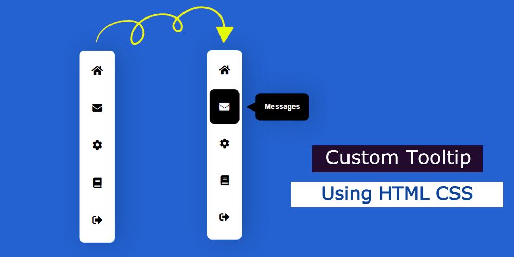
In this article, you will learn how to make Custom Tooltip using HTML CSS. Currently, CSS Tooltip is used in different elements of the website.
What is a tooltip in HTML code? A tooltip is basically a kind of hover or onclick effect to show some information in the form of a popup. In most cases, CSS’s ‘Before’ and ‘After’ is used to create a custom Tooltip.
Custom Tooltip CSS
In this article, we will learn how to create a tooltip with HTML content. Creating HTML Custom Tooltip is very easy if you know basic HTML and CSS.
Currently, this type of CSS tooltip is used in the navigation bar of almost every website. Which makes the menubar more attractive and advanced. In this article, I will show you how to create an HTML tooltip on hover.
In this menu bar, I have created five menu items and added an icon and Custom Tooltip in each. Only CSS is used to create this simple Tooltip. No JavaScript or JQuery was used. So if you are a beginner and want to make a CSS tooltip for the first time then this design is best for you.
See the Pen
Tooltip Menu by Shantanu Jana (@shantanu-jana)
on CodePen.
First, a menu bar has been created on the webpage. This is basically the Vaticel menu bar. In it, I added five menu items.
Under normal circumstances, we can only see the icons. This HTML tooltip attribute cannot be seen. When hovering over that icon, the tooltip will appear.
How to Create a Tooltip Using CSS
Now if you want to create a tooltip with HTML content then you need to have some idea about HTML and CSS. You have two options.
You can create it by downloading the source code directly if you want. Or you can learn how to create a CSS tooltip by following the step-by-step tutorials below. From this CSS tooltip tutorial, you will know…
- How to add CSS tooltip with any element.
Step 1:
The basic structure of the Tooltip menu bar
I first created a Vartical menu bar using the following HTML and CSS. This is basically the basic structure of this menu bar.
The width of this menu bar is 75px, height: 410px although you can change the size to your liking. The background color white has been used here and some box shadows have been used to enhance the look.
Step 2:
Custom tooltip menu bar’s menu item
I have added all the information related to the menu bar in this Custom Tooltip menu bar by the following HTML. An icon has been added here and the text used for Tooltip has been added.
The basic design of those menu items has been done by CSS below. Basically, the icons used here are CSS which are designed below.
Step 3:
Design the CSS Tooltip
The text used to create the custom Tooltip is designed with the following CSS. Opacity: 0 is used here which means we will not be able to see this text under normal conditions.
Arrangements have now been made to implement this CSS Tooltip. The instructions here are that when you hover over those menu items, the opacity will be: 1 and Tooltip will appear.
Step 4:
Make Tooltip CSS more interesting
As you can see in the picture above this simple CSS tooltip is almost made. However, some more effects have to be added. Now using CSS’s ‘Before’ I have added an arrow sign to the pure CSS tooltip.
Hopefully from this CSS tooltip tutorial, you have learned how to create it. First, I create a menu bar, and then I arranged to see them through the hover effect.
I have kept the text a bit away from the menu bar. This will make them look like a web tooltip. At the end of it all, I added an arrow sign before. Be sure to comment on how you like this CSS custom tooltip tutorial.


