Text Typing Animation or typewriter makes the homepage of any website much more beautiful and attractive. There are many ways to make the homepage interesting, among them CSS text typing is a significant one. If you are worried about wordpress hosting then ToggleBox site will help you.
CSS Typewriter You may have seen many types of portfolios website. Where a text is being typed repeatedly. It easily attracts the attention of the user.
In this article, I have shown you how to create a text typing animation using HTML and CSS code.
Of course, this is multiline text typing which means there will be a lot of text being typed over and over again.
CSS Text Typing Animation
This type of typewriter effect can be used on your personal site or business website. Where you can show your own experience or product name by typing repeatedly through animation.
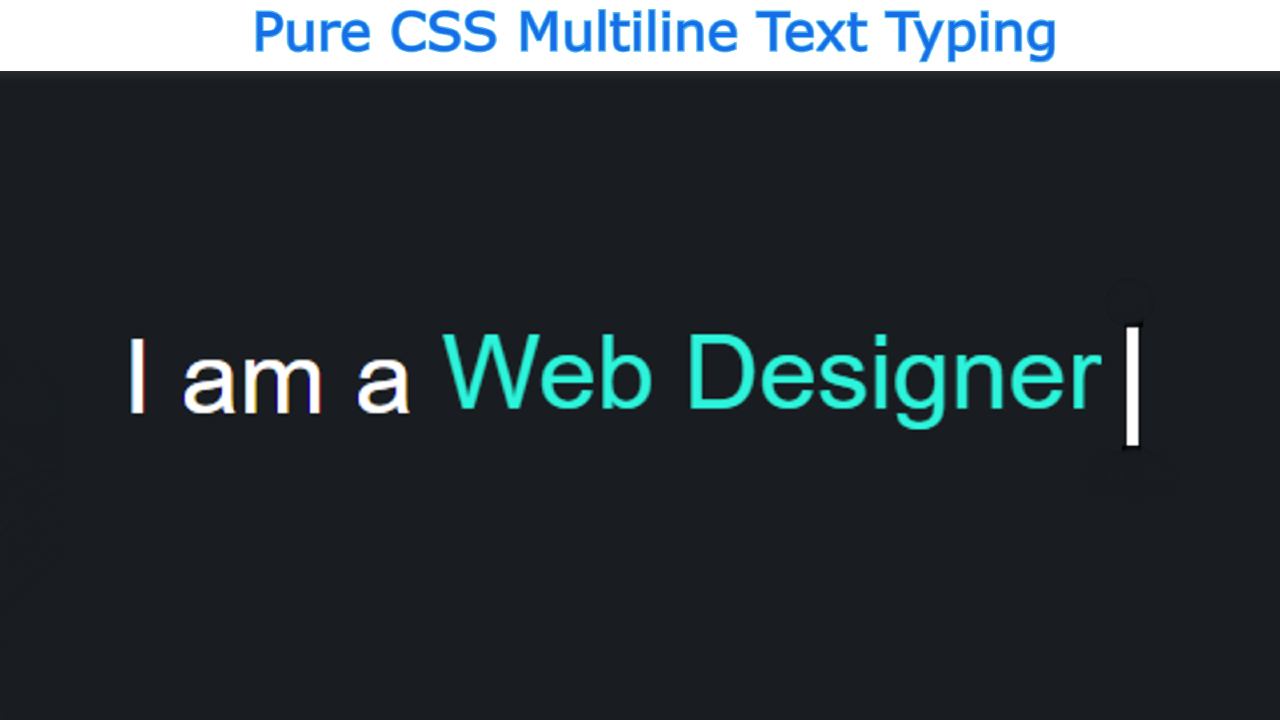
As you can see in the picture above this is a simple typewriter where I have fixed some text and typed a bit repetitive. This is not the first time I have shown you many more types of typewriter designs. But in that case, I took the help of JavaScript for multiple text types.
If you are a beginner, there is no reason to worry. Here I am going to show you an animation of Multiple Text Typing using Pure CSS. Below I have given a live demo that will help you know how it works.
See the Pen
Text Typing Animations by Foolish Developer (@fghty)
on CodePen.
If you want to get the source code, you can use the download button at the bottom of the article.
How to Create a Text Typing Animation in CSS
Below I have shared the complete tutorial on how it is made for you. Before sharing the tutorial, let me tell you something about this Text Typing Animation Effect.
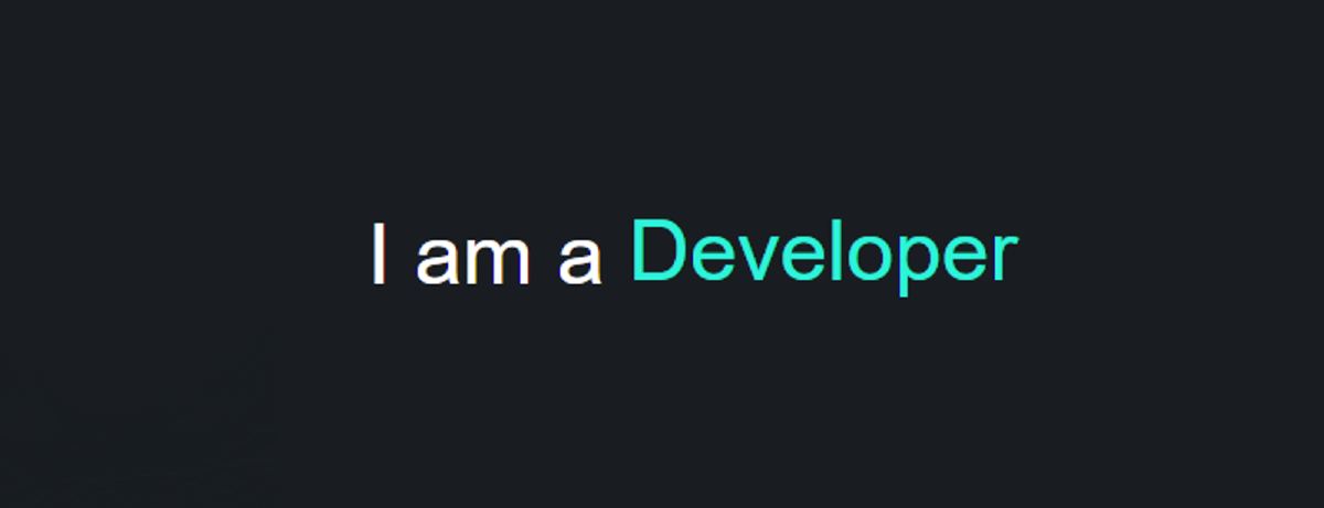
First I designed the webpage. Then here I have used some text which is in a completely fixed state and the rest has used a lot of text which will be typed in multiple ways. Of course, there is a cursor that makes this animation even more interesting.
Step 1: Design the web page
I designed the webpage using the following CSS codes. Here I have used black as the background color of the web page.
Step 2: Add text to Typewriter
I have added the text using the following HTML codes. The color of the tests typed here is green. I have used overflow hidden for only one text to be seen. Overflow Hidden helps to see only one of the typed text and hide the rest.
Step 3: Add animation to CSS text typing
Now I have added animation using the following CSS. I have used three codes for animation here. First I gave the animation in the cursor. Then I used animation in the text.
Here you will have 2 seconds to type each text. It will take two seconds to remove it again. At the end of it all, I used 16 seconds for the complete typing animation. Since I have used four texts here and it will take 4 seconds for each text to be typed and removed. I have used infinite here so that this method continues till infinity time.
Step 4: Enable text typing animation
Above we added animation but we need to use @keyframes to make it work.
I first executed the text using @keyframes. At 90-100% of the total time (2 seconds) we will see the text. It will start to be seen from 0% to 90% and we will see it completely.
I have executed the cursor using the following CSS codes. The cursor will be seen every 0.5 seconds and will be hidden again.
Hopefully from this tutorial, you have learned how to create text typing animations using only HTML and CSS code. This tutorial also shows you how to type multiple texts. Please comment on how you like it.

