Introduction :
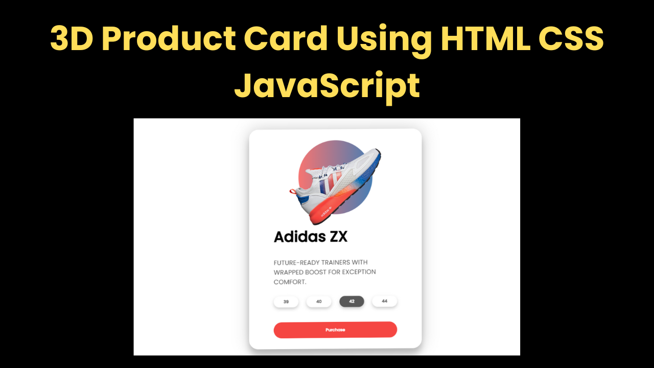
Hello, welcome to today’s new project. Today we have created a 3D Product Card Using HTML CSS JavaScript for you which is quite amazing. This is such a product card in which when you hover the card, you see the product image transformed, which looks quite amazing. Along with this, the product card also appears animated to you, which looks even better. You can also make this animation with the help of CSS, but we have made it with the help of JavaScript.
Explanation :
First of all we create the structure of our product with the help of HTML.
- Head Section:
- <meta>: The first thing that comes in the head section is the meta link which is very important for our project.
- <link>: After this the link which is the link of the .css file which we have to link with the HTML file.
- <title>: Then the title of our project which is very important for our project.
- Body Section:
- <div class=”container”>: First of all in the body section we have created a main container in which we will add the product card details.
- <div class=”card”>: Then we have created a card box which will contain the product, tittle and other things.
- <div class=”sneaker”>: To show the image, we have created an image logbox in which the image will be added.
- <div class=”circle”>: We have created a round circle in the background of the image, the image will be added above it so that the image looks good.
- <img>: To add the image we have used HTML’s image tag.
- <div class=”info”>: To add product information, we have left a separate detail box in which product details will be added.
- <button>: We have also created a size button in the product card which will show the product size.
- <div class=”purchase”>: Similarly, we have added a Buy Now button at last for which we have created a container.
CSS Styling:
- font-family: To design the product card, firstly we added the font to our project.
- flex: We have flexed the body items so that everything gets flexed and then it becomes easy to center it.
- container: In the container we have kept the width 50%, flexed the display and centered all the items.
- card: We have used shadow in the product card so that the card box looks good and the width is kept 25 rems.
- transform-style: We have also used transform property in the card which will give it a 3D look and we have also used padding.
- img: In the product image we have kept the width of 13rem and z-index is 2 and most importantly we have used transition so that the animation is displayed smoothly.
- circle: The circle is also used in the same image where we have used rgba color in the background.
- sizes button: We have used shadow in the size button so that the button looks good and 3d. Along with this, we have made the border and background non-removable.
- purchase button: In Buy Now button we have used red color in background and kept color white.
JavaScript:
Friends, we have now designed our product card with the help of HTML but we will have to use JavaScript to add animation to it.
- const card = document.querySelector(“.card”): First of all we have linked the project’s card to the JavaScript code with the help of JavaScript.
- container: Similarly we have linked the container also we have linked the card box.
- addEventListener: After this, we have created an event listener using JavaScript, in which when the mouse moves, it will work and the card will transform in it, which will rotate.
In the same way, we have created event listeners in the same way as the rest, which transforms and due to which the product card rotates and the items inside it also rotate, which looks quite amazing. You can also create this animation with the help of CSS, which is a very easy way.
Index.html
<!DOCTYPE html>
<html lang="en">
  <head>
    <meta charset="UTF-8" />
    <meta name="viewport" content="width=device-width, initial-scale=1.0" />
    <link rel="stylesheet" href="style.css" />
    <title>Talha - 3D Product Card</title>
  </head>
  <body>
    <div class="container">
      <div class="card">
        <div class="sneaker">
          <div class="circle"></div>
          <img src="images/adidas.png" alt="adidas" />
        </div>
        <div class="info">
          <h1 class="title">Adidas ZX</h1>
          <h3>
            FUTURE-READY TRAINERS WITH WRAPPED BOOST FOR EXCEPTION COMFORT.
          </h3>
          <div class="sizes">
            <button>39</button>
            <button>40</button>
            <button class="active">42</button>
            <button>44</button>
          </div>
          <div class="purchase">
            <button>Purchase</button>
          </div>
        </div>
      </div>
    </div>
    <script src="script.js"></script>
  </body>
</html>
Style.css
@import url("https://fonts.googleapis.com/css2?family=Poppins:wght@400;500&display=swap");

* {
  box-sizing: border-box;
  margin: 0;
  padding: 0;
}

body {
  font-family: "Poppins", sans-serif;
  display: flex;
  align-items: center;
  justify-content: center;
  min-height: 100vh;
  overflow: hidden;
  perspective: 1000px;
}

.container {
  width: 50%;
  display: flex;
  justify-content: center;
  align-items: center;
}

.card {
  min-height: 80vh;
  width: 25rem;
  box-shadow: 0px 20px 20px rgba(0, 0, 0, 0.2), 0px 0px 50px rgba(0, 0, 0, 0.2);
  border-radius: 30px;
  padding: 0rem 2rem;
  transform-style: preserve-3d;
}

.sneaker {
  min-height: 35vh;
  display: flex;
  justify-content: center;
  align-items: center;
  position: relative;
}

.sneaker img {
  width: 13rem;
  z-index: 2;
  transition: all 0.75s ease-out;
}

.circle {
  width: 7rem;
  height: 7rem;
  background: linear-gradient(
    to right,
    rgba(245, 70, 66, 0.75),
    rgba(8, 83, 156, 0.75)
  );
  position: absolute;
  z-index: -1;
  border-radius: 50%;
}

.info h1 {
  font-size: 1.7rem;
  transition: all 0.75s ease-out;
}

.info h3 {
  font-size: 1rem;
  padding: 2rem 0rem;
  color: #585858;
  font-weight: lighter;
  transition: all 0.75s ease-out;
}

.sizes {
  display: flex;
  justify-content: space-between;
  transition: all 0.75s ease-out;
}

.sizes button {
  padding: 0.5rem 2rem;
  background: none;
  border: none;
  box-shadow: 0px 5px 10px rgba(0, 0, 0, 0.2);
  border-radius: 30px;
  cursor: pointer;
  font-weight: bold;
  font-family: inherit;
  color: #585858;
}

button.active {
  color: white;
  background-color: #585858;
}

.purchase {
  margin-top: 3rem;
  transition: all 0.75s ease-out;
}

.purchase button {
  width: 100%;
  padding: 1rem 0rem;
  background: #f54642;
  border: none;
  color: white;
  cursor: pointer;
  border-radius: 30px;
  font-weight: bolder;
  font-family: inherit;
}

@media screen and (min-width: 740px) {
  .card {
    width: 35rem;
    padding: 0rem 5rem;
  }

  .sneaker img {
    width: 20rem;
  }

  .circle {
    width: 15rem;
    height: 15rem;
  }

  .info h1 {
    font-size: 3rem;
  }

  .info h3 {
    font-size: 1.3rem;
  }
}
Script.js
// Movement Animation to happen
const card = document.querySelector(".card");
const container = document.querySelector(".container");

// Items
const title = document.querySelector(".title");
const sneaker = document.querySelector(".sneaker img");
const purchase = document.querySelector(".purchase");
const description = document.querySelector(".info h3");
const sizes = document.querySelector(".sizes");

// Moving animation event
container.addEventListener("mousemove", (e) => {
  let xAxis = (window.innerWidth / 2 - e.pageX) / 25;
  let yAxis = (window.innerHeight / 2 - e.pageY) / 25;
  card.style.transform = `rotateX(${yAxis}deg) rotateY(${xAxis}deg)`;
});

// Animate In
container.addEventListener("mouseenter", (e) => {
  card.style.transition = "none";
  // Popout
  title.style.transform = "translateZ(150px)";
  sneaker.style.transform = "translateZ(200px) rotateZ(-45deg)";
  description.style.transform = "translateZ(125px)";
  sizes.style.transform = "translateZ(100px)";
  purchase.style.transform = "translateZ(75px)";
});

// Animate Out
container.addEventListener("mouseleave", (e) => {
  card.style.transition = "all 0.5s ease";
  card.style.transform = `rotateX(0deg) rotateY(0deg)`;
  //Popback
  title.style.transform = "translateZ(0px)";
  sneaker.style.transform = "translateZ(0) rotateZ(0deg)";
  description.style.transform = "translateZ(0px)";
  sizes.style.transform = "translateZ(0px)";
  purchase.style.transform = "translateZ(0px)";
});