Do you want to create a CSS Skeuomorphism Button? In this article you will know how to create Skeuomorphism Button using html, css and javascript.
Earlier I have created many other types of elements using Skeuomorphism design. Now I will explain how to create Skeuomorphism toggle Button.

Earlier I have shared many tutorials using neumorphism and Glassmorphism design like Skeuomorphism design.
Earlier I shared a tutorial on Profile Card, Login Form, Button using Skeuomorphism. Skeuomorphism Button is much more interesting than normal button design.
Skeuomorphism Button CSS
Skeuomorphism design is much more interesting than normal design. It is created by some shadows in CSS. If you know basic html css and javascript then you can easily create this project(Create Simple Skeuomorphic Buttons in CSS).
Yes you heard right I used a bit of javascript to make this button work. But no need to worry I have explained the complete code used to create this CSS Skeuomorphism button step by step.
See the Pen Skeuomorphism Button CSS by Ground Tutorial (@groundtutorial) on CodePen.
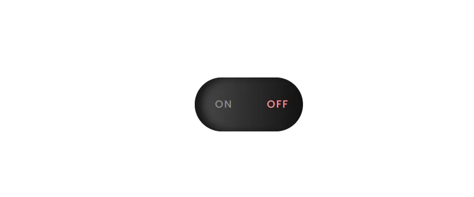
As you can see above this is a simple on off CSS Skeuomorphism Button. First I created a small button inside a box. Where clicking on one side turns it on and clicking on the other side turns it off.
How to Create Skeuomorphic Buttons in HTML CSS
Now if you want to create these Simple Skeuomorphic Buttons using css then follow below tutorial. If you only want the source code, use the download button below the article.
But if you are a beginner and want to make this design(Skeuomorphism Button Animation Effects) then follow the step by step tutorial below.
Step 1: Basic Structure of Skeuomorphism Switch
First I created the basic structure using the HTML and CFS code below. Here I converted the box to Skeuomorphism design using height: 6.25em, width: 12.5em and box-shadow.
					<div class="container" id="container">

</div>
					body {
  padding: 0;
  margin: 0;
}
.container {
  font-family: "Poppins", sans-serif;
  height: 6.25em;
  width: 12.5em;
  background: linear-gradient(to right, #4b4b4b, #111111);
  border-radius: 12.5em;
  position: absolute;
  transform: translate(-50%, -50%);
  top: 50%;
  left: 50%;
  box-shadow: inset 0.9em 0 0.9em #171717;
  display: flex;
  align-items: center;
  justify-content: space-around;
  transition: 0.3s;
}

Step 2: Add radio button by html
Now here a radio button is created using type=”radio” of input. Now here I have added the option of on, then I will add the option of off.
					<div>
  <input type="radio" id="on" name="switch" />
  <label for="on">ON</label>
</div>
					input[type="radio"] {
  appearance: none;
  background-color: transparent;
  border: none;
  outline: none;
}
label {
  font-size: 1.2em;
  letter-spacing: 0.1em;
  transition: 0.3s;
  cursor: pointer;
}

Step 3: Add another radio button to Skeuomorphism Design
As you see above ON option is added. Now add the OFF option. Above we have added css so no need to use separate css.
					<div>
  <input type="radio" id="off" name="switch" default />
  <label for="off">OFF</label>
</div>
Step 4: Activate the Skeuomorphism button by JavaScript
Above we have done the basic design of this Skeuomorphism Style Switch Button. Now we need to activate it by javascript.
When you click on option the button will turn on and some basic color will change. When you click on off, the Skeuomorphism button will turn off and some color will change.
These four lines of code are using JavaScript to select elements from an HTML document. The first line is selecting an element with the ID of “on” and assigning it to the variable “onSwitch”.
The second line is selecting an element with the ID of “off” and assigning it to the variable “offSwitch”. The third line is selecting a label element that has a “for” attribute with the value of “on” and assigns it to the variable “onLabel”.
The fourth line is selecting a label element that has a “for” attribute with the value of “off” and assigns it to the variable “offLabel”.
The last line is selecting an element with the ID of “container” and assigns it to the variable “container”. These elements can then be manipulated or interacted with using JavaScript.
					let onSwitch = document.getElementById("on");
let offSwitch = document.getElementById("off");
let onLabel = document.querySelector("label[for='on']");
let offLabel = document.querySelector("label[for='off']");
let container = document.getElementById("container");
This is a JavaScript function called “onClicked” which is defined as an arrow function. When this function is called, it will change the box-shadow property of the “container” element, it will change the color of the “offLabel” element and also the color of the “onLabel” element.
The box-shadow property will be set to “inset -0.9em 0 0.9em #494949” which will create an inset shadow effect with the specified offset, spread and color. The color of the “offLabel” element will be set to “#8e8e8e” and the color of the “onLabel” element will be set to “#98f195”. This arrow function can probably be called when the user clicks on the onSwitch element.
					let onClicked = () => {
  container.style.boxShadow = "inset -0.9em 0 0.9em #494949";
  offLabel.style.color = "#8e8e8e";
  onLabel.style.color = "#98f195";
};
This is another JavaScript function called “offClicked” which is also defined as an arrow function. When this function is called, it will change the box-shadow property of the “container” element, it will change the color of the “onLabel” element and also the color of the “offLabel” element.
The box-shadow property will be set to “inset 0.9em 0 0.9em #171717” which will create an inset shadow effect with the specified offset, spread and color. The color of the “onLabel” element will be set to “#8e8e8e” and the color of the “offLabel” element will be set to “#f1959f”. This arrow function can probably be called when the user clicks on the offSwitch element.
					let offClicked = () => {
  container.style.boxShadow = "inset 0.9em 0 0.9em #171717";
  onLabel.style.color = "#8e8e8e";
  offLabel.style.color = "#f1959f";
};
This code uses the JavaScript addEventListener method to attach a function to the “load” event of the window object. When the “load” event fires, the function checks the state of an HTML element with the id “onSwitch” (presumably a checkbox). If the checkbox is checked, the function calls the “onClicked” function. If it is not checked, the function calls the “offClicked” function.
					window.addEventListener("load", () => {
  if (onSwitch.checked) {
    onClicked();
  } else {
    offClicked();
  }
});
This code uses the JavaScript addEventListener method to attach two event listeners to two different HTML elements with the ids “onSwitch” and “offSwitch” (presumably two checkboxes).
The first listener is attached to the “click” event of the “onSwitch” element and calls the “onClicked” function when the checkbox is clicked.
The second listener is attached to the “click” event of the “offSwitch” element and calls the “offClicked” function when the checkbox is clicked.
					onSwitch.addEventListener("click", onClicked);
offSwitch.addEventListener("click", offClicked);

Hope you got to know how I made this project from above tutorial. If you only want the source code then use the download button below to download the full code of Skeuomorphism Switch.
This is a Skeuomorphism Button but I haven’t added any animation to it. If you want, you can add animations of your choice using css within this design. I’ll definitely try making the Skeuomorphism Button with Animation Effects next time.
You can also use this design for a simple toggle switch. But earlier I have shared many tutorials by css only. If you want to create Toggle Switch only by css without javascript then you can follow those tutorials.