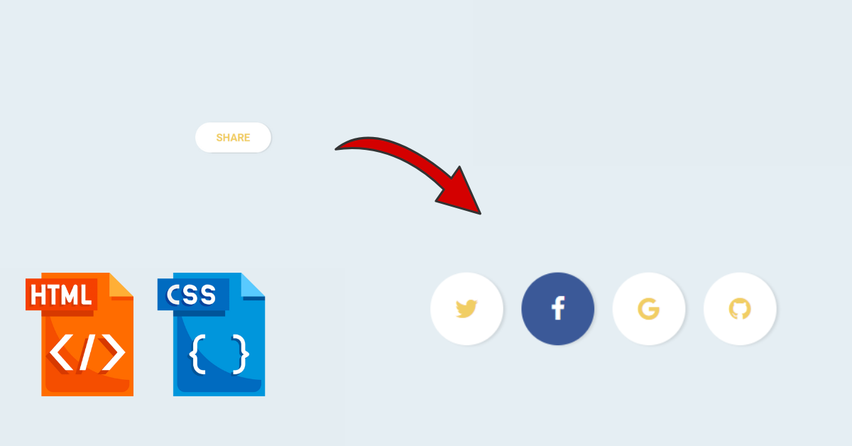
Preview Of Share Button:-

Introduction
Welcome Back to our new tutorial, Today We’ll be implementing the Share Button Using HTML and CSS in 3 Simple Steps. If you are a beginner you must need to learn how to create a share button. The code we’ve implemented below is simple and easy to understand.
What is the need for a Share Button?
If you’re wondering what is needed for Share Button on your website or what is needed to learn this, then you must know Share Button represents the social media platforms through which we can interact with our customers or users. It Expands our business and helps us to connect with more number of people in real life. Social Media Features allow us to Communicate and stay up-to-date with our website and business. You Should implement this in your next project.
Personal PortfolioWebsite Using HTML and CSS Source Code
HTML Code For Share Button
Choose your Editor and make a file name as index.html. Copy the following code and insert it into your file:-
<div class="share">
  <span>Share</span>
  <nav>
    <a href="#"><i class="fa fa-twitter"></i></a>
    <a href="#"><i class="fa fa-facebook"></i></a>
    <a href="#"><i class="fa fa-google"></i></a>
    <a href="#"><i class="fa fa-github"></i></a>
  </nav>
</div>
HTML Code Output

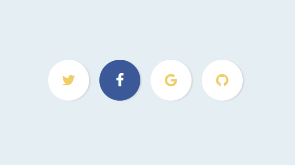
CSS Code For Share Button
Make another file name as an index.css and paste the following code:-
$backgroundColor: #e5eef3;
$buttonColor: #ffffff;
$textColor: #f1ce64;
$hoverColor: #fff;
$facebook: #3B5998;
$twitter: #61c5ec;
$google: #ea4335;
$github: #000000;

body {
  font-family: 'Roboto';
  background-color: $backgroundColor;
  text-align: center;
  color: $textColor;
  font-size: 28px;
}

a {
  color: $textColor;
}

.share {
  position: absolute;
  width: 400px;
  left: 50%;
  margin-left: -200px;
  top: 50%;
  margin-top: -40px;
  border-radius: 80px;

  span {
    width: 200px;
    line-height: 80px;
    display: inline-block;
    font-weight: 700;
    text-transform: uppercase;
    position: absolute;
    left: 50%;
    margin-left: -100px;
    opacity: 1;
    transition: opacity 0.3s ease-in-out;
    pointer-events: none;
  }

  nav {
    font-size: 0;
  }

  a {
    line-height: 80px;
    width: 80px;
    text-align: center;
    display: inline-block;
    background-color: $buttonColor;
    color: $buttonColor;
    overflow: hidden;
    opacity: 1;
    transition: all 0.3s ease-in-out;
    margin: 0 -20px;
    box-shadow: 3px 1px 3px rgba(0, 0, 0, 0.1);

    &:nth-child(1) {
      border-top-left-radius: 40px;
      border-bottom-left-radius: 40px;
      margin-left: 0;

      &:hover {
        background-color: $twitter;
      }
    }

    &:nth-child(2):hover {
      background-color: $facebook;
    }

    &:nth-child(3):hover {
      background-color: $google;
    }

    &:nth-child(4){
      border-top-right-radius: 40px;
      border-bottom-right-radius: 40px;
      margin-right: 0;

      &:hover {
        background-color: $github;
      }
    }
  }

  &:hover, &.hover {
    span {
      opacity: 0;
    }

    a {
      border-radius: 50%;
      margin: 0 10px;
      color: $textColor;
      font-size: 28px;

      &:hover {
        color: $hoverColor;
      }
    }
  }
}
Share Section Styling:- The class “share,” that represents the social media’s sharing section. It includes positioning, dimensions, border radius, and other stylings. You can further read more about these basic Styling properties from MDN Documents.
Share Section Text:- This styling is for the text within the share section, including positioning, opacity, and transition effects. Learn more about the Transition effect in CSS from Here.
Hover Effect Styling for Share Section:- When you click on the button or icons you’ll see the hover effect that happened on the mouse hovering on the element. In our code hovering results the hiding the text, modifying link styles, and adding additional hover effects for the links.
CSS Code Output

JavaScript Code For Share Button
Create another file name as Script.js and paste the following code:-
// Force a hover to see the effect
const share = document.querySelector('.share');

setTimeout(() => {
  share.classList.add("hover");
}, 1000);

setTimeout(() => {
  share.classList.remove("hover");
}, 3000);
The Below line will select the first element in the document with the class “share” using the document.querySelector method.
const share = document.querySelector('.share');After a some delay of 1 second, this code adds the class “hover” to the selected element. This will simulate the effect of hovering on the element and will trigger any associated CSS styles or animations tied to the “hover” class.
setTimeout(() => { share.classList.add("hover"); }, 1000);The Above JavaScript code is used to programmatically add and remove a “hover” class to an HTML element with the class “share” after a specific time interval that is defined in milliseconds.
Floating Social Media Icon Using HTML and CSS
Final Output
Below is the demo after implementing the code for HTML, CSS, and JavaScript your result should look like this:-
Conclusion
Congratulations you have just completed Another mini project that you can use in your next website. This is completely beginner-friendly code. Further, you can modify this as per your needs and ideas. You must do the experiments by adding hovering effects and transition effects and make it more impressive. Also for more such mini projects keep visiting our platform.
Reference
Credit:- RobVermeer
HAPPY CODING!