


Introduction
Welcome Developers, to our brand-new tutorial. Today we’ll be learning How to Create a responsive Pop-up Box Using Pure CSS. If you’re a beginner you must need to learn CSS effects and use cases.
What is a Pop-up Box?
Before diving into implementing the Pop-up box, let’s understand this terminology. A Pop-up Box is also known as a dialog box, it is a small window that appears after clicking on the button or it provides any kind of information to attract the user’s attention.
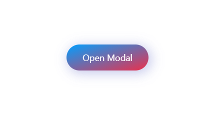
Preview Of Pop-up Box
Personal PortfolioWebsite Using HTML and CSS Source Code
HTML Code For Pop-up Box
Create a file name as “Index.html” and add the following code:-
<meta name="viewport" content="width=device-width, initial-scale=1.0">
<meta http-equiv="X-UA-Compatible" content="ie=edge">
<link rel="stylesheet" href="style.css">
<a href="#modal-opened" class="link-1" id="modal-closed">Open Modal</a>
<div class="container" id="modal-opened">
<div class="modal">
<div class="details">
<h1 class="title">Your Title</h1>
<p class="description">Slogan will be here at this place.</p>
</div>
<p class="txt">Lorem ipsum dolor sit amet, consectetur adipisicing elit. Facilis ex dicta maiores libero minus obcaecati iste optio, eius labore repellendus.</p>
<button class="btn">Button →</button>
<a href="#modal-closed" class="link-2"></a>
</div>
</div>
Below is the HTML Code explanation breakdown:-
The Above is a basic HTML structure with meta tags, a link to an external stylesheet, and a modal implemented using a container and a modal div.
The modal is triggered by clicking a hyperlink with the ID modal-closed and styled using the styles defined in the linked style.css file.
The modal content includes a title, description, text, a button, and a hyperlink for closing the modal.
The `id` name “modal-closed” is later used to close the modal when the user clicks on the little cross sign.
Inside the container, there’s a modal div <div class="modal"> that holds the actual modal content.
CSS Code for Pop-up Box
Create another file name as Index.css and add the following code:-
*,
*::after,
*::before {
  margin: 0;
  padding: 0;
  box-sizing: border-box;
}
html {
  font-size: 62.5%;
}
body {
  display: flex;
  flex-direction: column;
  justify-content: center;
  align-items: center;
  font-family: -apple-system, BlinkMacSystemFont, 'Segoe UI', 'Open Sans', sans-serif;
  min-height: 100vh;
}
a,
a:link {
  font-family: inherit;
  text-decoration: none;
}
.container {
  position: fixed;
  top: 0;
  left: 0;
  z-index: 10;
  display: none;
  justify-content: center;
  align-items: center;
  width: 100%;
  height: 100%;
}
.container:target {
  display: flex;
}
.modal {
  width: 60rem;
  padding: 4rem 2rem;
  border-radius: .0rem;
  color: hsl(0, 0%, 100%);
  background: linear-gradient(to right bottom, #009FFF, #ec2F4B);
  box-shadow: .4rem .4rem 2.4rem .2rem hsla(236, 50%, 50%, 0.3);
  position: relative;
  overflow: hidden;
}
.details {
  text-align: center;
  margin-bottom: 4rem;
  padding-bottom: 4rem;
  border-bottom: 1px solid hsla(0, 0%, 100%, .4);
}
.title {
  font-size: 3.2rem;
}
.description {
  margin-top: 2rem;
  font-size: 1.6rem;
  font-style: normal;
}
.txt {
  padding: 0 4rem;
  margin-bottom: 4rem;
  font-size: 1.6rem;
  line-height: 2;
}
.txt::before {
  content: '';
  position: absolute;
  top: 0%;
  left: 100%;
  -webkit-transform: translate(-50%, -50%);
          transform: translate(-50%, -50%);
  width: 18rem;
  height: 18rem;
  border: 1px solid hsla(0, 0%, 100%, .2);
  border-radius: 100rem;
  pointer-events: none;
}
.btn {
  padding: 1rem 1.6rem;
  border: 1px solid hsla(0, 0%, 100%, .4);
  border-radius: 100rem;
  color: inherit;
  background: transparent;
  font-size: 1.4rem;
  font-family: inherit;
  letter-spacing: .2rem;
  transition: .2s;
  cursor: pointer;
}
.btn:hover,
.btn:focus {
  border-color: hsla(0, 0%, 100%, .6);
  -webkit-transform: translateY(-.2rem);
          transform: translateY(-.2rem);
}
.link-1 {
  font-size: 1.8rem;
  color: hsl(0, 0%, 100%);
  background: linear-gradient(to right bottom, #009FFF, #ec2F4B);
  box-shadow: .4rem .4rem 2.4rem .2rem hsla(236, 50%, 50%, 0.3);
  border-radius: 100rem;
  padding: 1.4rem 3.2rem;
  transition: .2s;
}
.link-1:hover,
.link-1:focus {
  -webkit-transform: translateY(-.2rem);
          transform: translateY(-.2rem);
  box-shadow: 0 0 4.4rem .2rem hsla(236, 50%, 50%, 0.4);
}
.link-2 {
  width: 4rem;
  height: 4rem;
  border: 1px solid hsla(0, 0%, 100%, .4);
  border-radius: 100rem;
  color: inherit;
  font-size: 2.2rem;
  position: absolute;
  top: 2rem;
  right: 2rem;
  display: flex;
  justify-content: center;
  align-items: center;

  transition: .2s;
}
.link-2::before {
  content: '×';
  -webkit-transform: translateY(-.1rem);
          transform: translateY(-.1rem);
}
.link-2:hover,
.link-2:focus {
  border-color: hsla(0, 0%, 100%, .6);
  -webkit-transform: translateY(-.2rem);
          transform: translateY(-.2rem);
}
Below is the CSS Code Explanation for the Pop-up Box:-
The below CSS is used to style the model container with fixed positioning covering the entire viewport. When the container is the target of an anchor link, it sets display: flex to show the modal. You must need to learn more about the Flex property in CSS From here.
.container {
  position: fixed;
  top: 0;
  left: 0;
  z-index: 10;
  display: none;
  justify-content: center;
  align-items: center;
  width: 100%;
  height: 100%;
}
.container:target {
  display: flex;
}
.model class is used to specify the specific width, padding, border-radius, text color, background gradient, and box-shadow.
we’ve used the pseudo-element for adding the decorative lines.
30+ Javascript Projects with Source Code
.btn class will Styles a general button with padding, border, border-radius, text color, transparent background, font size, font family, letter spacing, transition, and cursor.
The CSS styles aim for a clean and visually appealing design with attention to details like gradients, shadows, and transitions for interactive effects.
The modal is set to display when clicking on the anchor link, and various elements within the modal are styled for a cohesive appearance.
CSS Code Output
Final Output For Pop-up Box
Conclusion
Congratulations!!! you have just completed Another mini-project for your portfolio that you can use on your next website. This is completely beginner-friendly code. Further, you can modify this as per your needs and ideas. You must do the experiments by adding hovering effects and transition effects and make it more impressive. Also for more such mini projects keep visiting our platform. You can also read about gradient, transition, effects, and shadow effects for interactive in CSS from here.
Resources
Credit:- Mohamed Yousef
HAPPY CODING!!!