
In this article, you will learn how to create a Responsive Checkout Form using HTML and CSS. Earlier I shared with you the tutorials of different types of checkout form CSS. This is the first time I have created a Responsive Checkout Form tutorial using HTML and CSS.
I use payment forms in different places. This type of check-out form is also used for a variety of e-commerce platforms, online products, or service platforms. This Responsive Form I created only with HTML and CSS.
Everything contained in a professional payment form is provided here. Although it is not functional as it is only designed by HTML CSS here.
Responsive Checkout Form
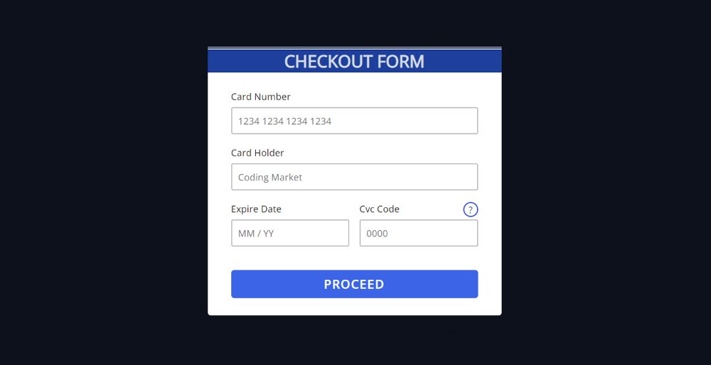
Checkout form HTML CSS is fully responsive so you can use it directly in any of your projects. Below I have given a preview that will help you to know how it works (Responsive Checkout Form using HTML CSS).
You can use the download button below the article to get the required source code.
See the Pen
CHECKOUT FORM HTML CSS by Foolish Developer (@foolishdevweb)
on CodePen.
I made a box on the webpage as you saw above. I used black as the background color of the webpage. The background of the entire checkout page has been whitewashed. First I used a heading with blue in the background.
There are four inputs here. To input the first input box card number, to input the name of the second input box cardholder. Then there are two input boxes to input Expire date and CVC code. There is a button at the end of all that will submit this information.
How To Create a Checkout Form with CSS
Below I have shown a step-by-step tutorial on how to create a Responsive Checkout Form. If you only want the source code, you can use the download button below the article.
Step 1: Basic structure of checkout form
I have created the basic structure of this check-out form and designed the webpage using the following HTML codes. Its max-width of background 500px and height will depend on the amount of content.

Step 2: Design the title in the form
A title has been added using the following CSS code. The h1 tag has been used to create this heading.

Step 3: 1st and 2nd input boxes of Checkout Form
I created the first two input boxes using the following HTML codes. The first input box to input the card number and the second input box to input the card holder’s name. Different conditions and limits have been used in the input box.
I have designed the above two input boxes using the following CSS.

Step 4: 3rd and 4th input boxes of the checkout form
The 3rd and 4th input boxes have been created using the following HTML codes. If you watch the demo you will understand that there is an icon instead of inputting CVC code.
When you hover or click on that icon, a small image will appear in the form of a pop-up. That image will show you where to find this CVC code on your card.
Using the CSS below, the two input spaces have been slightly designed.
Step 5: The tooltip is designed by CSS
The location of the popup box has been designed using the following codes.

Step 6: The tooltip is activated by CSS
The following codes have been used to design the image in that pop-up box. I have already added the image to the HTML code.

Step 7: Create a payment form button
The submit button has been designed using the following HTML and CSS code. The background color of the button is blue and the text color is white.

Step 8: Make Checkout Form Responsive with CSS
Above we have designed this completely (Responsive Checkout Form using HTML CSS). But now not a Responsive. You need to use some amount of CSS code to make it responsive.

Hopefully, you have learned from the above tutorial how this Responsive Checkout Form has been created using HTML and CSS. If there is any problem then you can definitely let me know by commenting.