A movie app is a digital platform in which a collection of movies is collected all on one platform. This helps in watching multiple movies with no extra cost of paying for different movies. This type of platform helps in saving money and watching movies on different devices at the same time.
This is an intermediate-level project where you will learn about different javascript concepts for creating the UI of the movie app by creating tiles for each movie so that it is easy for the user to choose from a list of movies. This type of project helps in creating useful real-world projects, and we will be creating this project from scratch, creating each element step by step.

Now, before we start with our project, let’s look at the live demo of our project. Without wasting any time, we will start off with our project.
Live Demo:
See the Pen movie ticket book website template by Short-Zed (@Short-Zed) on CodePen.
HTML Structure:
Adding Important Link:
We will be using some icons inside our project using the font-awesome import link, and then using the font-awesome classes, we added icons inside our movie app project, and now using the script, we will add a carousel to our movie app.
<link rel="stylesheet" href="https://cdnjs.cloudflare.com/ajax/libs/font-awesome/4.7.0/css/font-awesome.min.css">
<!---font icon CDN----->

 <script src="https://code.jquery.com/jquery-3.5.1.js"></script>
      <script src="https://cdnjs.cloudflare.com/ajax/libs/OwlCarousel2/2.3.4/owl.carousel.min.js"></script>
      <link rel="stylesheet" href="https://cdnjs.cloudflare.com/ajax/libs/OwlCarousel2/2.3.4/assets/owl.carousel.min.css">
<!----carousel cdn--->
Creating header:
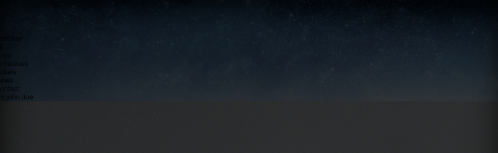
Now using the <nav> tag, we will create a navbar for our movie app where we will add a new navigation menu, and using the <p> tag, we will add a logo to our movie app. Using the font Awesome class, we will add the navigation menu to the navbar using the unordered list.
<!----movie site template---->

<header>
    <nav>
    <p class="logo">
      multi<span>flex<span>
    </p>

      <i class="fa fa-bars" id="menu"></i>

    <ul id="menu-box">
      <div class="marker"></div>
      <li>main</li>
      <li>schedlues</li>
      <li>tickets</li>
      <li>news</li>
      <li>contact</li>
      <li><span>mr.john doe <img src="https://images.pexels.com/photos/220453/pexels-photo-220453.jpeg?cs=srgb&dl=pexels-pixabay-220453.jpg&fm=jpg"> <i class="fa fa-angle-down"></i></span></li>
      <li><b>sign out</b></li>
    </ul>

  </nav>


</header>
Slider Menu:
Using the div tag with the popular movie app, we will create a create a carousel that will display all the latest movies at once, and then using the paragraph tag, we will add a little description about the movies.
<div class="popular-movie-slider">
<img src="https://imageio.forbes.com/blogs-images/scottmendelson/files/2014/10/2v00kg8.jpg?format=jpg&width=1200" class="poster">
<div class="popular-movie-slider-content">
<p class="release">2017</p>
<h2 class="movie-name">Interstellar</h2>
<ul class="category">
<p>Science fiction</p>
<li>drama</li>
<li>action</li>
</ul>
<p class="desc">Interstellar is a 2014 epic science fiction film co-written, directed, and produced by Christopher Nolan. It stars Matthew McConaughey, Anne Hathaway, Jessica Chastain, Bill Irwin, Ellen Burstyn, Matt Damon, and Michael Caine. Set in a dystopian future where humanity is embroiled in a catastrophic blight and famine, the film follows a group of astronauts who travel through a wormhole near Saturn in search of a new home for humankind.</p>
<div class="movie-info">
<i class="fa fa-clock-o"> <span>164 min.</span></i>
<i class="fa fa-volume-up"> <span>Subtitles</span></i>
<i class="fa fa-circle"> <span>Imdb: <b>9.1/10</b></span></i>
</div>
<div class="movie-btns">
<button><i class="fa fa-play"></i> Watch trailer</button>
<button class="read-more"><i class="fa fa-circle"></i> <i class="fa fa-circle"></i> <i class="fa fa-circle"></i> Read more</button>
</div>
</div>
</div>
<!---slider--->

Creating body Section:
We will create a section for our main body where we will display all the latest and most-viewed movies for the user to choose from the list of movies, and we will be displaying movies in the form of cards where each card tile displays a movie, and we will add a few movies to fill the body section so that our project can be completed easily.
We will be using the div tag, which is a block-level element that helps in creating different sections for different cards.
<section>

  <div class="movie-ticket-book">
    <div class="choose-date">
      <p class="heading">
        choose date:
      </p>
       <div class="wrapper">
       <div class="carousel owl-carousel">

        <div class="card card-1">
          <p>JUN 1t</p>
          <p>MON</p>
        </div>
        <div class="card card-2">
          <p>JUN 2nd</p>
          <p>TUE</p>
        </div>
        <div class="card card-3">
          <p>JUN 3nd</p>
          <p>wed</p>
        </div>
        <div class="card card-4">
          <p>JUN 4nd</p>
          <p>thu</p>
        </div>
         </div>
       <div class="marker"></div>
      </div>
    </div>
    <div class="choose-time">
     <p class="heading">
        avalible times:
      </p>
       <div class="wrapper">
       <div class="carousel owl-carousel">

        <div class="card card-1">
          <p>3D</p>
          <p>14:45</p>
        </div>
        <div class="card card-2">
          <p>3D</p>
          <p>11:45</p>
        </div>
        <div class="card card-3">
          <p>2D</p>
          <p>12:15</p>
        </div>
        <div class="card card-4">
          <p>3D</p>
          <p>13:00</p>
        </div>
         </div>
       <div class="marker"></div>
      </div>
    </div>
    <button>Buy ticket</button>
  </div>
  <!---movie-ticket-book-->


  <div class="filter-search-box">

    <div class="filters-box">

      <div class="all-filters filters">
        All formats <i class="fa fa-angle-down"></i>
      </div>

      <div class="date-filters filters">
       By Date <i class="fa fa-angle-down"></i>
      </div>

      <div class="category-filters filters">
        By category <i class="fa fa-angle-down"></i>
      </div>

      <div class="category-filters filters">
        Coming soon
      </div>

    </div>

    <div class="search-filters">
        <input type="text" placeholder="Search by name...">
        <i class="fa fa-search"></i>
      </div>

    <div class="search-bar">
      <div class="bar"></div>
    </div>

  </div>
  <!----filter-search-box---->


  <div class="movie-card-section">

    <div class="card">
      <img src="https://encrypted-tbn2.gstatic.com/images?q=tbn:ANd9GcTCXgCV-ZNb3InBCTaLdED58dF6iZJxIvCOBurktiWxXrwGc8DB">

      <div class="card-content">
        <p class="movie-name">
          the mummy
        </p>

        <div class="movie-info">
          <p class="time">11:30 <span>14:45<span class="d3">3D</span> 16:05<span class="d3">3D</span></span> 18:40 21:00 23:15</p>
        </div>
      </div>
    </div>
    <div class="card">
      <img src="https://m.media-amazon.com/images/M/MV5BMTYzODQzYjQtNTczNC00MzZhLTg1ZWYtZDUxYmQ3ZTY4NzA1XkEyXkFqcGdeQXVyODE5NzE3OTE@._V1_.jpg">

      <div class="card-content">
        <p class="movie-name">
          Wonder Woman
        </p>

        <div class="movie-info">
          <p class="time">11:30 <span>14:45 16:05</span> 18:40 21:00</p>
        </div>
      </div>
    </div>
    <div class="card">
      <img src="https://encrypted-tbn2.gstatic.com/images?q=tbn:ANd9GcSZeZdWD3S9rSzfwlSsnqBWERtgBHR4h_6kHb_fR_6J-BObyxfK">

      <div class="card-content">
        <p class="movie-name">
          Alien: Covenant
        </p>

        <div class="movie-info">
          <p class="time">11:30<span class="d3">3D</span> <span>14:45 16:05<span class="d3">3D</span></span> 18:40 21:00 23:15</p>
        </div>
      </div>
    </div>
    <div class="card">
      <img src="https://encrypted-tbn0.gstatic.com/images?q=tbn:ANd9GcTX2TBaWUUMpmbhcnr0zypXQltqtQmW9wED_Y8bYrynL98MM1Wq">

      <div class="card-content">
        <p class="movie-name">
          Baywatch
        </p>

        <div class="movie-info">
          <p class="time"><span>11:30 16:05<span class="d3">3D</span></span> 18:40 21:00 23:15</p>
        </div>
      </div>
    </div>

    <div class="card">
      <img src="https://encrypted-tbn0.gstatic.com/images?q=tbn:ANd9GcRXhEeDOpouHNg3A75Ngkgl-pQdWrr8ErxSuYCbb8-Tn7KcuD79">

      <div class="card-content">
        <p class="movie-name">
          Pirates of the Caribbean
        </p>

        <div class="movie-info">
          <p class="time">11:30 <span>14:45<span class="d3">3D</span> 16:05<span class="d3">3D</span></span> 18:40 21:00</p>
        </div>
      </div>
    </div>
    <div class="card">
      <img src="https://encrypted-tbn0.gstatic.com/images?q=tbn:ANd9GcS6NX1HzM5IkUhkwR1Yq7vkd9j5dqv0_Zaz5FCa2bzyJaUx9zOa">

      <div class="card-content">
        <p class="movie-name">
          transformers 5
        </p>

        <div class="movie-info">
          <p class="time">11:30 <span>14:45 16:05</span> 18:40 21:00</p>
        </div>
      </div>
    </div>
    <div class="card">
      <img src="https://encrypted-tbn0.gstatic.com/images?q=tbn:ANd9GcRJ8wYlRSHxcAyi7TijH8FjeTLKcYsKi3qCzI8r_X0xKU8LkAn_">

      <div class="card-content">
        <p class="movie-name">
          Planet of the Apes
        </p>

        <div class="movie-info">
          <p class="time">11:30<span class="d3">3D</span> <span>14:45 16:05<span class="d3">3D</span></span> 18:40 21:00 23:15</p>
        </div>
      </div>
    </div>
    <div class="card">
      <img src="https://www.movienewsletters.net/photos/NZL_105934R1.jpg">

      <div class="card-content">
        <p class="movie-name">
          Dark Tower
        </p>

        <div class="movie-info">
          <p class="time"><span>11:30 16:05<span class="d3">3D</span></span> 18:40 21:00 23:15</p>
        </div>
      </div>
    </div>

  </div>
  <!---movie-card--->

  <div class="show">
    <div class="show-bar">
      <div class="bar"></div>
    </div>
     <button>Show more</button>
  </div>
    <!---bar--->


</section>
Footer Section:
We will create a section for our main body where we will display all the latest and most-viewed movies for the user to choose from the list of movies, and we will be displaying movies in the form of cards where each card tile displays a movie, and we will add a few movies to fill the body section so that our project can be completed easily.
We will be using the div tag, which is a block-level element that helps create different sections for different cards.
<footer>

  <div class="logo-box">
    <p class="logo">
      multi<span>flex</span>
    </p>
    <p><i class="fa fa-copyright"></i> 2001-2017, SIA Multiflex</p>
  </div>

  <ul>
    <li>main</li>
    <li>schedlues</li>
    <li>tickets</li>
    <li>news</li>
    <li>contact</li>
  </ul>


<div class="socail-box">
  <i class="fa fa-facebook-f"></i>
  <i class="fa fa-twitter"></i>
  <i class="fa fa-instagram"></i>
</div>

</footer>
Styling Movie:
Using the universal selector, we will set the padding and margin to “zero,” the box size to border-box, and the transition property to all with a 2-second delay.
We will add the styling to the body; we will set the font family; we will set the font style as “Roboto”; and using the overflow-y property, we will set the scroll property in the vertical axis; and using the background property, we will set the background image property.
/*-----css movie site -----*/

*{
  margin:0;
  padding:0;
  box-sizing:border-box;
  transition:all .2s;
}


body{
  font-family: 'Roboto', sans-serif;
  overflow:hidden;
  overflow-y:scroll;
}


header{
  background:url('https://s3picturehouses.s3.eu-central-1.amazonaws.com/header/ph_15977496885f3bb9b84457c.jpg');
  background-size:cover;
  background-position:center;
  width:100%;
  height:550px;
  position:relative;
  padding-top:80px;
}


header:before{
  content:"";
  position:absolute;
  top:0;
  left:0;
  width:100%;
  height:100%;
  background:rgba(0,0,0,.75);
  box-shadow:inset 0 0 80px #000;
}
Styling Header:
Now using the header tag, we will style the navbar. Using the color property, we will set the font color to “white.” Using the display property, we will set the display to “flex.” Using the align item property, we will align the item to the center.
Using the class selector property, we will add the styling to the image. Using the background-color property, we will set the styling to the background, and using the display property, we will set the display to “grid.”
header nav{a
  color:#fff;
  display:flex;
  justify-content:space-between;
  align-items:center;
  padding:10px 100px;
  position:fixed;
  top:0;
  left:0;
  z-index:99;
  width:100%;

}


header nav .fa{
  cursor:pointer;
  display:none;
}


header nav .fa:hover{
  color:#DB0000;
}

.nav{
  background:#fff;
  color:#000;
  transition:background .5s;

}

.navBlack{
  background:#000;
  color:#fff;
  transition:background .5s;

}

header nav .logo{
  font-weight:700;
  font-size:1.5em;
}

header nav .logo span{
  color:#DB0000;
}

header nav ul .marker{
  background:#DB0000;
  width:40px;
  height:2px;
  position:absolute;
  bottom:-5px;
  left:0;
  border-radius:20px;
}


header nav ul{
  display:flex;
  justify-content:center;
  align-items:center;
  gap:20px;
  text-transform:uppercase;
  list-style:none;
  position:relative;
}


header nav ul li{
  cursor:pointer;
}


header nav ul li span{
  display:flex;
  gap:8px;
  align-items:center;
}

header nav ul li img{
  width:35px;
  height:35px;
  border-radius:50%;
  object-fit:cover;
}


header .popular-movie-slider{
  color:#fff;
  display:flex;
  justify-content:center;
  align-items:start;
  gap:35px;
  padding:10px 100px;
  position:relative;
}

header .popular-movie-slider .poster{
  width:300px;
  height:400px;
  object-fit:cover;
  border-radius:10px;
}


header .popular-movie-slider .popular-movie-slider-content{
  line-height:25px;
}

header .popular-movie-slider .popular-movie-slider-content .movie-name{
  font-size:1.8em;
}


header .popular-movie-slider .popular-movie-slider-content .category{
  display:flex;
  gap:30px;
  text-transform:capitalize;
  margin:10px 0;
}

header .popular-movie-slider .popular-movie-slider-content .desc{
  font-size:.90em;
}

header .popular-movie-slider .popular-movie-slider-content .movie-info{
  display:flex;
  gap:30px;
  margin:25px 0;
}

header .popular-movie-slider .popular-movie-slider-content .movie-info .fa-circle{
  color:#DB0000;
  font-size:.85em;
}

header .popular-movie-slider .popular-movie-slider-content .movie-info .fa span{
  font-family: 'Roboto', sans-serif;
  color:#fff;
  font-size:15px;
}


header .popular-movie-slider .popular-movie-slider-content .movie-btns{
  display:flex;
  gap:10px;
}


header .popular-movie-slider .popular-movie-slider-content .movie-btns button{
  width:200px;
  border:none;
  outline:none;
  padding:15px 0;
  border-radius:100px;
  font-size:1em;
  background:#DB0000;
  color:#fff;
  cursor:pointer;
  display:flex;
  justify-content:center;
  align-items:center;
  gap:2px;
}

header .popular-movie-slider .popular-movie-slider-content .movie-btns button .fa{
  font-size:.65em;
  color:#fff;
}


header .popular-movie-slider .popular-movie-slider-content .movie-btns .read-more{
  background:none;
}

header .popular-movie-slider .popular-movie-slider-content .movie-btns .read-more:hover{
  background:#000;
}

header .popular-movie-slider .popular-movie-slider-content .movie-btns button:hover{
  background:#000;
}


section .movie-ticket-book{
  background:#222;
  color:#fff;
  display:grid;
  grid-template-columns: auto auto auto;
  justify-content:space-between;
  align-items:center;
  padding:30px 100px;
}


section .movie-ticket-book .choose-date ,
section .movie-ticket-book .choose-time {
  position:relative
}

section .movie-ticket-book .choose-date .heading,
section .movie-ticket-book .choose-time .heading{
  text-transform:uppercase;
  font-weight:400;
}

section .movie-ticket-book .choose-date .wrapper,
section .movie-ticket-book .choose-time .wrapper{
  width: 300px;
}
section .movie-ticket-book .choose-date .carousel,
section .movie-ticket-book .choose-time .carousel{
  margin-top:15px;
  display:flex;
  justify-content:center;
  align-item:center;
  padding:10px 0;
}

section .movie-ticket-book .choose-date .carousel .owl-nav,
section .movie-ticket-book .choose-time .carousel
.owl-nav{
  color:#DB0000;
  position:absolute;
  width:99%;
  top:50%;
  left:-15px;
  transform:translate(0,-50%);
  font-size:1.5em;
  display:flex;
  justify-content:space-between;
}


section .movie-ticket-book .choose-date .carousel .card p:nth-child(1),
section .movie-ticket-book .choose-time .carousel .card p:nth-child(1){
  color:#888;
  font-size:.75em;
}


section .movie-ticket-book .choose-date .carousel .card p:nth-child(2),
section .movie-ticket-book .choose-time .carousel .card p:nth-child(2){
  color:#fff;
  font-size:1.2em;
  text-transform:uppercase;
}


section .movie-ticket-book .choose-date .wrapper .marker,
section .movie-ticket-book .choose-time .wrapper .marker{
  width:60px;
  height:2px;
  background:#DB0000;
  position:absolute;
  left:45%;
  transform:translate(-50%,0);
}


section .movie-ticket-book button{
  border:none;
  outline:none;
  height:50px;
  background:#DB0000;
  color:#fff;
  border-radius:50px;
  padding:10px 50px;
  cursor:pointer;
}

section .movie-ticket-book button:hover{
  background:#000;
}


section .filter-search-box{
  background:#111;
  display:flex;
  justify-content:space-between;
  align-items:center;
  padding:20px 100px;
  padding-top:50px;
  position:relative;
}


section .filter-search-box .filters-box{
  display:flex;
  gap:50px;
  color:#fff;
}


section .filter-search-box .filters-box .filters{
  cursor:pointer;
}


section .filter-search-box .search-bar{
  position:absolute;
  bottom:0;
  left:100px;
  width:83%;
  height:2px;
  background:#fff;
  border-radius:50px;
  overflow:hidden;
}

section .filter-search-box .search-bar .bar{
  width:10%;
  height:inherit;
  background:#DB0000;
}


section .filter-search-box .search-filters{
  color:#fff;
}

section .filter-search-box .search-filters input{
  border:none;
  outline:none;
  width:200px;
  padding:5px 10px;
  background:none;
  color:#fff;
  font-family: 'Roboto', sans-serif;
  font-size:1em;

}


section .movie-card-section{
  background:#111;
  padding:20px 100px;
  width:100%;
  display: grid;
  grid-template-columns:auto auto auto auto;
  gap:18px;
  padding-top:50px;
}


section .movie-card-section .card{
  margin-bottom:20px;
  color:#fff;
  text-transform:uppercase;
}

section .movie-card-section .card img{
  width:100%;
  height:350px;
  object-fit:cover;
  border-radius:10px;
  box-shadow:0 0 30px #000;
}


section .movie-card-section .card .card-content .movie-name{
  font-weight:700;
  margin-top:10px;
}

section .movie-card-section .card .card-content .movie-info{
  font-size:.95em;
  margin-top:10px;
}


section .movie-card-section .card .card-content .movie-info span{
  color:#666;
}

section .movie-card-section .card .card-content .movie-info .d3{
  background:#DB0000;
  border-radius:50%;
  font-size:.50em;
  color:#fff;
  padding:3px;
  margin-left:3px;
}


section .show{
  display:flex;
  justify-content:space-between;
  align-items:center;
  gap:20px;
  width:100%;
  background:#111;
  padding:10px 100px;
  padding-bottom:40px;
}


section .show .show-bar{
  background:#fff;
  width:100%;
  height:3px;
  border-radius:50px;
  overflow:hidden;
}

section .show .show-bar .bar{
  width:10%;
  height:inherit;
  background:#DB0000;
  border-radius:50px;
}


section  .show button{
  border:none;
  outline:none;
  width:250px;
  padding:15px 0;
  font-size:1em;
  border-radius:50px;
  background:#DB0000;
  color:#fff;
  cursor:pointer;
}


section  .show button:hover{
  background:#000;
}


/*---footer------*/
footer{
  background:#222;
  color:#fff;
  padding:40px 100px;
  display: grid;
  grid-template-columns:auto auto auto;
  align-items:center;
}


footer .logo-box{
  font-size:.85em;
}


footer .logo-box .logo{
  font-size:1.8em;
  font-weight:700;
}

footer .logo-box .logo span{
    color:#DB0000;
}


footer ul {
  text-transform:uppercase;
  list-style:none;
  display:flex;
  justify-content:center;
  gap:20px;
}


footer ul li{
  cursor:pointer;
  color:#888;
}


footer ul li:nth-child(1){
  color:#fff;
}

footer ul li:hover{
  color:#fff;
}


footer .socail-box{
  display:flex;
  gap:10px;
  justify-content:end;
}

footer .socail-box .fa{
  border:2px solid #fff;
  border-radius:50%;
  width:40px;
  height:40px;
  display:flex;
  justify-content:center;
  align-items:center;
  cursor:pointer;
}

footer .socail-box .fa:hover{
  background:#fff;
  color:#DB0000;
}


@media (min-width: 1024px) and (max-width: 1080px) {

  section .movie-card-section{
  grid-template-columns:auto auto auto;
  gap:15px;
}


}


@media (min-width: 720px) and (max-width: 1023px) {

  header nav ul{
    display:none;
    position:absolute;
    right:0;
    top:40px;
    color:#fff;
    background:#000;
    width:100%;
    height:100vh;
    padding:20px 30px;
  }

  header nav .fa{
  cursor:pointer;
  display:block;
}


header .popular-movie-slider{
  padding:10px 50px;
}

header .popular-movie-slider .poster{
  width:250px;
  height:300px;
}


section .movie-ticket-book{
  grid-template-columns: auto;
  justify-content:center;
  align-items:center;
  padding:30px 50px;
}


section .movie-ticket-book .choose-date .wrapper,
section .movie-ticket-book .choose-time .wrapper{
  width: 30%;
  position:relative;
  left:50%;
  transform:translate(-50%,0);
}
section .movie-ticket-book .choose-date .carousel,
section .movie-ticket-book .choose-time .carousel{
  margin-top:15px;
  display:flex;
  justify-content:center;
  align-item:center;
  padding:10px 0;
}

section .movie-ticket-book .choose-date .carousel .owl-nav,
section .movie-ticket-book .choose-time .carousel
.owl-nav{
  color:#DB0000;
  position:absolute;
  width:110%;
  top:50%;
  left:-50%;
  transform:translate(0%,-50%);
  font-size:1.5em;
  display:flex;
  justify-content:space-between;
}


section .movie-ticket-book .choose-date .wrapper .marker,
section .movie-ticket-book .choose-time .wrapper .marker{
  width:60px;
  height:2px;
  background:#DB0000;
  position:absolute;
  left:45%;
  transform:translate(-50%,0);
}


section .movie-ticket-book button{
  width:20%;
  margin-top:20px;
  position:relative;
  left:50%;
  transform:translate(-50%,0);
}


 section .filter-search-box{
  padding:20px 50px;
}


section .filter-search-box .filters-box{
  gap:10px;
}


section .filter-search-box .search-bar{
  left:50px;
  width:85%;
}


section .movie-card-section{
  padding:20px 50px;
  grid-template-columns:auto auto auto;
}


section .movie-card-section .card img{
  width:100%;
  height:300px;
}


section .show{
  padding:10px 50px;
  padding-bottom:40px;
}


footer{
  padding:40px 50px;
  grid-template-columns:auto;
  justify-content:center;
  align-items:center;
  gap:30px;
}


}


@media (min-width: 0px) and (max-width: 719px) {


  header {
    height:auto;
    padding-bottom:30px;
  }
  header nav{
    padding:10px 20px;
  }


  header nav ul{
    display:none;
    position:absolute;
    right:0;
    top:40px;
    color:#fff;
    background:#000;
    width:100%;
    height:100vh;
    padding:20px 30px;
  }

  header nav .fa{
  cursor:pointer;
  display:block;
}


header .popular-movie-slider{
  padding:10px 20px;
  display:block;
}

header .popular-movie-slider .poster{
  width:100%;
  height:300px;
  margin-bottom:20px;
}


section .movie-ticket-book{
  grid-template-columns: auto;
  justify-content:center;
  align-items:center;
  padding:30px 20px;
}


 section .filter-search-box{
  padding:20px 20px;
}


section .filter-search-box .filters-box{
  gap:10px;
}


section .filter-search-box .search-bar{
  left:20px;
  width:90%;
}


section .movie-card-section{
  padding:20px 20px;
  grid-template-columns:auto auto;
}


section .movie-card-section .card img{
  width:100%;
  height:300px;
}


section .show{
  padding:10px 20px;
  padding-bottom:40px;
}


footer{
  padding:40px 20px;
  grid-template-columns:auto;
  justify-content:center;
  align-items:center;
  gap:30px;
  font-size:.85em;
}


 section .filter-search-box{
  gap:20px;
  overflow-x:scroll;
}


 section .filter-search-box::-webkit-scrollbar {
  display: none;
}


section .filter-search-box .search-filters input{
  width:50px;
  padding:5px 10px;
}


  section .movie-ticket-book{
    padding:30px 0px;
  }

section .movie-ticket-book button{
 margin-top:10px;
}

}
Adding Javascript Function:
Using the let keyword, we will create a marker and set the value using the document. queryselector (‘marker), and we will create a variable where we will select the list items using the nav, ul, and li.
We will create a function called indicated, and using marker.style.left, we will add some space to the left and width. Using the items.foreach loop and the link with this keyword, we will set the value to the movie target.
Now we will use the Windows event listener, where we will add the scroll function. As soon as the user scrolls the webpage, the navbar position is fixed, the background is changed to white, and the font color changes to black.
let marker = document.querySelector('.marker');
let items = document.querySelectorAll('nav ul li');


function indicator(e){
  marker.style.left = e.offsetLeft + "px";
  marker.style.width = e.offsetWidth + "px";
}

items.forEach(link =>{
  link.addEventListener("click",(e)=>{
    indicator(e.target);
  })
})


//for menu scroll
let nav = document.querySelector('nav');
let ul = document.querySelector('nav ul');

window.addEventListener("scroll",()=>{
  if(window.pageYOffset >= 20){
    nav.classList.add('nav');
  }else{
    nav.classList.remove('nav');
  }

    if(window.pageYOffset >= 700){
    nav.classList.add('navBlack');
  }else{
    nav.classList.remove('navBlack');
  }
})


//menu
let menu = document.querySelector('#menu');
let menuBx = document.querySelector('#menu-box');
let a = true;

menu.addEventListener("click",()=>{

  if(a == true){
    menuBx.style.display = "block";
    menu.classList.replace("fa-bars","fa-remove");
    a = false;
  }else{
    menuBx.style.display = "none";
    menu.classList.replace("fa-remove","fa-bars");
    a = true;
  }

})


 $(".carousel").owlCarousel({
           margin: 20,
           loop: true,
           autoplay: true,
           autoplayTimeout: 5000,
           autoplayHoverPause: true,
           responsive: {
             0:{
               items:3,
               nav: true
             },
             600:{
               items:3,
               nav: true
             },
             1000:{
               items:3,
               nav: true
             }
           }
   });
Wohooh guys, we completed our movie website in a step-by-step manner. My personal suggestion for you is to always run a live local server for your project and keep checking on the structure of the website for Always be careful while creating any section; don’t just create the structure all at once. Step by step, add styling to your website so that, by the end, you do not forget anything and complete your project efficiently.
Video Output:
Now let’s take a look at the final output in video format for a better visual experience.
Conclusion:
Hopefully, the above tutorial has helped you to know how to create this Movie App using HTML, CSS and javascript.
Here we have learned how to use a Movie App using HTML, CSS and javascript. Next time, I am going to write an article on how to create a kaleidoscope using javascript. Please give us your valuable feedback on how you like this Movie App using HTML, CSS and javascript.
If you like the project, don’t forget to follow our website, foolishdeveloper.com.
Codepen by: short
Author: Arun