In this article, you are going to learn how to make an analog clock using HTML, CSS, and JavaScript programming code. Earlier I shared with you the method of making an analog clock of Neumorphism design. Now here I will show you how to make a simple analog clock.
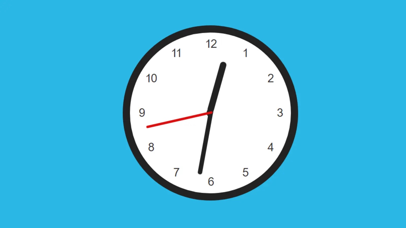
As you can see in the picture above it is a very simple and simple design. Here are three hands of hours, minutes, and seconds to see the time. There are numbers from 1 to 12 in the clock pulse. The time depends on the time of your device, that is, the time will be the same as the time of your device.
Javascript Analog Clock Code
Originally the HTML programming code was used to construct this watch. The CSS code has been used to design it. The most notable work is that of JavaScript programming code. Of course, to make this watch you need to have a basic idea about HTML, CSS, and JavaScript.
If you want to know how this watch works, you can watch the live demo below. Of course, I have put the necessary source code there, if you want you can copy those and use your own work.
See the Pen
javascript clock 3 by shantanu jana (@fghty)
on CodePen.
But if you are a beginner and want to know how I made this watch then you must follow the tutorial below.
How to make an analog clock in javascript
First of all, you have to create an HTML and CSS file before extending this watch. Combine HTML files and CSS files. You can also add CSS code to the HTML file using the style tag (<style>css code</style>).
Step 1: Create the basic structure of the clock
I have created the basic structure using the following HTML codes. The following HTML has been used to make this watch, basically the dial you see in the watch.
Step 2: Design the background using CSS code
The following CSS code has been used to design the above HTML code. added background color and added 1 border to the watch. In this case, I have used white color in the watch so that the hands and numbers can be seen more clearly.
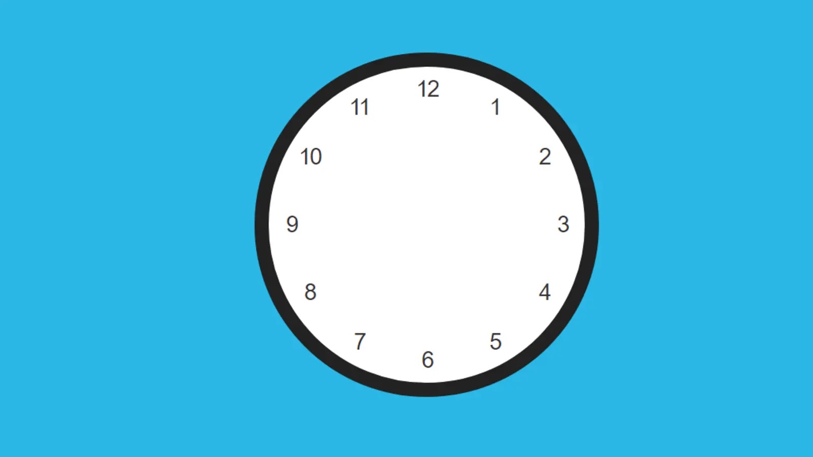
You can see the image below where I have shown what kind of result can be obtained by adding these two programming codes.
Step 3: Make numbers 1 to 12 in the analog clock
Above we have basically designed the background of the watch. In the meantime, we will add numbers from 1 to 12. Basically, we depend on these numbers to see the time.
In this case, I have added the number from 1 to 12 through the HTML programming code. I wrote the numbers using the span tag (<span>1</span> ,…., <span>12</span>).
Step 4: Sort the numbers according to specific distances
As you can see above, the HTML code writes those numbers. Now we will design these numbers and arrange them according to the specified distance.
In many cases, many people use background images not to write these numbers. Here I have arranged these numbers beautifully using nth-of-type() CSS code.
Now the question that arises in your mind may be how I arranged these numbers according to a completely specific distance. Let me tell you – I used degrees to measure this distance. We all know that if we measure a circular circle in degrees, its magnitude is 360 degrees. If we divide that 360 by 12, the value of each angle will be 30.
This means that if you place each number at a distance of 30 degrees, the number twelve will find its place in the circular frame at a completely fixed distance. As you can see below, I used the number one number to rotate 30 degrees. We have used the same number two by rotating it at a 60-degree angle.
Step 5: Add three hands(hr, min, sec) to the clock
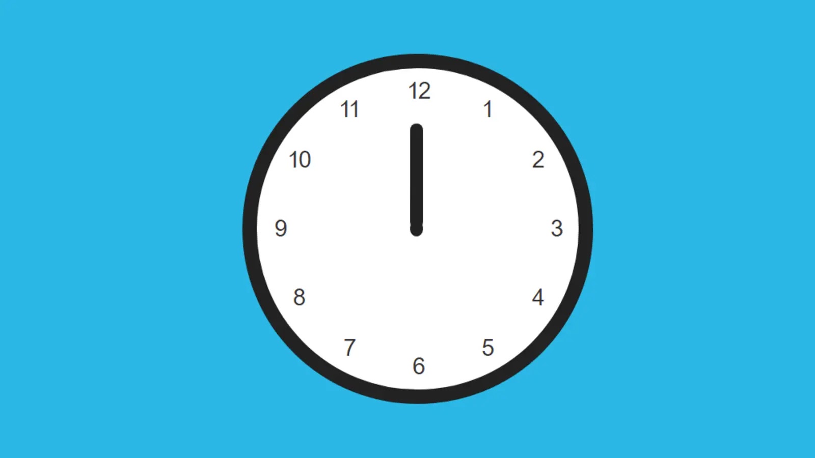
So far we have done the basic design of the watch. Now we will add three hands to the watch. When we set some time we set it on hours, minutes, and seconds. So in this case too I will use three hands which I have used to create the following HTML programming code.
Step 6: Arrange each hand beautifully
I have used the following CSS, I have only designed the hour hand. Now the question may be how these hands rotate at regular intervals.
Let me tell you – If you look at your CSS, you will understand that the position of one side of these hands has been absolute. As a result, that direction remains completely stable and the other side continues to rotate.
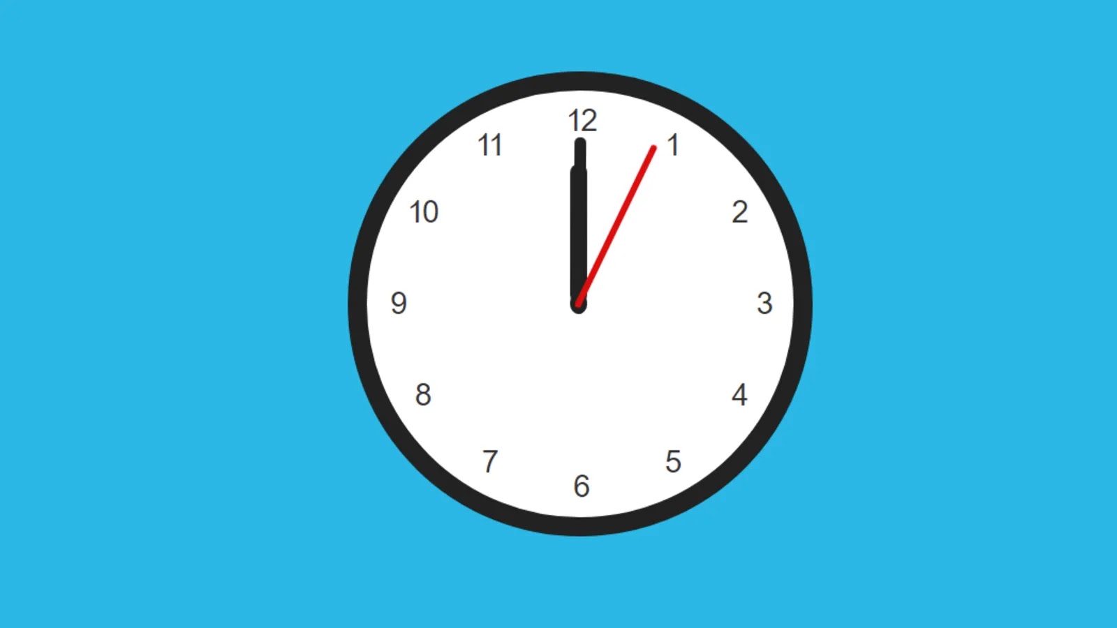
I have used the following codes to design the minute hand. Let me tell you one thing, if you want to increase the length and height of these cuts, you can do it very easily.
I have used the following codes to design secondhand. You will notice that I have instructed here to rotate this second hand using @keyframes rotateHand.
Step 7: Add JavaScript code to activate the clock
So far we have only designed it. Now we will activate this watch.
Step 8: Determine the rotation of the hands on the clock
I told you first that one part of the hands of the watch is fixed and the other part rotates. That rotation will be controlled by JavaScript programming code.
As I said before, one hour is equal to 30 degrees (1 hr = 30°), one minute is equal to 6 degrees (1 min = 6°) and one second is equal to 6 degrees (1 sec = 6°).
I will multiply the current clock by 30 by hand to rotate the cut of the clock according to the specified time. Let’s say we add minutes to it to keep the clock hand in a more neat and precise position.
For example, if I tell you that if the clock is currently at 03:30, then according to the rules, the hour hand will be at 90 degrees. In this case, the exact time will never be indicated. Because we know that in the case of 03:30 the hand of the clock will be somewhere between 3 and 4. That means the hand will be slightly higher than 90 degrees.
To determine this thing, we have added the distance of the hour hand to the minute hand. So that the hands of the clock will be in the right place. I have instructed the same minute and second-hand rotation method.
If you know the basic JavaScript programming code then hopefully you can understand this design.
Hopefully from this article, you have learned how to make this clock using HTML, CSS, and JavaScript programming code.
If you can understand how to make this watch from this article, please comment with your opinion. I have already made many more types of JavaScript clocks so you can see those designs if you want.


