A year consists of twelve months, fifty-two weeks, and three hundred and sixty days. Every day is a fresh day, full of inspiration and energy. We have a happy celebration of the new year every year. We celebrate that we have successfully finished another year together with our family and look forward to the joys that the new year will bring us.
While people celebrate the new year in different ways depending on where they live, we developers use our skills to make amazing new designs and animations that we can share with our close ones to give new year wishes.
Similarly, each year we make some unique visuals and videos to wish our loved ones a happy new year. This time, we’re going to use more advanced concepts to create an animated Happy New Year using HTML and CSS.

I hope you got some basic idea of what we are going to do in this article. We will be using advanced CSS properties for creating unique visuals and designs, which we will use to share with our family members.
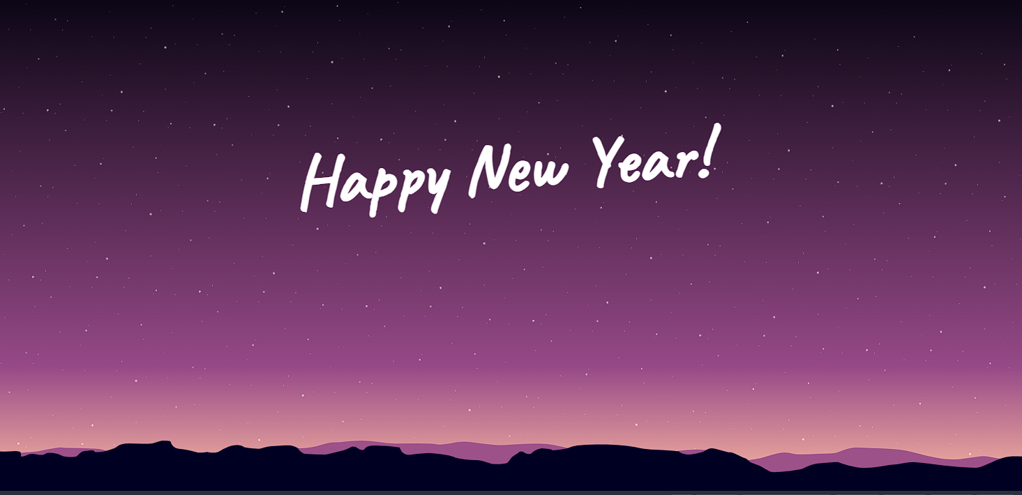
Let’s start with a simple example of creating a basic structure for our Happy New Year wish. But before that, let’s take a look at the live demo of the project.
Live Demo:
HTML Code Structure (Happy New Year)
First of all, using the <h1> tag, we will create the happy new structure for my wife, and using the div tag, a block level element with class “starts,” and using the basic block level element (div) with class stars, we will add stars to our happy new year app.
Using SVG (Scalable Vector Graphics), these graphics use XML code to provide high-quality graphics on the website. By using SVG, we will add high-definition graphics that are unique and user-interactive. Here, inside the structure of our Happy New Year wishes, we will add two SVGs, one for the buildings and the other for the mountains.
<h1 id="title">Happy New Year!</h1>
<div class="stars"></div>
<svg class="mountains mountains--layer1" xmlns="http://www.w3.org/2000/svg" width="1920" height="200" viewBox="0 0 1920 200" preserveAspectRatio="none">
  <title>bergskedja</title>
  <path d="M0,41.57s21.25,2.19,27.33,2.19,22.27-4.37,28.34,0-1,22.94,6.07,19.67S72.87,52,81,52.81s16.19,10.15,22.27,0,25.3-1.41,30.36,6.24,21.25,7.33,26.32,4.76,8.1-20.66,16.19-22,17.21-6.31,18.22,0,5.06,3,12.15,3,20.24-10.93,25.3-14.2S238.86,11,259.1,11s35.42,4.37,43.52,0S316.79.05,321.86.05,337-1,337,6.61s6.07,24.92,15.18,26.12,30.36,11,34.41,14.31,18.22-2.19,18.22-2.19c11.13,7.65,20.24,0,20.24,0S441.29,23,453.43,18.63s17.21,4.37,20.24,7.65S497,32.62,500,32.73s19.23-10.82,23.28-10.82,27.33-4.37,34.41-3.28,16.19,10.72,16.19,14.1S582,52.5,586,52.5s15.18,2.19,21.25,2.19,14.17,1.09,17.21,1.09,6.07-3.28,26.32-13.11S669,21.91,677.11,24.09s9.11,14.2,16.19,13.11,0-17.48,24.29-17.48a140.45,140.45,0,0,1,44.53,7.65s3,29.5,17.21,29.5c0,0,28.34-7.65,36.44-7.65s39.47,7.33,47.57,16.23,32.39,12.18,42.51,12.18,25.3,15.3,28.34,15.3,23.28,3.28,28.34-5.46S967.59,66.7,975.69,58s10.12-21.3,17.21-11.2,13.16,8.47,16.19,0,14.17-16.12,17.21-16.12,19.23,3.28,19.23,6.56,25.3-2.19,35.42-12,39.47-9.83,65.79-9.83,54.65,9.83,61.74,14.2,33.4,7.65,42.51,7.65,20.24,4.37,26.32,4.37,5.06,9.83,17.21,13.11,25.3-8.19,28.34-7.92,10.12-16.12,19.23-16.12,27.33,16.94,34.41,16.12,22.27,22.12,28.34,24.31,2,12.13,18.22,22.45,22.27,32.18,34.41,32.18,50.61-8.74,54.65-15.3,22.27-19.67,27.33-19.67,34.41-7.65,38.46-4.37,29.35,22.94,48.58,22.94,46.56-14.2,54.65-14.2,23.28-9.83,35.42-9.83,46.56,12,57.69,14.2,42.51,8.74,58.7,8.74,38.67-42.77,66.8-45.89c6.12-.68,20.24,1.09,20.24,1.09V200H0Z"/>
</svg>

<svg class="mountains mountains--layer2" xmlns="http://www.w3.org/2000/svg" width="1920" height="200" viewBox="0 0 1920 200" preserveAspectRatio="none">
    <title>bergskedja2</title>
    <path d="M0,82.09s21.14-13,30.14-19,24-16,45-17.5,49.5-23.86,63-17c0,0,62.87.71,70.5,6.67s81,40.83,127.49,40.83,88.5-20.16,126-24.33,68.23-29.63,90-24.33,31.5,3.89,46.5-.72,25.5-19.61,42-19.61,25.5-7.1,51-7.1,39,11.59,63,11.59,60-3,75,3S864.1,4,882.09,4,934.41,22.09,960,17.59s58.59-7.5,75.09-4.5,36,16.9,61.5,25,82.5,17,97.5,18.55,51.77-6,67.5-10.5S1313,30,1330.81,38s23.76,44,44.76,44,45-6,57-12,31.5-22.5,45-22.5,12,7.5,31.5,7.5,42-4.5,57-4.5,24-25.5,49.5-22.5,66,1.9,90,13,49.5,30.55,78,33.55,54-16.5,69-12,44.91,19.5,67.45,19.5V200H0Z"/>
</svg>
Output:

Styling Happy New Year Design
1. Styling Basic structure & body:
We will first import new font faces, which we will later use inside our Happy New Year design. Using the Google Import link, we will be using the font family “Caveat.”.
Using the body tag selector, we will set the background as a linear gradient with the bottom color combining yellow, maroon, and white. Using the height property, we will set the height of the Happy New Year to 100%, and then, using the display type Flex, we will set the display of our Happy New Year to flexible and responsive, and align all the content at the center of the webpage.
@import url("https://fonts.googleapis.com/css?family=Caveat");

html,
body {
    //background: linear-gradient(to bottom, rgba(24,26,43,1) 0%, rgba(57,71,105,1) 73%, rgba(106,96,120,1) 100%);
    background: linear-gradient(
        to bottom,
        rgba(9, 5, 19, 1) 0%,
        rgba(150, 73, 135, 1) 75%,
        rgba(253, 188, 163, 1) 100%
    );
    height: 100%;
    display: flex;
    align-items: center;
    justify-content: center;
    overflow: hidden;
}
2. Adding Stars and Animation
Now, using the class selector property (.stars), we will add the styling to our block-level element. We will set the position as “absolute,” and using the top, right, bottom, and left spacing properties, we will set all the space to zero so that stars cover the whole area.
Then, using the before and after properties, we will set the content property to blank, and using the display property, we will set the display to block. Now using the background property, we will set an image background that contains images of small stars, and now using the animation property, we will set the animation property to rotate with an interval of 360 seconds up to infinite times.
Using the keyframes property, we will use the keyframes to add-in the animation. Using the keyframes, we will add two keyframes, in which one keyframe uses the transform property to rotate and set to zero, and then again using the transform property at 100% to rotate the image to 360°.
.stars {
    position: absolute;
    top: 0;
    right: 0;
    bottom: 0;
    left: 0;
    &:after,
    &:before {
        content: "";
        display: block;
        position: absolute;
        top: 0;
        left: 0;
        bottom: 0;
        right: 0;
        background: url("data:image/png;base64,iVBORw0KGgoAAAANSUhEUgAAAZAAAAGQAQMAAAC6caSPAAAABlBMVEVHcEz///+flKJDAAAAAXRSTlMAQObYZgAAAIVJREFUeAHt2SEOwkAQhtFJKuqKRRGOgKzgUMgKRI/G0ZDoacNkN/ue/zJ+/ugBcI+01/EEAGBc04FkP58AVFoi7VaSLAEAAPB/j0hbK678AADMkXbZG03mGA0AAKsP3JgAAGDa88knsuZ8Mp1M6gEAPFtNrtEjtkh7lyRb3/PAWpS0BPgC0PMMdOEjXqoAAAAASUVORK5CYII=");
    }
    &:after {
        background-size: 100px;
        opacity: 0.4;
    }
    &:before {
        background-size: 200px;
        opacity: 0.6;
    }
    animation: rotation 360s infinite linear;
}

@keyframes rotation {
    0% {
        transform: rotate(0);
    }
    100% {
        transform: rotate(360deg);
    }
}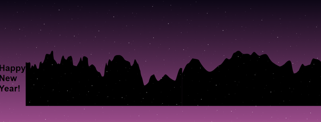
3. Styling Heading and SVG Mountains:
Now using the heading tag selector, we will select the heading and set the font size of our Happy New Year heading as calc 1.5em and 5vw and the font color of the heading as white. Using the font-family property, we will set the font style as “Caveat.” Using the text-align property, we will set the text to the center, and using the transform property, we will rotate it -4° around the x axis and -15° around the y axis.
Now using the class selector (.Mountains), we will set the position as “Absolute,” and using the minimum width property, we will set the minimum width to 100%, and the height of the mountain is set to 60px.
We will create two layers of the mountain, one behind the other, using the z-index property. We will set the z-axis position of the first layer to the top, and then, using the z-index property, we will set the z-index of the second layer to “zero.”.
h1 {
    font-size: calc(1.5em + 5vw);
    color: #fff;
    font-family: "Caveat", sans-serif;
    text-align: center;
    padding: 0.5em;
    transform: rotate(-4deg) translateY(-15vh);
}

.mountains {
    position: absolute;
    bottom: 0;
    left: 0;
    right: 0;
    width: auto;
    min-width: 100%;
    height: 60px;
    fill: #000022;
}
.mountains--layer1 {
    z-index: 2;
}
.mountains--layer2 {
    fill: #9d5189;
    z-index: 0;
}
Javascript for fireworks Animation
1. Creating Brust:
Using the mo.js library, we will create the burst animation. First of all, using the const keyword, we will create a burst child, and then, using the fill property, we will specify the color transition of the fireworks. Using the delay keyword, we will add a delay of 300 miliseconds, and the duration of the fireworks is 700 milliseconds.
Now, using the other variable burst portion, we will determine the number of burst children created after burst animation, and the range is between 15 and 20. Then we will add functionality to each individual burst to add uquiness to the fireworks.
// Create the bursts
const B_CHILD = {
    fill: { "#ffffff": "#ef1cec" },
    delay: "rand(300, 359)",
    duration: 700,
    pathScale: "rand(0.8, 1)",
    isSwirl: true,
    swirlSize: "stagger(-2,2)",
    swirlFrequency: 1
};
const B_OPTS = {
    count: "rand(15,20)",
    top: "100%",
    children: {
        ...B_CHILD
    }
};
const burst1 = new mojs.Burst({
    ...B_OPTS,
    radius: { 0: "rand(150,170)" },
    x: -45,
    y: -335
});

const burst1_2 = new mojs.Burst({
    ...B_OPTS,
    radius: { 0: "rand(150,170)" },
    x: -45,
    y: -335,
    children: {
        ...B_CHILD,
        delay: "rand(260, 350)",
        pathScale: "rand(0.7, 0.8)",
        degreeShift: 20
    }
});

const burst2 = new mojs.Burst({
    ...B_OPTS,
    radius: { 0: "rand(100,150)" },
    x: 140,
    y: -315,
    children: {
        ...B_CHILD,
        fill: { "#ffffff": "#d8ff00" }
    }
});

const burst2_2 = new mojs.Burst({
    ...B_OPTS,
    radius: { 0: "rand(100,150)" },
    x: 140,
    y: -315,
    children: {
        ...B_CHILD,
        fill: { "#ffffff": "#d8ff00" },
        delay: "rand(260, 350)",
        pathScale: "rand(0.7, 0.8)",
        degreeShift: 20
    }
});
2. Interactive burst:
We will be creating interactive burst shot animations. As the user clicks anywhere on the page, a burst animation around the cursor will be created. Using the rand function of mathematics, we will be creating burst tunes at different points on the webpage.
We will be using the click-add event listener, which will listen to every click and replay the burst and burst 2 animations accordingly. Using the mo.js timeline is used to create fireworks lines fw1 and fw2.
The timeline is set to repeat, and it plays a sequence of firework lines, triggering the associated bursts (burst1, burst1_2, burst2, burst2_2) when each firework line starts. This helps in creating a more interactive and user-friendly design.
// Create interactive burst
const burst_tune = new mojs.Burst({
    ...B_OPTS,
    radius: { 0: "rand(100,150)" },
    left: 0,
    top: 0,
    x: 0,
    y: 0,
    children: {
        ...B_CHILD,
        delay: "rand(0, 50)",
        fill: { "#ffffff": "#d8ff00" }
    }
});
const burst_tune_2 = new mojs.Burst({
    ...B_OPTS,
    radius: { 0: "rand(100,150)" },
    left: 0,
    top: 0,
    children: {
        ...B_CHILD,
        fill: { "#ffffff": "#d8ff00" },
        delay: "rand(10, 150)",
        pathScale: "rand(0.7, 0.8)",
        degreeShift: 20
    }
});
document.addEventListener("click", function (e) {
    burst_tune.generate().tune({ x: e.pageX, y: e.pageY }).replay();
    burst_tune_2.generate().tune({ x: e.pageX, y: e.pageY }).replay();
});

// Create the firework lines
const FW_OPTS = {
    shape: "curve",
    fill: "none",
    isShowStart: false,
    strokeWidth: { 3: 0 },
    stroke: "#ffffff",
    strokeDasharray: "100%",
    strokeDashoffset: { "-100%": "100%" },
    duration: 1000
};
const fw1 = new mojs.Shape({
    ...FW_OPTS,
    radius: 170,
    radiusY: 20,
    top: "100%",
    y: -165,
    angle: 75,
    onStart: function () {
        burst1.replay(0);
        burst1_2.replay(0);
    }
});

const fw2 = new mojs.Shape({
    ...FW_OPTS,
    radius: 180,
    radiusY: 50,
    top: "100%",
    x: 50,
    y: -155,
    strokeDashoffset: { "100%": "-100%" },
    angle: -60,
    delay: 200,
    onStart: function () {
        burst2.replay(0);
        burst2_2.replay(0);
    }
});

// Underline under title
const underline = new mojs.Shape({
    parent: document.getElementById("title"),
    shape: "curve",
    strokeLinecap: "round",
    fill: "none",
    isShowStart: false,
    strokeWidth: { "1em": "5em" },
    stroke: "#ffffff",
    strokeDasharray: "200%",
    strokeDashoffset: { "200%": "100%" },
    radius: 150,
    radiusY: 10,
    y: "1.1em",
    angle: -10,
    duration: 2000,
    delay: 1000
}).then({
    strokeWidth: { "5em": "1em" },
    strokeDashoffset: { "100%": "-200%" },
    duration: 2000,
    delay: 10000
});
const timelineText = new mojs.Timeline({
    repeat: 2018
})
    .add(underline)
    .play();

// Fire off the explosions
const timeline = new mojs.Timeline({
    repeat: 2018
})
    .add([fw1, fw2])
    .play();
Hopefully, the above tutorial has helped you understand how we have used HTML, CSS, and Javascript to create the unique Happy New Year Project.
Let’s take a look at the video output of the project for better understanding, and looking at the live demo helps in analyzing the design.
Here we have learned how to create a Happy New Year wishing design. Next time, I am going to write an article on how I love your code animation using HTML and CSS. Please give us your valuable feedback on how you like this Happy New Year using HTML CSS and Javascript.
If you like the project, don’t forget to follow our website, foolishdeveloper.com.