Introduction :
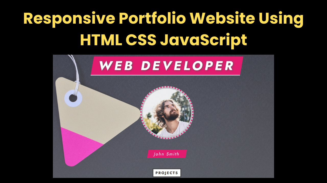
A Responsive Portfolio Website Using HTML CSS JavaScript website is more than just a collection of projects—it’s a personal brand, a place to showcase your skills, creativity, and expertise. It acts as a digital resume, providing insight into technical skills, creativity, and problem-solving abilities. This tutorial provides a comprehensive guide on creating a structured, interactive, and visually appealing portfolio using HTML, CSS, and JavaScript. The goal is to ensure the website remains fully responsive, offering seamless navigation and engagement.
Importance of a Portfolio Website:
Having a personal website is beneficial in multiple ways:
- It establishes credibility and professional presence.
- It serves as a centralized space to display projects and achievements.
- It allows potential employers or clients to interact with showcased work.
- It helps in branding and differentiating one’s skills from the competition.
A well-structured portfolio is user-friendly, responsive across devices, and incorporates interactive elements to enhance the browsing experience.
Setting Up the Project:
Before beginning, ensure the following prerequisites are met:
- A basic understanding of HTML, CSS, and JavaScript.
- A code editor such as Visual Studio Code or Sublime Text.
- A project directory containing essential files:
- index.html (structure)
- style.css (styling)
- script.js (functionality)
- images/ (media assets)
With the setup complete, the next step is to structure the webpage properly.
Step 1: Structuring the HTML:
HTML forms the foundation of the portfolio, organizing content into distinct sections. The primary components include:
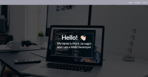
Hero Section:
This section introduces the developer with a heading, profile image, and a call-to-action button. It creates an engaging first impression.
<section class="hero">
    <h1>Web Developer</h1>
    <img src="images/profile.jpg" alt="Profile Image" class="profile-img">
    <h3>John Smith</h3>
    <a href="#projects" class="hero-btn">View Projects</a>
</section>
Navigation Bar:
A fixed navigation bar ensures smooth transitions between sections. It remains visible while scrolling.
<nav class="navbar">
<a href="#home">Home</a>
<a href="#about">About</a>
<a href="#portfolio">Portfolio</a>
<a href="#contact">Contact</a>
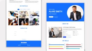
</nav>Skills Progress Bars:
Progress bars dynamically represent proficiency levels in various technologies.
<div class="skill-bar">
    <p>JavaScript <span>85%</span></p>
    <div class="skill-progress"></div>
</div>
Project Gallery:
A structured layout ensures projects are displayed attractively. Each card includes an image, description, and relevant links.
Contact Form:
A contact section allows visitors to communicate through a simple, user-friendly form.
<form class="contact-form">
    <input type="text" placeholder="Name">
    <input type="email" placeholder="Email">
    <textarea placeholder="Message"></textarea>
    <input type="submit" value="Send">
</form>
Step 2: Styling with CSS:
CSS enhances the design, ensuring a professional appearance and responsive layout.
Key Styling Features:
- Typography and Colors: Uses a modern font with a balanced color scheme.
- Hero Section Effects: Gradient overlays and well-spaced elements improve readability.
- Sticky Navigation Bar: Remains fixed for easy accessibility.
- Animated Progress Bars: Displays skill levels smoothly.
- Hover Effects on Projects: Details appear when users hover over each project.
Below is an example of how the sticky navigation bar is styled:
.navbar {
    position: fixed;
    top: 0;
    width: 100%;
    background-color: #e41c6f;
    box-shadow: 0px 4px 6px rgba(0, 0, 0, 0.1);
}
Responsive Design:
The website adapts seamlessly across different screen sizes using CSS media queries:
- Maximum width: 1200px – Adjusts section padding.
- Maximum width: 800px – Reduces font sizes for better readability.
- Maximum width: 500px – Optimizes layout for mobile viewing.
Step 3: Adding JavaScript for Interactivity:
JavaScript enhances the portfolio by making it dynamic and user-friendly.
Key Features:
- Sticky Navigation: Keeps the navbar visible while scrolling.
- Section-Based Navbar Highlighting: Highlights the active section in real-time.
- Animated Progress Bars: Adjusts the width dynamically as users scroll.
- Smooth Scroll Behavior: Ensures seamless navigation when clicking on links.
The following JavaScript snippet controls the progress bar animation:
document.querySelectorAll('.skill-progress').forEach((el, i) => {
    el.style.width = `${progressBarPercents[i]}%`;
    el.previousElementSibling.firstElementChild.textContent = progressBarPercents[i];
});
Conclusion:
A well-structured portfolio website not only showcases technical skills but also establishes a strong professional presence. Combining HTML, CSS, and JavaScript, developers can create an engaging, responsive, and interactive platform that effectively highlights their expertise. Regular updates, design refinements, and feature enhancements ensure the portfolio remains impactful and relevant in an evolving digital space. Investing in a well-crafted portfolio is a step toward better visibility, career opportunities, and professional growth.
Index.html:
<div class="container">
<!-- Section 1 -->
<section class="section-1 center" id="section-1">
<h1 class="section-1-heading">
Web Developer
</h1>
<img src="images/john-smith.jpg" alt="John Smith" class="person-img" />
<h3 class="person-name">John Smith</h3>
<a href="#section-3" class="section-1-btn">Projects</a>
</section>
<!-- End of Section 1 -->
<!-- Navbar -->
<nav class="navbar center">
<a href="#section-1" class="navbar-link">Home</a>
<a href="#section-2" class="navbar-link">About</a>
<a href="#section-3" class="navbar-link">Portfolio</a>
<a href="#section-4" class="navbar-link">Contact</a>
</nav>
<!-- End of Navbar -->
<!-- Section 2 -->
<section class="section-2" id="section-2">
<h1 class="section-heading section-2-heading">About Me</h1>
<div class="progress-bars-wrapper">
<div class="progress-bar">
<p class="progress-text">
HTML
<span></span>%
</p>
<div class="progress-percent"></div>
</div>
<div class="progress-bar">
<p class="progress-text">
CSS
<span></span>%
</p>
<div class="progress-percent"></div>
</div>
<div class="progress-bar">
<p class="progress-text">
JavaScript
<span></span>%
</p>
<div class="progress-percent"></div>
</div>
<div class="progress-bar">
<p class="progress-text">
SASS
<span></span>%
</p>
<div class="progress-percent"></div>
</div>
<div class="progress-bar">
<p class="progress-text">
ReactJS
<span></span>%
</p>
<div class="progress-percent"></div>
</div>
<div class="progress-bar">
<p class="progress-text">
NodeJS
<span></span>%
</p>
<div class="progress-percent"></div>
</div>
<div class="progress-bar">
<p class="progress-text">
MongoDB
<span></span>%
</p>
<div class="progress-percent"></div>
</div>
</div>
<div class="services">
<div class="service">
<i class="far fa-lightbulb"></i>
<h2 class="service-heading">Creative</h2>
</div>
<div class="service">
<i class="fas fa-cut"></i>
<h2 class="service-heading">Problem Solving</h2>
</div>
<div class="service">
<i class="fas fa-tachometer-alt"></i>
<h2 class="service-heading">Fast</h2>
</div>
<div class="service">
<i class="fas fa-rocket"></i>
<h2 class="service-heading">Dynamic</h2>
</div>
</div>
</section>
<!-- End of Section 2 -->
<!-- Section 3 -->
<section class="section-3" id="section-3">
<h1 class="section-heading section-3-heading">My Projects</h1>
<div class="projects-wrapper center">
<div class="project">
<div class="project-text">
<h2 class="project-name">architect website</h2>
<h4 class="project-technologies">HTML / CSS / JS</h4>
</div>
<img src="images/project-1.jpg" class="project-img" />
<a
href="https://www.youtube.com/watch?v=3J-EFMzz94g"
class="project-link"
target="_blank"
>Go to Video</a
>
</div>
<div class="project">
<div class="project-text">
<h2 class="project-name">Budget App</h2>
<h4 class="project-technologies">ReactJS</h4>
</div>
<img src="images/project-2.jpg" class="project-img" />
<a
href="https://www.youtube.com/watch?v=fDffQYs2WB0"
class="project-link"
target="_blank"
>Go to Video</a
>
</div>
<div class="project">
<div class="project-text">
<h2 class="project-name">wine house</h2>
<h4 class="project-technologies">HTML / CSS / JS</h4>
</div>
<img src="images/project-3.jpg" class="project-img" />
<a
href="https://www.youtube.com/watch?v=jtmuopTpzGE"
class="project-link"
target="_blank"
>Go to Video</a
>
</div>
<div class="project">
<div class="project-text">
<h2 class="project-name">task manager</h2>
<h4 class="project-technologies">ReactJS</h4>
</div>
<img src="images/project-4.jpg" class="project-img" />
<a
href="https://www.youtube.com/watch?v=fqup-BL3VjI"
class="project-link"
target="_blank"
>Go to Video</a
>
</div>
<div class="project">
<div class="project-text">
<h2 class="project-name">The Road</h2>
<h4 class="project-technologies">HTML / CSS / JS</h4>
</div>
<img src="images/project-5.jpg" class="project-img" />
<a
href="https://www.youtube.com/watch?v=qmyN7lYY_xo"
class="project-link"
target="_blank"
>Go to Video</a
>
</div>
<div class="project">
<div class="project-text">
<h2 class="project-name">food recipe app</h2>
<h4 class="project-technologies">ReactJS</h4>
</div>
<img src="images/project-6.jpg" class="project-img" />
<a
href="https://www.youtube.com/watch?v=d1vT4kkTCaw"
class="project-link"
target="_blank"
>Go to Video</a
>
</div>
<div class="project">
<div class="project-text">
<h2 class="project-name">slideshow</h2>
<h4 class="project-technologies">HTML / CSS / JS</h4>
</div>
<img src="images/project-7.jpg" class="project-img" />
<a
href="https://www.youtube.com/watch?v=1qhSSp2q7n4"
class="project-link"
target="_blank"
>Go to Video</a
>
</div>
<div class="project">
<div class="project-text">
<h2 class="project-name">Hamburger menu</h2>
<h4 class="project-technologies">HTML / CSS / JS</h4>
</div>
<img src="images/project-8.jpg" class="project-img" />
<a
href="https://www.youtube.com/watch?v=9Q7wy8r3i8w"
class="project-link"
target="_blank"
>Go to Video</a
>
</div>
<div class="project">
<div class="project-text">
<h2 class="project-name">CSS grid menu</h2>
<h4 class="project-technologies">HTML / CSS / JS</h4>
</div>
<img src="images/project-9.jpg" class="project-img" />
<a href="" class="project-link" target="_blank">Go to Video</a>
</div>
</div>
</section>
<!-- End of Section 3 -->
<!-- Section 4 -->
<section class="section-4" id="section-4">
<h1 class="section-heading section-4-heading">Contact Me</h1>
<form class="contact-form center">
<input type="text" placeholder="Name" />
<input type="email" placeholder="Email" />
<textarea placeholder="Message"></textarea>
<input type="submit" value="Submit" class="contact-form-btn" />
</form>
</section>
<!-- End of Section 4 -->
<!-- Section 5 -->
<footer class="section-5 center">
<div class="social-media">
<a href="#none" class="social-media-link">
<i class="fab fa-github-square"></i>
</a>
<a href="#none" class="social-media-link">
<i class="fab fa-youtube"></i>
</a>
<a href="#none" class="social-media-link">
<i class="fab fa-facebook-square"></i>
</a>
<a href="#none" class="social-media-link">
<i class="fab fa-instagram-square"></i>
</a>
</div>
<p class="copyright">
Copyright © CodeAndCreate. All Rights Reserved
</p>
</footer>
<!-- End of Section 5 -->
</div>
<script src="script.js"></script>Style.css:
/* Reset and Common Styles */
* {
  margin: 0;
  padding: 0;
  outline: none;
  box-sizing: border-box;
  text-decoration: none;
  list-style-type: none;
  font-family: "Jost", sans-serif;
  font-weight: 400;
}

html {
  font-size: 62.5%;
  scroll-behavior: smooth;
}

.center {
  display: flex;
  justify-content: center;
  align-items: center;
}

.section-heading {
  font-size: 5rem;
  color: #333;
  text-transform: uppercase;
  letter-spacing: 0.5rem;
  margin-bottom: 15rem;
  border-bottom: 0.3rem solid #333;
  text-shadow: 0.2rem 0.2rem 0.5rem #555;
}
/* End of Reset and Common Styles */

/* Section 1 */
.section-1 {
  width: 100%;
  height: 100vh;
  background: linear-gradient(
      rgba(255, 255, 255, 0.2),
      rgba(255, 255, 255, 0.3)
    ),
    url(images/bg.jpg) center no-repeat;
  background-size: cover;
  flex-direction: column;
}

.section-1-heading {
  font-size: 6rem;
  font-weight: 700;
  color: #fff;
  background-color: #e41c6f;
  padding: 0 3rem;
  margin-bottom: 5rem;
  text-transform: uppercase;
  letter-spacing: 1rem;
  border-bottom: 0.3rem solid #fff;
  text-shadow: 0.2rem 0.2rem 1rem #555;
  transform: skew(-10deg);
}

.person-img {
  width: 25rem;
  height: 25rem;
  object-fit: cover;
  border-radius: 50%;
  border: 0.7rem dotted #e41c6f;
  background-color: rgba(255, 255, 255, 0.7);
  padding: 0.5rem;
  opacity: 0.9;
}

.person-name {
  font-size: 2rem;
  color: #fff;
  background-color: #e41c6f;
  margin: 5rem 0;
  padding: 0.5rem 3rem;
  letter-spacing: 0.3rem;
  transform: skew(-10deg);
}

.section-1-btn {
  font-size: 1.7rem;
  font-weight: 700;
  color: #333;
  background-color: #fff;
  border: 0.3rem solid #333;
  padding: 0.5rem 1rem;
  text-transform: uppercase;
  letter-spacing: 0.3rem;
}
/* End of Section 1 */

/* Navbar */
.navbar {
  width: 100%;
  height: 4rem;
  background-color: #e41c6f;
  box-shadow: 0.2rem 0.2rem 0.5rem #555;
  position: absolute;
  z-index: 300;
}

.sticky {
  position: fixed;
  top: 0;
}

.navbar-link {
  font-size: 1.7rem;
  font-weight: 600;
  color: #333;
  margin: 0 3rem;
  letter-spacing: 0.3rem;
  text-transform: uppercase;
  position: relative;
  transition: color 0.2s;
}

.change.navbar-link {
  color: #fff;
}

.navbar-link:hover {
  color: #fff;
}

.navbar-link::before {
  content: "";
  width: 0;
  height: 0.2rem;
  background-color: #fff;
  position: absolute;
  right: -15%;
  bottom: -0.3rem;
  transition: width 0.2s;
}

.change.navbar-link::before {
  width: 130%;
}

.navbar-link:hover::before {
  width: 130%;
}
/* End of Navbar */

/* Section 2 */
.section-2 {
  width: 100%;
  height: 100%;
  padding: 15rem 0 10rem 0;
  background-color: #fff;
  display: flex;
  flex-direction: column;
  align-items: center;
}

.progress-bars-wrapper {
  margin-bottom: 10rem;
}

.progress-bar {
  width: 60rem;
  height: 3rem;
  background-color: #ccc;
  margin: 1.5rem 0;
  border-radius: 0.3rem;
  box-shadow: 0.2rem 0.2rem 1rem #555;
  position: relative;
}

.progress-text {
  position: absolute;
  left: 1rem;
  font-size: 1.5rem;
  color: #fff;
}

.progress-text span {
  margin: 0 0.5rem;
  font-size: 1.8rem;
  font-weight: 700;
}

.progress-percent {
  width: 0;
  height: 100%;
  background-color: #e41c6f;
  border-radius: 0.3rem;
  transition: width 0.5s 0.5s ease-in-out;
}

.services {
  width: 100%;
  height: 30vh;
  display: flex;
  justify-content: space-evenly;
  align-items: center;
}

.service {
  text-align: center;
}

.service:first-child,
.service:last-child {
  align-self: flex-start;
}

.service i {
  font-size: 10rem;
  color: #888;
  margin-bottom: 2rem;
  text-shadow: 0.1rem 0.1rem 0.5rem #555;
}

.service h2 {
  font-size: 2rem;
  color: #fff;
  background-color: #777;
  width: 25rem;
  letter-spacing: 0.3rem;
  transform: skew(-10deg);
  box-shadow: 0.2rem 0.2rem 0.5rem #555;
}
/* End of Section 2 */

/* Section 3 */
.section-3 {
  width: 100%;
  height: 100%;
  padding: 10rem 0;
  background-color: #eef;
  display: flex;
  flex-direction: column;
  align-items: center;
}

.projects-wrapper {
  width: 80%;
  flex-wrap: wrap;
}

.project {
  display: flex;
  flex-direction: column;
  justify-content: center;
  align-items: center;
  margin: 1rem;
  background-color: #fff;
  box-shadow: 0.3rem 0.3rem 0.5rem #777;
  position: relative;
  overflow: hidden;
  transition: box-shadow 0.5s;
}

.project:hover {
  box-shadow: 1rem 1rem 1rem #777;
}

.project-text {
  text-align: center;
  letter-spacing: 0.1rem;
  position: absolute;
  top: -10rem;
  z-index: 10;
  transition: top 0.3s;
}

.project:hover .project-text {
  top: 5rem;
  transition: top 0.3s 0.3s;
}

.project-name {
  font-size: 3rem;
  font-weight: 700;
  color: #333;
  text-transform: capitalize;
}

.project-technologies {
  font-size: 1.8rem;
  color: #e41c6f;
}

.project-img {
  width: 40rem;
  transition: opacity 0.3s;
}

.project:hover .project-img {
  opacity: 0.2;
}

.project-link {
  font-size: 2rem;
  font-weight: 500;
  color: #333;
  letter-spacing: 0.1rem;
  border: 0.3rem solid #e41c6f;
  padding: 0 1rem;
  background-color: #fff;
  position: absolute;
  bottom: -5rem;
  transition: bottom 0.3s;
}

.project:hover .project-link {
  bottom: 5rem;
  transition: bottom 0.3s 0.3s;
}
/* End of Section 3 */

/* Section 4 */
.section-4 {
  width: 100%;
  height: 70vh;
  background-color: #333;
  display: flex;
  flex-direction: column;
  align-items: center;
  justify-content: space-evenly;
}

.section-4-heading {
  color: #fff;
  box-shadow: none;
  border-color: #fff;
  margin-bottom: 5rem;
}

.contact-form {
  width: 50rem;
  flex-direction: column;
}

.contact-form input,
.contact-form textarea {
  width: 100%;
  padding: 0.5rem;
  margin: 0.5rem 0;
  background-color: #eef;
  font-size: 1.5rem;
  border: 0.2rem solid #e41c6f;
  color: #555;
}

.contact-form textarea {
  height: 10rem;
  max-height: 15rem;
  max-width: 100%;
}

.contact-form .contact-form-btn {
  background-color: #e41c6f;
  color: #fff;
  text-transform: uppercase;
  letter-spacing: 1rem;
  cursor: pointer;
}
/* End of Section 4 */

/* Section 5 */
.section-5 {
  width: 100%;
  height: 30vh;
  background-color: #222;
  flex-direction: column;
}

.social-media {
  margin-bottom: 5rem;
}

.social-media-link {
  margin: 0 2rem;
  padding: 0.7rem;
  background-color: #e41c6f;
  border-radius: 0.5rem;
  display: inline-block;
}

.social-media-link i {
  font-size: 3rem;
  color: #fff;
}

.copyright {
  color: #aaa;
  font-size: 2rem;
  letter-spacing: 0.2rem;
  font-weight: 300;
  text-align: center;
}
/* End of Section 5 */

/* Responsive */
@media (max-width: 1200px) {
  .services {
    height: auto;
    flex-wrap: wrap;
  }

  .service {
    margin: 3rem 2rem;
  }

  .section-4 {
    height: 80vh;
  }
}

@media (max-width: 800px) {
  .section-1-heading {
    font-size: 4rem;
  }

  .progress-bar {
    width: 50rem;
  }
}

@media (max-width: 600px) {
  .section-1-heading {
    font-size: 3rem;
  }

  .navbar-link {
    margin: 0 2rem;
    font-size: 1.5rem;
  }

  .section-2 {
    padding: 10rem;
  }

  .section-2-heading {
    margin-bottom: 10rem;
  }

  .progress-bar {
    width: 45rem;
  }

  .project-img {
    width: 100%;
  }

  .contact-form {
    width: 40rem;
  }

  .copyright {
    width: 70%;
  }
}

@media (max-width: 500px) {
  html {
    font-size: 55%;
  }
}

@media (max-width: 450px) {
  html {
    font-size: 45%;
  }

  .section-1-heading {
    font-size: 2.5rem;
  }

  .navbar-link {
    margin: 0 1.5rem;
  }

  .section-2-heading {
    text-align: center;
  }

  .progress-bar {
    width: 40rem;
  }
}
/* End of Responsive */
Script.js:
const navbar = document.querySelector(".navbar");
const navbarOffsetTop = navbar.offsetTop;
const sections = document.querySelectorAll("section");
const navbarLinks = document.querySelectorAll(".navbar-link");
const progress = document.querySelector(".progress-bars-wrapper");
const progressBarPercents = [97, 89, 85, 87, 80, 70, 50];

window.addEventListener("scroll", () => {
  mainFn();
});

const mainFn = () => {
  if (window.pageYOffset >= navbarOffsetTop) {
    navbar.classList.add("sticky");
  } else {
    navbar.classList.remove("sticky");
  }

  sections.forEach((section, i) => {
    if (window.pageYOffset >= section.offsetTop - 10) {
      navbarLinks.forEach((navbarLink) => {
        navbarLink.classList.remove("change");
      });
      navbarLinks[i].classList.add("change");
    }
  });

  if (window.pageYOffset + window.innerHeight >= progress.offsetTop) {
    document.querySelectorAll(".progress-percent").forEach((el, i) => {
      el.style.width = `${progressBarPercents[i]}%`;
      el.previousElementSibling.firstElementChild.textContent =
        progressBarPercents[i];
    });
  }
};

mainFn();

window.addEventListener("resize", () => {
  window.location.reload();
});