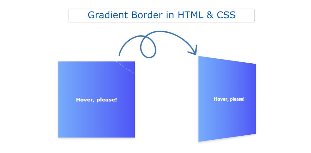
In this article, you will learn how to create a 3D Flip Card using HTML and CSS. CSS flip card is used in different places. This type of card flip effect CSS is used in various image galleries, and team section profile cards.
In the case of the flip card, if you click on the element or move the mouse, it will rotate 180 degrees and you can see the back of the element.
This card will contain information on both sides. Under normal circumstances, we will see the information on the front.
CSS Flip Card
When you click on the 3d flip card, you can see the information on the back. It is made up of a little bit of HTML and CSS. This is a basic design that you can copy and use in your work.
See the Pen
CSS Card Flip On Hover by Shantanu Jana (@shantanu-jana)
on CodePen.
The demo section above will help you to know how it works. From here you will get the required source code.
Although there are many more options for downloading source code. The article has a code section below where you can get all the codes together.
How to make a 3d flip card in CSS
You will also get a download button at the bottom. From where you can download all the codes with a single click.
Step 1: Basic structure of the card
The basic structure of this CSS 3D Flip Card has been created and designed using the following HTML codes. Flip Card width: 300px, height: 300px used. Here the box shadow is used to highlight the card.
Step 2: Attach 3D Flip to the card
Now this card has been converted to a 3D Flip Card. RotateY (180deg) has been used using only transform to flip the card.
Since we want the card to rotate along the y axis which is rotated 180deg along the axis. Here 3D flip of the card will work in both hover and focus.
Step 3: Add information to the front of the card
Now I have added some information on the front of the card. Basically, I have added a simple heading. Here linear-gradient color is used in the background.
Step 4: Information on the back of the 3D Flip Card
Now I have added the various information on the back of the card and designed it.
Card Flip Effect CSS
This 3D Flip Card has been completed. If you can’t assemble the code above, use the section below. In this code section, you will get all the source codes together.
Create an HTML and CSS file. Then add the following HTML codes to the HTML file and the CSS codes to the CSS file.
See the Pen
CSS Card Flip On Hover by Shantanu Jana (@shantanu-jana)
on CodePen.
If you do not have an ID for programming or coding, you can download the code directly. Please comment on how you like this CSS flip card.
If there is any problem while making this 3D Flip Card then don’t forget to let us know by commenting.
