
Feedback is used to give reviews about the product and services. Taking feedback from multiple users helps the product owner manage the quality and services of their products.
Most feedback is given in two ways: either with the help of the star rating method or by writing reviews. In the star rating method, we create a section inside the website where a group of stars along with each product of the website are given, where a 1-star rating means poor product and a 5-star rating means very good product.

We will create a 5 star rating project using HTML and CSS, and we will use the step-by-step method so that even beginners can easily understand the whole project.
Also, if you want to gain some experience, try to create a 5-star rating project on your own along with the article that helps in better understanding the projects and allows you to add your styling inside your project.
30+ HTML CSS and Javascript Projects
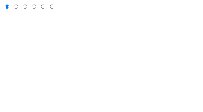
Let’s have a look at the live project before we begin working on our project.
General Question Related to 5-Star Rating App
Q What is a 5-star rating App?
It is one of the types of feedback given for particular products and services. In this article, we will be creating a group of stars where if the user clicks on the 1 star, that means he is not satisfied with the services, and if he clicks on the 5 star, that means the services are awesome.
Q What are the languages used for creating 5 Star rating app?
We will be using HTML for creating the structure and CSS for styling the 5-star rating app.
Adding the structure:
First of all, using the block level element tag <div>, we will create a main container for our rating stars, and then using the <input> tag with type “radio,” we will create the container for our star rating. We will create five similar types of star rating containers where we will add the star icon, and along with that, we will create a counter container that will count the number of stars selected.
<div class="rating-stars">
	<input type="radio" name="rating" id="rs0" checked><label for="rs0"></label>
	<input type="radio" name="rating" id="rs1"><label for="rs1"></label>
	<input type="radio" name="rating" id="rs2"><label for="rs2"></label>
	<input type="radio" name="rating" id="rs3"><label for="rs3"></label>
	<input type="radio" name="rating" id="rs4"><label for="rs4"></label>
	<input type="radio" name="rating" id="rs5"><label for="rs5"></label>
	<span class="rating-counter"></span>
</div>
CSS :
Basic Styling and Container Styling:
Using the body tag selector, we will set the margin to “zero,” and using the width and height properties, we will set the width and height to 100 vw and 100 vh, respectively, and using the align-items property, we will align the items to the center of the body of the webpage. Also, using the background color property, we will set the radial gradient background with a combination of blue and white.
Now using the class selector (.rating-stars), we will set the display to “block,” and using the width property, we will set the width to 50 vmin. With the help of the text-align property, we will align the text to the center, and using the background property, we will add a radial gradient of 90 degrees white and 50 degrees off-white.
Similarly, we will be styling the star rating counter. We will set the font color to gray, and we will add a little border-radius to the star rating counter.
body {
	margin: 0;
	width: 100vw;
	height: 100vh;
	display: flex;
	align-items: center;
	justify-content: center;
	background-color: #11114e;
	background: radial-gradient( circle at 50% 100%, #1d659f, #11114e);
}

body * {
    box-sizing: border-box;
}

.rating-stars {
	display: block;
	width: 50vmin;
	padding: 1.75vmin 10vmin 2vmin 3vmin;
	background: linear-gradient(90deg, #ffffff90 40vmin, #fff0 40vmin 100%);
	border-radius: 5vmin;
	position: relative;
}

.rating-counter {
	font-size: 5.5vmin;
    font-family: Arial, Helvetica, serif;
    color: #9aacc6;
    width: 10vmin;
    text-align: center;
    background: #0006;
    position: absolute;
    top: 0;
    right: 0;
    height: 100%;
    border-radius: 0 5vmin 5vmin 0;
    line-height: 10vmin;
}
Styling Element and Adding Checked Property:
Now using the input tag selector we will set the display of the input tag as none and using the label tag we will set the label width and height as 5vmin respectively and using the background property we will set the background as black .
Now using the before property, we will add some polygon properties for creating the star shape of the radio button, and then using the hover property, as the user hovers over the stars, the yellow background color will be added to the stars. Using the checked property, if the user selects the 5 stars, the checked property checks all the stars and adds the background color to all the stars. If the user selects the first star, then using the checked property, the background color will be added to that star only.
.rating-counter:before {
	content: "0";
	transition: all 0.25s ease 0s;
}


input { display: none; }

label {
	width: 5vmin;
	height: 5vmin;
	background: #000b;
	display: inline-flex;
	cursor: pointer;
	margin: 0.5vmin 0.65vmin;
	transition: all 1s ease 0s;
	clip-path: polygon(50% 0%, 66% 32%, 100% 38%, 78% 64%, 83% 100%, 50% 83%, 17% 100%, 22% 64%, 0 38%, 34% 32%);
}

label[for=rs0] {
	display: none;
}

label:before {
	width: 90%;
	height: 90%;
	content: "";
	background: orange;
	z-index: -1;
	display: block;
	margin-left: 5%;
	margin-top: 5%;
	clip-path: polygon(50% 0%, 66% 32%, 100% 38%, 78% 64%, 83% 100%, 50% 83%, 17% 100%, 22% 64%, 0 38%, 34% 32%);
	background: linear-gradient(90deg, yellow, orange 30% 50%, #184580 50%, 70%, #173a75 100%);
	background-size: 205% 100%;
	background-position: 0 0;
}

label:hover:before {
	transition: all 0.25s ease 0s;
}

input:checked + label ~ label:before {
	background-position: 100% 0;
	transition: all 0.25s ease 0s;
}

input:checked + label ~ label:hover:before {
	background-position: 0% 0
}


#rs1:checked ~ .rating-counter:before {
	content: "1";
}

#rs2:checked ~ .rating-counter:before {
	content: "2";
}

#rs3:checked ~ .rating-counter:before {
	content: "3";
}

#rs4:checked ~ .rating-counter:before {
	content: "4";
}

#rs5:checked ~ .rating-counter:before {
	content: "5";
}

label + input:checked ~ .rating-counter:before {
	color: #ffab00 !important;
	transition: all 0.25s ease 0s;
}


label:hover ~ .rating-counter:before {
	color: #9aacc6 !important;
	transition: all 0.5s ease 0s;
	animation: pulse 1s ease 0s infinite;
}

@keyframes pulse {
	  50% { font-size: 6.25vmin; }
}

label[for=rs1]:hover ~ .rating-counter:before {
	content: "1" !important;
}

label[for=rs2]:hover ~ .rating-counter:before {
	content: "2" !important;
}

label[for=rs3]:hover ~ .rating-counter:before {
	content: "3" !important;
}

label[for=rs4]:hover ~ .rating-counter:before {
	content: "4" !important;
}

label[for=rs5]:hover ~ .rating-counter:before {
	content: "5" !important;
}


input:checked:hover ~ .rating-counter:before {
	animation: none !important;
	color: #ffab00 !important ;
}
Final Video Output:
Conclusion:
Hopefully, the above tutorial has helped you to know how to create this 5-star Rating app using HTML and CSS.
Here we have learned how to use a 5-star Rating app using HTML and CSS. Next time, I am going to write an article on how to create a javascript calendar. Please give us your valuable feedback on how you like this 5-star Rating app using HTML and CSS.
If you like the project, don’t forget to follow our website, foolishdeveloper.com.
Codepen by: jostexu
Author: Arun