
Tabs are the multiple webpages inside a page. A collection of multiple pages inside a page is called a tab, which contains different information about the websites. This type of tab is included in a large e-commerce website where users need to display different types of products and images for different services.

These multiple tabs inside a webpage help in easy management of the data and help in making large commercial projects. Creating multiple tabs, each for a different use, helps the user find the related information easily and quickly.
In this article, we will be creating a multi-tab webpage in which different tabs contain different data, and we will also be using animation inside our webpage while switching between different pages.
Live Demo of the Project:
What is the need of Tabs in Websites?
A website includes sub-websites, which can be referred to as tabs within a larger website. To make it easier for users to access necessary details, this sub-website helps in efficiently managing the website’s data.
50+ Navigation Bar using HTML, CSS, and JavaScript (Free code+ Demo)
Adding HTML
To make the project understandable even for beginners, we will be creating our tab structure step by step. First, we’re going to use the font amazing link to create some font icons for our webpage. We will include a link to the amazing font on our webpage in order to do that.
We will next use the div tag to construct a container for our tabs, and last, we will add the heading for our project using the <h1> tag.
<!DOCTYPE html>
<html>
	<head>
		<title>Pure CSS3 Tabs</title>
		<meta charset="utf-8">
		<meta name="viewport" content="width=device-width, initial-scale=1.0, minimum-scale=1.0">
	<link rel="stylesheet" href="//cdnjs.cloudflare.com/ajax/libs/font-awesome/3.1.0/css/font-awesome.min.css" />
	</head>
	<body>

		<div class="page">
			<h1>Pure CSS Tabs</h1>


	</body>
</html>
Creating tabs Structure:
We will create four different tabs inside our project, and for that, we will be adding content for all four tabs.
<!-- tabs -->
<div class="pcss3t pcss3t-effect-scale pcss3t-theme-1">
<input type="radio" name="pcss3t" checked id="tab1"class="tab-content-first">
<label for="tab1"><i class="icon-bolt"></i>Tesla</label>
<input type="radio" name="pcss3t" id="tab2" class="tab-content-2">
<label for="tab2"><i class="icon-picture"></i>da Vinci</label>
<input type="radio" name="pcss3t" id="tab3" class="tab-content-3">
<label for="tab3"><i class="icon-cogs"></i>Einstein</label>
<input type="radio" name="pcss3t" id="tab5" class="tab-content-last">
<label for="tab5"><i class="icon-globe"></i>Newton</label>
<ul>
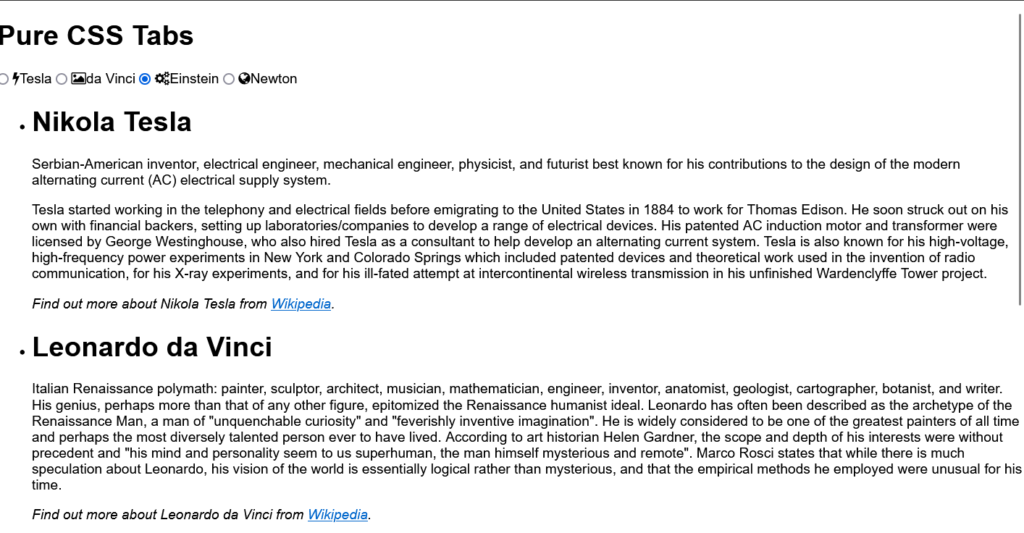
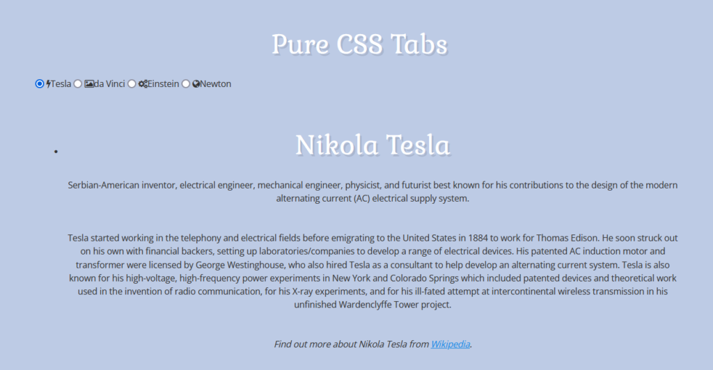
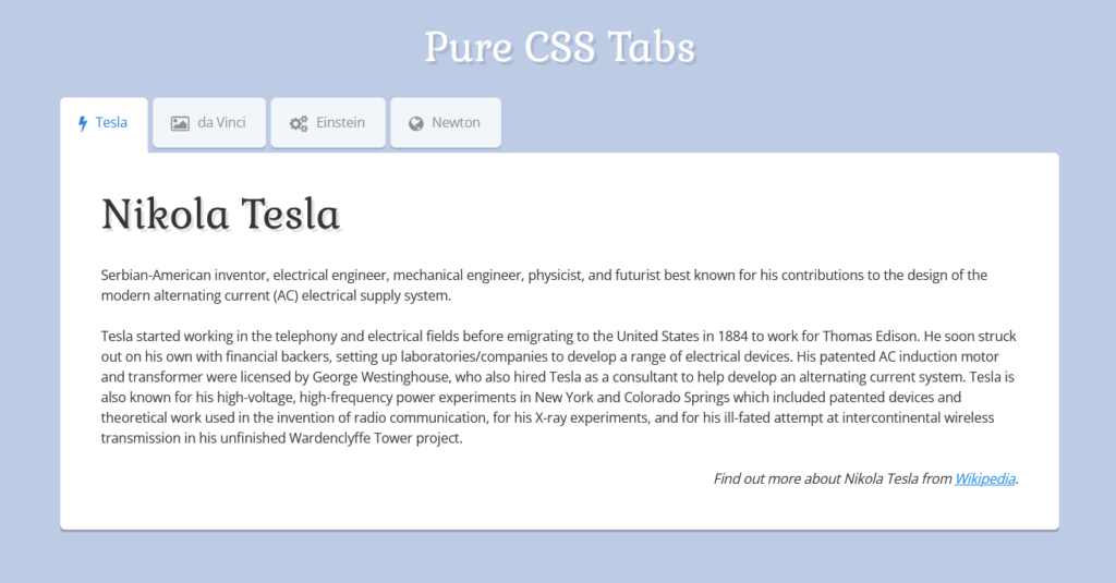
<li class="tab-content tab-content-first typography">
<h1>Nikola Tesla</h1>
<p>Serbian-American inventor, electrical engineer, mechanical engineer, physicist, and futurist best known for his contributions to the design of the modern alternating current (AC) electrical supply system.</p>
<p>Tesla started working in the telephony and electrical fields before emigrating to the United States in 1884 to work for Thomas Edison. He soon struck out on his own with financial backers, setting up laboratories/companies to develop a range of electrical devices. His patented AC induction motor and transformer were licensed by George Westinghouse, who also hired Tesla as a consultant to help develop an alternating current system. Tesla is also known for his high-voltage, high-frequency power experiments in New York and Colorado Springs which included patented devices and theoretical work used in the invention of radio communication, for his X-ray experiments, and for his ill-fated attempt at intercontinental wireless transmission in his unfinished Wardenclyffe Tower project.</p>
<p class="text-right"><em>Find out more about Nikola Tesla from <a href="http://en.wikipedia.org/wiki/Nikola_Tesla" target="_blank">Wikipedia</a>.</em></p>
</li>
<li class="tab-content tab-content-2 typography">
<h1>Leonardo da Vinci</h1>
<p>Italian Renaissance polymath: painter, sculptor, architect, musician, mathematician, engineer, inventor, anatomist, geologist, cartographer, botanist, and writer. His genius, perhaps more than that of any other figure, epitomized the Renaissance humanist ideal. Leonardo has often been described as the archetype of the Renaissance Man, a man of "unquenchable curiosity" and "feverishly inventive imagination". He is widely considered to be one of the greatest painters of all time and perhaps the most diversely talented person ever to have lived. According to art historian Helen Gardner, the scope and depth of his interests were without precedent and "his mind and personality seem to us superhuman, the man himself mysterious and remote". Marco Rosci states that while there is much speculation about Leonardo, his vision of the world is essentially logical rather than mysterious, and that the empirical methods he employed were unusual for his time.</p>
<p class="text-right"><em>Find out more about Leonardo da Vinci from <a href="http://en.wikipedia.org/wiki/Leonardo_da_Vinci" target="_blank">Wikipedia</a>.</em></p>
</li>
<li class="tab-content tab-content-3 typography">
<h1>Albert Einstein</h1>
<p>German-born theoretical physicist who developed the general theory of relativity, one of the two pillars of modern physics (alongside quantum mechanics). While best known for his mass–energy equivalence formula E = mc2 (which has been dubbed "the world's most famous equation"), he received the 1921 Nobel Prize in Physics "for his services to theoretical physics, and especially for his discovery of the law of the photoelectric effect". The latter was pivotal in establishing quantum theory.</p>
<p>Near the beginning of his career, Einstein thought that Newtonian mechanics was no longer enough to reconcile the laws of classical mechanics with the laws of the electromagnetic field. This led to the development of his special theory of relativity. He realized, however, that the principle of relativity could also be extended to gravitational fields, and with his subsequent theory of gravitation in 1916, he published a paper on the general theory of relativity.</p>
<p class="text-right"><em>Find out more about Albert Einstein from <a href="http://en.wikipedia.org/wiki/Albert_Einstein" target="_blank">Wikipedia</a>.</em></p>
</li>
<li class="tab-content tab-content-last typography">
<div class="typography">
<h1>Isaac Newton</h1>
<p>English physicist and mathematician who is widely regarded as one of the most influential scientists of all time and as a key figure in the scientific revolution. His book Philosophiæ Naturalis Principia Mathematica ("Mathematical Principles of Natural Philosophy"), first published in 1687, laid the foundations for most of classical mechanics. Newton also made seminal contributions to optics and shares credit with Gottfried Leibniz for the invention of the infinitesimal calculus.</p>
<p>Newton's Principia formulated the laws of motion and universal gravitation that dominated scientists' view of the physical universe for the next three centuries. It also demonstrated that the motion of objects on the Earth and that of celestial bodies could be described by the same principles. By deriving Kepler's laws of planetary motion from his mathematical description of gravity, Newton removed the last doubts about the validity of the heliocentric model of the cosmos.</p>
<p class="text-right"><em>Find out more about Isaac Newton from <a href="http://en.wikipedia.org/wiki/Isaac_Newton" target="_blank">Wikipedia</a>.</em></p>
</div>
</li>
</ul>
</div>First, we’ll create a div container and add the icons and links to the various parts inside of it. We will add the links for the various parts using the element and the icons using the font Awesome Classes.
Then using the unordered list tag we will create a list of different text section where using the list tag we will create multiple list and inside every list we will add a paragraph for adding the text inside each paragraph for different tabs .
Adding Styling (CSS):
Element Styling:
Using the Google import link, we will import two new different types of font styles, gabriela and open-sans, which we will be using inside our project. Then, then using the multiple tag selector, we will set their padding and margin to zero and the font color to charcoal gray.
Now using the body tag selector, we will set the background of the body to sky blue, and using the font family property, we will add the open sans font style to our tab section. Using the h1 tag, we will add the font size of the heading of our tab project, and also using the text shadow property, we will add a shadow to our text.
@import url(https://fonts.googleapis.com/css?family=Gabriela);
@import url(https://fonts.googleapis.com/css?family=Open+Sans);

html, body, div, h1, h2, h3, p, pre {
	margin: 0;
	padding: 0;
	color: #333;
}
html, body {
	background: #bdcbe5;
	font-family: 'Open Sans', Helvetica, Arial, sans-serif;
	font-size: 13px;
	line-height: 1.55;
}
h1 {
	padding: 40px 0 20px;
	font: 40px/60px Gabriela, Georgia, serif;
	text-align: center;
	text-shadow: 3px 3px rgba(0,0,0,0.1);
	color: #fff;
}
p {
	margin-bottom: 40px;
	text-align: center;
}
a {
	text-decoration: underline;
	color: #1889e6;
}
a:hover {
	text-decoration: none;
}
Background and page styling:
.bg class selector property, we will set the position of the backgorund as fixed, and using the width and height properties, we will set the width and height as 100%. Also, using the class selector (.page), we will set the position as “relative,” and using the max-width property, we will set the maximum width as 980 px, and using the padding property, we will set the padding as 20 and 40 px, respectively.
.bg {
	position: fixed;
	top: 0;
	left: 0;
	width: 100%;
	height: 100%;
}
.page {
	position: relative;
	max-width: 980px;
	margin: 0 auto;
	padding: 0 20px 40px;
}
Main Styling:
We will use the class selector property (.pcss3t) we will set the padding, margin and border as zero and using the outline property we will set the outline as “none” and using the font-size property we will set the font size as 0 and using the text align property we will align the text to the left.
We will be using the display property to none and then using the checked property we will use the checkbox to display the particular class . We will create a serparate class for each tabs and set the display of each tab as none and then using the label class property we will set the label class with checked property through which we will be using the checked tab section.
.pcss3t {
	margin: 0;
	padding: 0;
	border: 0;
	outline: none;
	font-size: 0;
	text-align: left;
}
.pcss3t > input {
	position: absolute;
	left: -9999px;
}
.pcss3t > label {
	position: relative;
	display: inline-block;
	margin: 0;
	padding: 0;
	border: 0;
	outline: none;
	cursor: pointer;
	transition: all 0.1s;
	-o-transition: all 0.1s;
	-ms-transition: all 0.1s;
	-moz-transition: all 0.1s;
	-webkit-transition: all 0.1s;
}
.pcss3t > label i {
	display: block;
	float: left;
	margin: 16px 8px 0 -2px;
	padding: 0;
	border: 0;
	outline: none;
	font-family: FontAwesome;
	font-style: normal;
	font-size: 17px;
}
.pcss3t > input:checked + label {
	cursor: default;
}
.pcss3t > ul {
	list-style: none;
	position: relative;
	display: block;
	overflow: hidden;
	margin: 0;
	padding: 0;
	border: 0;
	outline: none;
	font-size: 13px;
}
.pcss3t > ul > li {
	position: absolute;
	width: 100%;
	overflow: auto;
	padding: 30px 40px 40px;
	box-sizing: border-box;
	-moz-box-sizing: border-box;
	opacity: 0;
	transition: all 0.5s;
	-o-transition: all 0.5s;
	-ms-transition: all 0.5s;
	-moz-transition: all 0.5s;
	-webkit-transition: all 0.5s;
}
.pcss3t > .tab-content-first:checked ~ ul .tab-content-first,
.pcss3t > .tab-content-2:checked ~ ul .tab-content-2,
.pcss3t > .tab-content-3:checked ~ ul .tab-content-3,
.pcss3t > .tab-content-4:checked ~ ul .tab-content-4,
.pcss3t > .tab-content-5:checked ~ ul .tab-content-5,
.pcss3t > .tab-content-6:checked ~ ul .tab-content-6,
.pcss3t > .tab-content-7:checked ~ ul .tab-content-7,
.pcss3t > .tab-content-8:checked ~ ul .tab-content-8,
.pcss3t > .tab-content-9:checked ~ ul .tab-content-9,
.pcss3t > .tab-content-last:checked ~ ul .tab-content-last {
	z-index: 1;
	top: 0;
	left: 0;
	opacity: 1;
	-webkit-transform: scale(1,1);
	-webkit-transform: rotate(0deg);
}
Adding responsiveness:
We will set the height of each of the elements as auto so that the tabs can increase and decrease the height according to the size, and then using the grid option, we will create different grids for each section.
30+ HTML CSS and Javascript Projects
Also, using the media query property, we will set the media query and maximum width of the screen size so that we can detect the screen size of the devices and manage the size of each tab accordingly.
.pcss3t-height-auto > ul {
	height: auto !important;
}
.pcss3t-height-auto > ul > li {
	position: static;
	display: none;
	height: auto !important;
}
.pcss3t-height-auto > .tab-content-first:checked ~ ul .tab-content-first,
.pcss3t-height-auto > .tab-content-2:checked ~ ul .tab-content-2,
.pcss3t-height-auto > .tab-content-3:checked ~ ul .tab-content-3,
.pcss3t-height-auto > .tab-content-4:checked ~ ul .tab-content-4,
.pcss3t-height-auto > .tab-content-5:checked ~ ul .tab-content-5,
.pcss3t-height-auto > .tab-content-last:checked ~ ul .tab-content-last {
	display: block;
}


/**/
/* grid */
/**/
.pcss3t .grid-row {
	margin-top: 20px;
}
.pcss3t .grid-row:after {
	content: '';
	display: table;
	clear: both;
}
.pcss3t .grid-row:first-child {
	margin-top: 0;
}
.pcss3t .grid-col {
	display: block;
	float: left;
	margin-left: 2%;
}
.pcss3t .grid-col:first-child {
	margin-left: 0;
}
.pcss3t .grid-col .inner {
	padding: 10px 0;
	border-radius: 5px;
	background: #f2f2f2;
	text-align: center;
}
.pcss3t .grid-col-1 {
	width: 15%;
}
.pcss3t .grid-col-2 {
	width: 32%;
}
.pcss3t .grid-col-3 {
	width: 49%;
}
.pcss3t .grid-col-4 {
	width: 66%;
}
.pcss3t .grid-col-5 {
	width: 83%;
}
.pcss3t .grid-col-offset-1 {
	margin-left: 19%;
}
.pcss3t .grid-col-offset-1:first-child  {
	margin-left: 17%;
}
.pcss3t .grid-col-offset-2 {
	margin-left: 36%;
}
.pcss3t .grid-col-offset-2:first-child {
	margin-left: 34%;
}
.pcss3t .grid-col-offset-3 {
	margin-left: 53%;
}
.pcss3t .grid-col-offset-3:first-child {
	margin-left: 51%;
}
.pcss3t .grid-col-offset-4 {
	margin-left: 70%;
}
.pcss3t .grid-col-offset-4:first-child {
	margin-left: 68%;
}
.pcss3t .grid-col-offset-5:first-child {
	margin-left: 85%;
}


/**/
/* typography */
/**/
.pcss3t .typography {
	color: #666;
}
.pcss3t .typography h1,
.pcss3t .typography h2,
.pcss3t .typography h3,
.pcss3t .typography h4,
.pcss3t .typography h5,
.pcss3t .typography h6 {
	margin: 40px 0 0 0;
	padding: 0;
	font-family: Gabriela, Georgia, serif;
	text-align: left;
	color: #333;
}
.pcss3t .typography h1 {
	font-size: 40px;
	line-height: 60px;
	text-shadow: 3px 3px rgba(0,0,0,0.1);
}
.pcss3t .typography h2 {
	font-size: 32px;
	line-height: 48px;
	text-shadow: 2px 2px rgba(0,0,0,0.1);
}
.pcss3t .typography h3 {
	font-size: 26px;
	line-height: 38px;
	text-shadow: 1px 1px rgba(0,0,0,0.1);
}
.pcss3t .typography h4 {
	font-size: 20px;
	line-height: 30px;
}
.pcss3t .typography h5 {
	font-size: 15px;
	line-height: 23px;
	text-transform: uppercase;
}
.pcss3t .typography h6 {
	font-size: 13px;
	line-height: 20px;
	font-weight: 700;
	text-transform: uppercase;
}
.pcss3t .typography p {
	margin: 20px 0 0 0;
	padding: 0;
	line-height: 20px;
	text-align: left;
}
.pcss3t .typography ul,
.pcss3t .typography ol {
	list-style: none;
	margin: 20px 0 0 0;
	padding: 0;
}
.pcss3t .typography li {
	position: relative;
	margin-top: 5px;
	padding-left: 20px;
}
.pcss3t .typography li ul,
.pcss3t .typography li ol {
	margin-top: 5px;
}
.pcss3t .typography ul li:before {
	content: '';
	position: absolute;
	top: 8px;
	left: 0;
	width: 6px;
	height: 4px;
	background: #404040;
}
.pcss3t .typography ol {
	counter-reset: list1;
}
.pcss3t .typography ol > li:before {
	counter-increment:list1;
	content: counter(list1)'.';
	position: absolute;
	top: 0;
	left: 0;
}
.pcss3t .typography a {
	text-decoration: underline;
	color: #1889e6;
}
.pcss3t .typography a:hover {
	text-decoration: none;
}
.pcss3t .typography .pic {
	padding: 4px;
	border: 1px dotted #ccc;
}
.pcss3t .typography .pic img {
	display: block;
}
.pcss3t .typography .pic-right {
	float: right;
	margin: 0 0 10px 20px;
}
.pcss3t .typography .link {
	text-decoration: underline;
	color: #1889e6;
	cursor: pointer;
}
.pcss3t .typography .link:hover {
	text-decoration: none;
}
.pcss3t .typography h1:first-child,
.pcss3t .typography h2:first-child,
.pcss3t .typography h3:first-child,
.pcss3t .typography h4:first-child,
.pcss3t .typography h5:first-child,
.pcss3t .typography h6:first-child,
.pcss3t .typography p:first-child {
	margin-top: 0;
}
.pcss3t .typography .text-center {
	text-align: center;
}
.pcss3t .typography .text-right {
	text-align: right;
}


/**/
/* steps */
/**/
.pcss3t-steps > label {
	cursor: default;
}


/**/
/* animation effects */
/**/
.pcss3t-effect-scale > ul > li {
	-webkit-transform: scale(0.1,0.1);
}
.pcss3t-effect-rotate  > ul > li {
	-webkit-transform: rotate(180deg);
}
.pcss3t-effect-slide-top > ul > li {
	top: -40px;
}
.pcss3t-effect-slide-right > ul > li {
	left: 80px;
}
.pcss3t-effect-slide-bottom > ul > li {
	top: 40px;
}
.pcss3t-effect-slide-left > ul > li {
	left: -80px;
}


/*----------------------------------------------------------------------------*/
/*                                   LAYOUTS                                  */
/*----------------------------------------------------------------------------*/

/**/
/* top right */
/**/
.pcss3t-layout-top-right {
	text-align: right;
}


/**/
/* top center */
/**/
.pcss3t-layout-top-center {
	text-align: center;
}


/**/
/* top combi */
/**/
.pcss3t > .right {
	float: right;
}


/*----------------------------------------------------------------------------*/
/*                                    ICONS                                   */
/*----------------------------------------------------------------------------*/

/**/
/* icons positions */
/**/
.pcss3t-icons-top > label {
	text-align: center;
}
.pcss3t-icons-top > label i {
	float: none;
	margin: 0 auto -10px;
	padding-top: 17px;
	font-size: 23px;
	line-height: 23px;
	text-align: center;
}
.pcss3t-icons-right > label i {
	float: right;
	margin: 0 -2px 0 8px;
}
.pcss3t-icons-bottom > label {
	text-align: center;
}
.pcss3t-icons-bottom > label i {
	float: none;
	margin: -10px auto 0;
	padding-bottom: 17px;
	font-size: 23px;
	line-height: 23px;
	text-align: center;
}
.pcss3t-icons-only > label i {
	float: none;
	margin: 0 auto;
	font-size: 23px;
}


/**/
/* font awesome */
/**/
@font-face{ font-display:swap;
	font-family: 'FontAwesome';
	src: url('../fonts/fontawesome-webfont.eot?v=3.0.1');
	src: url('../fonts/fontawesome-webfont.eot?#iefix&v=3.0.1') format('embedded-opentype'),
	url('../fonts/fontawesome-webfont.woff?v=3.0.1') format('woff'),
	url('../fonts/fontawesome-webfont.ttf?v=3.0.1') format('truetype');
	font-weight: normal;
	font-style: normal;
 }
.icon-glass:before {content: '\f000';}
.icon-music:before {content: '\f001';}
.icon-search:before {content: '\f002';}
.icon-envelope:before {content: '\f003';}
.icon-heart:before {content: '\f004';}
.icon-star:before {content: '\f005';}
.icon-star-empty:before {content: '\f006';}
.icon-user:before {content: '\f007';}
.icon-film:before {content: '\f008';}
.icon-th-large:before {content: '\f009';}
.icon-th:before {content: '\f00a';}
.icon-th-list:before {content: '\f00b';}
.icon-ok:before {content: '\f00c';}
.icon-remove:before {content: '\f00d';}
.icon-zoom-in:before {content: '\f00e';}
.icon-zoom-out:before {content: '\f010';}
.icon-off:before {content: '\f011';}
.icon-signal:before {content: '\f012';}
.icon-cog:before {content: '\f013';}
.icon-trash:before {content: '\f014';}
.icon-home:before {content: '\f015';}
.icon-file:before {content: '\f016';}
.icon-time:before {content: '\f017';}
.icon-road:before {content: '\f018';}
.icon-download-alt:before {content: '\f019';}
.icon-download:before {content: '\f01a';}
.icon-upload:before {content: '\f01b';}
.icon-inbox:before {content: '\f01c';}
.icon-play-circle:before {content: '\f01d';}
.icon-repeat:before {content: '\f01e';}
.icon-refresh:before {content: '\f021';}
.icon-list-alt:before {content: '\f022';}
.icon-lock:before {content: '\f023';}
.icon-flag:before {content: '\f024';}
.icon-headphones:before {content: '\f025';}
.icon-volume-off:before {content: '\f026';}
.icon-volume-down:before {content: '\f027';}
.icon-volume-up:before {content: '\f028';}
.icon-qrcode:before {content: '\f029';}
.icon-barcode:before {content: '\f02a';}
.icon-tag:before {content: '\f02b';}
.icon-tags:before {content: '\f02c';}
.icon-book:before {content: '\f02d';}
.icon-bookmark:before {content: '\f02e';}
.icon-print:before {content: '\f02f';}
.icon-camera:before {content: '\f030';}
.icon-font:before {content: '\f031';}
.icon-bold:before {content: '\f032';}
.icon-italic:before {content: '\f033';}
.icon-text-height:before {content: '\f034';}
.icon-text-width:before {content: '\f035';}
.icon-align-left:before {content: '\f036';}
.icon-align-center:before {content: '\f037';}
.icon-align-right:before {content: '\f038';}
.icon-align-justify:before {content: '\f039';}
.icon-list:before {content: '\f03a';}
.icon-indent-left:before {content: '\f03b';}
.icon-indent-right:before {content: '\f03c';}
.icon-facetime-video:before  {content: '\f03d';}
.icon-picture:before {content: '\f03e';}
.icon-pencil:before {content: '\f040';}
.icon-map-marker:before {content: '\f041';}
.icon-adjust:before {content: '\f042';}
.icon-tint:before {content: '\f043';}
.icon-edit:before {content: '\f044';}
.icon-share:before {content: '\f045';}
.icon-check:before {content: '\f046';}
.icon-move:before {content: '\f047';}
.icon-step-backward:before {content: '\f048';}
.icon-fast-backward:before {content: '\f049';}
.icon-backward:before {content: '\f04a'; position: relative;	left: -2px;}
.icon-play:before {content: '\f04b'; position: relative; left: 1px;}
.icon-pause:before {content: '\f04c';}
.icon-stop:before {content: '\f04d';}
.icon-forward:before {content: '\f04e'; position: relative;	left: 2px;}
.icon-fast-forward:before {content: '\f050';}
.icon-step-forward:before {content: '\f051';}
.icon-eject:before {content: '\f052';}
.icon-chevron-left:before {content: '\f053';}
.icon-chevron-right:before {content: '\f054';}
.icon-plus-sign:before {content: '\f055';}
.icon-minus-sign:before {content: '\f056';}
.icon-remove-sign:before {content: '\f057';}
.icon-ok-sign:before {content: '\f058';}
.icon-question-sign:before {content: '\f059';}
.icon-info-sign:before {content: '\f05a';}
.icon-screenshot:before {content: '\f05b';}
.icon-remove-circle:before {content: '\f05c';}
.icon-ok-circle:before {content: '\f05d';}
.icon-ban-circle:before {content: '\f05e';}
.icon-arrow-left:before {content: '\f060';}
.icon-arrow-right:before {content: '\f061';}
.icon-arrow-up:before {content: '\f062';}
.icon-arrow-down:before {content: '\f063';}
.icon-share-alt:before {content: '\f064';}
.icon-resize-full:before {content: '\f065';}
.icon-resize-small:before {content: '\f066';}
.icon-plus:before {content: '\f067';}
.icon-minus:before {content: '\f068';}
.icon-asterisk:before {content: '\f069';}
.icon-exclamation-sign:before {content: '\f06a';}
.icon-gift:before {content: '\f06b';}
.icon-leaf:before {content: '\f06c';}
.icon-fire:before {content: '\f06d';}
.icon-eye-open:before {content: '\f06e';}
.icon-eye-close:before {content: '\f070';}
.icon-warning-sign:before {content: '\f071';}
.icon-plane:before {content: '\f072';}
.icon-calendar:before {content: '\f073';}
.icon-random:before {content: '\f074';}
.icon-comment:before {content: '\f075';}
.icon-magnet:before {content: '\f076';}
.icon-chevron-up:before {content: '\f077';}
.icon-chevron-down:before {content: '\f078';}
.icon-retweet:before {content: '\f079';}
.icon-shopping-cart:before {content: '\f07a';}
.icon-folder-close:before {content: '\f07b';}
.icon-folder-open:before {content: '\f07c';}
.icon-resize-vertical:before {content: '\f07d';}
.icon-resize-horizontal:before {content: '\f07e';}
.icon-bar-chart:before {content: '\f080';}
.icon-twitter-sign:before {content: '\f081';}
.icon-facebook-sign:before {content: '\f082';}
.icon-camera-retro:before {content: '\f083';}
.icon-key:before {content: '\f084';}
.icon-cogs:before {content: '\f085';}
.icon-comments:before {content: '\f086';}
.icon-thumbs-up:before {content: '\f087';}
.icon-thumbs-down:before {content: '\f088';}
.icon-star-half:before {content: '\f089';}
.icon-heart-empty:before {content: '\f08a';}
.icon-signout:before {content: '\f08b';}
.icon-linkedin-sign:before {content: '\f08c';}
.icon-pushpin:before {content: '\f08d';}
.icon-external-link:before {content: '\f08e';}
.icon-signin:before {content: '\f090';}
.icon-trophy:before {content: '\f091';}
.icon-github-sign:before {content: '\f092';}
.icon-upload-alt:before {content: '\f093';}
.icon-lemon:before {content: '\f094';}
.icon-phone:before {content: '\f095';}
.icon-check-empty:before {content: '\f096';}
.icon-bookmark-empty:before {content: '\f097';}
.icon-phone-sign:before {content: '\f098';}
.icon-twitter:before {content: '\f099';}
.icon-facebook:before {content: '\f09a';}
.icon-github:before {content: '\f09b';}
.icon-unlock:before {content: '\f09c';}
.icon-credit-card:before {content: '\f09d';}
.icon-rss:before {content: '\f09e';}
.icon-hdd:before {content: '\f0a0';}
.icon-bullhorn:before {content: '\f0a1';}
.icon-bell:before {content: '\f0a2';}
.icon-certificate:before {content: '\f0a3';}
.icon-hand-right:before {content: '\f0a4';}
.icon-hand-left:before {content: '\f0a5';}
.icon-hand-up:before {content: '\f0a6';}
.icon-hand-down:before {content: '\f0a7';}
.icon-circle-arrow-left:before {content: '\f0a8';}
.icon-circle-arrow-right:before {content: '\f0a9';}
.icon-circle-arrow-up:before {content: '\f0aa';}
.icon-circle-arrow-down:before {content: '\f0ab';}
.icon-globe:before {content: '\f0ac';}
.icon-wrench:before {content: '\f0ad';}
.icon-tasks:before {content: '\f0ae';}
.icon-filter:before {content: '\f0b0';}
.icon-briefcase:before {content: '\f0b1';}
.icon-fullscreen:before {content: '\f0b2';}
.icon-group:before {content: '\f0c0';}
.icon-link:before {content: '\f0c1';}
.icon-cloud:before {content: '\f0c2';}
.icon-beaker:before {content: '\f0c3';}
.icon-cut:before {content: '\f0c4';}
.icon-copy:before {content: '\f0c5';}
.icon-paper-clip:before {content: '\f0c6';}
.icon-save:before {content: '\f0c7';}
.icon-sign-blank:before {content: '\f0c8';}
.icon-reorder:before {content: '\f0c9';}
.icon-list-ul:before {content: '\f0ca';}
.icon-list-ol:before {content: '\f0cb';}
.icon-strikethrough:before {content: '\f0cc';}
.icon-underline:before {content: '\f0cd';}
.icon-table:before {content: '\f0ce';}
.icon-magic:before {content: '\f0d0';}
.icon-truck:before {content: '\f0d1';}
.icon-pinterest:before {content: '\f0d2';}
.icon-pinterest-sign:before {content: '\f0d3';}
.icon-google-plus-sign:before {content: '\f0d4';}
.icon-google-plus:before {content: '\f0d5';}
.icon-money:before {content: '\f0d6';}
.icon-caret-down:before {content: '\f0d7';}
.icon-caret-up:before {content: '\f0d8';}
.icon-caret-left:before {content: '\f0d9';}
.icon-caret-right:before {content: '\f0da';}
.icon-columns:before {content: '\f0db';}
.icon-sort:before {content: '\f0dc';}
.icon-sort-down:before {content: '\f0dd';}
.icon-sort-up:before {content: '\f0de';}
.icon-envelope-alt:before {content: '\f0e0';}
.icon-linkedin:before {content: '\f0e1';}
.icon-undo:before {content: '\f0e2';}
.icon-legal:before {content: '\f0e3';}
.icon-dashboard:before {content: '\f0e4';}
.icon-comment-alt:before {content: '\f0e5';}
.icon-comments-alt:before {content: '\f0e6';}
.icon-bolt:before {content: '\f0e7';}
.icon-sitemap:before {content: '\f0e8';}
.icon-umbrella:before {content: '\f0e9';}
.icon-paste:before {content: '\f0ea';}
.icon-lightbulb:before {content: '\f0eb';}
.icon-exchange:before {content: '\f0ec';}
.icon-cloud-download:before {content: '\f0ed';}
.icon-cloud-upload:before {content: '\f0ee';}
.icon-user-md:before {content: '\f0f0';}
.icon-stethoscope:before {content: '\f0f1';}
.icon-suitcase:before {content: '\f0f2';}
.icon-bell-alt:before {content: '\f0f3';}
.icon-coffee:before {content: '\f0f4';}
.icon-food:before {content: '\f0f5';}
.icon-file-alt:before {content: '\f0f6';}
.icon-building:before {content: '\f0f7';}
.icon-hospital:before {content: '\f0f8';}
.icon-ambulance:before {content: '\f0f9';}
.icon-medkit:before {content: '\f0fa';}
.icon-fighter-jet:before {content: '\f0fb';}
.icon-beer:before {content: '\f0fc';}
.icon-h-sign:before {content: '\f0fd';}
.icon-plus-sign-alt:before {content: '\f0fe';}
.icon-double-angle-left:before {content: '\f100';}
.icon-double-angle-right:before {content: '\f101';}
.icon-double-angle-up:before {content: '\f102';}
.icon-double-angle-down:before {content: '\f103';}
.icon-angle-left:before {content: '\f104';}
.icon-angle-right:before {content: '\f105';}
.icon-angle-up:before {content: '\f106';}
.icon-angle-down:before {content: '\f107';}
.icon-desktop:before {content: '\f108';}
.icon-laptop:before {content: '\f109';}
.icon-tablet:before {content: '\f10a';}
.icon-mobile-phone:before {content: '\f10b';}
.icon-circle-blank:before {content: '\f10c';}
.icon-quote-left:before {content: '\f10d';}
.icon-quote-right:before {content: '\f10e';}
.icon-spinner:before {content: '\f110';}
.icon-circle:before {content: '\f111';}
.icon-reply:before {content: '\f112';}
.icon-github-alt:before {content: '\f113';}
.icon-folder-close-alt:before {content: '\f114';}
.icon-folder-open-alt:before {content: '\f115';}


/*----------------------------------------------------------------------------*/
/*                               RESPONSIVENESS                               */
/*----------------------------------------------------------------------------*/

/**/
/* pad */
/**/
@media screen and (max-width: 980px) {

}


/**/
/* phone */
/**/
@media screen and (max-width: 767px) {
	.pcss3t > label {
		display: block;
	}
	.pcss3t > .right {
		float: none;
	}
}


/*----------------------------------------------------------------------------*/
/*                                   THEMES                                   */
/*----------------------------------------------------------------------------*/

/**/
/* default */
/**/
.pcss3t > label {
	padding: 0 20px;
	background: #e5e5e5;
	font-size: 13px;
	line-height: 49px;
}
.pcss3t > label:hover {
	background: #f2f2f2;
}
.pcss3t > input:checked + label {
	background: #fff;
}
.pcss3t > ul {
	background: #fff;
	text-align: left;
}
.pcss3t-steps > label:hover {
	background: #e5e5e5;
}


/**/
/* theme 1 */
/**/
.pcss3t-theme-1 > label {
	margin: 0 5px 5px 0;
	border-radius: 5px;
	background: #fff;
	box-shadow: 0 2px rgba(0,0,0,0.2);
	color: #808080;
	opacity: 0.8;
}
.pcss3t-theme-1 > label:hover {
	background: #fff;
	opacity: 1;
}
.pcss3t-theme-1 > input:checked + label {
	margin-bottom: 0;
	padding-bottom: 5px;
	border-bottom-right-radius: 0;
	border-bottom-left-radius: 0;
	color: #2b82d9;
	opacity: 1;
}
.pcss3t-theme-1 > ul {
	border-radius: 5px;
	box-shadow: 0 3px rgba(0,0,0,0.2);
}
.pcss3t-theme-1 > .tab-content-first:checked ~ ul {
	border-top-left-radius: 0;
}
@media screen and (max-width: 767px) {
	.pcss3t-theme-1 > label {
		margin-right: 0;
	}
	.pcss3t-theme-1 > input:checked + label {
		margin-bottom: 5px;
		padding-bottom: 0;
		border-radius: 5px;
	}
	.pcss3t-theme-1 > .tab-content-first:checked ~ ul {
		border-top-left-radius: 5px;
	}
}


/**/
/* theme 2 */
/**/
.pcss3t-theme-2 {
	padding: 5px;
	background: rgba(0,0,0,0.2);
}
.pcss3t-theme-2 > label {
	margin-right: 0;
	margin-bottom: 0;
	background: none;
	border-radius: 0;
	text-shadow: 1px 1px 1px rgba(0,0,0,0.2);
	color: #fff;
	opacity: 1;
}
.pcss3t-theme-2 > label:hover {
	background: rgba(255,255,255,0.2);
}
.pcss3t-theme-2 > input:checked + label {
	padding-bottom: 0;
	background: #fff;
	background: linear-gradient(to bottom, #e5e5e5 0%, #ffffff 100%);
	background: -o-linear-gradient(top, #e5e5e5 0%, #ffffff 100%);
	background: -ms-linear-gradient(top, #e5e5e5 0%, #ffffff 100%);
	background: -moz-linear-gradient(top, #e5e5e5 0%, #ffffff 100%);
	background: -webkit-linear-gradient(top, #e5e5e5 0%, #ffffff 100%);
	filter: progid:DXImageTransform.Microsoft.gradient(startColorstr='#e5e5e5', endColorstr='#ffffff', GradientType=0);
	text-shadow: 1px 1px 1px rgba(255,255,255,0.5);
	color: #822bd9;
}
.pcss3t-theme-2 > ul {
	margin: 0 -5px -5px;
	border-radius: 0;
	box-shadow: none;
}
@media screen and (max-width: 767px) {
	.pcss3t-theme-2 > ul {
		margin-top: 5px;
	}
}


/**/
/* theme 3 */
/**/
.pcss3t-theme-3 {
	background: rgba(0,0,0,0.8);
}
.pcss3t-theme-3 > label {
	background: none;
	border-right: 1px dotted rgba(255,255,255,0.5);
	text-align: center;
	color: #fff;
	opacity: 0.6;
}
.pcss3t-theme-3 > label:hover {
	background: none;
	color: #d9d92b;
	opacity: 0.8;
}
.pcss3t-theme-3 > input:checked + label {
	background: #d9d92b;
	color: #000;
	opacity: 1;
}
.pcss3t-theme-3 > ul {
	border-top: 4px solid #d9d92b;
	border-bottom: 4px solid #d9d92b;
	border-radius: 0;
	box-shadow: none;
}


/**/
/* theme 4 */
/**/
.pcss3t-theme-4 > label {
	margin: 0 10px 10px 0;
	border-radius: 5px;
	background: #78c5fd;
	background: linear-gradient(to bottom, #78c5fd 0%, #2c8fdd 100%);
	background: -o-linear-gradient(top, #78c5fd 0%, #2c8fdd 100%);
	background: -ms-linear-gradient(top, #78c5fd 0%, #2c8fdd 100%);
	background: -moz-linear-gradient(top, #78c5fd 0%, #2c8fdd 100%);
	background: -webkit-linear-gradient(top, #78c5fd 0%, #2c8fdd 100%);
	filter: progid:DXImageTransform.Microsoft.gradient(startColorstr='#78c5fd', endColorstr='#2c8fdd', GradientType=0);
	box-shadow: inset 0 1px rgba(255,255,255,0.5), 0 1px rgba(0,0,0,0.5);
	line-height: 39px;
	text-shadow: 0 1px rgba(0,0,0,0.5);
	color: #fff;
}
.pcss3t-theme-4 > label:hover {
	background: #90cffc;
	background: linear-gradient(to bottom, #90cffc 0%, #439bde 100%);
	background: -o-linear-gradient(top, #90cffc 0%, #439bde 100%);
	background: -ms-linear-gradient(top, #90cffc 0%, #439bde 100%);
	background: -moz-linear-gradient(top, #90cffc 0%, #439bde 100%);
	background: -webkit-linear-gradient(top, #90cffc 0%, #439bde 100%);
	filter: progid:DXImageTransform.Microsoft.gradient(startColorstr='#90cffc', endColorstr='#439bde', GradientType=0);
}
.pcss3t-theme-4 > input:checked + label {
	top: 1px;
	background: #5f9dc9;
	background: linear-gradient(to bottom, #5f9dc9 0%, #2270ab 100%);
	background: -o-linear-gradient(top, #5f9dc9 0%, #2270ab 100%);
	background: -ms-linear-gradient(top, #5f9dc9 0%, #2270ab 100%);
	background: -moz-linear-gradient(top, #5f9dc9 0%, #2270ab 100%);
	background: -webkit-linear-gradient(top, #5f9dc9 0%, #2270ab 100%);
	filter: progid:DXImageTransform.Microsoft.gradient(startColorstr='#5f9dc9', endColorstr='#2270ab', GradientType=0);
	box-shadow: inset 0 1px 1px rgba(0,0,0,0.5), 0 1px rgba(255,255,255,0.5);
	text-shadow: none;
}
.pcss3t-theme-4 > ul {
	border-radius: 5px;
	box-shadow: 0 2px 2px rgba(0,0,0,0.3);
}
@media screen and (max-width: 767px) {
	.pcss3t-theme-4 > label {
		margin-right: 0;
	}
}


/**/
/* theme 5 */
/**/
.pcss3t-theme-5 {
	padding: 15px;
	border-radius: 5px;
	background: #ad6395;
	background: linear-gradient(to right, #ad6395 0%, #a163ad 100%);
	background: -o-linear-gradient(left, #ad6395 0%, #a163ad 100%);
	background: -ms-linear-gradient(left, #ad6395 0%, #a163ad 100%);
	background: -moz-linear-gradient(left, #ad6395 0%, #a163ad 100%);
	background: -webkit-linear-gradient(left, #ad6395 0%, #a163ad 100%);
	filter: progid:DXImageTransform.Microsoft.gradient(startColorstr='#5f9dc9', endColorstr='#a163ad', GradientType=1);
}
.pcss3t-theme-5 > label {
	margin-right: 10px;
	margin-bottom: 15px;
	background: none;
	border-radius: 5px;
	text-align: center;
	color: #fff;
	opacity: 1;
}
.pcss3t-theme-5 > label:hover {
	background: rgba(255,255,255,0.15);
}
.pcss3t-theme-5 > input:checked + label {
	background: rgba(255,255,255,0.3);
	color: #000;
}
.pcss3t-theme-5 > input:checked + label:after {
	content: '';
	position: absolute;
	top: 100%;
	left: 50%;
	margin-top: 10px;
	margin-left: -6px;
	border-right: 6px solid transparent;
	border-bottom: 6px solid #fff;
	border-left: 6px solid transparent;
}
.pcss3t-theme-5 > ul {
	margin: 0 -15px -15px;
	border-radius: 0 0 5px 5px;
	box-shadow: none;
}
@media screen and (max-width: 767px) {
	.pcss3t-theme-5 > input:checked + label:after {
		display: none;
	}
}


/*----------------------------------------------------------------------------*/
/*                               CUSTOMIZATION                                */
/*----------------------------------------------------------------------------*/

/**/
/* height */
/**/
.pcss3t > ul,
.pcss3t > ul > li {
	height: 370px;
}
final Video Output:
Conclusion:
Hopefully, the above tutorial has helped you to know how to create this personal website using HTML and CSS source code.
Here we have learned how to use a Tabs Using HTML and CSS. Next time, I am going to write an article on how to create profile page using HTML. Please give us your valuable feedback on how you like this Tabs Using HTML and CSS.
If you like the project, don’t forget to follow our website, foolishdeveloper.com.
Codepen by:Alvaro
Author: Arun