
Hello in this article you are going to learn about How to create a popup login form using HTML, CSS, and Bootstrap . I have designed another pop-up login form. I have also designed many more types of simple login forms.
If you want to create a pop-up login form without using Bootstrap or jquery, you can see my previous design. These login forms are the same as the normal login forms. Normally a button or link can be found on the home page.
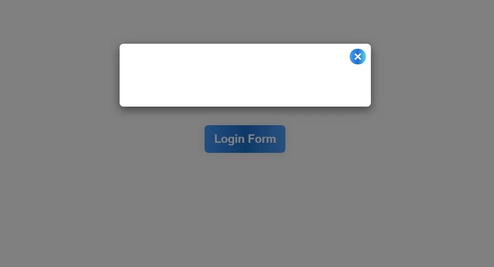
In this case, I have used the button on the home page. When you click on that button, the complete login form will appear. Clicking on that button will open a pop-up box. There is a button to close that page, which when clicked will hide the login popup again.
How to create login popup form Html and CSS
If you want to see its live demo, you can see the demo below. From there you can copy the required source code and use it in your own work.
If you are a beginner, you can follow the tutorial below. Below I have shown step by step how I have designed this login form.
See the Pen
Popup Login form by shantanu jana (@fghty)
on CodePen.
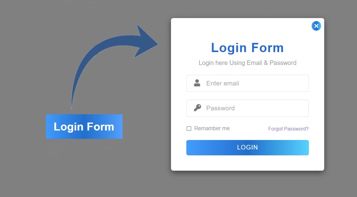
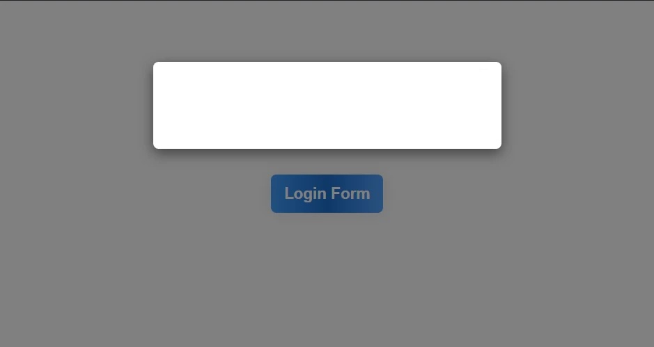
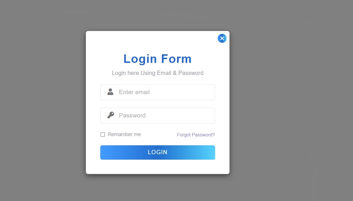
As you can see in the demo above, there is only one login button on the homepage. Then when you click on that login button, the complete login popup form will appear.
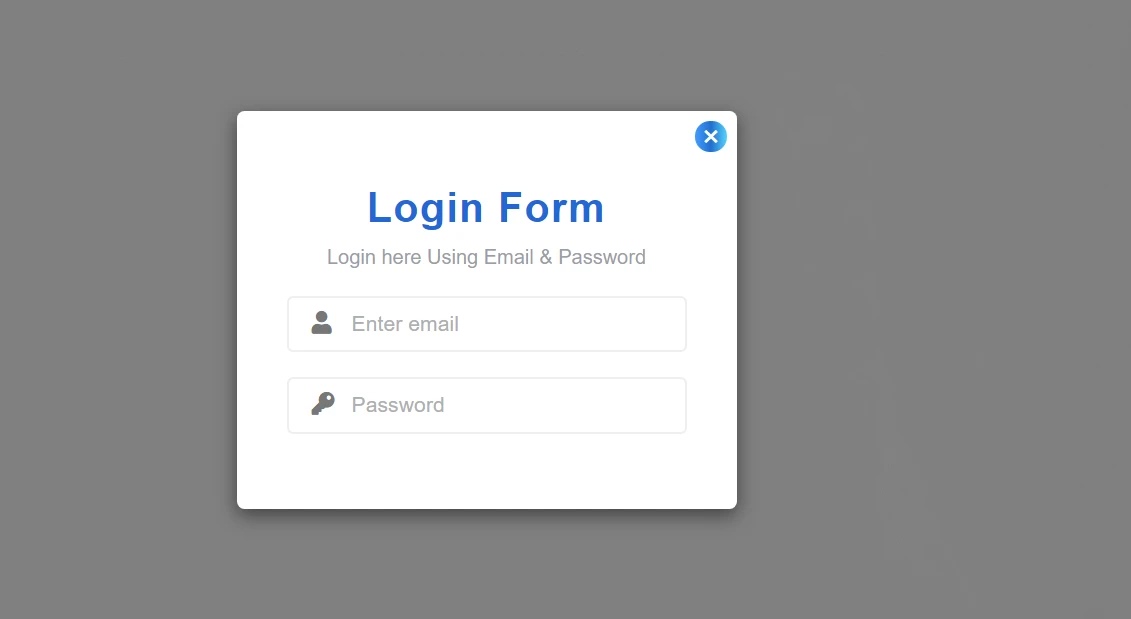
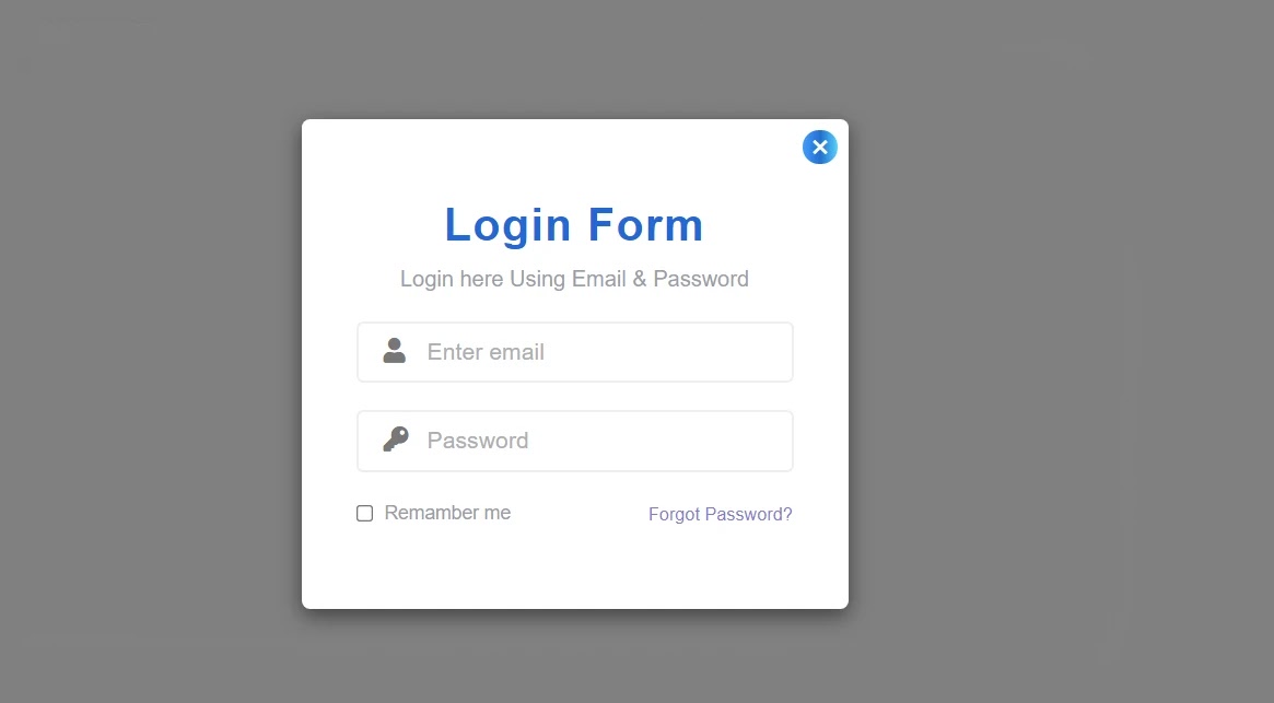
First of all, I used a title in the login popup form and gave a little description below it. There is a place to input email id and password to log in. In each of those places, I used an icon, that is, I used a lock icon instead of a profile and password instead of an email. There is also the option to remember me and forget my password.
Below, I have used a login button. I have used gradient color on this login button. If you want to make too, you must have an idea about basic HTML and CSS.
If you want to create a nice pop-up login form without using bootstrap and the jQuery plugin, of course, you can see another design I made. That login form was only created by me using HTML, CSS, and JavaScript programming code.
Step 1: Create the basic structure for creating the Login Popup Form
To create it, you first need to create an HTML and CSS file. Then combine the HTML file and the CSS file. Copy the programming structure below and add it to the HTML file.
In this case, we have used some links like JQuery and Bootstrap which have made this login form functional and responsive respectively.
<!doctype html>
<html lang="en">
  <head>
    <link
      rel="stylesheet"
      href="https://cdnjs.cloudflare.com/ajax/libs/font-awesome/5.15.3/css/all.min.css"
    />

    <meta charset="UTF-8" />

    <meta http-equiv="X-UA-Compatible" content="IE=edge" />

    <meta name="viewport" content="width=device-width, initial-scale=1.0" />

    <title>Document</title>

    <link
      rel="stylesheet"
      href="https://maxcdn.bootstrapcdn.com/bootstrap/3.3.7/css/bootstrap.min.css"
    />

    <style>

      .modal-box{ font-family: 'Poppins', sans-serif; }
    </style>
  </head>
  <body>

    <div>

      <div>

        <div>

          <div>

            <!-- Button trigger modal -->
            <!--Home page Button-->
            <!--Login Form-->
          </div>

        </div>

      </div>
    </div>
    <script
      type="text/javascript"
      src="https://code.jquery.com/jquery-1.12.0.min.js"
    ></script>
    <script src="https://maxcdn.bootstrapcdn.com/bootstrap/3.3.7/js/bootstrap.min.js"></script>

  </body>
</html>
HTML Output:

Step 2: Create the login button on the home page
First of all, I created the button on the homepage in this login popup form. I designed and implemented this login pop-up form using HTML and CSS code.
<button type=”button” data-toggle=”modal” data-target=”#myModal”>
Login Form</button
>
<button type="button" data-toggle="modal" data-target="#myModal">
.show-modal {
  color: #fff;
  background: linear-gradient(to right, #33a3ff, #0675cf, #49a6fd);
  font-size: 18px;
  font-weight: 600;
  text-transform: capitalize;
  padding: 10px 15px;
  margin: 200px auto 0;
  border: none;
  outline: none;
  box-shadow: 0 0 20px rgba(0, 0, 0, 0.1);
  display: block;
  transition: all 0.3s ease 0s;
}
.show-modal:hover,
.show-modal:focus {
  color: #fff;
  box-shadow: 0 0 10px rgba(0, 0, 0, 0.4);
  outline: none;
}

Step 3: Create a popup box using the code below
I created the pop-up box with the help of the following programming codes. A box opens when you click on the login button. The following programming code has been used to create it.
<div id=”myModal” tabindex=”-1″ role=”dialog” aria-labelledby=”myModalLabel”>
<div role=”document”>
<div>
<–Close button–>
<div>
<!–Login Content–>
</div>
</div>
</div>
</div>
<div id="myModal" tabindex="-1" role="dialog" aria-labelledby="myModalLabel">

  <div role="document">

    <div>
                    <--Close button-->
      <div>

        <!--Login Content-->
      </div>

    </div>

  </div>
</div>
.modal-dialog {
  width: 400px;
  margin: 70px auto 0;
}
.modal-dialog {
  transform: scale(0.5);
}
.modal-dialog {
  transform: scale(1);
}
.modal-dialog .modal-content {
  text-align: center;
  border: none;
}
Step 4: Make a button to cancel the popup login form
A box has been created as you can see above. But I didn’t make any button to cancel that box. The following programming codes have been used to create and execute the button to cancel this box.
<button type="button" data-dismiss="modal" aria-label="Close">
  <span aria-hidden="true">×</span>
</button>
.modal-content .close {
  color: #fff;
  background: linear-gradient(to right, #33a3ff, #0675cf, #4cd5ff);
  font-size: 25px;
  font-weight: 400;
  text-shadow: none;
  line-height: 27px;
  height: 25px;
  width: 25px;
  border-radius: 50%;
  overflow: hidden;
  opacity: 1;
  position: absolute;
  left: auto;
  right: 8px;
  top: 8px;
  z-index: 1;
  transition: all 0.3s;
}
.modal-content .close:hover {
  color: #fff;
  box-shadow: 0 0 5px rgba(0, 0, 0, 0.5);
}
.close:focus {
  outline: none;
}
Step 5: Make space for email and password input
As you can see in the demo above I have used a title and some description in this login form. I have used the following programming codes to make room for email input and password input.
First of all, I made a place to input passwords and email ids. I have used one of the necessary icons with it. I have taken the help of the following CSS codes to design it.
<div>

  <h3>Login Form</h3>

  <p>Login here Using Email & Password</p>

  <div>
      <span><i></i></span><input type="email" placeholder="Enter email" />
  </div>

  <div>
      <span><i></i></span> <input type="password" placeholder="Password" />
  </div>
            <!--remamber me--> <!--Login Button-->
</div>
.modal-body {
  padding: 60px 40px 40px !important;
}
.modal-body .title {
  color: #026fd4;
  font-size: 33px;
  font-weight: 700;
  letter-spacing: 1px;
  margin: 0 0 10px;
}
.modal-body .description {
  color: #9a9ea9;
  font-size: 16px;
  margin: 0 0 20px;
}
.modal-body .form-group {
  text-align: left;
  margin-bottom: 20px;
  position: relative;
}
.modal-body .input-icon {
  color: #777;
  font-size: 18px;
  transform: translateY(-50%);
  position: absolute;
  top: 50%;
  left: 20px;
}
.modal-body .form-control {
  font-size: 17px;
  height: 45px;
  width: 100%;
  padding: 6px 0 6px 50px;
  margin: 0 auto;
  border: 2px solid #eee;
  border-radius: 5px;
  box-shadow: none;
  outline: none;
}
.form-control::placeholder {
  color: #aeafb1;
}
Step 6: Add Forgot Password and Remember Me option
If you notice here I have added the option of a Remember Me and Forgot Password. The following codes have helped to create that. Remember me is basically a checkbox that when you click on it, the information in that login form is saved.
<div> <input type=”checkbox” /> <label>Remamber me</label></div>
<a href=””>Forgot Password?</a>
<div>
     <input type="checkbox" />
        <label>Remamber me</label>
</div>
    <a href="">Forgot Password?</a>
.form-group.checkbox {
  width: 130px;
  margin-top: 0;
  display: inline-block;
}
.form-group.checkbox label {
  color: #9a9ea9;
  font-weight: normal;
}
.form-group.checkbox input[type='checkbox'] {
  margin-left: 0;
}
.modal-body .forgot-pass {
  color: #7f7fd5;
  font-size: 13px;
  text-align: right;
  width: calc(100% - 135px);
  margin: 2px 0;
  display: inline-block;
  vertical-align: top;
  transition: all 0.3s ease 0s;
}
.forgot-pass:hover {
  color: #9a9ea9;
  text-decoration: underline;
}
Step 7: Add a login button
There is a login button at the end of this login form as you saw in the picture above. I used a nice login button here and used a gradient color on it. Which the following programming codes have helped to create and design.
<button>Login</button>
.modal-content .modal-body .btn {
  color: #fff;
  background: linear-gradient(to right, #33a3ff, #0675cf, #4cd5ff);
  font-size: 16px;
  font-weight: 500;
  letter-spacing: 1px;
  text-transform: uppercase;
  line-height: 38px;
  width: 100%;
  height: 40px;
  padding: 0;
  border: none;
  border-radius: 5px;
  border: none;
  display: inline-block;
  transition: all 0.6s ease 0s;
}
.modal-content .modal-body .btn:hover {
  color: #fff;
  letter-spacing: 2px;
  box-shadow: 0 0 10px rgba(0, 0, 0, 0.5);
}
.modal-content .modal-body .btn:focus {
  outline: none;
}
Step 8: Make this design responsive
@media only screen and (max-width: 480px) {
  .modal-dialog {
    width: 95% !important;
  }
  .modal-content .modal-body {
    padding: 60px 20px 40px !important;
  }
}
Conclusion:
Hopefully, in this tutorial, you have learned how to create a beautiful pop-up login form with the help of HTML, CSS, and bootstrap programming code. If you have any problems, you can definitely comment.