In this article, you will learn how to create a Glassmorphism Profile Card design using HTML and CSS. Earlier I shared with you tutorials on many more types of web elements such as login forms, calculators, etc. using Glassmorphism design.
Now is the time to create a profile card of Glassmorphism. I took the help of HTML and CSS to create this profile card. If you know basic HTML and CSS then you can easily make this Glassmorphism Profile Card.
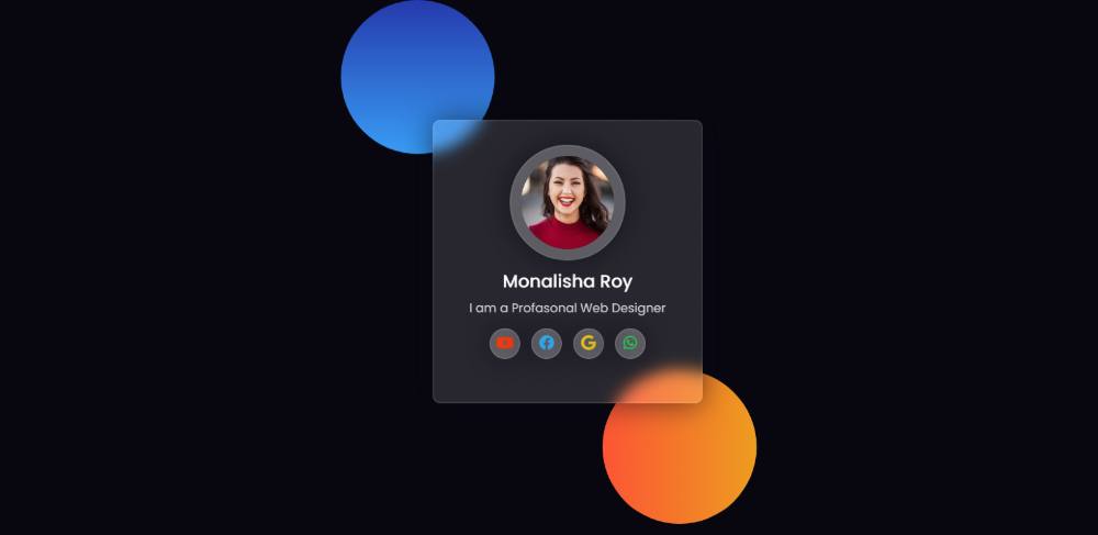
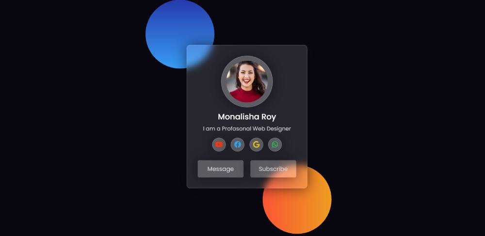
This type of design is much more attractive and beautiful than ordinary design. It has everything like a normal profile card but with a transparent background and a color element in the background.
Glass Morphism Profile Card Design
Below I have given a demo to know how this Glassmorphism Profile Card works. In its demo section, you will find the required source code and live demo. You can copy those codes and use them in your work. However, I have given the download button below the article, with the help of which you can download the codes. Live Demo 👇👇
See the Pen
Untitled by Foolish Developer (@foolishdevweb)
on CodePen.
Hopefully with the help of the demo section above you have learned how to create a Glass Profile Card design. As you can see above, I have created two colorful circles on top of a web page. Gradient colors have been used in those circles.
Then I made a profile card. First of all, I used a profile image in this card, then the name and some descriptions were used, then four social-media-icons and two buttons at the end. This is a very simple and easy profile card.
How to Create Glassmorphism Profile Card
Now is the time to learn the tutorial on creating profile cards. Here I have shared step-by-step tutorials for beginners. I have shown how this profile can be easily created. HTML has been used to create the basic information and structure of this card and CSS has been used to design it.
A profile image has been used and a font awesome CDN link has been used. If you only want the source code, you can use the download button at the bottom of the article.
Step 1: Design the webpage
Two circles have been created on the web page using the following HTML and CSS codes. Gradient color has been used in these sites. You can use colorful images instead of these elements.
Web pages have been designed using the following codes and black color has been used on this page.
Now those round circles have been made. The width and height of those circles are 200px and border-radius: 50% has been used to convert it to round. Different gradient background colors have been used for each.
Step 2: Basic structure of profile card
Now is the time to create the basic structure of this profile card. The background color of the card is transparent. The backdrop filter has been used to create some blur in the background.
It also has a 2-pixel border to enhance its beauty. This profile card width: 350px and height will depend on the number of containers.
Step 3: Add a profile image to the card
Now it’s time to add a profile image to this profile card. The following HTML and CSS codes have been used for this. The height of this profile image: 150px, width: 150px, and border-radius: 50% have been used to make the image round.
Step 4: Add names and descriptions
Now some basic information has been added to this profile card using the following codes. First the name and then some text. Font-size: 23px has been used to increase the size of the name and font-size: 16px for the size of the description.
Step 5: Add social icons to Glassmorphism Profile Card
Now is the time to add four social media icons. Here I have added four icons. You can change the icon to your liking. Border-radius: 50% is used to make the icon’s background height and width 40px and to make the background round.
Now I have added color to those icons and different colors have been used for each of them. Font-size: 20px has been used to increase the size of each icon.
Step 6: Make two buttons
Now it’s time to create two buttons. The size of this button depends on the padding. Front size and color white have been used to increase the text size.
Some of the buttons have been positioned using the following codes and added a hover effect.
Hopefully from this simple tutorial above you have learned how to create this Glassmorphism Profile Card. I have already created a login form using the Glassmorphism design.
If you want, you can download the required code using the download button below. Please comment on how you like this Glassmorphism Profile Card Design.

