
Create Registration Form using Bootstrap is an intermediate-level project where we will learn about the Bootstrap framework and its properties used for creating responsive projects. The registration form helps the user get access to the personal environment of the website, where they can add private data without any third-party intervention. We will be using the CSS framework Bootstrap to add styling to your registration form.
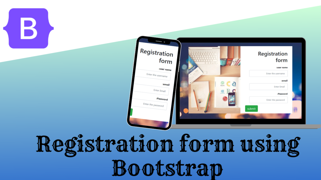
We will be using the CSS framework Bootstrap to add styling to our project, which will help in creating responsive registration forms for every small device so that we can add user interactiveness to the project.
Live Demo Bootstrap Registration Form:–
Adding the Structure (HTML):
Adding the bootstrap Link :
We will be using the bootstrap inside our project, for that we need to import the bootstrap link inside the head section of the HTML file.
https://cdnjs.cloudflare.com/ajax/libs/twitter-bootstrap/4.0.0/css/bootstrap.css
Creating Structure:
We will create a main container for our registration form element using the div tag. Inside our div tag, we will create a child div tag with class image, where we will create a container for our div tag with class firm, and using the <h1> tag, we will create the main heading of our registration form.
We are going to create the registration form’s structure using the form tag. We will first create a label for the user name within our registration form, and then we will create the registration form’s input element by utilizing the input box type as text. Additionally, we will construct the password and email input boxes. Finally, we will add the registration form’s submit button using the button tag with bootstrap classes.
<div class="container" id="registration-form">
        <div class="image"></div>
        <div class="frm">
            <h1>Registration form</h1>
            <form>
                <div class="form-group">
                  <label for="username"><b>user name:</b></label>
                    <input type="text" class="form-control" id="username" placeholder="Enter the username">
                </div>
                <div class="form-group">
                  <label for="email"><b>email:</b></label>
                    <input type="email" class="form-control" id="email" placeholder="Enter Email">
                </div>
                <div class="form-group">
                  <label for="pwd"><b>Password:</b></label>
                    <input type="password" class="form-control" id="pwd" placeholder="Enter the password">
                </div>
                <div class="form-group">
                    <button type="submit" class="btn btn-success btn-lg float-left">submit</button>
                </div>
            </form>
        </div>
    </div>
CSS
Adding Basic Styling:
The HTML tag selector makes it easy to style a whole webpage at once. We can add an image to the background using the background property and adjust the background-size to fill the entire webpage with the background-size property. The body’s background color will now be changed to “transparent” using the body tag selector.
html{
    background: url("https://dl.dropboxusercontent.com/s/eht0zcv3ya92rtx/background.jpg?dl=0") no-repeat;
	background-size: cover;
    min-height: 100%;
}

body{
	background-color: transparent;
}

Adding Styling to the container:
Using the id selector property, we will select the container for our registration form, and using the maximum width property, we will set the maximum width of 800px, and using the margin property, we will set the margin of 120px for our registration form.
Full Screen Menu Using Bootstrap (Code + Demo)
Now using the child class selector image, we will be adding an image to our registration form with the height of the image at 500 pixels and the width of the image at 50% of the registration form, and using the background size property, we will set the background size to “cover.”.
Now, using the media query process, we will add responsiveness to our project by adding a maximum screen width of 700 pixels to our registration form. If the screen size goes below the defined screen size, the width and height of the image will be automatically set based on the screen size.
#registration-form{
	max-width: 800px;
	margin: 120px auto;
}

#registration-form .image{
	float:left;
	background-image: url("https://dl.dropboxusercontent.com/s/5lg1zkgu8esm5jw/desk.jpg?dl=0");
	height: 500px;
	width: 50%;
	background-size: cover;
	background-position: 25%;
}

#registration-form .frm{
	float:right;
  direction: rtl;
  text-align: right;
	height: 500px;
  width: 50%;
  min-width: 250px;
  padding: 0 35px;
  background-size: 100% 100%;
  background-color: white;
}

#registration-form h1{
	margin-top: 30px;
	margin-bottom: 20px;
}

#registration-form .form-control{
	width: 90%;
	padding: 12px 20px;
	height: auto;
}

@media screen and (max-width: 700px){
	#registration-form .image{
		width: 30%;
	    background-position: 60%;
	}

	#registration-form .frm{
		width: 70%;
	}

	#registration-form .form-control{
		width: 100%;
	}
}

@media screen and (max-width: 500px){
	#registration-form .image{
		display: none;
	}

	#registration-form .frm{
		width: 100%;
	}

	#registration-form h1{
		text-align: center;
	}

	#registration-form .btn{
		width: 100%;
		margin-top: 20px;
	}
}
Final video output:
Conclusion:
So, you saw how we created the Bootstrap Registration form in a step-by-step manner, explaining all the important concepts, starting from creating the structure for the bootstrap registration form to styling the to-do to make it look more interactive.
For more such projects stay connected with Foolish Developer and become an expert in coding. If you have any queries feel free to ask in the comment section.
Thank you!!
Author: Arun
Codepen by: NicoHDL